Designing an e-commerce site for a toy store — a UX case study
Timeline: 2 Weeks Materials: Cards, Sticky Notes, Pen, Paper, Figma
UX Techniques Used: Competitive/Comparative Analysis, Mind Mapping, Card Sorting, User Personas, Systems Map, Site Map, User Flows, Wireframing, Prototyping, Usability Testing
Brief
For this project I was provided with a brief to design a brand new e-commerce website for Jeffrey’s Toys, the oldest toy store in San Francisco.
While the primary goal of the new e-commerce website was to physically bring customers into the store, they also wanted to broaden their customer reach beyond SF by allowing products to be purchased online for delivery or for in store pickup.
The site needed to reinforce their core business values: traditional, fun, and creative. The site also needed to distinguish Jeffrey’s toys from other e-commerce retailers by emphasising their highly curated inventory of hand picked specialty items.
The primary business goals for this website included:
- Having clear ways of locating specific products
- Ability to support a single page for each product
- Having an efficient means of purchasing one or more products
- Steering customers towards popular products.
User Research
User Personas
Who are we really designing this website for? With the brief I was given, the client had already defined 3 user personas, each with specific needs and pain points that needed to be addressed in the website.

Based on the three user personas, I identified the main user needs I wanted to address in the website while also taking into consideration the needs of Jeffrey’s Toys.
The primary needs I defined were:
- Clear product organisation for a seamless shopping experience
- Product search to easily find products
- Helpful Product Suggestions that reflects Jeffrey’s Toys expertise and curated inventory
- Customer brand relationship to establish trust
- Detailed product information to ensure proper product selection
- Product reviews to help make informed buying decisions and allow for user input
- Efficient checkout process to save users time and allow for easy purchase of products
Competitor Research/Comparitive Research
To gain inspiration for my e-commerce website, I began by identifying 3 main competitors, specifically boutique toy stores in San Francisco, and 3 main indirect competitors in the toy retail market. The direct competitors I analysed included Ambassador Toys, Amazon, and TANTRUM. The indirect competitors were Lululemon, Ikea, and CVS. My goal was to compare and identify common features across these sites and potential opportunities for Jeffrey’s Toys to differentiate itself.
The most important takeaway from this activity was learning how different websites organised their toy selection and the overall layouts they used for those websites. This was helpful information that helped solidify the stage for my second phase of research.

Mind Mapping
After completing my competitor/comparitive research, I then went on to complete a mind map. For this project, the needs of the business and the needs of its customers/user personas were already defined into a long list of information. All together this list was overwhelming, so I referred to the technique of mind mapping to help me assess it. The point of this activity was to help me organise the information into more defined ideas, and then establish relationships and hierarchy amongst those ideas.

Information Architecture
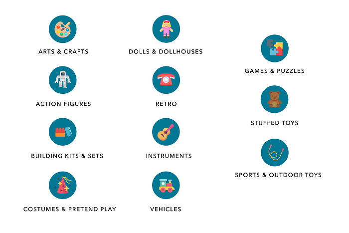
The next step of my process was to develop the navigation system by conducting a card sort, a user research technique to tap into people’s existing mental models. For this project I was given an inventory of 94 of the stores best-selling products to use as a guide. With such a large inventory, it was essential to organise this information in a clear and understandable way so that site visitors could find the products they’re looking for.
Card Sorting

- Open Card Sorting: I asked 9 participants to organise the 94 products into categories that seemed the most logical to them. Then I had them label each of those groups with titles they felt accurately described the items in that category. The goal of this was to gain an understanding of the potential ways the products on the Jeffrey’s Toys website could be categorised and how those categories could be labeled.
- Closed Cart Sorting: Based on the results of the open card sorting, I created 13 predetermined categories from the most common group labels. I then conducted a closed cart sort where a group of 20 different participants had to sort the items into these predetermined categories. This helped clarify whether those categories were logical to the majority of users before I began to move forward with my design.
Site Map
With the results of the card sort and inspiration from other competitor websites, I created a site map to define the overall structure of the website. This was to ensure that products were going to be placed where users would expect to find them when visiting the website and make the experience more intuitive.

System Map
To give myself a comprehensive overview of how a user might navigate through the website, I created a system map. The main goal of this was to gain a better understanding of the functionality and the breadth of the experience that my website should be providing users. I also used this to explore the different ways the website and physical store could be connected.

User Flows
After defining the “bigger picture” of the experience I needed to provide the users, I created a user flow for each of the personas to make this experience more specific to each of their goals. The point of this was to define the intended steps each user might take through various pages and actions on the website in order to complete their goal. Not only would this allow me to focus on what each of the users needed to accomplish, but also how to deliver that experience in the most effective manner possible when designing my website.
The first user persona I addressed in my user flows was Jenny. Jenny’s main goal was to return to the website looking for a beginner level magic trick toy for her grandson. Jenny’s user flow (illustrated below) shows how she might go about searching for the magic trick toy and the several different paths she could take to successfully purchase it.

Both Debbie and Jenny wanted an efficient checkout process, so it was important that I cover this in one of my user flows. The flow below shows how Debbie might accomplish her goal of buying an Evil Knievel Stunt Cycle once she has selected it. I wanted to minimise the steps she needed to take to complete the checkout process by allowing her to sign in to her account. This would automatically input her checkout information for her to streamline the process.

Development Phase
Sketching
Once I organised all my insights from the exploration phase, I began to design the website. To start this process I began to sketch several of the site’s main screens, using my user flows as a guide. This allowed me to quickly explore several concepts for the website layout. I then tested this with 3 participants to validate whether these solutions addressed both the user and business needs.

Wireframing
Based on the feedback and personal insights I learned from the sketching phase, I began to design my first wireframes using Figma. I made sure to prioritise the features that would best address the needs of the users throughout the website.

Prototyping
1. Homepage
I kept the homepage clean and simple to avoid overwhelming users on first page they see. To allow users to easily locate and find products I included a global and secondary navigation, as well as a search bar. The new arrivals and product recommendation sections were key to showcasing the curated and frequently updated inventory as well giving users helpful suggestions on what to buy. I wanted to emphasise the importance of the customer brand relationship by highlighting the rich history and specialty of Jeffrey’s Toys. I incorporated this by featuring an “Our story” section on the homepage that also links to the about page with further information. In the footer, I placed important links where users could obtain additional information they might need. I also included a social feed for users to gain inspiration from other customers and to raise awareness for in store events.

2. Product Category Page
Once a user selects the shop button or a certain category they are brought to a page that lists all the items under that specific category. One of my user personas wanted an age appropriate toy for her grandson, so including a filter and sort by function for topics such as age, price and brand was important to include. I also included a breadcrumb trail to make it easier for the user to navigate and identify where there are within the website.

3. Single Product Page
On the single product page, I wanted to make sure to provide detailed product descriptions so that users can ensure the product fits their needs. Below a user could find helpful product recommendations based on the current product they’ve selected. I also gave priority to the product reviews section since this allows for user input, establishes trust and also allows users to make more informed buying decisions. To make the checkout process as efficient as possible, I designed a drop down cart summary that would appear every time a user clicked add to cart. Users could then conveniently click on the checkout now button to begin the checkout process.

4. Cart Summary Page
Once the checkout now button or cart icon was selected, a user would be led to the cart summary page pictured below. This was the first step in the checkout process where users could review and make changes to their cart as appropriate. I also included the option to select between in store pick and home delivery as a way to entice customers to visit the Jeffrey’s Toy store and lower shipping costs.

5. Checkout Page
One of the primary pain points of the three user personas was having an efficient checkout process so I made sure to make this experience as seamless as possible. As a returning customer, users have the option to log in to their account and have their saved shipping and payment information auto filled in for them. I decided to keep the checkout process all on one page to make it easier for users to edit their information at any point in process. The progress bar at the top also indicates to users how many steps the checkout process will take, what point they are at now, and how close they are to completing their order.


6. Additional Screens
I also created some additional screens that included an Order Confirmation Page to indicate to users that the checkout process has successfully been completed. They could also find important details here about their order for reference.
I created a Contact Page where users could inquire about products they were unable to find on the site as well as learn about store hours, the location and phone number to call.
It was important that I included an About Page to emphasises what distinguishes Jeffrey’s Toys from other e-commerce websites such as Amazon. I also utilised this page as an opportunity to discuss in the unique 60 year long history of this local business to reinforce their brand values of tradition, fun and creativity.


Usability Testing
Once I completed my wireframes, I created a prototype of my website to begin usability testing. This would allow me to evaluate how users would engage with the proposed website solution and validate whether it was addressing the primary user needs. It was important to test with mid-fidelity, greyscale wireframes to gather honest, critical feedback from potential customers and to solidify the functionality of the website before addressing the visual design.
I conducted a usability test with 4 participants and asked them to complete three different scenarios to put themselves into the shoes of my user personas. These three scenarios included:
1. You need to buy a toy for your daughter. Show me how you would find a product and successfully purchase it.
2. Show me how you would find out what events are happening at Jeffrey’s Toys next month.
3. Show me how you would inquire about a toy that you couldn’t find when searching for it on the website.
These were my key findings from the tests:
- Overall users were able to easily navigate the website and locate products and information
- Participants found promo code section to be distracting in checkout flow
- A few participants wanted a way to inquire about products if they didn’t want to call
- Some felt there could be a greater push to bring people into the store

The Next Steps
This case study represents the start of a bigger design process for the development of this e-commerce website. The next steps I would like to take for this project would be to continue to conduct usability testing and further iterate on my designs. Given more time, I’d like to explore more ways Jeffrey’s Toys can bring customers into the store from their website. I would also like to create content for the website and start to incorporate more of the visual style and branding of Jeffrey’s Toys. Below you can find my initial explorations into how this visual style might look. I wanted the visual design to emphasise these core values: simplicity, creativity, and tradition.


Thanks for reading!
Questions? Thoughts? Interested in working together? Let’s connect at hello@alliemtaylor.co

