Designing and launching a landing page from scratch without any code — a UX case study
I wanted to design something from the beginning to the launch.
As I've been studying UX/UI design for a year now, I decided I could practice it by creating a landing page for my blog.
☝ ️I don't know how to code or program, but I decided to use Bubble for it.
“Bubble is a code-free programming language that lets you build and host web applications without engineers.”
I choose Bubble because it's a platform with many other possibilities and I wanted to learn more about it.
⚠️ Challenge
Design a landing page with these points in mind:
- Answer the what/why and how I’ll solve the person's pain point;
- Short content with bullets and formatting to increase the readability;
- Visible CTA button;
- Use of white spaces;
- No other prominent links to distract the visitor;
- Testimonials helping to clarify the purpose of the page;
- Another CTA section at the bottom;
- An image that relates to the product;
- Display an optimized form to allow me to understand this visitor.
🎯 What I'm trying to accomplish with the traffic:
1. Let visitors download an Initial Guide for the Diet;
2. Try to collect their email address in exchange for the file;
3. Try to get more information with a survey after the download.
♻️ The process

🔍 Discovering
Based on online research and forums, I found some motivations and difficulties of people interested in a diet with no meat or no animal products at all. [1] [2] [3]
The main motivations:
- Respect for the animals
- Health habits
- Concern for the environment
Main difficulties:
- The high price of vegan products;
- Difficult access to vegan products;
- Little variety of products and recipes;
- Difficulty replacing animal products.
Looking at my blog stats on Medium I observed that the 2 more visualized articles were about recipes — as the blog has other articles not related to recipes as well — and the most traffic came from Google.
📝 Defining
Based on my own experience changing diets and the online research, I created a proto-persona, that is a starter version to the personas, to help me focus the content of the landing page to the user's goals.

I skipped demographic data on this proto-persona because to develop empathy the motivations and reasonings were more important.
Storyboard
I made a storyboard to help me to empathize and visualize a potential experience of this person.

⚒ Developing
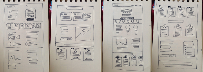
Sketches
I searched for references and sketched some ideas for the design of the page. I was also deciding what kind of section it would have in it.
🚀 Delivering
Mockup and iterating
With the sections of the page defined I still had to summarize all the information I had about this diet. I did the mobile-first approach to be forced to prioritize the information.

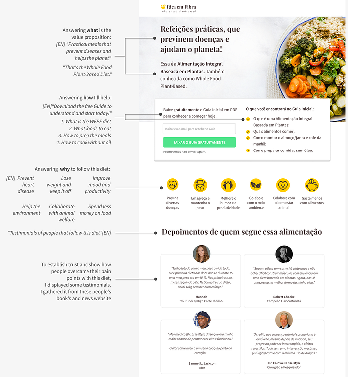
After some iterations and reflection about the points I mentioned at the beginning of this article (in the Challenge section), I came up with this version below.
As the page is in Portuguese, I translated some sentences to explain the solution I came for it, emphasizing the why, what and how:
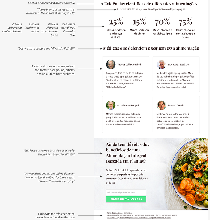
Translation of the continuation of the page:
Testing
I wanted to check if someone that didn’t know anything about this diet would understand the purpose of the landing page.
I tested with one person.
“Testing one user is 100 percent better than testing none. Testing always works, and even the worst test with the wrong user will show you important things you can do to improve your site.” Steve Krug — Don't make me think 🤓
I asked what called her attention on the page:
-"The big colorful plate with food called my attention and these yellow icons as well."
What did she think the page is about and what for?
- "It's a website that talks about food and how it can help people. There's this PDF to download that will say how you can eat following this whole food plant-based diet".
During the test, I noticed it wasn’t clear that there was a reference for the scientific research mentioned on the page. I made a tweak adding small number symbols ( ¹ ² ³ ⁴) on each scientific evidence creating a relationship with the links available at the bottom of the page.
Building and launching
To design on Bubble I watched and read a few tutorials [1] [2] [3].
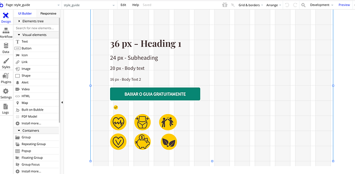
Defining a style guide at the beginning of the design and bringing it to Bubble was really useful on the process of building it.
An important step was to know how to make centralized elements when in the mobile version. To accomplish this, an article helped me.
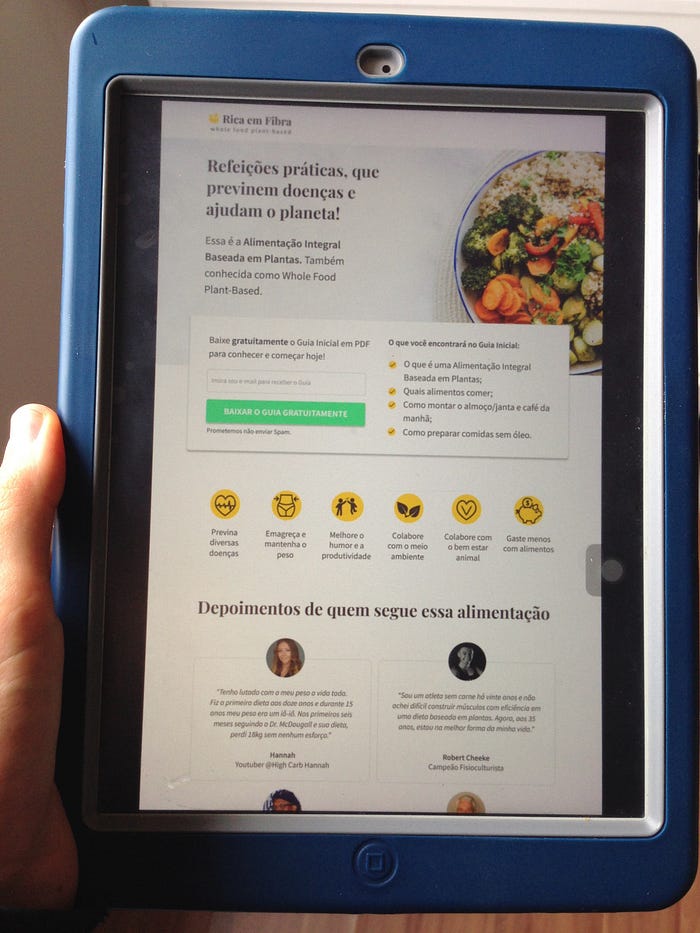
Here is a screenshot of the three different views of the responsive design:

I put a survey after the download was concluded in an attempt to get more information about the visitor. The user doesn't have to answer it to get the file.

The page has a small tag on the right that is the Hotjar (trial version) that I installed to test and see if I could get more feedback.
After making the design, my husband helped me a lot with the programming part on Bubble. (Thank you!)
Here is the final page:

I tested with 2 more people that didn't know about the diet and I made a small tweak on the page.
Also, I realized that a survey at the end of the process might be forgotten, as the person download the file and go see it instead of staying on the page.
For now, I decided to keep it like this.
🤔 Take away
This project was exciting and challenging at the same time. I could practice the design, creation of content, building and launching a landing page.
To summarize all the information about this diet wasn't simple and creating the proto-persona really helped me to focus the content in one direction.
For upcoming projects, it would be important to validate the proto-persona. I could try it with the email I'd get from the visitor.
Thank you for reading and for your claps👏 if you enjoyed this article.
This will encourage me to continue sharing those articles.
If you have any feedback, I’d like to hear from you.
Find me on Linkedin.