Designing apps for young kids
There’s a lot of debate over how much we can expose children to digital devices. Personally I believe that, as almost everything in life, the key is in balance.
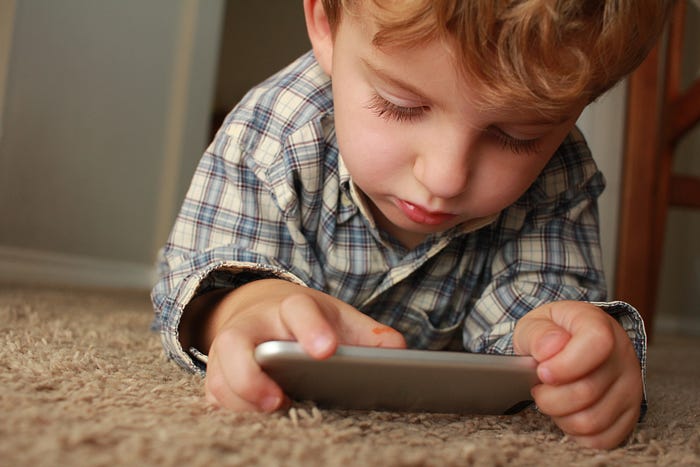
Today children see adults using mobile devices and computers all the time, their natural instinct to imitate grown-ups drives their curiosity towards these objects. My 8 months old daughter can’t use any of those yet, of course, but she seems to be totally fascinated by them.
This is one of those topics like “coffee”. Every day there seems to be a study stating that “it’s good for you”, just to be contradicted by a new study the following day that warns you about the dangers about it, and so on.
As I said before, balance is the key. Digital products shouldn’t be used in place of real toy manipulation and real life interactions, but they can be precious tools in brain development, learning and yes, also entertainment.
In the past few years I had several chances to design award winning digital products for young kids (generally 3–5 yo), from games to media players to educational apps, and I thought I might share some of the things I learned from these experiences.
First of all: people might think that designing apps for young children is easy, or easier than other products. They couldn’t be more wrong! In fact, it’s often harder, from a UX/UI stand point. Why?
1. They can’t read.
Adding labels under icons is pretty useless. It can help parents, sure, especially the first times they use the app together with their children. But we all know sometimes we just need them to be entertained by themselves and there must be a solid UI, made of clear icons and well defined color code that can easily be learned and remembered.
Also, such young kids still can’t think abstractly, so an icon that might be obvious for an adult can be a total mystery for a 4 years old. This doesn’t mean you have to be literal with icons. Sometimes simple shapes are the best choice, even if the kid doesn’t recognize the triangle as the standard icon for “Play” they will remember that shape as the one that start the game or the video or the music, etc.

2. They don’t have the dexterity and muscular control of an adult in their hands/fingers.
Therefore all the UI elements must be bigger than normal and have enough space around, to avoid involuntary taps.
Young kids can’t perform advanced actions such as multitouch tap, swipe, double tap, pinch, etc… It’s a good idea to limit the interaction to simple taps on clearly identifiable areas.
On this regard, you should also keep in mind that kids expect a feedback on every action they perform. I personally believe that a feedback, even a simple one, such as a change in opacity or a subtle scale, should be applied on any interaction on any app, not just for kids. But in children’s product especially, feedback is really important. They need to have a clear understanding that their action is doing something. They still don’t have a perfect sense of real life actions vs. digital interactions on screen, for this reason it’s always better to provide some sort of “physical” feedback to their taps. Sounds are also a great addition in terms of feedback.
The spacing and sizing of elements, requiring a lot of real estate, are also the reason why it’s better to create apps for tablets rather than mobile phones, when designing for little ones.
3. They shouldn’t be overloaded with information.
It’s a good idea to avoid overloading with information a screen, also for grown-ups’ apps. Techniques such as progressive disclosure can come handy when the load of information, commands, data we need to display is a considerable amount.
Young children still can’t understand the hierarchy of the information we present them on the device, they still require some time to fully understand each and every object they see on screen, so putting too much stuff on a single screen can be overwhelming and confusing for them.
Think about tv series for the same age group, such as Peppa Pig or Pocoyo. The amount of elements on screen is minimal (but colorful and fun. Minimal doesn’t mean boring), one action at a time, characters are made of simple shapes. These are good practices we should keep in mind when we design the UI.

4. They require special safety measures
Like parental gates, locked internet access, no outbound links, etc. Safety in kids apps is a serious business. Every parent is concerned (and with good reasons) about what their children can see on screen. This is why Youtube created an app specifically made for their younger viewers. Or Netflix has a special user profile for kids.
Apps for kids have a very strict set of rules when it comes to connectivity. Outbound links that trigger a browser should absolutely be avoided or gated. Of course any kind of social interaction is also a big no no.
There are specific certifications, such as Kidsafe you can get to let users (a.k.a. parents in this case) know your app is safe for children.
In app purchases (IAP) are stuff for grown-ups, this is why any transaction involving real money MUST be gated behind a parental gate of some sort.
The same goes with settings pages, which could include account information, credit card information, links to policies that might bring you outside the app into a browser etc…
A gate can be a simple question or action, that is easy and quick to be performed by a parent, but it’s impossible to understand for a kid. The most obvious solution is something requiring reading, which is something 3–5 years old shouldn’t be able to do yet. Some examples:
- the gate presents numbers from 0 to 9, there’s a sequence of numbers written in letters on top, the user must tap the numeric version of it. “Tap five, seven, nine”
- a simple sum, even better if written as a text. “How much is three plus two?”
- the description of an action to be performed on screen, randomly picked from a set and different every time. “Swipe left”

Another thing to avoid is in-app advertising. I’ll talk about monetization of kid apps later on in another post (follow me 😉), but keep in mind advertising is not an option.
First of all, banners or full screen ads or any sort of advertising, usually involve a link to a website or to the app store/google play store. Another reason is that advertising networks normally don’t have a specific cluster for such young viewers, so you could get advertisements for a more mature audience, involving violent games, gambling or who knows what.
Lastly, children this young would have a very hard time understanding what is part of the app, what is an ad. They lack the experience to make this distinction.

5. We’re not kids anymore
We’ve all been kids, of course, but unfortunately we’re not anymore. So trying to empathize with such users it’s harder. When we design for adults, even if the target audience is far from our tastes, beliefs or needs, we can still try to get ourselves in those shoes.
With young children is of course harder, their way of thinking, their needs, their knowledge, their experience, everything about them is far from what we are. And what we were! Yes, we were children as well, we probably had lots in commons with today’s kids, but still, it was another era. We had nothing like the internet and these devices.
Testing, observing (possibly in an environment comfortable for kids, where they don’t feel observed and judged like specimens), researching are great tools of course. Co-designing with kids and teachers is highly advised, as well as collecting feedbacks from parents. But still it’ll be hard for us, as adults, to fully get a grasp on their way of thinking.
6. You have to deal with the most demanding users you can find: parents.
Parents are of course very concerned about the wellbeing of their little ones. They want the best of the best, and considering also they’re the ones who pay for apps and devices, they are usually really demanding.
When you design apps for kids you actually have to consider two very distinct kind of users: children AND parents. This is probably the biggest reason why doing product design for kids is particularly complicated.
You have to let parents understand your app is 100% safe (see above, point 4 about certifications), but also that it’s useful, it’s possibly educational or at least not inappropriate. Ideally it should teach something in a fun and entertaining way. It should provide a fun experience without being too addictive, keeping kids glued to the screen for hours or causing tantrums when they get taken away from the screen.
Parents have no mercy in their reviews on the stores, so be careful and take good care of their journey as customers and their UX as well. They most likely will use these apps to get some help when they need their kids to be quiet while they get their haircut, or they’re commuting to school or else, so frustration is not admitted. If it makes their life easier and you’re very lucky, you might, maybe, on a good day, get a good review. If it causes any inconvenience, you can be sure, 100%, in rain or sunshine, you’ll get a nasty review. Believe me on that.

In conclusion
This first part was dedicated mostly to the general struggles in terms of UX/UI. If you want to design apps for kids, remember it won’t be easier than making any other app. It’ll probably be more complicated.
Designing digital products for kids is one of the most complicated tasks you can undertake in terms of UX/UI and once you master that, you’ll be probably ready for anything else 😎.
⬜️⬜️⬜️⬜️⬜️⬜️⬜️⬜ 👧🏻👧🏼🧒🏻👦🏼👧🏾👦🏿👧🏽👧🏻👧🏼🧒🏻👦🏼👧🏾👦🏿👧🏽👧🏻👧🏼 ⬜️⬜️⬜️⬜️⬜️⬜️⬜️⬜
My new book “Designing Digital Products for Kids”! Out December the 4th!
Learn the secrets to design successful digital products for children.
You’ll find answers to all your questions regarding the industry, and its peculiarities in 📐 UX design, 🎨 UI design, 🔍 user testing, 📈 business strategies, and much more.
⬜️⬜️⬜️⬜️⬜️⬜️⬜️⬜ 👧🏻👧🏼🧒🏻👦🏼👧🏾👦🏿👧🏽👧🏻👧🏼🧒🏻👦🏼👧🏾👦🏿👧🏽👧🏻👧🏼 ⬜️⬜️⬜️⬜️⬜️⬜️⬜️⬜

