Designing better tables for enterprise applications
An in-depth guide on how to design tables in enterprise applications, and how to avoid commonly made mistakes

Enterprise applications are complex — there is an insane amount of information that is to be displayed that contains data from various sources, modules and users. There are complex graphs, usage patterns, and lists of data that need to be skimmed through before one can make sense of what the console is getting at.
The biggest challenge with designing enterprise applications is the lack of examples of patterns that work or don’t work in specific scenarios.
Since most enterprise applications contain sensitive data pertaining to the company, there are very few examples out there that talk to some of the common problems faced while designing enterprise apps. There exists pattern libraries that talk in-depth about how each component should work but very little on when to use them. The patterns we see in design libraries are often oversimplified and does not work in real enterprise applications where data and the use-cases are more complex in nature.
The patterns work well in a silo but when they meet convoluted workflows, domain specific user-types and data of a large scale, they break.

Tables in the enterprise world
What you see below is a typical enterprise application. The working window is dense with information with a crazy number of panels each indicating information that is contextual to any other selection made on the screen.

As you can notice above, the most space consuming section of the application is a table. Tables This article will help designers who are trying to figure out how to use table patterns the right way depending on specific scenarios.
A pattern of the past in most consumer facing applications but very much an effective and widely used one in the enterprise world. There is no better way, yet, to display huge lists of data in any other way but on tables. Tables are effective because the nature of enterprise applications requires users to view rows of data simultaneously, scanning through alerts, comparing data and looking at data in any specific order of the user’s choice.
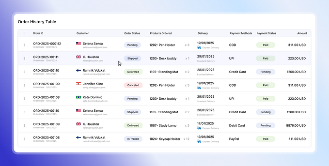
What you are seeing below might seem like a very regular table pattern and might seem like there is nothing wrong about the usability of it at first, but as you get deeper into working on it, one would start realizing the quirks of operating it.

1. Links on tables
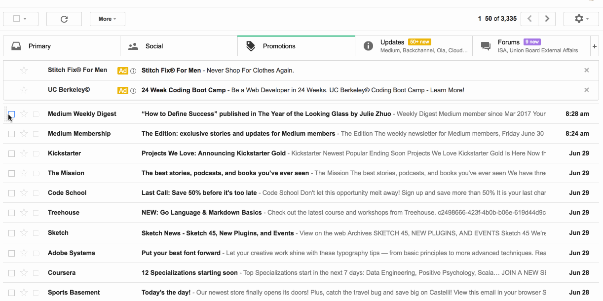
In the first example here, the links on the first column probably hints at the fact that clicking it will take you to the user’s profile. Not very clear, but not very hard to guess either.
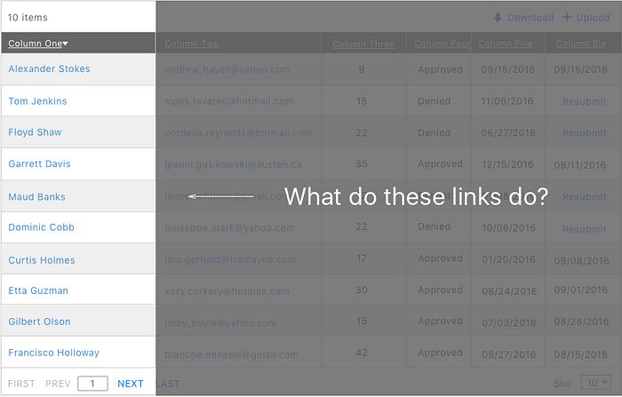
But on the other hand, what happens on clicking on the link in the example below?
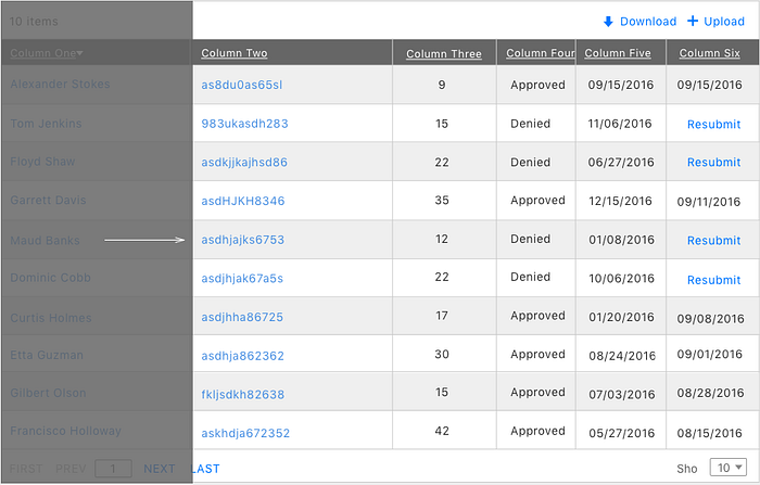
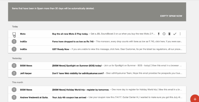
Above is a real example from an enterprise application, where clicking the link copies the code to the clipboard. This action was not very easy to understand and such ambiguous patterns should be avoided.
2. Actions on tables
Performing actions such as delete, move, print, export etc are very common, especially when done for multiple items simultaneously. Most enterprise applications have actions present on each row, and sometimes it is necessary to have these as there is a need to perform the actions on specific rows. Having said that, most actions can be extrapolated from the row and be a different section on the page.
Action proximity of links
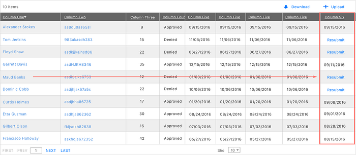
The proximity of action that needs to be performed on a row should not be furthest away from the identifying column. More often than not, this leads to an action being performed on the wrong row. This puts too much cognitive effort for a person to keep track of row and click the action without mistaking it for another row. This pattern is prone to error and should be avoided.
Redundant Actions
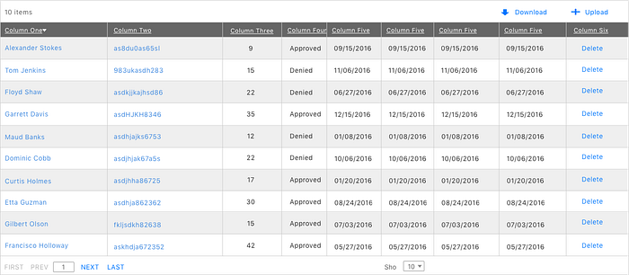
Here the action “Delete” is present on all the rows and seems repetitive on each row. Imagine the same row with five or six options that repeat itself — this would make the table look visually very cluttered. Also, in such a table, it is impossible to delete multiple items at the same time as there is no way to select multiple items.

A good pattern followed to select and perform actions on multiple items on a table at the same time is allowing each row to be selected. Upon selection, a toolbar appears either right above or below the table where the actions to be performed can be placed.
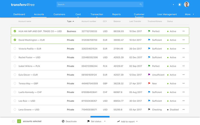
This pattern is followed in most enterprise applications that has multiple list items in the form of a table. Some designers find the checkbox to be visually overwhelming as well because they are present on each row.
Google Inbox has a pattern that reveals the checkbox only on hovering over the leftmost part of the row as highlighted below. In addition, for power users there is an option to use shift and select multiple items at the same time. This is a very good example of implementing action patterns on a table.
Icon only actions are another commonly used pattern that makes the user think, and a rule of thumb for a good user experience is not to make them think. It cognitively loads the user to remember what each icons mean and where they are located.
3. Pagination and search on tables
The nature of enterprise application is usually such that tables that run multiple pages just due to the volume of data. Often times, designers wonder if users even paginate through multiple pages to view data or if they are viewing just what is present on the first page.
A table pattern in an enterprise application is successful if there is no need to paginate to view data.
How can this be accomplished? Good filters and a robust search mechanism.
When a user paginates, they are looking for something specific. So before we get into designing good pagination, one must ask the question —
How might we make finding items on this table easier?
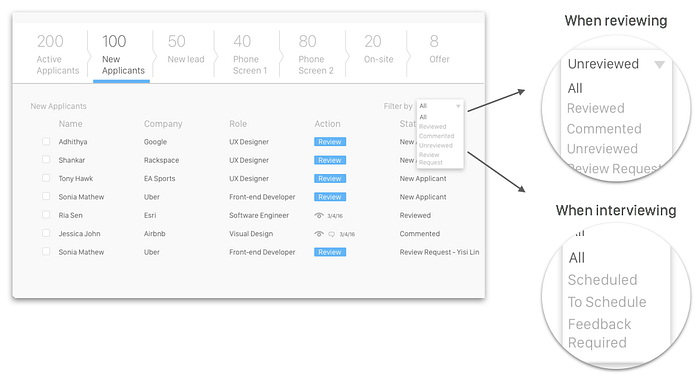
One good proven solution is providing filters that are contextual in nature — that is, based on the workflow of a user on the current screen, the filters present themselves with the options that could be most relevant to the current scenario.
When does search help?
Just leaving this here..
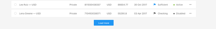
Now that we know how to think about pagination, it is necessary nevertheless. One of my biggest pet-peeves with pagination is the presence of item limits in the following fashion —

The user sees the first ten items on the list and has to paginate to view the eleventh one. Why can the table not programmatically find out if there are just one to three more items on the next page and display them all here? Or even better, no pagination if the items on the table are lesser than say 25? These are not difficult to implement, just that they have not been given much thought about.
Multi-select breaks on pagination
A user selects the first three items on page, then the first four on the second page, logically when he hits delete all 7 should be deleted. That does not happen because it is technically challenging and costly to retain the information of user-selection when paginating across pages.
Selecting all items is another challenge when you have a table that paginates. It is only possible to either select all the items in the current view, or select all the items on the complete list.
Here, the user selects all the items on the page, then selects all 3000 odd items on the entire list. On paginating the selection is missing — this is again a technical limitation of pagination where preserving the memory of selection is expensive from an engineering standpoint.
What about infinite scroll/ lazy loading?
Many applications are moving away from pagination altogether for a Facebook/Twitter styled infinite feed. Designers have mixed thoughts about this, and to me personally, a “Load More” button works best.
This loads only what fits in the current view, and if there is a conscious action from the user to load more, then more items are loaded.
Closing thoughts
This is by no-stretch an extensive list of suggestions for designing tables but a conglomeration of most commonly occurring problems and ways to solve them. I’d love to hear from you if you have items that could be added to this list.
There are some excellent UI suggestions by Andrew Coyle on designing better data tables. I’d highly recommend reading it for good interaction practices on tables.
Image template credit — Payment System Admin Sketch template by Jurij Ternicki from Sketch App Resources.
I am Adhithya, a Product Designer at OpenDNS, San Francisco. If you liked this article, hit the recommend button below. ☺️
You can find me on Twitter. Check my work here, or simply write to me at adhithya.ramakumar@gmail.com
Adhithya wrote this story to share knowledge and to help nurture the design community. All articles published on uxdesign.cc follow that same philosophy.