Member-only story
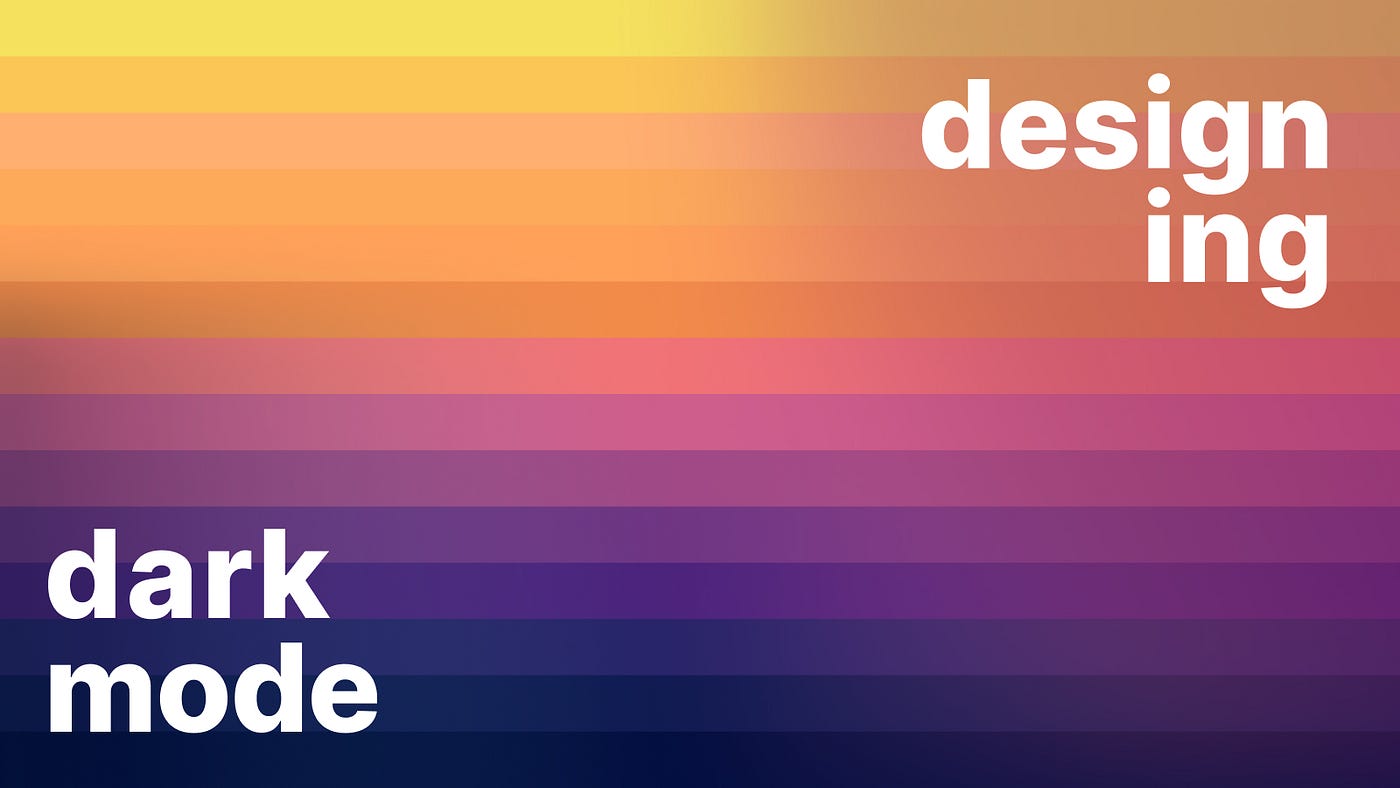
Designing dark mode
Design considerations for crafting a great dark mode.
In this article I discuss the key aspects to consider when designing a dark mode/theme. Everything from colors and shadows to icons and typography.
This is a two-part series:
- Implementing dark mode
- Designing dark mode
What is dark mode?
You can skip this if you have read part one of the series.
Dark mode is a dark theme that emits low levels of light while maintaining a high standard of usability¹. It achieves this by using dark greys and desaturated colors.
Users expect a product or website to offer a dark experience when their device switches to dark mode. It has become a baseline feature.
The main benefits for your users are:
- Reduced light, avoids eye strain and helps with conditions like cloudy vision or photophobia².
- Better battery life on OLED screens³.
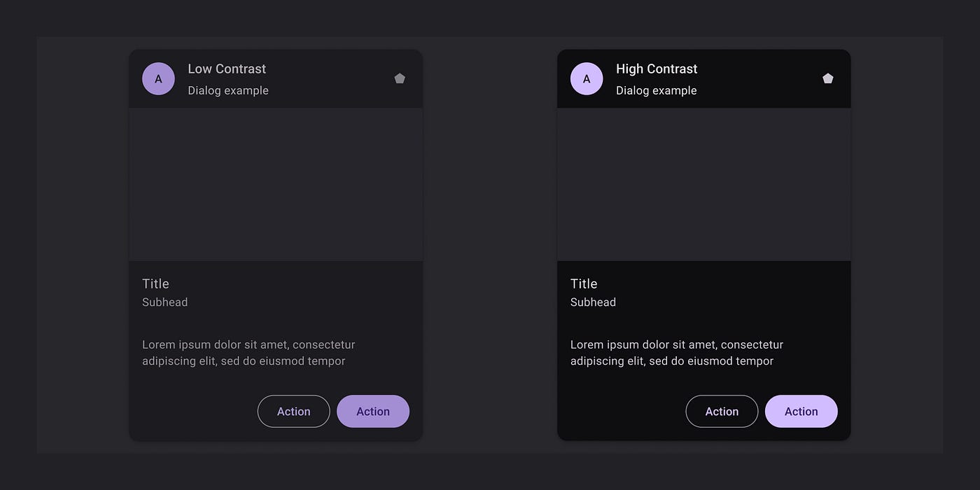
There is no contrast standard for dark mode, it can be high or low contrast. As long as you are within the WCAG color ratios⁴.
Designing dark mode
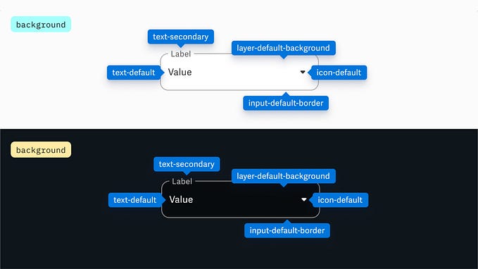
When designing dark and light themes for a product there are a few things to consider for a consistent and accessible experience.
The main aspects are:
- images
- icons
- shadows
- typography
- color
Images
When creating a product with multiple themes, you must make sure that images work in every theme. There are a few methods outlined below that you can use depending on the platform and image type.
Avoid backgrounds
We all used to give out jpgs the same background color as the websites canvas. This made a logo seem to have no bg at all. Since this does not work with multiple themes, upgrade to a png or webp with real…


