Designing for a 128x64 pixel display — a UX case study
Designing Products for the Specialist Racing Drone Industry.

Product creation is a complex process that requires an array of specialists engaged in various product development stages. For this reason, before we dive into the story below, I would like to start off on an organizational note by providing a table of contents. If you’re interested solely in visual design, head over to the Interface section. Respectively, if you’re looking to understand decision making processes and the product development approach, I recommend the first two chapters.
When you think of UX design, you’re most likely to associate the concept with the process of creating websites and web and mobile-based apps. Tailor-made interfaces, such as those designed for specialist equipment, are nowhere near the mainstream you can read on in thematic literature. For instance, in his famous book “About Face”, Alan Cooper dedicates only 17 out of a total of 720 pages to so-called “other devices”.
In the following article, based on my work on Pirx The Pilot, I describe the process of creating such software — from product goals, technological limitations, and functionality choices, to the specificity of designing a single-button, 128x64-sized interface.
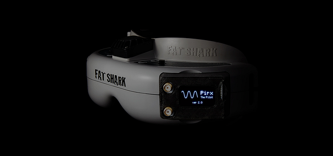
Pirx The Pilot is an FPV (first-person view) software that provides the user (pilot) with the best possible experience throughout the process of search, signal reception, and configuration. The first two mentioned functions stem from algorithm implementation, whereas the latter relates to interface use.
Design goals and device limitations
Originally, Pirx was designed for the popular Eachine Pro58 drone vision module, while version 2.0 also extends to RealAcc RX5808 Plus. Both are diversity receivers, hence, are equipped with two receiving antennas. In practice, either of the two antennas is used, depending on the signal strength.
The user experience goal was to achieve the highest possible level of maintenance-free use: I switch the device on and there — ready to use! This concept has been fulfilled for users who aren’t interested in customization. Still, a separate approach was needed for advanced users, who were at risk of getting discouraged if the interface did not cater to their needs.
Many appliance makers make the mistake of putting dozen of new–and unwanted–features into their new, digital models. Instead of making things easier, that ‘simple’ LCD touchscreen becomes a confusing array of unworkable controls.
The true Ockham’s Razor was, in this case, the limited cache memory of the equipment — 64KB (which, in reality turned out to be 128KB, contrary to the producer’s suggestion). We did not want to include any quasi functions with names that would imply uniqueness, but would, in reality, duplicate others with just a minor tweak in parameters (which, in its own right, is a relatively popular marketing gimmick).
Other limitations and equipment features that influenced design were:
- A monochromatic 128x64px screen;
- A three-position button (the input device);
- A buzzer emitting monotonic sounds.
The button turned out to be most problematic, as it allows the application of nine states — short click/long click/hold of the button for each bottom/middle/top position. Naturally, more states, such as holding the button for ten seconds, are available, but are very inconvenient and require the use of a timepiece. Meanwhile, the inability to check whether the button had been pressed properly until its release proved to be the biggest challenge. Interestingly enough, the problem only manifested itself during the testing stage.
Here, the buzzer has proved itself useful as additional confirmation of proper button use, be it a short click of longer hold. Through the application of metal detector-imitating sounds, it also serves as a perfect aide in the lost drone search function.
Functions and the rightness of their implementation
Functions that meet user needs
Once solutions available on the market had been considered, we were able to define a single-function MVP — the selection of band and channel that should be received. Its extension, respectively, is the automatic choice based on the frequency of the strongest signal. Naturally, functions that work without the need of user involvement are most convenient (i.e. Google Maps connection search).
A common scenario is that a user owns several drones with video transmitters simultaneously set to varying frequencies. Manual band and channel selection — or even automatic search — seem redundant each and every time the receiver is switched on. The function of adding chosen frequencies to a Favorites list (in practice, the launch of a default screen after switch-on) accommodates this specific need. It is the single best way to use the receiver.

Functions for advanced users
While “good-to-have” functions don’t serve the main channel selection purpose, they provide access to information and possibilities useful for the advanced user. The concept has been fulfilled through the implementation of functions such as Spectrum (a graphic presentation of nearby signal strength) and Manual Tune (adjusting the currently received channel to its specific frequency, with accuracy to 1mHz).

Functions enhancing convenience and user enjoyment
In the event of a crash (i.e. drone collision that terminates the flight), users often encounter the problem of locating the drone, which might be lying in the grass or hanging from a tree branch. If we can’t remember any characteristic landmarks in the seconds before the crash (so-called “failsafe”) and the drone camera is facing the ground, locating the quad can be an especially daunting task. If the battery remains intact and the equipment is still emitting the signal, we can use it to our favour throughout the search.
Diversity-type modules use two types of antennas: omni and directional. In case of the latter, the equipment keeps receiving the signal if it is aligned directly between the drone and receiver antenna.
By applying the above, the Detector function allows the localization of the drone through indicating the direction search should be conducted in. On the basis of the emitted signal strength, it also informs the user on the proximity of the equipment. The entire process is visualized on screen and supported by buzzer tones.
The On-Screen Display function (OSD, for short) can prove especially convenient. It allows screen content to be displayed directly in the goggles, thus making it possible to keep them on while handling the receiver. As an exception to the rule, the three-position button — despite its presence on the left side, with goggles on — does not derange interface navigation (which may be problematic with five-position joysticks).

Functions that allow equipment personalization
We all like to mark our items — attach stickers on laptops and goggles, put covers on our phones, or set specific wallpapers and ringtones, to name just a few. The small display screen of the module also leaves room for personal labelling. To meet the personalization demand, we created the Call Sign function, which allows the name or nickname of the user to be displayed on the Screenscaver.
In the case of LEDs — or, more specifically, an attached RGB LED strip — the situation is analogical: one can set the color according to his/her preference. While neither function increases or enhances the signal quality, they correspond to the humane need of marking belongings and standing out in the crowd (the LED color may correspond to the color displayed on the drone, thus indicating the identity of its pilot).

Interface design
Understanding the area in which creative decisions are made — in this case, an STM32-based receiver with a small screen and a single button — allows us to establish a specific user interface design approach.
Information architecture optimization for small screens
The channel selection screen is the default view where the user is provided with two MVP functions — Channel Mode and Autosearch. At the same time, it is also the screen where most data is provided simultaneously, thus requiring the information architecture to be well-thought-out and displayed properly on the screen.
Coding and sequencing can be used to highlight information. […] Symbol can be coded using colour, alphanumerics (text), shape, intensity, flashing (blinking), and orientation.
— An Introduction To Human-Computer Interactions, Paul Booth
As the display did not allow color or intensity manipulation, the size and location of information on the screen became the basic distinction tool. Current channel and band selection, displayed with the largest possible font, is the single most important information provided to the user. The second largest font has been used to indicate the frequency corresponding to respective channels.
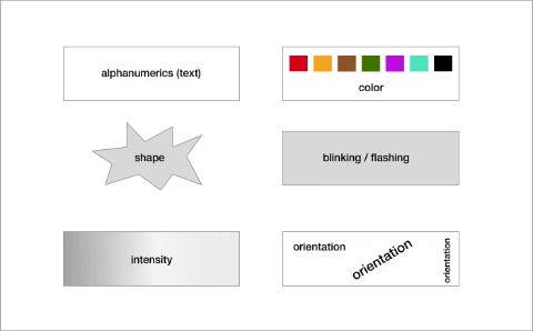
Two progress bars located at the top and bottom screen edges indicate connection to nearby antennas and inform the user on the signal strength. A filled progress bar provides information on the antenna currently in use, while the passive antenna progress bar is filled with checkerboard pattern (an approach derived from monochromatic graphs to distinguish area and intensity).

Adding text information to indicate reception quality is an interesting solution for limited screen space. Specifically, the text is restricted to three characters. When the strongest possible reception is achieved, there is no space to display “100%”– comprised of four-symbols. Here, displaying the word “MAX” serves the purpose. After all, it means the exact same thing, and uses just three characters — simply put, an ingenious alternative to a cluttered screen.

Information on the current receiver mode (Favorites, Channel Mode, and Autosearch) is another significant element of the interface. Favorites, for instance, is supplemented by an indication of the current channel’s position on the saved list. This is displayed on the right side of the name and is aligned to the reading direction.
Three remaining interface elements are module temperature (which may change, depending on battery voltage), frequency range graph with current position, and a supplementary information on the channel in use, which indicates the divergence between the optimal and manually-set frequencies.
Interaction Design
Throughout the process of designing the Main Menu interface, special emphasis has been put on quick identification of the current position and those in proximity. We have found that applying the slot machine analogy (known for its wide use in iOS list selection) was perfect for the navigation button mechanism (up/down and pressing), as well as certain functions of the Favorites list. For version 2.0, we have decided to build upon the metaphor, and applied an animation that further similarized the interface to the slot machine/roll analogy.

The current position selection is displayed on the bright bar, along with a suggestive icon (unfortunately, presentation abilities of monochromatic 16x16px graphics are quite limited). Arrows next to the previous and following positions of the menu suggest the type of motion needed to proceed to the desired position.
Solutions that focus on featuring single elements of the menu, all the while applying the wheel-button (an imprecise entry solution), are a waste of time for the user, who must remember positions of the menu or click through their entirety each time.
While the button potentially has an indefinite number of use variations, using more than three isn’t reasonable. These are — short click, long click (ca. one-two seconds), and hold (hence, everything longer than two seconds). Think of this as an analogy to double-click or right button use in mouses. Due to the specific properties of the wheel-button, performing double-click is more difficult than press-and-hold.

Mechanics-wise, the solution is closer to game interaction; for instance, similarly to No Man’s Sky, the action is performed by a press-and-hold action and supported by a visual process indicator. For this reason, saving (i.e. adding to Favorites) or editing the channel are both performed by the same variation — long hold.
Selecting the right design software
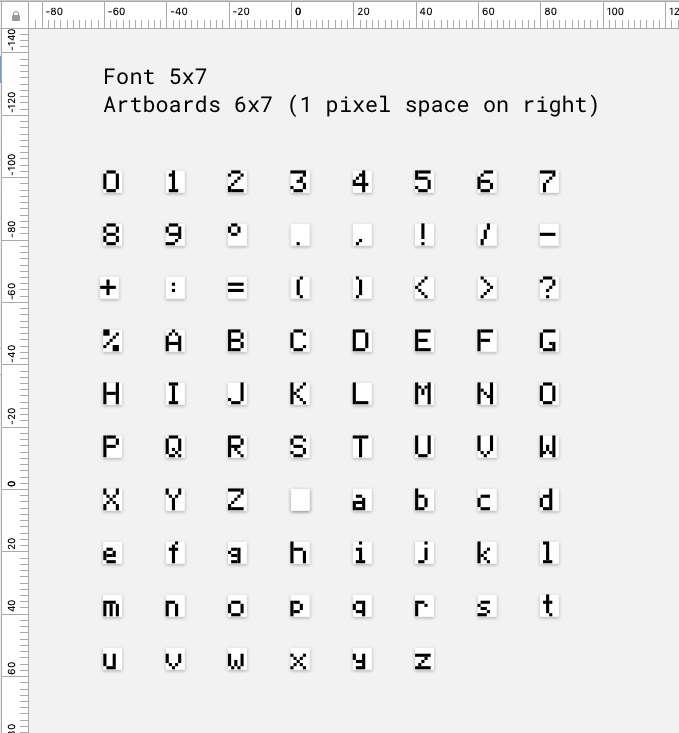
The interface, fonts, and icon were all created in Sketch, whereas Iconmoon helped generate font files. As for development work, we performed size-check of elements in Marvel. As pixel-perfect is, in this case, a norm, all the work has been performed in zoom, on a pixel grid.

Interestingly, the inability to quickly verify the interface on real equipment turned out to be quite problematic. Specifically, it required the actual coding of all screen elements, as well as adding in the tailor-made pixel font. Let’s just say that designing the font itself is a whole different story and worthy of a separate piece.
For the sake of this article, I’ll resort to the description of two problems related to the process. The first is scalability of the font — specifically, the selection of size and decision as to whether increasing the font size also ought to result in a more detailed view of symbols (i.e. bigger number of available pixels). The second problem was using national symbols, complex in nature and impossible to be conveyed in a 5 x 7px element.
User feedback
To summarize the result of our work on Pirx The Pilot, I’d like to share some opinions on the usability and overall experience of using the software.

Racing drones
Racing drones, or — more specifically — quadrocopters (due to their four motors) are relatively still a novelty. They were developed as a result of miniaturizing equipment that transmits the real-time view from the camera attached to the drone directly to the user’s screen. As the drone pilot sees the view from the drone camera, his/her left and right are equivalent to left/right drone perspective. The same applies to up and down. While it doesn’t resemble the VR immersion capabilities, where a head twist results in a shift of the virtual camera angle, the experience — especially if you’d never experienced FPV flight — is undoubtedly memorable.
FPV
In order for the camera transmission to work properly, an analogue transmitter, receiver, and camera-view display goggles (or a different screen) are all needed. In case of the latter, the receiver is placed in one of the case indentations.
Translated by Anna Rubkiewicz (contentki.com).


