Designing for Accessibility — The Design Sprint that worked great and all the key takeaways.
We were a part of the design team(of a product) that was working on making applications easy to access for people with disabilities. In order to know our audience better we tried to contact them (online or meeting them in person). After our research of “knowing the people better” was complete, we ran a Design Sprint (the one by Jake Knapp GV) and came up with great results. The aim of this article is to impart all the insights that we gathered during the process so that everyone can benefit from it.
Our Role : Design Research // Interaction Design //Solution mapping
Process followed (In 2 simple steps)
- We went to real users so as to know them better
- Ran the Design Sprint
It was very important to have a deep understanding of the people we are designing for. So we went to the users already using the application and watched them use the product. We had these points in mind while observing them and using the product.
-What is their impairment ?
What is the severity of it?
How do they tackle and get through their daily challenges with impairment?
What are certain assistive technologies that they use?
What or how’s experienced are they with those assistive technologies?
What’s their skill level?
What are their paint points in trying to achieve the tasks that are related to your product?
Then we ran the design sprint and here’s the detailed version of it. Design Sprint is basically a 5 Days process (developed by Jake Knapp @ Google) which divides the whole problem scenario into a 5 day sprint process so that we can come up with solutions that work great.
DAY 1
The goal of the first day was to encourage everyone to share what they already knew and develop a common understanding with the rest of the group.
- We jotted down all the problems on sticky notes
- The we explored HMW’s (How Might We) to come up with opportunities which are interesting to explore.
- Then came lightning demos — observing the competitors that are dealing with similar kind of problem.
- Sketching the user story.

DAY 2
- Choose a part of the problem
- Mindmapping
- Crazy Eight’s
- Finally Storyboarding

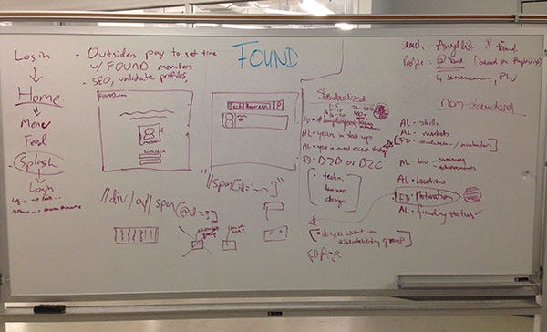
DAY 3 — Decide and search for conflicts
- Test your assumptions
- Whiteboarding the user story
DAY — 4 — Prototyping Solutions
DAY 5 — Testing with real users
Luckily it all worked fine and we could provide people with a better experience. The users found it easy to understand and use.
All the key Takeaways
1) Complexion reduction works better than the other alignments.
Bigger Bolder texts, more universal icons and use of proper white spaces.
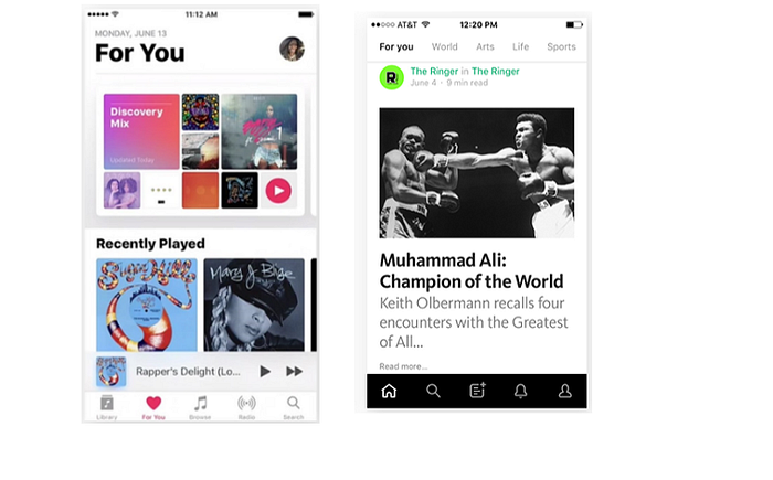
There is no practical theory or evidence that supports this claim, but we observed that left aligned and bigger bolder texts were easy to read and understand than right aligned or centre aligned texts. Here’s an example to make it more clear.
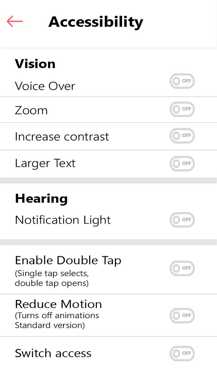
2) SINGLE TAP SELECTS, DOUBLE TAP / LONG PRESS OPENS
Single tapping an element on the application would select it and then long press or double tap to open it. This not only works good for people with visual impairment, but also helps people with cerebral palsy to deal with screen interactions in a better way. This works almost similar to TalkBack in Android or VoiceOver in IOS.
3) Make use of more universal icons
4) Notification light for people with hearing Impairment
5) Give people an easy option from within the app/website to switch to accessibility options.