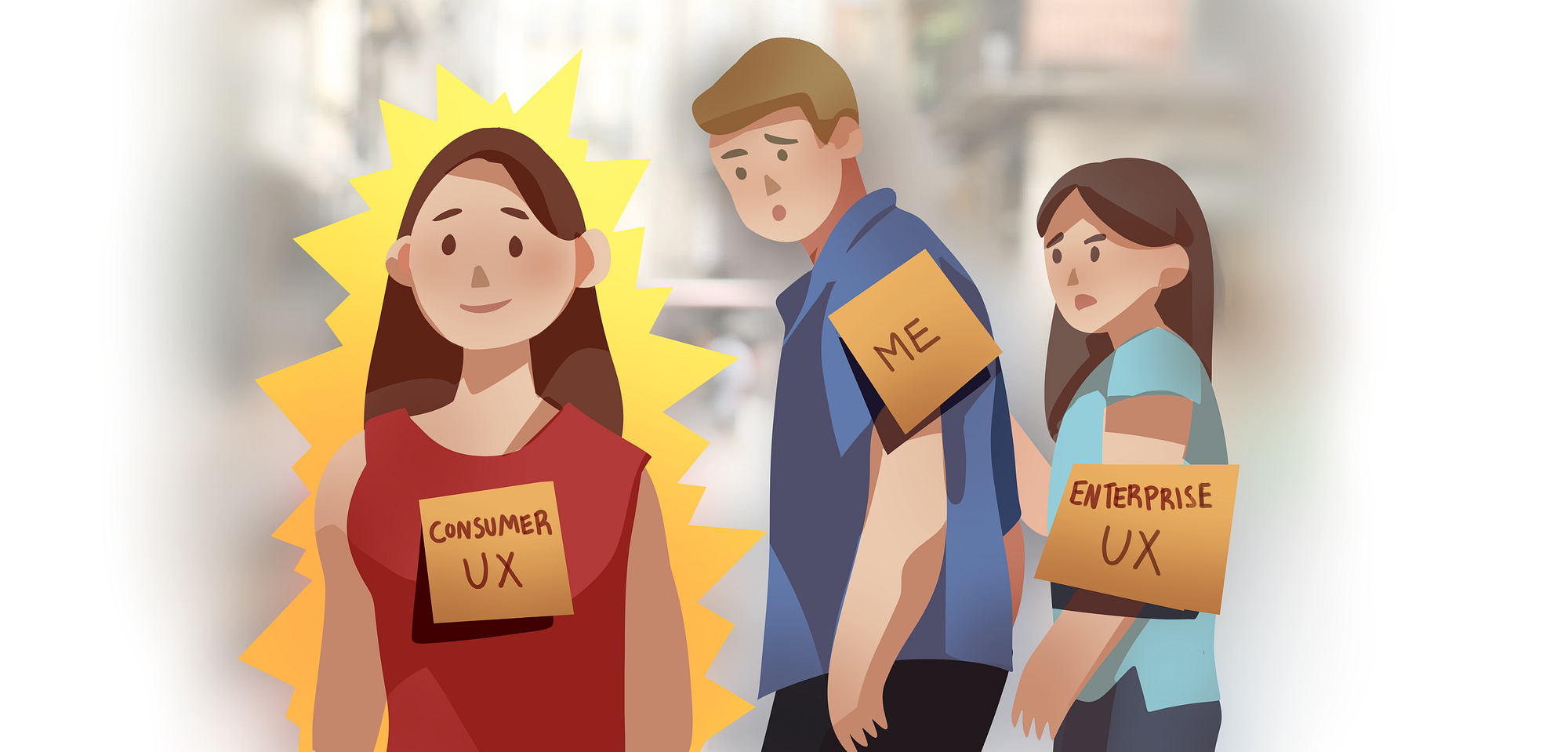
Designing for enterprise vs. designing for consumers
A question I am often asked by people eyeing a career in User Experience is what is Enterprise UX and what makes it different from Consumer UX? As someone who has spent the last 5+ years mainly working on Enterprise IT solutions, here are some of my thoughts.
First of all, Enterprise UX is generally split into two types, Internal Solutions or Business-to-Business (B2B).
Some unique aspects about designing Internal Solutions:
Your work will (probably) never be displayed on your portfolio
Unfortunately almost every internal solutions project in enterprise will be covered by a hefty NDA.
A large subset of enterprise projects are to facilitate proprietary internal processes for specific sets of users. This means your designs will probably never be seen by anyone other than the same users who stare it every day. Even if you manage to get permission to include it in your portfolio, it will need to be scrubbed of all sensitive data.
Luckily most companies who have deep enough pockets to build their own custom IT solutions are usually larger and their brand likely carries enough “clout” for designers to simply name drop the project and save the work-process presentation till a later interview step.
Willing but busy test subjects
One of the best things about working on internal products is your users are going to be people in your organization.
This eliminates a whole level of legal issues when it comes to conducting usability studies. Additionally, because most internal projects are to optimize and improve on existing workflows, your users are usually pretty eager to volunteer. They are the ones who will be suffering through a poorly designed solution, so it is in their best interest to get in early with the feedback.
The drawback is they also have full time jobs they need to balance, so it might be hard to obtain their precious time. If you can manage that, they are usually eager to offer more feedback than you might expect.
Some things about B2B
You may not (fully) satisfy the end user
For a consumer product, if it’s ugly or hard to use a consumer can just refuse to use it. A business on the other hand could “mandate” all employees learn a specific software they use to conduct business even if it has a somewhat steep learning curve.
B2B Enterprise products ultimately will be sold to business decision makers who push it down to the users. Things they care about are quantifiably improving efficiency and security while preventing errors. Most organizations are looking for a solution to replace and/or optimize existing processes.
That is not to say enterprise software shouldn’t aim to be user friendly, but often they can get away with more as long as certain objectives that are deemed crucial by business are accomplished. The impact to the bottom line sometimes emerges as the most important factor.
UX leaders at large companies around the world are still fighting for a seat at the table to prove the value of good design. Unfortunately many enterprise UX designers walk a tightrope between satisfying business objectives, technical requirements and user needs.
Like in most projects, in the Enterprise space, if it can be proven that a better UX will lead to a quantifiable increase in productivity that can be measured in $$$ savings, then you have yourself an amazing opportunity and challenge.
You might have to listen to the Whales
If you work in B2B, the concept of “whales” might be familiar. Often they are the clients that generate the most revenue and therefore have the most sway in the roadmap of a certain product. This sometimes may work out quite well because having fewer points of contact simplifies the requirement gathering and confirming process. Unfortunately it also leaves the possibility of large segments of users’ opinions ignored.
There have been many cases of a feature being requested that just doesn’t seem to fit in most workflows (because it is something unique to a whale). Usually the decision is to just “go for it” because the sales team has already promised this in the next release and this one client accounts for 40% of the revenue of the product. This often results in solutions that seem a bit random and illogical to the rest of the users.
Usually until a designer hits management level, they may have little sway over powerhouse stakeholders like the sales team. This potential conflict of interest is definitely something that the design organization as a whole needs to band together to balance the long term vision of a product with immediate “quick wins” so the product can be designed and built in a scalable way.
Enterprises operate on Legacy systems.
Almost all the F500 companies grew to their behemoth size partially due to company acquisitions.
With each merger a completely different system and workflow are patch-worked into existing ones. It is not uncommon to find software dating back to the 90s still in operation for a surprising amount of large companies out there. While in concept it seems like it would be easy to just “consolidate everything”, the process of reconciling databases and systems is messy and takes time.
A lion’s share of Enterprise UX is to do this tough job of moving users off of a group of legacy (sometimes manual) workflows. This involves deep understanding of user goals, multiple systems, mapping them out, identifying redundancies and synergies, and then pelting it with edge cases to see if it can reliably produce the same (if not better) outcomes than the current way of doing things.
While it is not always the case, enterprise software tends to be much more complex than consumer software as even though the concept is to “start fresh with a new system”, the data is all coming from a pile of old systems that comes with their own load of baggage.
The ability to think about processes at a system level, ask the right questions and effectively document are some of the most useful skills in this kind of project.
I am not a developer so I have no idea if the image I grabbed from Google below is an accurate representation of a typical back end architecture.
All I know is for every project the developers produce a similar looking diagram that maps where data comes from and where it goes, and often it is very complex and comes with a whole series of restrictions of what is possible when it comes to pulling, storing and pushing data.
Rules and Regulations
Most enterprise organizations need to follow a strict set of policies and are usually bound by various governance requirements.
Some common examples include legal/privacy requirements (ex. GDPR), internationalization requirements (ex. Date formats, languages), accessibility (ex: WCAG&ARIA), security and more.
Each one of these rules comes with subject matter experts, a checklist of sorts and also a series of more vague situational best practices that really depend on specific scenarios and use cases. While more and more consumer apps are being regulated, the monetary value of the sensitive data many enterprise organizations hold often results in increased regulatory scrutiny.
Often this results in obvious answers being out of the question. Sure a third-party solution to your exact problem might exist but due to some rule or regulation, you simply can’t use it.
Often designs end up a bit sub-optimal for users because so many of these criteria must be filled, and it might not be obvious at a first glance. This is one of the reasons why historically many government software designs seem so obtuse.
Slow to Change
Similar to the point above, something more unique about enterprise software users is that they tend to be more change-adverse. That just means you need to really consider the ramifications of changing up the workflows, using different colours or even something as simple as moving a button from one part of the screen to another.
We aren’t even talking about Information Architecture. Sure your card sorting studies might show that the navigation for existing solutions is all wrong, or a bunch of things should actually be nested somewhere else. However you will soon find that there will be considerable pushback when you actually move to implement these changes.
It is key to know when to trust in your research and expertise, and when to push ahead vs. relenting and slowing down the pace so you don’t alienate too many of the users. It will take time, resources, and guidance for them to learn or relearn processes that’s ingrained into them over the course of several years.
While they may be resistant to change, it definitely doesn’t mean we as UX professionals can’t advocate for it, we just need to understand their struggles and have their best interests in mind when doing so.
Information Density
A common similarity for many legacy enterprise apps is that they are incredibly information dense.
The ideal solution might hide all the unnecessary information and reveal only what is needed but the risk of “hiding the wrong thing” could be so devastating that the risk isn’t worth the incremental screen real-estate saved.
This often results in incredibly packed screen designs that increase the cognitive load on the user. The usual justification is that it is up to the users to “learn” how to use the software which is only something that you can get away with in Enterprise software.
Additionally for many administrative or monitoring solutions, it is important to see information side-by-side for comparison and reference. Complex non-linear workflows make it even more challenging as many options need to be both accessible yet out of the way.
As a result it is not uncommon for enterprise apps to sacrifice white space to pack more information on the page, because often the user simply needs to see more information to complete more complex tasks.
Opportunities
As organizations rely more and more on technology, Enterprise UX is going to emerge as a key competitive advantage for many.
Having the skills to wade through complexity, balance multiple stakeholder opinions and innovate within constraints will be the hot knife that cuts through the butter that is Enterprise Software.
With many exciting technologies like Machine Learning on the horizon, business will be lining out the door with their vast repositories of messy data. UX will be at the forefront of figuring out what the users want out of this data and how it needs to be manipulated and accessed to produce valuable insights.
While there will be a time and place for beautiful dribbble-worth visuals, the heavy lifting will be in the not-glamorous trenches of Enterprise UX that happens in spreadsheets, data sets, scratchy prototypes, surveys and hours upon hours of talking and testing with users and stakeholders.
What ends up in front of users might not be completely clean and simple, but you can trust that every speck of datum that makes it to a high-profile enterprise product has passed through the scrutiny of the UX gauntlet. Our users already have their hands full trying to do their jobs, and we can help lighten the load by clearing away some obstacles. That’s pretty rad.
If you have never worked in Enterprise design before, hopefully this was a good intro into some of the challenges in this underrepresented space. As a follow up, I wrote this piece on why I LOVE working in Enterprise UX, so feel free to check it out!

