Designing for international audiences
What I’ve learned as a UX designer on the international team at Audible, an Amazon company.
A chemistry teacher is diagnosed with cancer. To secure his family’s future, he starts a meth business with a former student of his. Have you seen this show? No, it’s not Breaking Bad…
Breaking Bad’s story fascinates both American and international audiences, but not every detail resonates with every audience. Take the Colombian adaptation of Breaking Bad, Metástasis. In addition to a straightforward translation from English to Spanish, a number of cultural details needed “translation.” For example, the RV used in Breaking Bad is not common in Latin America so it was translated to an old school bus in Metástasis. And instead of owning two cars as in Breaking Bad, Walter’s family owns just one. These types of changes yield a more culturally appropriate experience without impacting the underlying story.

Paying attention to the details of culture differences is key when designing for international audiences. We need to challenge our own cultural biases and ensure our work is accessible beyond our personal cultural bounds. What follows is a brief discussion of a few of the issues I have encountered while considering design for a multinational audience.
Our cultures impact our behaviors

Acknowledge behavior patterns and how they differ across cultures.
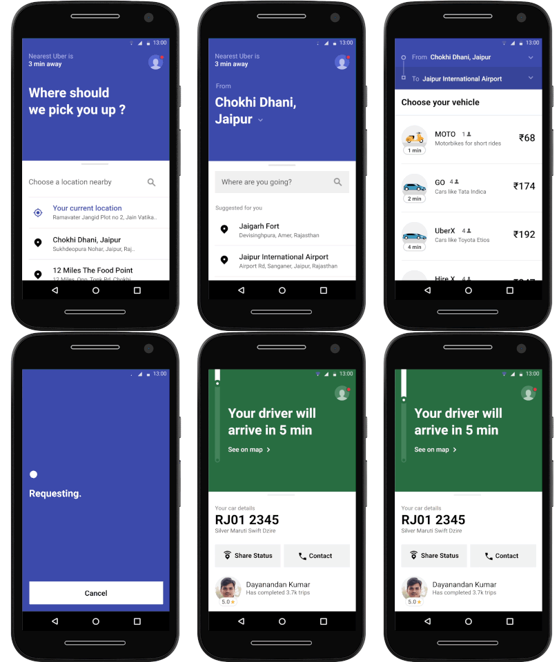
With an app that takes up less phone storage, and works in areas with lower connectivity, Uber has created a service tailored to the needs of their users. Uber Lite, launched in India, serves users who may have basic Android phones and use limited data plans and even accepts cash payments. We see similar examples of this with mobile applications like Google Maps that offer meaningful offline experiences. Google offers guidance for developers looking to implement offline experiences.
Time your messaging.
Different cultures engage with products and services in different ways and at different times. When thinking about delivering messages to users, consider when a particular audience might be the most receptive. For example, you might choose to delay notifications until a user is at a specific location to avoid disturbing them while driving or in meetings. Here’s Apple’s developer resource for scheduling notifications.
Understand underlying values.
A design with one-click purchasing may be received really well in the U.S. but not so well in a country with very high rates of fraud. In this case, without extensive payment or identity validation, your users may have fears and apprehension associated with what an American may perceive as a streamlined process.
Design with translations in mind

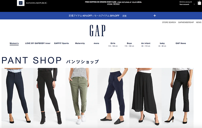
Avoid using text in images.
This is generally bad practice as this text cannot be translated, cannot always be discovered by search engines or locally in the browser, and it is not accessible to users who use screen-readers.

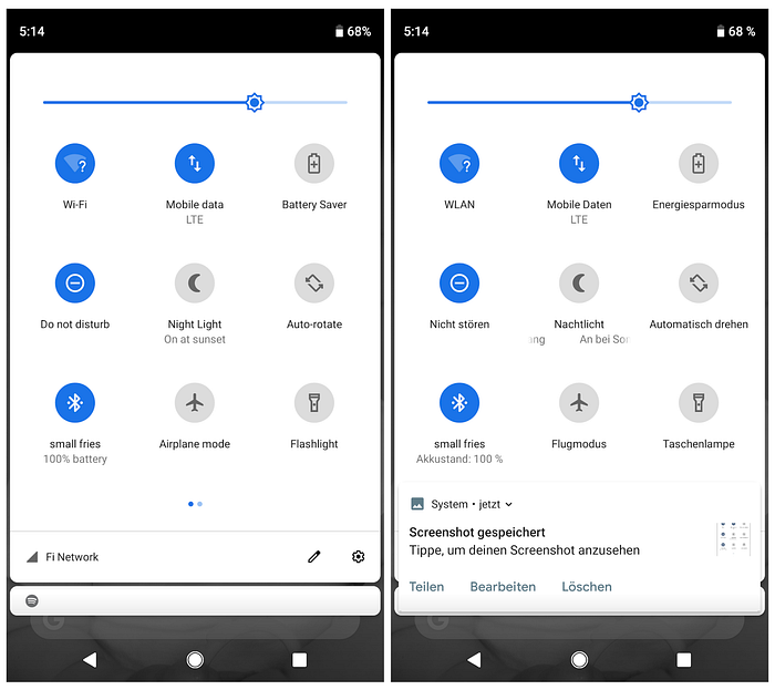
Account for varied string lengths.
Different languages can take up hugely different amount of space on the screen. It is imperative to think about text expansion and contraction for any languages your designs will be launched in. On top of the length of strings, we need to be mindful of the directionality of language. Sites and applications that rely on right-to-left (RTL) and left-to-right (LTR) languages need to be designed for that from the beginning and be continuously tested. Even when designers and engineers are aware of these needs, our biases and assumptions (as English speakers) can be strong enough that our designs or code fail on RTL languages.

Localize the language.
Names or labels of certain things might not make sense in another language or to another culture. What is sold in the U.S. as Diet Coke can be found in countries in the EU and Mexico as Coca-Cola Light.
Ensure formatting is flexible

Make sure your designs don’t hinge on specific formats that don’t accommodate international differences. It’s helpful to consider that things like dates, measurements, and addresses all vary in format for different locations.
Stay legit
It should be no surprise that different countries have various legal differences. Make sure that you understand any legal constraints you may need to work within. For example, recording in public places is illegal in many locales (e.g. the EU)… so you may have to rethink that data collection strategy you have for that mobile app you’re designing.
Cross-country collaboration
When you are designing for international users, you will likely be collaborating and coordinating with people in other countries. When the time difference is large enough, it can feel like a burden to coordinate with remote teams. In order to stay productive, planning is helpful to optimize your working time. Save your heads-down alone working time for when your counterparts may be offline, and your meeting times for the few hours you may overlap. Accounting for international holidays or other working schedules will be important for planning too so that you can stay on top of how much you can get done within a specific timeline. People in America take days off for Thanksgiving, in Japan they take a week off during Golden Week, and in Israel the work week runs Sunday-Thursday instead of Monday-Friday. This isn’t just about scheduling meetings. For Chinese New Year much of the country shuts down, so don’t put yourself in a position where you need anything during that week (e.g. shipping/mailing of parcels).
Testing. Testing…
As with any design work, you should be continuously validating decisions and assumptions with your users so you never lean too much on your own personal biases.
This was by no means an exhaustive list, but just a few things that I’ve learned to be pertinent in my first few months working on our international team at Audible. The views represented in this post are solely my own and not those of any company or client I have worked for or currently work for.

