The Complete guide to UX/UI design for Salesforce Lightning apps

Working with Salesforce can be a challenge for designers not used to working with predefined system. The ecosystem is large and products on the platform are different. We’ll discuss how to navigate designing with Salesforce.
Salesforce is now one of the largest CRM platforms available. According to a study by Gartner, spending on Salesforce related implementations outnumbered the next competitor (SAP) by over 2.5 to 1. The benefits of Salesforce are outstanding. You have a very flexible, customizable platform combined with a pretty good out of the box design system and components. Plus, the ecosystem is so rich that you can run your entire business on it (which several businesses do). It is used for Fortune 500 companies and small businesses alike.
Because of the growth of the platform, there are more opportunities for designers to get involved in designing for Salesforce. As I explained in my last article, Enterprise UX is now a thing, and Salesforce is an important part of that ecosystem. In this article we’ll break down the ecosystem, the benefits and challenges of working with Lightning, and some tips and tricks for your next project working with Salesforce.
The ecosystem
First we have to start with the different parts of the Salesforce ecosystem. While the “CRM” (Lightning) part of Salesforce is what started the company, the system itself is comprised of several parts and functionality, but they all integrate together.

Lightning Apps:
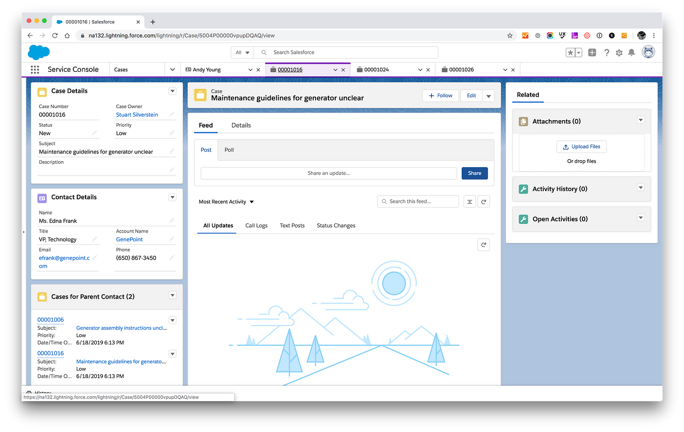
All of the below apps work within the “Lightning” framework — which uses the Lightning design system, and allows the team to add functionality to the application. The Lightning framework works very much like Google Material and Google Apps, whereby they are all united by a unified architecture and design system, where you can switch “apps” and views depending on the products you have enabled. These apps have the same design system, and use the Lightning modules. If you are working on the Service Console, this is the system you will be using,
- CRM/Sales Cloud
This is the heart of the system which allows sales teams to operate. Pipeline, Customer CRM, Leads, etc. - Service Cloud:
This application gives you the ability to create cases within Salesforce. It also adds a Knowledgebase to the functionality. - Marketing Cloud:
This lighting app has journey builders, email and marketing automation

Mobile Apps:
Mobile apps are a native version of the Lightning system. These modules are different than the desktop version, and the patterns will be different as well. The native mobile modules are often different than the responsive version of the browser based cloud apps. This is based on the idea that mobile will have its own set of tasks. These are built in the mobile app builder. As of Winter 2020 release though, the mobile application resembles the Lightning Console much more.

Communities
While the initial intent of Communities initially was for intranets, partner portals, and customer self service, Communities is now being used for portals and websites of all types to give a branded view experience, leveraging the same core data to an additional audience.
You get native integration with all the functionality, however, this application has an additional set of native components, not all of which are available on Lightning are available in Communities (visit the component reference and filter by “Lightning Communities” which is a mix of Aura Components and Lightning components). Also, if you are not doing a custom layout, the layouts here are different from Lightning, as well as a lot of the design patterns. This includes special blog and forum post content types that only exist in Communities.
Here is a list of experience builder’s features to customize:
Brand and colors
Layouts

Commerce
This is both the front end and the service end of the e-Commerce platform that integrates with Salesforce. Like Communities, it has its own subset of components, although the builder is the same as communities, so it is much more like using Communities versus using Lightning.
In this article we will only address the Lightning apps using Salesforce Design Lightning System (SLDS). If you are working on Communities or Commerce, there are a different set of out of the box components that are specific to those platforms, as well as the builder tools.
The layout & navigation patterns
Global Navigation —Scoped and modular tabs.
Salesforce global navigation has 2 main patterns — scoped tabs — which has all the top level items listed out, and modular tabs, which keeps a closable tab open for each record, much like windows in a web browser. Most applications use the modular tabs, with the scoped tabs being carried over for late adopters.
There are a few main layouts that are reused across the system for efficiency. There are a few variations on these, but these are the main ways that the Lightning system wants you to create a layout. While they are context independent (you can have a customer record in any context), the detail layouts and the middle level list layouts are consistent with themselves.

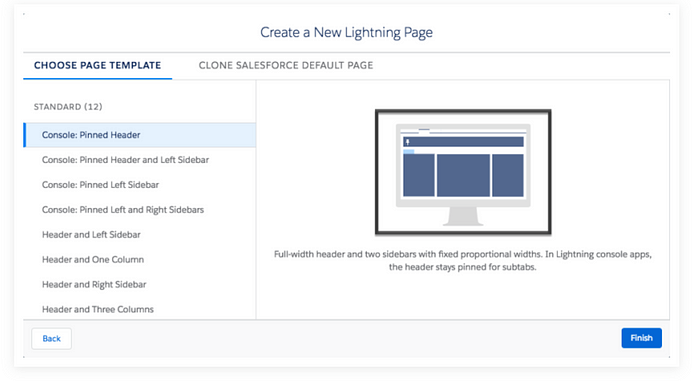
In addition to the above, there are additional Lightning Page Templates that can add further customization to your layout and still work nicely within the Lighting System.
Working with custom and out-of-the-box
When planning your work, you will want to get a sense of whether you will need to use the Lightning Web Components or you will be doing a custom application. In many cases, using Lightning will be the best bet, simply because of the maintenance and dev work it takes to create custom components. This also keeps things consistent, and you can leverage the design system they created. If you are tasked with using Salesforce as the backend system for your app and are going to use the API’s to pull the data, you will have more flexibility, but it will come with a significantly higher level of effort.
If you are going to use the Lightning System, you will want to keep a few things in mind:
- Use the Lightning way of doing things first
Much as using any other design system, Lightning has its way of doing things — layouts, modules etc. One of the things Lightning wants you to do is reuse the modules in a variety of contexts. Modules such as Jabber or Communication, can be used at the Case Level, Record Level or User Level. - Views often come with defaults that can be modified.
For instance, the default on the list view, has a bunch of filters, all of which are easily customizable within the default parameters. - Many components are customizable, but that makes them more prone to breakage in future releases.
While the modules have parameters that can be adjusted, a lot of times you cannot change a module — such as take a layout of a timeline component and put your own data types in it. If you want to change a module’s data that is not a parameter, developers will have to customize it, and can be more prone to breakage. - AppExchange
If you cannot find a default Lightning Web Component, you may be able to find something on the AppExchange. This way you can skin or modify an existing module. - Be purposeful about creating a custom component
If you find that you need a custom component, remember that custom components will have to be coded, and maintained. Salesforce makes 3 releases a year on average. Each time there is a new release, it may break your custom component. Plus with Lightning Components, you get the benefit of enhanced features as Salesforce develops them. In addition, working with custom components can introduce additional bugs in the system to fix. If you can do good UX with a Lightning component and make it work, the experience will benefit overall.
Moral of the story: Custom components OK, Lightning components better. - Get a Sandbox and play
If you create your own developer sandbox and see how the modules and layouts work, you will quickly understand how they work.
Modifying the visual assets
While you may want to use the modules and Lightning Design System, you may not want your app to look like “Salesforce.” Salesforce Lightning comes with a set of design tokens, which are variables on which the system is based, such as spacing, density colors, fonts, etc. If you modify these items, you can easily make Salesforce look less Salesforce-y.
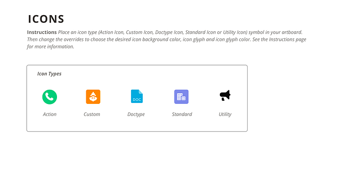
Also, Salesforce has a complete list of icons. Icons are used EVERYWHERE, and are tied to components and context. There are 5 types of icons:
- Standard: These are the icons used everywhere which help label modules.
- Action icons: which are tied to an action
- Custom icons: which are for adding custom to layouts and modules, but are not part of the defaults
- Doctype icons: which represent different file types
- Utility icons: Which are attached to modules and are the most common
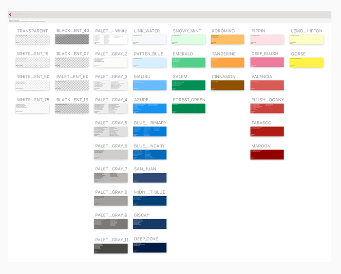
Colors are another way to customize lightning. Lightning does have a very robust color system, with all types of hues and values, Most brand systems don’t include this level of detail. The colors are all editable, however be careful about changing hues and values — because they are often tied to the meaning of the interface and the balance of the UI in general, so swapping out a dark blue for a medium yellow may have unintended consequences during development. Colors are also linked to a data object- Lavender is a contact, Koromiko is Cases, Activity is Salem, etc.
Prototyping solutions
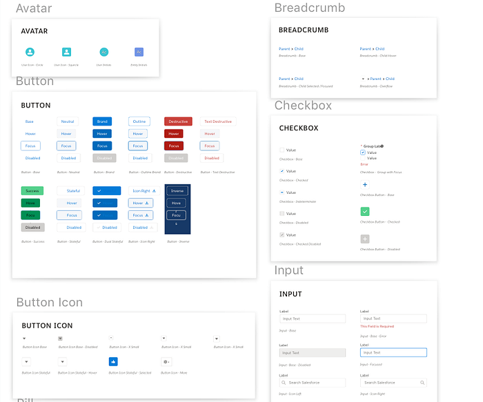
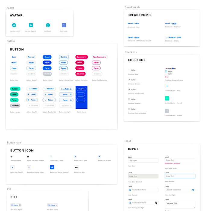
As far as prototyping, if you have something simple, or are just demoing some layouts, you can use the Sketch, Figma or Framer X template with the SLDS that you can use to customize. The file is set up very flexibly to use and modify the modules. It has Lightning, Mobile, Builder and Wireframing components. It is a lifesaver. You can design in Sketch and prototype in Invision, Principle, etc, or use Figma or Framer to prototype.
However, if you need to do more in-depth user testing, you may want to consider either:
a) Building in a prototyping software that can handle variables, multi-state objects and inputs — such as Axure or UX Pin.
b) Consider building a prototype in Salesforce or working in a sandbox. I know this option might seem daunting at first, but if you are using out of the box functionality mostly, this will save you a ton of time. You can fill in your custom components by placing graphics in modules to represent custom modules. You can get a much more realistic experience this way, and if you are going to be working in SF for a while, this may be a worthwhile investment. I have included a link to a Trailhead so you can learn the basics of creating your own Salesforce layout. It is much easier than it sounds.
Resources
Lightning component reference: https://developer.salesforce.com/docs/component-library/overview/components
Sketch file for SLDS (Saleforce Lightning Design System):
https://github.com/salesforce-ux/design-system-ui-kit
Figma kit for SLDS: https://www.figma.com/file/5dgFdCHB6FGjfOPAZEDNVK/Lightning-Design-System-Components-for-Web?node-id=0%3A1
FramerX kit for SLDS:
https://github.com/salesforce-ux/design-system-ui-kit-framerx
Trailheads for customization of Lightning (learn to prototype in SF):
https://trailhead.salesforce.com/content/learn/modules/lex_customization
https://trailhead.salesforce.com/en/content/learn/trails/lex_admin_implementation
Data Objects:
For those of you who are heavier into information architecture, here are the object models for the different Salesforce domains:
https://developer.salesforce.com/docs/atlas.en-us.api.meta/api/data_model.htm
Lightning Page Components reference:
https://help.salesforce.com/articleView?id=lightning_page_components.htm&type=5
Special thanks to my friend Jon Cline, for contributing his expertise to lend some background on this information.
