Designing for the Workspace First

Redesigning a digital product or designing one from scratch can be a little overwhelming at first. Even though we have many standards and best practices, there are many ways to design and organize information for the same thing. When it comes to design and UX my focus is on software and Web and mobile apps. Over the years I’ve adopted designing the workspace first as part of my process. I define the workspace as the “container” that everything else goes inside of. Usually this consists of some combination of navigation, search, header and footer. As an example, here is the workspace for Google Inbox.

Who knows how many different options or prototypes the Google Inbox team looked at before deciding upon this one but there are many different ways this information could have been presented. Designing for the workspace first allows for a very narrow and specific focus on one thing. It allows the team or group you’re working with to sort of “baby step” into the design process in a way that is not overwhelming. It’s a great way to start to get a sense of space and how content might be organized; it takes a bit of imagination to fill in the blanks but this is easily mitigated through conversation and sketching. Lastly, it’s relatively quick to put together different design approaches for the workspace so it doesn’t add a lot of time to the overall design process. In my experience, completing this step unites the team and gives people the confidence that we looked at many options and went with the one that worked the best.
The Workspace & the Design Process
This step is usually preceded by group collaborative sketching as well as a design pattern review and the 20 second gut test where the group and main stakeholders vet and rate existing user interface layouts. You can read a little bit more about those activities in my post about Fostering a Collaborative Design Process. Collaborative sketching allows the group and main stakeholders to take part in the design process and quickly sketch out ideas in a facilitated and structured fashion (which helps set everyone up for success). The design pattern review lets the group look at common UI layouts (remember, these people are not professional designers — they need a little hand holding). The process of the 20 second gut test allows the team to unite on up to three main design directions and or look and feel approaches; extremely helpful in accelerating the design process (think lightening speed!).
Real Project Example
Last year I had the pleasure of working on a really fun redesign project where I not only had a lot of freedom (from red tape and any sort of politics) but also a great chance to take an already talented and multi-faceted team and put a process in place that allowed for a united front and a great outcome. Here I’ll show real examples of how we started by designing the workspace first.


In Addition to Imagination
Like I mentioned before it takes a little bit of imagination to start to fill in the blanks and see how the workspace can evolve in the context of your specific project. As most designers can attest, once you start putting real information into the design and adding color it feels much more real and you often get different feedback than you would if just looking at gray wireframes. To mitigate this I pulled different dashboard designs from other mockups on Dribbble (not designed by me), added a little color to my workspace wireframes and dropped the other dashboards in. Now we had something that looked and felt much more real, which allowed the group to have the best insight possible and give the best feedback. These are essentially fake but they get the job done.
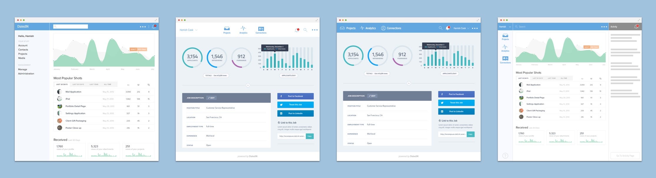
Maybe it’s because of the previous activities we did as a team or perhaps other factors, but during our first design review of these directions, the team quickly aligned on one direction (the last one). It was one of the shortest meetings I’ve ever had. From here we went on to design the more complex pieces of the dashboard and all the content that goes inside of the Workspace. This approach laid the groundwork for the rest of the process and there’s also an educational component to working like this. Clients quickly understand that when we break things down into smaller steps it’s easier to make decisions and progress; it’s great for momentum.
The Final Result
Three to four weeks later and many client meetings, rounds of design and customer interviews later we had our final design.


See the project on Dribbble →
See a case study containing this work →


