Designing language selectors that work well with assistive technology
Part II: Accessible language selectors
In this two-part series, I share my experience with designing language selectors. I highlight the most common issues and make recommendations on what to pay special attention to for great user experience.
In Part I, besides addressing some interesting problems with the usage of flags and language abbreviations, I also write about how to improve the discoverability of your language selector. Since publishing Part I, many of you asked for my advice on what to do in some tricky situations. One of the most exciting questions I got was about alternative text so I decided to write a post on how to design language selectors that work well with assistive technology.
Discoverability (recap)
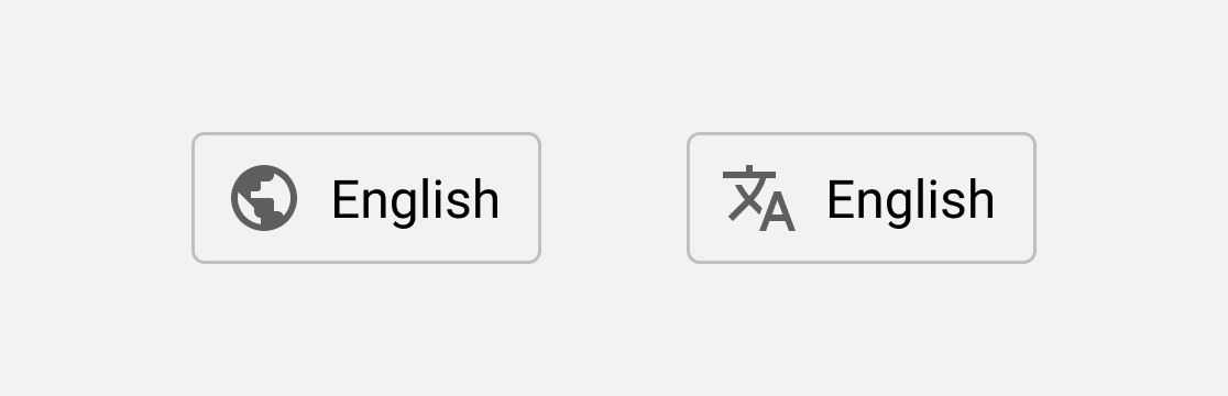
As I addressed in my previous post, using an icon for the language selector can help visitors find where to switch to another language even if they don’t understand a word on the screen in front of them.
Placement is also important. Based on my research, most users expect to find the language selector either in the (top/side) navigation bar or in the footer.
Tip: There’s an exciting method to test if your language selector works. Replace all the text on your webpage with gibberish and show it to people from your target audience. Ask them to select another language and see if they can find out where to do it.
Accessibility text
Ok, but what about the visually impaired? 🤔 — you might wonder.
For the sake of the example, let’s say that you have a friend called Jackie who is blind, therefore, uses assistive technology (a screen reader software) to access webpages.
Jackie’s screen reader reads aloud both visible (headlines, paragraphs, etc.) and non-visible text (alternative text, ARIA labels) on her screen.
And while the placement of your language selector can still help her find it (most screen reader software solutions have shortcuts to jump to the first/last element on the page), she’s not going to be able to see the icon. That’s where accessibility text comes into the picture. When the screen reader reads the language selector button, it will read the accessibility text.

But… wait a minute! What if Jackie doesn’t speak English? How is the accessibility text helpful for her if she lands on a webpage where the selected language is English by default? 🤯
Fortunately, Chrome’s Translate webpages feature translates both visible and non-visible (accessibility) text. So, when the page is automatically translated to a language that Jackie can understand, she’ll know where to find the language selector.

Of course, if she uses a browser without such functionality, she might not be able to find where the language selector is.
Language preselectors
We can try and help Jackie preselect a language that she’s most likely to understand by setting up automatic redirection rules. Due to certain limitations, this can sometimes result in an unsatisfactory solution.
To avoid this from happening, some websites have a so-called language preselector landing page that enables visitors to manually select their preferred language before they can start browsing the website.

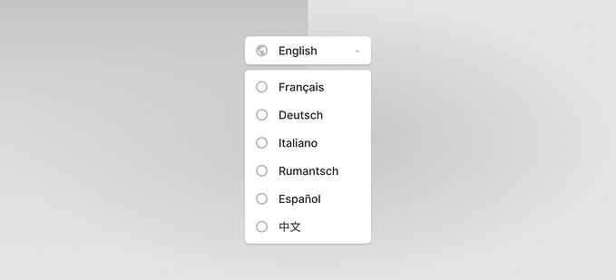
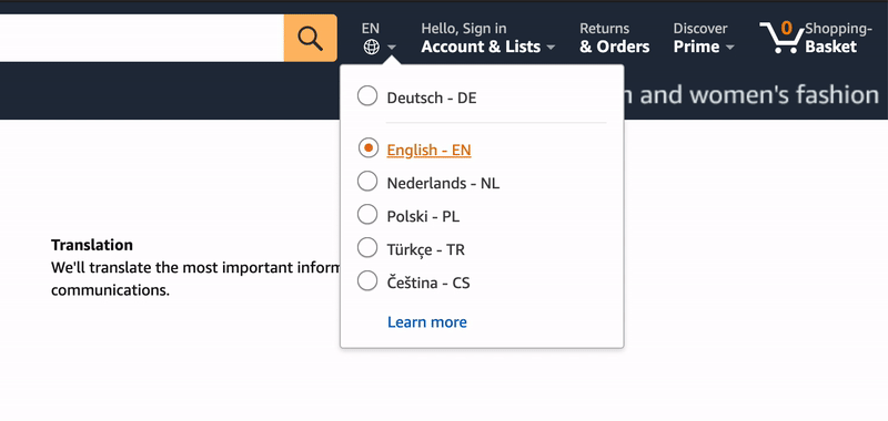
This sounds like a good solution for two reasons. One, it’s right there when someone opens your website and two, “…visually-impaired users seem to prefer simple links with the language name (e.g. ‘English’, ‘Français’, ‘Español’) as opposed to drop-down menu lists or images with embedded links, which often impose accessibility barriers.” — Silvia Rodríguez Vázquez, University of Geneva
Having a language preselector might be beneficial for some users but it can also introduce an additional barrier to others. If you prefer this solution, it’s probably a good idea for your website to remember your visitors’ choice so they don’t have to choose their language every time they open it.
The ultimate solution
There is, of course, a more subtle solution than masking your entire site with a preselector interface. This one combines most of the advantages of the above-mentioned solutions.
Placing links to your website in other languages instead of hiding them under a single button can increase discoverability for people both with and without visual disabilities, therefore, it can be considered as one of the best solutions. This is how, for example, Google does it.
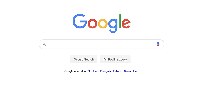
However, most sites are not as “simple” as Google.com. So, if you have a “traditional” website, I recommend placing these links directly in the footer.
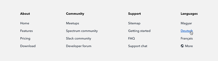
For better discoverability, I suggest putting another language selector in the main navigation bar of your website. Since usually there isn’t a lot of space there, you can use a button with an icon — and of course, proper accessibility text.

This way, even if visually impaired visitors can’t locate the language selector in the main navigation bar, they’ll have a chance to find it in the footer.
According to research conducted by Silvia Rodríguez Vázquez from the University of Geneva, “when having problems to locate the language selector, users would follow a candidate chunk discovery strategy […], tabbing through a list of links and looking for the desired language name.”
To further improve the user experience, I’d also recommend making the “Languages” section in the footer dynamic based on, for example, the visitor’s location.
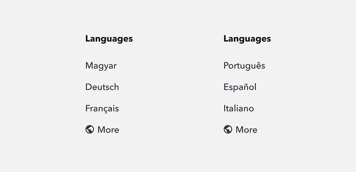
This will enable your website to provide an exceptional and personalized user experience for each visitor — even if automatic redirect rules fail to give them their preferred language.
Keyboard navigation
No matter which solution you decide to go with, you always need to make sure that your language selector (and actually, your entire website) is compatible with keyboard-only navigation.
Why is it so important? Screen reader users and people with certain motor impairments usually use their keyboards exclusively to navigate on the web. In some cases, even users without disabilities prefer keyboard navigation, simply because it’s more convenient or faster than using the mouse.
Takeaways
- People often expect to find the language selector either in the main navigation or in the footer of websites.
- A globe or a translate icon can help people locate the language selector even if they don’t understand any text on the screen.
- Visually impaired people who use screen readers to navigate on the web might have a hard time finding where to select another language. Using alt or aria-label attributes (in HTML) can help them find it easier.
- Language preselector landing pages enable visitors to manually select their preferred language before actually starting to browse your website. It can be beneficial but can also be an unnecessary barrier to some people.
- The ultimate solution combines having a language selector button with an icon (and proper accessibility text) in the main navigation bar and links to your website in other languages in the footer.
- When deciding which language selector to go for, you always have to consider your target audience and understand the trade-offs of each solution.
- Want to learn more about how to write good accessibility text? Check out Google’s accessibility guidelines.
Special thanks to Rachel Hart whose question inspired me to do additional research, look for a solution that works and write this post. Thanks for being curious and having inclusivity in mind when designing user interfaces.