The state of open-data design
Looking at the state of UX in open data, and tips for how to navigate the beast that is government open data.

Open data is a wonderful thing, especially at the governmental level. It increases transparency, which in turn decreases corruption. It increases knowledge sharing, which also increases innovation.
At a macro level, open data creates a more efficient and innovative society. On the micro level, open data allows anyone, even high school kids, and people like you and me, to have access to petabytes of government data in just a few clicks. Historically this data was locked away in servers of some governmental ivory tower. Or it was scattered among ministries, each with their own red tape limiting access to the elite few.
Similar to how the telescope allowed everyone to become an astronomer, government open data portals allow anyone to explore public data to better understand their society and the world around them.
“Going back to our friend Galileo and his early telescope, what we now have is the power to hand out telescopes to anyone whose curiosity is piqued and who wants to learn more.” — The Data Visualization Revolution, Scientific American
What surprised me was the diversity of governments that are on board the open data choo-choo train. Not only are developed western liberal democracies on board, but countries across the liberal-conservative spectrum: Australia, Uruguay, Saudi Arabia, Colombia, Denmark, USA, Iceland, Kenya, Russia, UAE, France, Japan, UK, China, Philippines, Sweden, Tunisia, Ghana, Korea, Kazakhstan, you name it, they all want to be the leaders in the sphere of open data.
Every government wants to invest in open data, and they want their open data portal to be the shining beacon that proudly sets an example to the rest of the world.
The official motivation is usually framed around governments wanting to empower their citizens, businesses, and institutions with accurate and timely data. And there’s truth to that, but that’s only part of the equation.
A key factor at play here is that governments are now being ranked on their e-government capability, and yearly leaderboards are being published by the United Nations. Nothing like a bit of inter-provincial or inter-national competition to accelerate government altruism.
The open data leaderboard(s).
There are currently three important leaderboards that nations are striving to climb.
United Nations E-Government Survey
The first is the United Nations E-Government Survey. This ranks the entire online services capability of a country. Everything from finding open data, to filing a tax return online, and general day-to-day services like registering a new car. Denmark, Korea, and Estonia are at the top of the UN leaderboard. While the United Nations is as official as it gets, this survey paints a broad picture of a country’s digital know-how. Too broad, in fact, to judge their open data capability alone.
Open Data Barometer
The Open Data Barometer is a better measuring stick for the maturity of government open data portals. The focus here is on getting a global snapshot of open data maturity, by country.

Canada and the UK top the Open Data Barometer leaderboard. With Australia, France, and Korea in close pursuit.
The Open Data Barometer ranks only the countries that have committed to the International Open Data Charter, which is a pledge to making government data open and readily available by following 6 key principles.
The International Open Data Charter
- Open by default — even anonymous users should be able to download all the data without ever needing to sign up for an account or jump through any special hoops. You should be able to go to an open data portal, find a dataset that interests you, and with the click of a button download that dataset file. Simple, no-nonsense access to open data for everyone.
- Timely and Comprehensive — the data provided should include the latest figures, be complete, and of high quality. Governments shouldn’t censor and interfere with the data they publish.
- Accessible and Usable — accessible here goes beyond just making an open data portal WCAG 2.0 compliant, although this would certainly be a key component. Accessibility here includes making the dataset free of charge and without restrictive licenses, making it machine-readable, and helping raise the overall data literacy of its citizens.
- Comparable and Interoperable — this one’s a bit of a vague, lofty goal at the moment without concrete steps to get there. Tim Berners Lee offers a solution here with the idea of Linked Open Data. It gives a 5-star rating for open data, with the aim of allowing technical users to build mashups and comparisons of different open datasets on the web. This could reveal never-before-seen patterns in data, and would further help bring data into the mainstream public.
- For Improved Governance & Citizen Engagement — quite vague, but with the emphasis on government doing the right thing and not doing dodgy things like removing datasets and punishing users that reveal patterns of corruption.
- For Inclusive Development and Innovation — governments should do more than just release open datasets and then twiddle their thumbs. They should be proactive about educating citizens on how to use open data, collaborate with public and private institutions to foster innovation using the data that is being provided. Again, quite lofty but with the right intentions.
Global Open Data Index
This is yet another ranking index that ranks countries according to their own requirements.
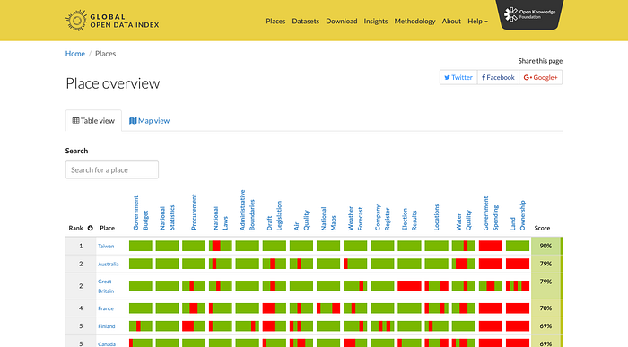
How the Global Open Data Index differs from the Open Data Barometer exactly, I don’t know, I must say. I’ll update this post if I dig deeper into this.
These guiding principles are flawed but valuable.
Reading into the details of some of these principles, it’s clear a lot of them are vague and subjective. For example, “We recognize that data should be presented in structured and standardized formats to support interoperability, traceability, and effective reuse.” Okay. Cool. Structured and standardised. Great. We want data to be orderly and well structured.
But what counts as “structured” and “standardised”? The devil is in the details here. It’s not enough to just say “make your data structured and standardised”. What are the exact criteria that will judge an open data portal as being highly structured and standardised? And how do we standardise on the international level when each government has its own data portals, with its own implementations of structure and standardisation.
The call here is largely left to the judgment of the person doing the evaluation. And that’s a problem because it leaves the door open to bad judgment, and inconsistency of rankings at best, and nepotism and corruption at worst.
In reality, even datasets within a single open data portal are rarely structured, let alone having some standardisation on a global level. We’ve still got a long way to go.
Nevertheless, these are honest attempts at improving the status quo, and now we have some direction regarding how we should design and build open data portals for government. Decision-makers care about these principles and rankings because their own KPIs and salaries are tied to them.
The problems with designing for government.
As most people can imagine, designing for government is challenging. There are in fact so many barriers that it’s no surprise that the user experience of government open data portals is one that is so cumbersome and dated that it almost has a nostalgic resembling of the web of yesteryear.
Low design maturity.
Take one look at the following government open data portals. Just on first visual impression alone, they tell you everything you need to know about the state of government open data portals in 2021.
Dated visual aesthetic, uninspiring copy, mediocre content discovery.


Government open data portals are in desperate need of some Silicon Valleyesque startup minds to come on board and disrupt the whole spectrum of open data. The closest I’ve seen to this is Kaggle, a non-government site, which shines like a diamond in the rubble that is the open data sphere.
“Most open data sites are badly designed, and here I am not talking about their aesthetics — which are also subpar — but about the conceptual model used to organize and deliver data to users. “ — What’s Wrong with Open-Data Sites — and How We Can Fix Them, Scientific American
The open data frameworks are still immature. CKAN, the most popular open data platform on the internet — the “WordPress of open data portals” if you like — is being used as the foundation of some massive open data portals around the world, but it also is in need of holistic, design-led re-imagining.
Combine all these factors and you have a cocktail soup of limitations. Even the best designers will burn up in the atmosphere of the political institutions where non-designers and non-techies set the objectives, give feedback and approve design work. It’s like designing with one hand tied behind your back and a blindfold over your eyes.
The soil isn’t ready for good design, and until the soil is ready, no amount of design expertise can produce the kind of impact that open data is promising.
The current generation of open data portals just isn’t made for people. At least not the majority of people you see walking down the street. Normal, everyday citizens. At best these portals can only be of use to data scientists and programmers.
Design system disarray.
A good design system helps us create open data portals in less time and with greater consistency with the country’s other government sites. Working with different governments, I’ve found there’s often no decent design system at all, or worse, there are multiple competing design systems that one needs to juggle and prioritise.
Take the hodgepodge of design systems in Australia. There’s a design system provided by the Australian federal government, then there’s another design system for the state of New South Wales, Victoria has one too, as does South Australia, and Western Australia too.
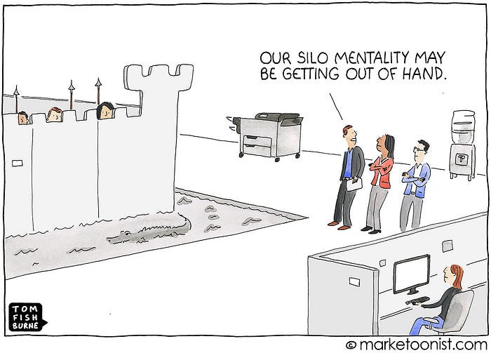
Duplication of efforts, silos, and the squandering of taxpayer money.
Looking on from the perspective of a UFO looking at this planet’s hodgepodge of open data portals, it boggles the mind. The vast amount of duplication of efforts is astounding.
Not just between governments. But inside single jurisdictions as well. Take the example of the European Union’s two duplicate, and siloed, open data portals, the European Data Portal and the EU Open Data Portal.
The Australian federal government has created data.gov.au. The New South Wales government has data.nsw.gov.au. The Victorian government has created data.vic.gov.au. Et cetera…
There’s so much needless doubling up that I believe the label “squandering taxpayer money” is justified. It’s complete lunacy that in one country there are multiple competing design systems and open data portals. I’m using Australia as an example here. But Australia isn’t alone in this. Every other country has fallen prey to the same inefficiency, except for perhaps city-states like Singapore, which have it easy.
I understand this probably goes into the political debate of centralised vs decentralised government, and the argument that having a country’s states competing against each other creates healthy competition and spurs on innovation. I find that hard to believe. This all looks like one giant exercise in wasting national resources. All this competition and innovation should happen in a singular, well-funded federal open data portal.
Forget a utopian, global open data portal. Can we at least have each country get their own house in order?
I mean, what’s next? Will every capital city have its own design system and open data portal? Oops. Too late.
Madness.
Taxpayer money funds institutions that then privatise the data.
A beautifully functioning open data portal is useless if the data is kept locked away in ivory towers.
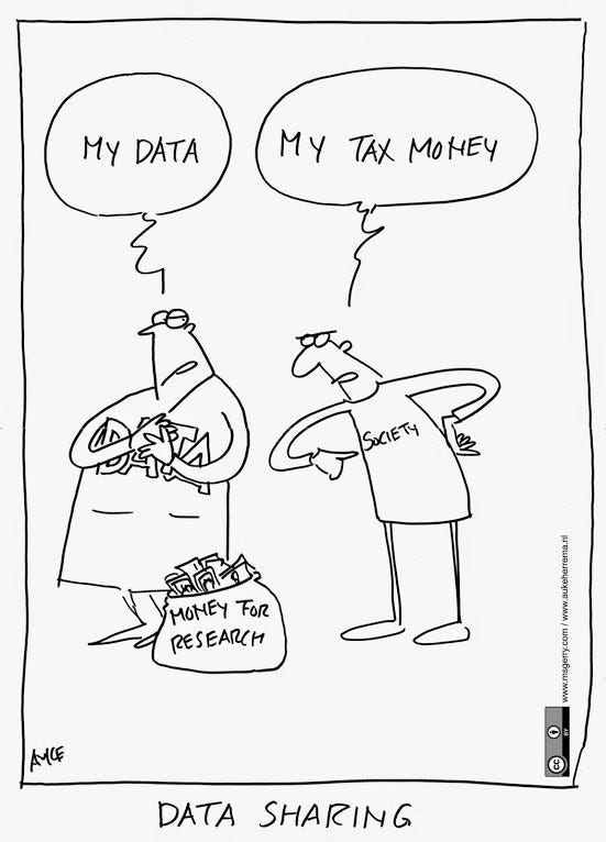
No designer can solve this problem. This is a macro-political problem. As citizens we can raise awareness and demand that governments encourage, push and squeeze any institutions that take government funding.
Simply put, if they take our money then they must respect the social contract and hand over the data back to society. Or face punishment. Politicians who discourage, slow down, or blocks access to open data should be seen as doing their society a large disfavour, and should be investigated for corruption.
The only exceptions could be relating to highly sensitive government information, like cybersecurity strategies, etc. But as citizens, we should keep a careful eye on things like government-industry cronies labelling environmental or air pollution data as “high risk”, and blocking access.
Good design burns up in the stratosphere of government committees.
In my decade of design experience, I’ve come to the conclusion that it’s impossible to create extraordinary work without two key ingredients:
- A design-led process (good luck finding that work)
- Stakeholders who are themselves design and tech experts, or stakeholders who are willing to hand over the project’s steering wheel to someone who is qualified in this area of speciality (good luck finding that work too).
This is why you’ll see the best design coming from private companies that are formed by designers and techies.
Government in essence doesn’t offer fertile soil for design to flourish. There are exceptions. More on those below. But the current status quo is that if you work with government, shipping cutting-edge work is impossible and one has to be contempt with user experiences that can be best described as “workable”. At least this has been my experience.
Navigating the limitations of government.
Designing for government is some of the most difficult design work one can do. It requires the patience of a Dalai Lama, the stakeholder management skills of Don Draper, and the ability to occasionally detach from the work. To say that it’s an obstacle-ridden marathon is a laughable understatement. It takes many projects to very slowly shift the culture towards one that is more conducive to good design.
In government, the majority of work involves preparing the soil for good design.
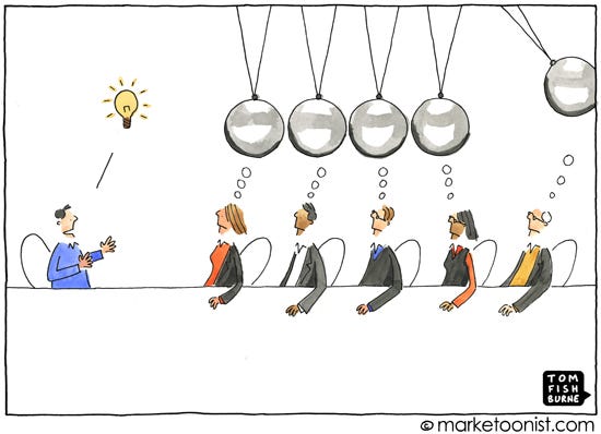
- Committees are ingrained in the culture. Governments essentially are committees at their core, and a committee is a place where good design goes to fizzle out into mediocrity.
- People without design and tech experience call the shots and set the creative goal posts. Even before I can design a single pixel for government, the project brief is skewed in such a way as to make it impossible to explore a wide range of design solutions. The BRD — business requirements document, comes pre-baked with features lists, and design details like “we need an icon for each category”, “every page should have share buttons”, and I’ve even seen “users should have the ability to change font colour”. There are countless other examples.
- Discovery phases are unheard of. Forget design sprints, simply having design run a few sprints ahead of development is a rarity. The features are defined, the requirements scattered across 50-page documents. User research? Forget it. We’ve got a defined scope, and we’re starting next week and we’ll have the designers “provide us some mockups” to unblock the development work.
How these challenges can be overcome.
To really push the envelope in the government open data portal space, there are two approaches that might work:
- Design experts brought in with license to change. Someone with tremendous design clout, say a ThoughtWorks or IDEO, Deloitte and co would need to be hired with the specific instruction of spearheading the initial work on the project, be given leadership-level blessing to freely reimagine the organisation’s approach to shipping digital products, and to create a holistic ground up design-led vision for the open data portal before a single line of code is written.
- A proper internal design practice is set up. The UK government was the first to really make large sum investments in design, creating the Service Manual, and hiring some 800 designers. Recently, the Australian government has started playing major catch-up of their own, forming the Digital Transformation Agency.
How I imagine these challenges really being solved.
Two words: private enterprise.
In our current system, I can only see private enterprises leading the way, for better and worse. Capable design leadership within government might play fast catch-up, and occasionally do a bit of innovating themselves. But given the inefficiencies of government I don’t see the next leap forward in open data portals coming from government.
Private enterprise is pushing for the moon, it’s making electric cars readily available, it has mapped the entire globe, it’s rolling out truly global internet, and it’ll fix the problems with open data as well. For better and worse.
The best that governments can do is make their raw data accessible through APIs so that the privatised organisations can come in, scrape their data and take care of the data consumption experience.
Google, not the United Nations, will build the Global Open Data Portal. Google will scrape all of the world’s open data portals, and put everything under one roof, completely flanking the siloed federal/state/city alphabet soup of open data portals. One open data portal for all the world’s open data, with an accessible, meaningful, and lightning-fast user experience. One that delivers both the raw data and the meaningful information, and can be used by both data geeks and the high school kids alike.
The problem with open data in general.
A lot of the hurdles that come up when creating open data portals are often outside of the sphere of influence of the government organisation tasked with building the open data portal.
Open data is esoteric.
Most citizens understand that a 10% cut in healthcare budget spells troubling times ahead. But most citizens don’t understand how to navigate the datasets which record this data. Let alone the ability to juxtapose the budget of healthcare with that of military spending.
Currently, it’s up to data-wielding experts to dig into this raw data, interpret it, and spoon feed it to the rest of us. To really dig into complex data you must download Excel-like CSV files, complex geospatial files, and open them in software that can interpret that file, and then know how to use that software well enough to interpret the data. And as soon as you download it, you now have a siloed, out-of-date piece of raw data. To update it tomorrow means going through the whole process all over again.
Is there a way to keep your interpretation of the data up to date? Yes, but I hope you have a computer science degree or are one of these self-made web developer whiz kids, because you’ll need to write a piece of software to interface programmatically with the open data portal servers in order to continuously download a fresh copy of the data, and display it on the HTML, CSS, JavaScript data visualisation dashboard that you handcrafted.
Open data is a chaotic information architecture mess.
In many ways, we live in the future already, but humanity is still figuring out how to do open data right. We’re collecting more data than we know how to organise, categorise, and standardise.
Even when organisations commit to sharing their raw data, each organisation organises it differently. Each dataset is organised differently. One data scientist collects their data in one way, another one does it in another way. There are chunks of data missing. Projects get funded and defunded. It’s a mess.
The extent of the information architecture problem is outside of my sphere of speciality so I won’t dwell on it for too long. Many posts, books, committees, conferences, entire countries, and international conferences will need to collaborate to standardise open data.
Humanity doesn’t have a perfect track record of standardisation. Just look at the USA not adopting the metric system, road rules and signage varying from country to country, power outlets, and voltage varying from region to region.
But we also have managed to globally standardise things like air traffic communication, measurement of time, and web technologies like HTML, CSS, and JavaScript. I hope that we’ll manage to do the same for open data.
The best government open data portals.
data.gov.uk
The UK has set the standard for government websites worldwide. I’d say it’s the first properly done government site.


User-centred, information design-led, accessible, and simple. The open data portal is nothing more than a big data warehouse, but given those modest intentions, it does a good job at creating a user interface that is simple and intuitive to use.
data.cms.gov
The USA’s Center for Medicare & Medicaid Services open data portal is a straightforward affair for the most part. What’s noteworthy is the previewing of data before downloading.


The dataset page offers a preview section, labelled the “Dataset explorer”, which shows a preview of the data, saving the user time. The “Try the API” section saves developers time by allowing them to interact with the data right on the dataset page as well.
opendata.dk
Denmark’s open data portal follows the basic structure of CKAN and adds a simple, branded UI on top of it — which might not sound too remarkable — but this alone makes it better than most open data portals on the web.


I’ve scavenged hundreds of government open data portals, and so far these are the only really worthy mentions. There are others that aren’t too bad, like africaopendata.org, opendata.go.ke, dataportal.se, data.gov.au, datos.gob.mx, and others. But, the really great open data portals catering to Average Citizen — ironically enough — are created outside of government.
The best non-government open data portals.
Governments should look outside of the government sphere when looking for inspiration. These sites offer a better user experience, and make their data more accessible, and more meaningful to the average citizen.
Kaggle
Hands down the best-designed open data portal on the internet. Aimed at more expert users, but within that niche, they offer a top-tier user experience and a real community hub. All open data portals — government and non-government — should look to Kaggle for inspiration.


Aside from the awkward doubling up of search bars on the search page, Kaggle otherwise offers great and coherent features. Strong community features like voting on datasets, commenting, following datasets and people. Kaggle is a Github for open data, if you like.
FiveThirtyEight
The content on offer is a mix of US-centred politics and sports. There are elements of the UX and content presentation that could be valuable universally to any open data portal.


What I love about FiveThirtyEight is that they tell stories, and don’t just act as a data warehouse. Now, admittedly stories invite room subjectivity, and the whole beauty of data is its objectivity. If the unemployment rate is 9%, well, there’s no denying that.
But what do we do with this data? And should the open data portal allow room for interpretation, or should it just be a pure data warehouse? That’s up for debate, but there’s no denying the power of a story backed by data.
Data USA
Introduces the concept of a data cart, which allows you to add a bunch of datasets to a cart, and download them all (similar to an eCommerce cart, except it’s all free). The implementation of the data cart isn’t ideal because there’s no visual confirmation when a dataset is added to the cart, but this feature is beside the point anyway.


What Data USA provides is an excellent data consumption experience. No need to download datasets to gain insights. Everything you need is shown on the site itself. You can then download the datasets if you wish to really dig into them, but you can gain the majority of insights directly on their data visualisations.
Google’s Dataset Search
Classic Google. One big search bar and off you go! It’s a typical Google site. Lightning-fast search performance, unrivalled simplicity.


However, no explorability, or serendipitous discovery. If you want to just browse datasets you’re out of luck. Also, you can’t download datasets directly from their search results. This is a long way from the Global Open Data Portal that I imagine uniting all the siloed datasets that are scattered across the internet.
Statista
I’m not a fan of Statista or its pay-for-data business model, but what they do extremely well is showing key takeaway stats. And subsequently, their SEO is stronger than any other open data portal or statistics site.


Just Google “unemployment rate Australia” or “largest armies in the world”, and you’ll likely get a Statista result shown at the top of Google, with a nice visual preview of the chart. In terms of UX that’s already superior to most other data sites, which require you to land on their site to get a summary of this information.
World Bank Open Data
This one’s not going to win any UI design awards anytime soon, but again, what this portal does incredibly well is providing you with all the information that you need, right on the data page, so that you don’t even need to download the dataset.


Type “GDP of Indonesia” in Google and you’ll likely see the live data from the World Bank Open Data right in the top list of Google search results. The best UI is no UI and the best open data portal is one I don’t even need to visit in order to get access to its data.
The New York Times Coronavirus Interactive Article
This is the pinnacle of open data. It’s a choreography of raw data, summary, and story. This is the whole point of open data portals in the first place — the ability for laypersons to come and quickly make sense of what’s happening.


I hope that this is the start of a trend among news media. Real, up-to-date, live data embedded directly into the stories. Now, for the purpose of storytelling, a snapshot of the data may be better suited to the story at hand. But the link to the raw data should always be readily available so that it can be analysed and scrutinised.
Tips.
I’ve been involved in some 4–5 projects so far, and I’ve learned enough to be able to share some, hopefully, helpful tips.
Redefine “success”.
Try to remind yourself that even if the output isn’t going to come close to something like Kaggle. However, the impact of the work is far-reaching. The people who create open data portals are creating some of the most important resources on the internet. To design these portals is a privilege, even if it is done within a limiting anti-design climate.
Stick to a realpolitik approach to design.
You can become an ideological design zealot, insisting on a design-thinking approach, extensive research, user-centred design, citizen involvement, pixel-perfect execution — and thereby get completely burned out along the way.
Or, you can accept that governments are far behind Silicon Valley. Decision-makers in government are incentivised to avoid risk at all costs.
Adopting a “realdesign” approach means being able to work within the creative limitations of soil that is not ripe for design, knowing full well that it isn’t, and still taking pride in the fact that your contributions have made things a little better than they would have been without you.
Use these rankings and guiding principles to your advantage.
Entire projects are being funded where the UN and Open Data Barometer rankings and principles are mentioned in the requirements sections of the project briefs. I know, because I’ve read them.
I’ve personally been involved with governments that rely on both the UN E-Government Survey and the Open Data Barometer as a key measure for success. On one project I’ve helped design an open data portal for a government with a low score on the rankings, and their #1 motivation was to improve their low score on these rankings.
Prestige, and the promise of elevating prestige goes a long way. And in my experience the idea of elevating national prestige goes a longer way, and opens more doors than just the underlying altruistic principles of open data.
Even so, these guidelines and rankings will give you greater leverage to put forward a design process and direction which is designed to maximise the rankings, and in the process squeeze in an improved user experience as well.
As designers, we should tie our process, and design decisions as close as possible to the rankings and principles that influence a government body’s e-Government prestige, and KPIs of the body’s senior decision makers.
In the political climate of government institutions and digital projects that are over-scoped and under-budgeted, realpolitik wins the day. The more pragmatic and low risk the path, the less resistance you’ll encounter.
Watch out for “innovation”.
“Innovative” in the context of government means “we want to appear innovative without the risk of experimentation, and pushing the envelope”. Innovative, here really means contemporary — at best.
An unassuming designer might see this buzzword and interpret it as a true license for a blank creative canvas. A realpolitik-minded designer would read between the lines here, and do the “innovation” song and dance with stakeholders, while producing a solution that can survive the acid test of the committee meeting, by being most closely aligned with existing open data best practices.
Don’t force users to create an account to download data.
Being able to quickly and anonymously download open data creates, of course, a better user experience. But even this sometimes requires a bit of “stakeholder massaging” before it’s accepted.
Luckily, it’s often quite possible to win over even the most conservative stakeholder because the The International Open Data Charter’s first and foremost principle is open by default. And no stakeholder wants to be the one that owns the decision to go against an international open data charter, which will subsequently give their country a lower ranking.
Understand that some datasets won’t be public.
All governments have secret information. Some data will be deemed too sensitive to release to the public, but the portal might still cater to this kind of data by only allowing access to certain users.
Cater to citizens, not just data nerds.
Governments aim first to cater to data scientists and programmers. It makes sense when looking at the current state of affairs. First, you serve the people who already know what to do with open data, and who could contribute most to society by having access to it.
Your Average Citizen is at the bottom of the list of priorities. And while it’s easy to take a woke stance about how this is morally wrong, and that governments should place their citizens highest on the list of priorities, I actually think that prioritising subject matter experts makes complete sense.
However, what I strongly disagree with is when the Average Citizen persona is so low in the list of priorities, that the open data portal becomes an inaccessible, esoteric, high-tech alien landscape to them.
We can create open data portals that tick all the boxes. Valuable to subject matter experts by providing access to the raw data, and valuable to Average Citizen with some basic tech skills.
Try to build information hubs, not just data warehouses.
Having too much unsummarised data is like having no data at all. If I want to get a pulse on the state of nursing in a country, instead of having to look for, and download a dozen different datasets, with some 10K rows of CSV data each, and spend hours painstakingly sifting through the data, the vast majority of users just need a page that summarises things for them.
Data USA is a poster child of a site doing this well. The summary is provided along with the raw data, satisfying both your average citizen, and your average data geek.

Data warehouses are great. We need to catalogue the vast raw open data somewhere. But what we also need is a summary of that raw data.
Data visualisations are great. Takeaway information is even better.
My former colleague and design mentor Chris Thelwell won the Tata Communications F1 Connectivity Innovation award by creating a truly “out of the box” solution for his project focusing on data visualisation.
The project brief asked, “how do we summarise and present the vast amount of race data that is generated during a Formula 1 race and make it instantly available to race viewers?”
Competing applicants submitted a fireworks display of data vis dashboard after data vis dashboard. Pie charts, plot graphs, bar charts, heatmaps, animations, you name it.
What did Chris do? He went in a completely different direction.
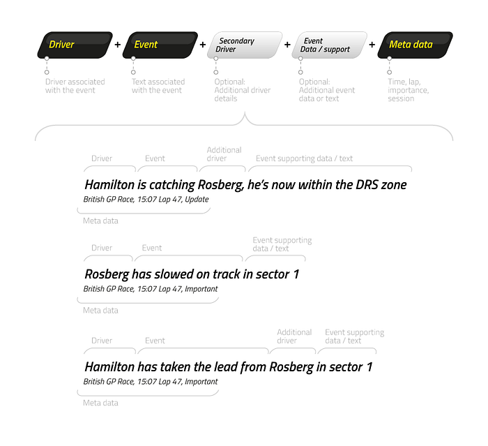
He asked the question “what is the point of all this data vis spectacle?” and the answer is “its purpose is to help the user make sense of the most important events in the race as they happen”.
His solution didn’t feature a single chart. Yet it was more valuable than the entire sum of pie charts, graphs, and heatmaps of the competing projects combined. And it was more accessible than all of them. And it won the competition.
You can read the entire story here if you’re interested. But the takeaway here is a reminder that the best UI is no UI, and data visualisations aren’t the point of open data. Valuable, timely, summarised information is the point of open data.
Make the site as accessible as possible, given project constraints.
Accessibility research and testing should be part of every government project by now you’d think. Well, you’d be wrong. Even just running the Google Chrome accessibility audit isn’t part of common development practice, let alone full-fledged testing with people with disabilities.
Of course, “accessibility” is on the project requirements doc, but it ends up being treated similar to “innovation” — just a buzzword that’s thrown around to impress, rather than a deep understanding of what committing to that buzzword actually entails, and a dedication to the painstaking work required to turn it into reality.
Again, this is where realdesign comes into play. You can either champion the user and further slow down a project that’s already past its deadline, and piss off everyone on the team. Or, you can just make sure that your UI mockups cater to the basics, like high enough contrast UI elements, and avoidance of small font sizes. There are tools to help you do that.
I predict a firestorm of woke designers arguing that “you’re supposed to shake things up, that’s called championing the user”. I think they’re ideologues. Again. This is a marathon. And to conserve your own mental health I encourage you to only gently nudge in the right direction and to repeatedly nudge over a long time, but not to insist.
Design for fast, no-nonsense faceted search.
The quality of the search experience is in the hands of the developers as much as it’s in the hands of designers, if not more.
Designers need to implement a best practices faceted search UI, allowing users to quickly narrow down their search.
Developers need to make it lightning fast. The faster the better. This might be more easily said than done, but the user doesn’t care. Users are accustomed to the lightning speed of Google, Airbnb, Booking.com, Twitter, Facebook. Any search experience that is slower than these household experiences will be deemed as too slow.
Leverage the community.
Take a lesson from Reddit, Quora, and again, Kaggle. Allow users to vote, favourite, and comment on datasets. Community-driven sites aren’t new. They all use tried and tested methods for allowing high-quality content to rise to the top, organically. And best of all, it’s less work and cost for the government organisation in charge of the portal. Cha-ching. Win-win.
Understand the concerns government stakeholders have about internet trolls, and offer solutions that may be deemed safe enough.
Government stakeholders are paranoid about internet trolls. As such, the whole community piece can be a hard sell, in particular a comments feature. I empathise with government decision-makers here because it would only take one troll to create a viral public controversy, or for online bullying to occur, and before you know it, a light of responsibility is cast on the organisation in charge of the portal.
I’d also like to think that humans have by now realised that it’s not the technology that’s the problem, but the people who choose to use the tech in malicious ways. Unless I’m mistaken, we’re yet to ban knives, cars, and lighters because we understand that these tools aren’t to blame — people are.
For some reason, the general public hasn’t yet grasped the same principle when it comes to digital things. When someone gets bullied on Facebook, a PR person from Facebook has to answer questions. And of course, the organisation has a duty to take down comments that are flagged as inappropriate, but society at large doesn’t seem to deem this good enough.
What to do when you reach such a dilemma? Realdesign.
Identify the risk of abuse here. Least risky are star ratings. Most risky are comments. There are ways to mitigate the risk of comments as well. Disqus strikes a good balance here with their user reputation system and automated spam moderation.
Of course, all these additional features increase project scope. But you can expose the options to the stakeholders and allow them to choose what level of risk they are comfortable with.
Suggest that they don’t spend time reinventing the wheel, but get out of the way if they insist.
Any good startup knows the value in focusing on their core experience and not needlessly growing scope by reinventing the wheel. Your average government stakeholders don’t. They often lack the tech awareness, and they’ll gladly assign a budget to custom building an entire forum system instead of just picking up and integrating something like Discourse.

And third-party online services like Disqus and Medium? Forget about it. Not a chance. I understand and even agree to an extent to avoiding third party services, but open source software? It makes zero sense to not embrace it, given that it’s completely free and that the government has complete control.
It’s best not to even suggest any third-party services in order to not lose trust with stakeholders. Instead only suggest them as design inspiration, and then find open source solutions that will help build a solution that will be completely owned by the client organisation.
Think beyond the open data portal.
Your open data portal doesn’t just exist on youropendataportal.url. The presentation of Google search results listings, social share cards, decisions regarding how support works, the ability to embed a dataset preview on a third-party site — all this contributes to the holistic user experience of the open data portal.
Google search results listings. The idea that users start on the dataset home page is a misnomer. Yes, of course, that’s going to be the highest visit page in your Google Analytics, but compare that to the traffic sources coming in from a Google search and you’ll realise that a large percentage of users start their discovery flow outside of your open data portal altogether. Optimise for it. Add relevant SEO tags to the home, category, organisation, dataset page templates, so that they are meaningful when viewed in Google search.
Don’t neglect social share cards. Implement proper sharing tags on each page, especially the dataset pages.


Use metatags.io to check support for sharing tags on your site. With proper social sharing tags, each page that is shared on social media or on chat apps like Slack, Telegram, and co. will give users a proper preview card, making it more likely that people will engage with what’s being shared.
Think about support. The decision on what support will entail exactly is largely outside of your hands. This is often an afterthought and a single email address with “email us if you need support” is the default solution for the vast majority of open data portals. If possible, try to encourage multiple channels of support, like online chat.
But make sure there are proper measures in place to handle that online chat. There’s nothing worse than an online chat that is permanently offline because no team has been set up to handle the support enquiries. In that case, it’s more honest to just put an email address and say “email us”.
Help build a solid API and developer experience. Using the API, third-party apps can directly connect to a dataset, in order to constantly serve live data to an app or service. A good API will allow third parties to innovate and find new patterns in the data, and it may be the single greatest feature of an open data portal. It allows private enterprise and hobbyists alike to present the data in new ways, increasing the speed of innovation.
To create a good API you need good developers who can structure it technically in such a way that it makes sense to other developers, and you need good docs so that people can quickly get up to speed on how to integrate with the API.

Embeddable datasets. You can embed a YouTube video on your blog post, so why can’t you do the same with a chart of a country’s birth rate over the last 50 years? Let’s make it possible for users to embed data on third-party sites, and to make data visualisation easily shareable on social media.
De-risk the committee by assigning one key decision-maker.
Do this right at the start of the project. Actually, do this before the start of the project. The committee will come. It’s inevitable. But at least by asking the client to assign one key decision-maker and project owner, then you can leverage this person to prioritise the feedback noise that the committee produces.
This person may then assign another person to act on their behalf in the day-to-day review of design work. That’s ok. But at least this way you don’t have to run around chasing feedback from dozens of people and figure out what to do when you get conflicting ideas from people.
Whenever there’s a tie break, the project owner steps in to break it. This person often has little design experience, and their decisions won’t often be for the best, but at least you have a sense of direction for the project, and at least they are then owning those decisions. In a committee, it’s all too easy for stakeholders to push the project in a bad direction without owning that decision because of the hectic noise that committees produce. And in such a situation it’s all too easy for the designer to be seen as the owner of those decisions.
Trust me, implementing a less than ideal UX direction is bad enough. The last thing you want is to be seen as spearheading that decision. By assigning a single individual project owner from the client-side, you can still suggest the best solution, but if they veer off course, then that decision is with them.
Prepare the soil as much as circumstances allow.
As described so far, the soil of government organisations is not ripe for good design. It’s not that government organisations only need better designers, but they need a re-haul of their culture, processes, and guiding principles.
- If at all possible, ask for a UX discovery process up-front, weeks before a single line of code is due to be written.
- Try to do a design evaluation of their current portal if there is one.
- Do user research with all possible user types that the portal is meant to cater for. Try to incorporate an Average Citizen persona, and if possible, user test the current site with some regular people outside of the data science world. Present the screen recordings of their confused faces to stakeholders to show them just how confusing their open data portal is when it doesn’t cater to these people.
- Do a comparative analysis of the best open data portals in the world, in and outside of government. And especially outside of government. Show them Kaggle. Change the design taste palette of the stakeholders, open their minds to what’s possible. Help them look beyond the arid landscape of the current sphere of open data sites.
- Review the design system, and choose a single design system to abide by. You’ll have to abide by the design system of the organisation’s choosing, even if that’s part of the inefficiency I talked about earlier, where every state and every city, and neighbourhood now wants their own bespoke design system. Highlight any weaknesses in the design system if you’re working for an organisation that has a low maturity design system. The lower maturity of their design system, the more time you’ll need to spend crafting UI components from scratch. Set those expectations.
Take a deep breath.
It’s easy to get overwhelmed when dealing with multiple layers of government organisations, and teams within sub-organisations, and stakeholders that pop up out of nowhere and suddenly want to change direction, and committees that have their own groupthink approach, and developers who find every user-centred improvement too challenging, and your own quality standards as a designer, and the sub-conscious pressure of the design community who urges you to be the champion for the user, and fight courageously for a more user-friendly world.
Try to think about it from this angle. You may not be able to implement a great user experience given all the limitations. But at least you can strive to implement a better UX than if you weren’t part of the project at all.
Try to regularly remind yourself that there’s no responsibility without authority. You’re designing with a hand tied behind your back and blindfolds over your eyes, and someone who can produce even a mediocre outcome in that environment is doing exceptionally well for themselves.
To design for government is to be an unsung hero, so celebrate your own efforts, and hold yourself to your own standards.
The future of open data portals.
Not just a data warehouse.
Think about IKEA. Your typical IKEA store has two completely separate experiences that tie in together beautifully. The first is the showcase. It’s IKEA’s interpretation of how you might make use of its raw goods. The second is the warehouse which gives you a sort of database-level access to all of its goods, organised very categorically in isles.
Both are necessary.
Without the IKEA showroom, it would be difficult to make sense of how to make the most out of IKEA’s products.. Without access to the products, the showroom becomes meaningless. It’s the same with open data.
We need access to the open data warehouse, but we also need the showroom so laypersons can make sense of the data. As with the New York Times interactive article above, we need a choreographed, bite-sized summary of the data. The key ingredients are raw data, summary, and takeaway. This is what open data is supposed to be all about.
Now, again, one might argue that storytelling is too subjective for a purely objective science-oriented open data portal. But, I fully disagree. I think we can have the best of both worlds: on one hand the raw, scientific data, and on the other hand, subjective interpretations of the data, of which there can be many. Having said that, we can have governments focus on providing the warehouse, and by providing a great API and embeddable data, allow third-party sites to take care of the storytelling. Perhaps this would be the most efficient solution.
No need to download datasets.
The current state of downloading datasets reminds me of GPS navigation in the year 2004. It’s akin to downloading map files to a GPS device so that it can navigate you to your destination. It’s inefficient, cumbersome, inaccessible to low-tech users, and the moment you download the data it becomes instantly out of date. Why bother when you can have a service like Google Maps instead?
The first wave of open data portals is happening right now. It’s a big database with a UI slapped on top of it.
The second wave will be for open data portals moving to a Data USA (see above) style solution of providing summary information so that the majority of insights can be gleaned from the website, without the need to download datasets.
The third wave will be a New York Times style (see above) storytelling with data. As long as the raw data remains open and unaltered, we can then have people interpret data in many ways, and discuss and debate their interpretations.
Global standardisation of data structures. Enterprise again leading the way.
The IA piece is the most difficult one of all. It also goes outside of my area of specialty. But what even I realise is that if we have nearly 200 countries in the world, and if we don’t agree to standards on how data will be captured and organised, then it’ll be difficult to compare and contrast data between countries.
International organisations like the United Nations, World Bank, and co. are leading the way here. But with so many siloed open data portals and not only each country doing their own thing, but even within a single country, we have different regions setting up different open data portals. Even each city has its own open data portal.
This trend is creating tremendous fragmentation. I imagine we’ll sooner see a private startup lead the way and scrape all the world’s open data portals and put them under one roof before we see local, state, federal and international governments all collaborating together in harmony.
Data not for the sake of data. Data for the sake of better stories, and a better society.
I highly recommend the book Sapiens. It really drives home the power of myth and story, how the human brain isn’t designed to empathise with information and data, but with an emotive story.
Numbers don’t bring people to tears. Stories do. The infamous Stalin is quoted as saying “a single death is a tragedy, a million deaths is a statistic”, and he is absolutely right on this account.
“A single death is a tragedy, a million deaths is a statistic.”
Think of the Rosa Parks story, or the story of Anne Frank, or that of Mohamed Bouazizi. Stories are powerful. Stories shed light on reality and they rile people up to come together and advance society. And stories backed by accurate, credible data might just pack some of the greatest punches of the 21st century.
Open data portals need to facilitate journalists, and bloggers alike to enable storytelling and the exchange, and debate of ideas. To do this, open data portals need to unblock the hurdles to good design and follow the best practice guidelines discussed above.
Open data won’t save the world, but it will at least allow us to understand it better, and to create a slightly more egalitarian, fair society.
And of course, open data, like anything else, can be used to falsify truths and push political agendas that aren’t in line with the best interests of humanity as a whole. But the solution here isn’t less data, but more credible and instantly verifiable data.
Knowledge is power, and the people who design open data portals — that includes the designers, government stakeholders, data scientists, product managers, software engineers, and citizens — are shaping one of humanity’s most important digital resources of the 21st century.
Thank you for reading. Fire away with questions and comments. Follow me to read more of my design-related content. Connect with me on LinkedIn, and find out more about me on my website.

