Designing responsibly: FOMO, notifications, and other drugs

I use my smartphone a lot *pretends to be shocked*.
It often happened to me that I was late for places because I was hooked up on my phone while having breakfast. This is how my breakfast usually looks like: an avocado toast, some scrambled eggs, some seasonal fruit, coffee or tea — Earl Grey my fave — , and a book. But instead of actually reading the book I was scrolling down puppies on my Instagram feed. When I checked the time again it’s been more than 20 minutes looking at the phone and yes, I was late.
I didn’t quite get why I was going back to the cellphone so much, so I started analyzing my morning routine. While I was making breakfast and getting dressed I’ve noticed I was sort of glancing time on the phone, estimating how much time I have left to have breakfast and then leave. While I was moving around the apartment it was just a quick glance. But when I finally sat down to have breakfast… there goes the scroll. And dogs and articles and notes and everything on the phone. I just wanted to check the time left to leave, but I always ended up watching some funny dog on Instagram or taking another silly quiz in some random site.
I was coming back to check the time, but I ended up scrolling apps. So the actual problem to solve wasn’t the amount of time spent on the phone, but to know what time it was. Thus, an analogic wall clock was the solution. And now I’m using my cellphone a bit less (a little bit).
Naturally I’m not the only one who’ve has seen themsef on this situation. Wether notifications were popping up, new e-mails arriving or a lot of puppies to scroll down on instagram, we all waste a lot of time on the phone.
Why is it so hard to quit the phone?
We all know the deal: if we get frustrated with an interface it’s not our fault, but the designer’s fault. Is the same with cellphone“addiction”: it’s not our fault, but the app’s (or the phone’s) fault. Apps are designed to be addictive.
Push notifications appeared along with Blackberry, and the goal was to reduce the time people spent on their phones. It was simple: since you had a quick sum up on the screen you wouldn’t need to open all the mails all the time, so you will use the phone less. But it backfired.
In this world where everything is trying to catch our eye, phones and apps won’t stay behind. We went from being overwhelmed on the street with banners to also have banners on the internet. With applications comes push notifications, and we have them all the time begging for our attention.
Apps often incorporate gestures and behaviors that borderline dark patterns, so they’ll get users “hooked” on the next great app. Pull to refresh mimics the slot machines mechanics. A repetitive action allegedly controlled by me could or could not give me something good in return — money. If I pull to refresh my twitter feed it could or could not give something good in return — an inspiring tweet.
We now also have stories, chat and messages on every app, so we talk with the same person in three different apps — sometimes at the same time. Foodie apps rush to let me know I’m near by the new cool place in town, and suddenly other apps are telling me that “they miss me” (how could that ever be possible?).

FOMO
We hear a lot about F.O.M.O (fear of missing out) lately. There’s so many options, how could I ever know if I’ve made the right choice? How could I know if I’m missing that huge news, or if the restaurant we picked has or has not the best burger in town?
We are aware of everything all the time. We are phisically living in a time and space, but our mind is living in thousands of other spaces at the same time. Push notifications call for our attention. So we go back to be connected to the world, to our loved ones, and to the phone.
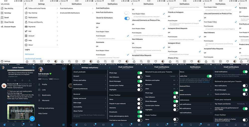
Too much notifications are annoying, and we get too much notifications from too much apps. We could use the settings to reduce the amount of notifications on each app. But is not that easy. Usually there’s too many choices (again) and too many screens. So we end up wasting even more time on the phone while trying to use the phone less. And we have to do this for every app.

What could we do as designers?
There’s a thin line between engaging users and making them addicts to a product. The challenge is where we set that line. As designers, we have tools and knowledge about users minds, people cognitive thinking process and how they emotionally react and act to events. We can either use this to help people, or to trick people. We must choose where we stand as designers, which projects we work on and what we recommend to our teams. We can and we should define our design ethics. We can and we should balance business goals while taking care of users.
If we ever get the chance to design push notifications or notifications in general for an app, let’s not only make the assets for the right OS. We can also make the difference defining the notifications experience. We could:
Define frequency for notifications
Is it really necessary that all the notifications pop one at a time? Could we group them every few minutes — or whatever works — so we send less notifications in a longer period of time? Instead of sending one notification for every “this person liked your photo”, “this one too”, we could spare some attention and time for users and say “two persons liked your photo”. People is still going to come back to your app if the app is actually good you know, you don’t need to overwhelm them with push notifications.
Create meaningful notifications
You don’t need to send a push notification for everything that happens (or doesn’t happen) on your app. Users won’t come back because the app says it “missed them”. If we want the user to come back and still use the app, notifications should add value to the user experience, helping them decide what they need to do.
Define simple and transparent settings for notifications
Please don’t hide the notifications setting deep down the app’s architecture. Make the settings easy to find, and easy to use. Yes, if users get tired of trying to find out how to use the settings, they will probably give up and leave it as it is. But do we really want this? Isn’t it our job — better say, our rol as designers to help people? And a little memo: purposely frustrating users in benefit of the app is called dark (UX) patterns.
Companies are increasingly getting more conscious about this. Apple and Google both added last year native options on their mobile OS to set notifications and screen time settings on the phone. Screen Time on iOS12 and app track notification on Android P aims to bring more power to users, to help them — us — to be conscious of how much we use our cellphone. To be less aware of screens, and to be more aware of life.
Times are changing, and design challenges are changing too. Until a few years ago, the challenge in design was to make users feel comfortable with new interfaces, so we can make them use more the new smartphones and apps. To get them “hooked” to apps. As the businesses goals moves to making profitable and usable apps, we now have a new duty: to think how the app impacts the user’s life-style, when we are engaging and when we are creating addiction. When we are giving real options for the user to choose from. It’s time for design to be responsible. And the only way to design responsibly is to develop empathy, hospitality and humanity.


![Por qué la gente de 45+ años usa el teléfono con el dedo índice y otros cuentos [first draft]](https://miro.medium.com/v2/resize:fit:679/1*34QxeNk0Km0xbAwcUMVApg.jpeg)


