What will our map look like for the future of climate change?

Who are tomorrow’s climate migrants?
“With every degree of temperature increase,” writes Gaia Vince in Nomad Century: How Climate Migration Will Shape Our World, “roughly a billion people will be pushed outside the zone in which humans have lived for thousands of years.”
These migrants will largely come from countries within the tropical latitudes. As global warming inches up degree by degree (as is expected by current emissions trajectories), a zone of inhabitability will begin to emerge roughly along the equator and bulge outwards, reaching further and further north as temperatures increase, threatening especially Sub-Saharan Africa, the Indian subcontinent, Southeast Asia and much of South America north of Patagonia.
But these won’t be the only regions. As the climate changes worldwide in ways both anticipated and not, people all around the world will find themselves vulnerable to forest fires, drought, flooding, food insecurity or “wet bulb” temperatures that make the outside environment unlivable for weeks at a time.
Where will they go?
One such effect of these climate shifts is that regions of the world currently inhospitable for large-scale agriculture and urban life — such as Alaska, northern Canada, Siberia and Patagonia — will potentially develop into some of the last areas left for human civilization.
The Arctic circle, which today is home to just 4 million people (over a tenth of which are Indigenous), could potentially balloon to half a billion or more. The Western Antarctic may potentially be green enough to host hundreds of millions of people as well.
I am not the only one aware of these impending changes, which are well documented in books like Vince’s or David Wallace Well’s The Uninhabitable Earth. The Arctic powers of the day — namely: the United States, Russia, Canada and the Nordic European countries — have taken notice as well, and the race to claim the Arctic has already begun.
As the climate changes and ravages human life in the tropics and subtropics, the zones of habitability will push human beings to the margins of the map we have long ignored. Which got me to thinking, what will the map of the future even look like?
Mapping changes
Map projections are tricky business. Inherently distortive, the results of those distortions are inherently political, emphasizing or de-emphasizing spatial and distance relations to serve one end or another. Each projection has its advantages and disadvantages (some having more of one than the other).
For myself as well as (I suspect) many other members of Western industrialized nations, the Mercator Projection was the gold-standard map projection in the classroom, even long past the era when its limitations were commonly understood by teachers and students. For those unfamiliar, it appears as such:
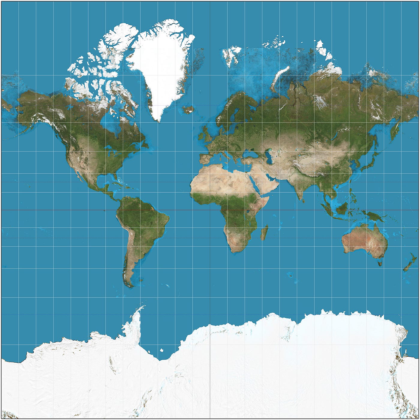
Essentially honest at the equator in terms of size and distance of mapped lands, it becomes more distorted the closer you are toward the poles, giving the impression that Greenland (1/15th the size of Africa) is equivalent in size, or that Antarctica (roughly one-and-a-half times the size of Europe) is an endless marginal expanse of land. (For more fun exploration of geographical comparisons, check out The True Size Of … tool online.)
The projection, which has existed since at least the early 16th-century, was drafted primarily for the purposes of European sailors as they embarked on missions of exploration, colonization and trade.
It is ironic that the projection which became the most popular map in usage worldwide would be incompatible for a future in which we might mostly be living in the very margins it fails to represent.
So what might the maps of the future — those which properly account for our new homes — look like?
Gauss–Krüger
Our first candidate is the Gauss–Krüger projection, which emphasizes the poles of the Earth at the expense of the equator and the tropics. The benefits of this map are obvious: as humanity concentrates toward the poles, emphasizing the geography at the expense of the extreme north and south of the planet highlights where most of the action will be.
The downsides are equally obvious, however. Central and South America bear the worst of the distortion while Southeast Asia and Indonesia are chopped to bits. While far fewer people will be living in these regions compared to the rest of the world today, it’s important to consider what might be the political ramifications of essentially writing off large sections of the world that will already be struggling. Mercator infamously inflates the size of Western nations at the expense of their southern neighbors to a degree that’s arguably political.
Azimuthal equidistant

The Azimuthal equidistant projection is a similar pole-centric map projection that, unlike the Gauss–Krüger, only attempts to capture one pole at at time (an inherent weakness), with its South Pole-equivalent available here.
While this projection has its adherents (among them the UN, which adapted it for its logo), the distortions in this map make it impossible to display two most-habitable climate zones of the future. Were this to be the standard map of the future, it would require classrooms (and board rooms, and all other kinds of rooms featuring people pointing at maps) to display both the North and South map together. Knowing people’s penchant for cutting corners and saving a dime, it’s entirely reasonable to assume people on one pole or another wouldn’t bother to obtain the map of the other half of the world, potentially reinforcing mental divisions of the two poles and increasing strife, conflict and ignorance between the two.
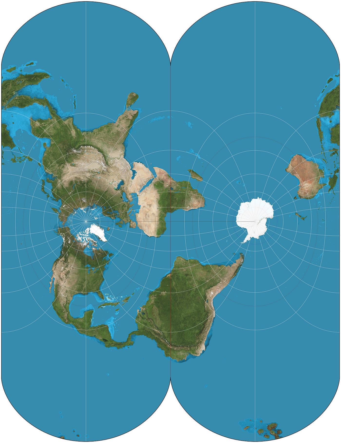
Lambert azimuthal equal-area projection

Essentially a remix of the previous Azimuthal projection, the Lambert azimuthal equal-area projection serves as a counterpoint for the need for two maps in the original Azimuthal, keeping a relatively to-scale north and south pole visible on the map at once.
The cost of that is, of course, that not all lands in the Artic circle are visible (with much of Alaska and Siberia unintelligible despite their enormous importance), and New Zealand, as another one of the future’s last hopes for habitability, is sidelined by yet another projection that largely forgets it’s even there.
Dymaxion map
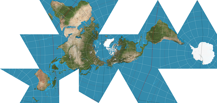
My personal favorite — if only because it’s not every day you find a map with six times the average number of corners — the Dymaxion map (or Fuller map) captures nearly all of the world’s landmasses with minimal spatial distortion, allowing both the north and south pole to be equally visible and represented without distorting the tropics (it even has New Zealand!).
The obvious drawback to the Dymaxion map, however, is that it features large interruptions that make ocean navigation all but impossible. And, while the interruptions were carefully designed to avoid cutting into any major landmass, there are a few close-calls (Madagascar and the Korean peninsula in particular) and good luck mapping out any of the Pacific Islands (though, given the sea rise that will accompany climate change, that will likely be the least of those nations’ worries).
Projecting the future
What with the traditional Mercator projection featuring a heavily hierarchical relationship between west/east and north/south, the Dymaxion map (and many others) reimagine the planet as radiating out from the poles the rest of the world rotates around.
To be biased is inescapable — how we are biased is not. Perhaps just as the map projections of old have been biased toward colonial and hegemonic perspectives, maybe by opting for a different “default” view of the world we can influence the ways in which we are biased to think of our world both geographically and politically.
The above are but a few of the dozens of projections we have available for reconceiving our world in the future. Climate change is inescapable, and as the world is remade by it there will be innumerable shifts — economic, cultural, political — that will accompany it.
Some of those changes will be immense and have been written about repeatedly. Others, such as how the map will look, will sneak up on us so quickly and subtly we may not even notice they’ve happened. That doesn’t mean they won’t be conscious, deliberate choices made by people advancing particular interests. As in all things design, it’s important to recognize these changes as they occur and consider their broader implications.
(We could also just start using globes more.)
Thanks for reading this post about the climate and design. If you’re interested in more, be sure to follow me and reach out to me on LinkedIn.


