Designing widgets for iOS, macOS and iPadOS — the ultimate guide
In this guide, I will cover all you need to know to design widgets for iOS, macOS and iPadOS. Apple’s Human Interface Guidelines form the basis of this guide. I will be using Twitter and Duolingo as examples.
Home screen widgets were one of the most anticipated features leading up to WWDC2020. It redefines how your app presents the user with new information. Your widget is an extension to your app. You can display important information without users opening your app.
You can find Apple’s guidelines regarding widgets here. There is also an introduction video. I’m going to build widgets for the Twitter app as we go while keeping and reiterating the guidelines from Apple.
Ideation
Widgets should help users avoid performing repetitive actions. Your widget needs to be:
- Informational: Don’t make a widget if it’s only a larger icon. Use it to pass information to the user, which adds value.
- Personal: Provide personal information that helps establish a connection with the user. The Photos widget is an excellent example of how personal a widget can be.
- Contextual: Update widgets to provide relevant information. If there are no events left on my calendar, the widget updates itself to show tomorrow’s summary.
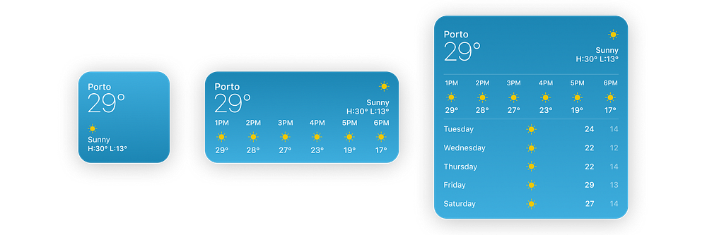
Sizes
Regardless of the size of your widget, it should always focus on one thing. In most cases, a widget would provide information based on your app’s primary function.
Tap Styles
The Human Interface Guidelines give us three styles we can use to get started on our Twitter widget.
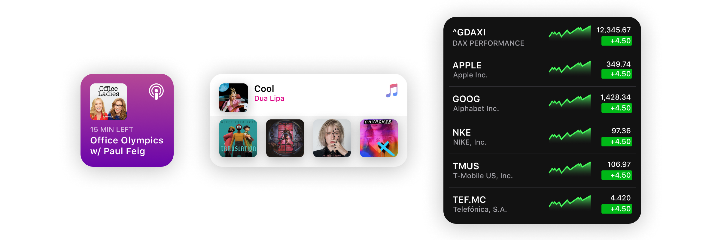
- Fill Style: As the name suggests, fill the widget with rich colours and content. Suitable when you are deep-linking to a single piece of content.
- Cell Style: Every tappable cell contains different elements. With multiple tap target support, each cell leads to different locations in the app.
- Content Style: When your content is unconfined in the widget. Again, each is leading to different locations in the app.
As you can see, there’s only one “tap target” in the Fill style, while others have multiple tap targets.
Tap Targets
Tap Targets are areas when tapped would have a specific action. The small widget acts like a single tap target; present limited content. We cannot deep-link different sections to different parts of the app. Medium and large widget sizes support multiple tap targets.
Since the small size supports only a single tap target, all small widgets follow the Fill style. Using the Fill style in larger sizes is not advisable. It only wastes space when you can have way more elements.
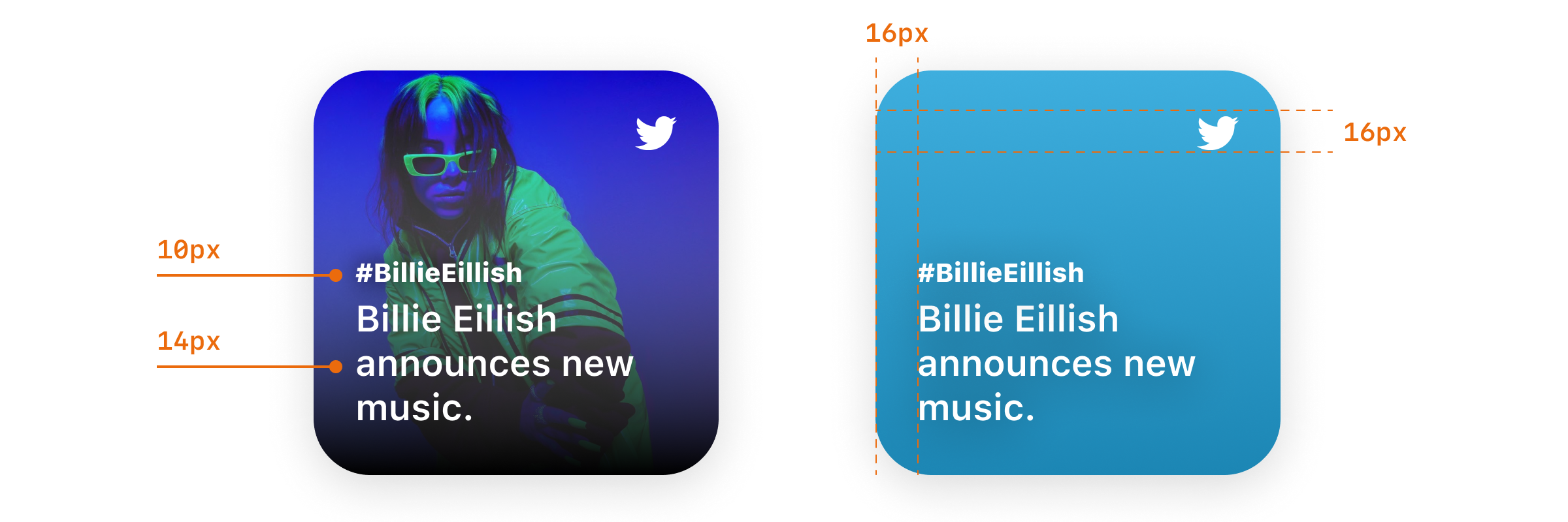
Spacing
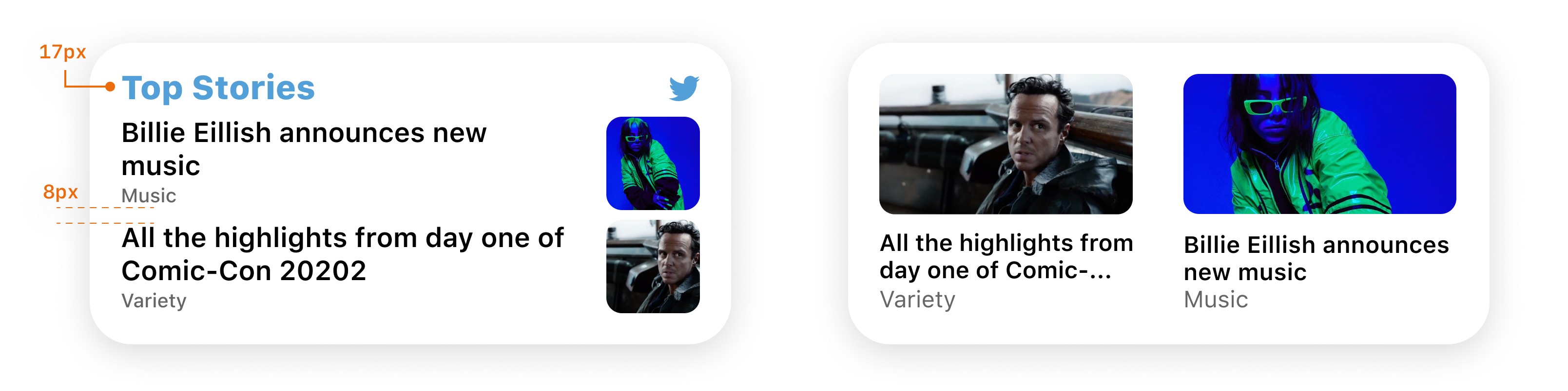
As always, the spacing between elements is a crucial aspect of your design. Apple recommends having a 16pt margin from the edges of the widget. In layouts with graphics, use a tighter 11pt margin.

Content and Personality
When designing a widget, think about content and personality together.
You can derive personality of your widget from your app’s design and its icon. Use familiar colours and typography to help users make the connection. Rich images, a simplistic look or a tint colour are some of the ways to add some personality.
Content layouts can either scale between sizes or have a different look across sizes.
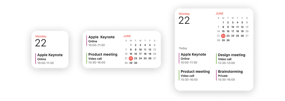
The Weather widget expands by adding some more content as size increases. The idea behind the widget remains the same. The Calendar widget combines different elements as it gets more space.
Creation
Now that we have some basic info, we are ready to start building our Twitter widget.
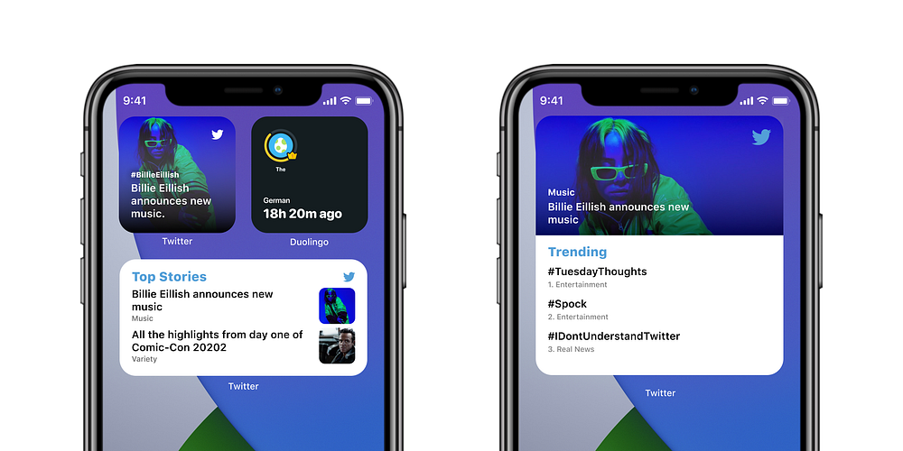
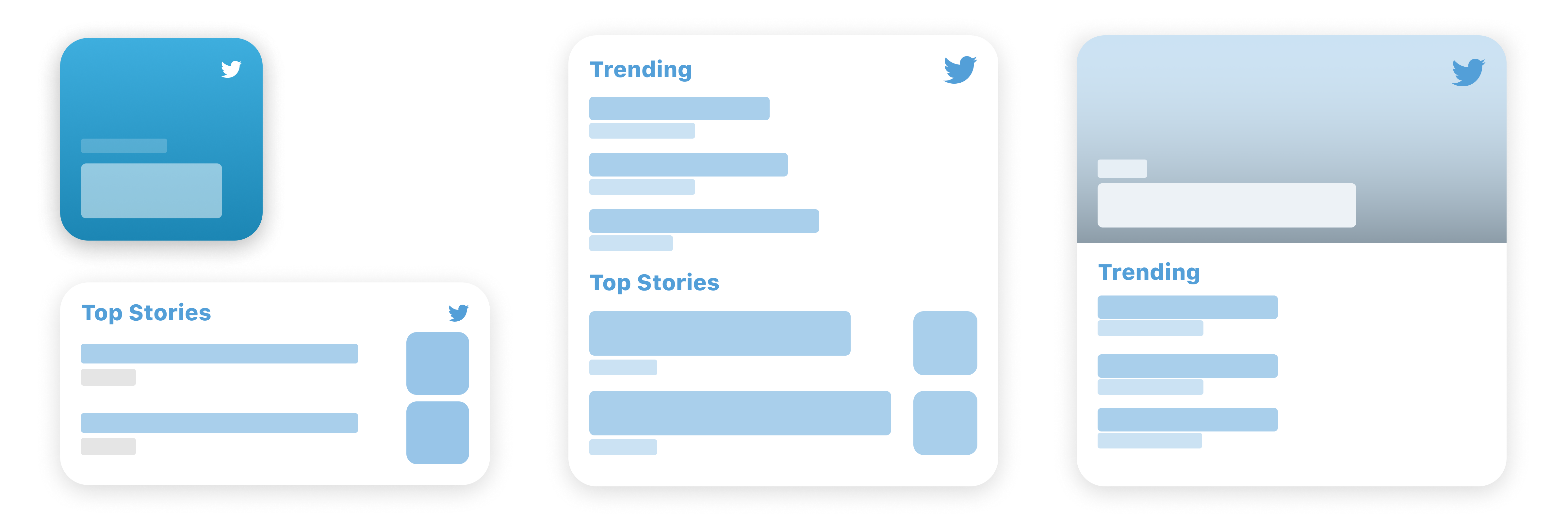
Let’s start with the small size and use the Fill style.
That looks pretty good. It presents information about the latest trend, updating with time (contextually). Twitter presents curated trends in the ‘For You’ section so we don’t have to worry about it being personal. The rich background image adds more personality compared to the gradient background.
Let’s see how it looks when we try to scale this up to support the other two sizes.
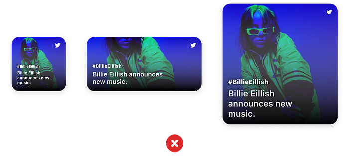
It doesn’t add any value even though we end up using up to 4x space. That’s why it’s important to not scale up your widget for the sake of adding support. If it does not add value, you should not add support for that size.
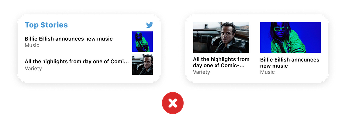
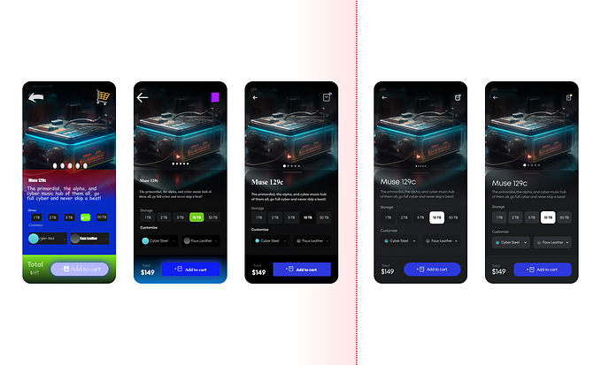
Let’s start with our medium-sized widget. Now that we have multiple tap targets, we can have more elements in the widget. Each title can lead to a different location in the app using deep-linking.
The layout seems fine to me, but I feel that adding a bit of corner radius would complement the soft look of the widget.
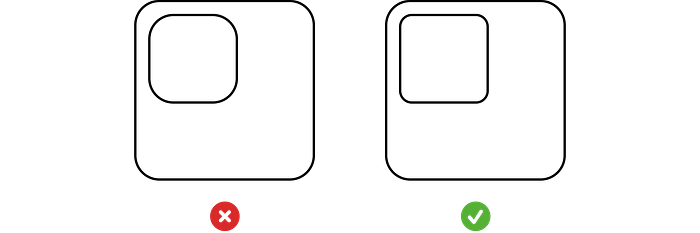
That’s much better. SwiftUI provides a method which applies corner-radius based on the properties of the element. You can find more about it here. Make sure you add corner radius in moderation, overdoing will also be detrimental.
Now moving to the largest size, I think going with the content style would look good. Here’s what I came up with:
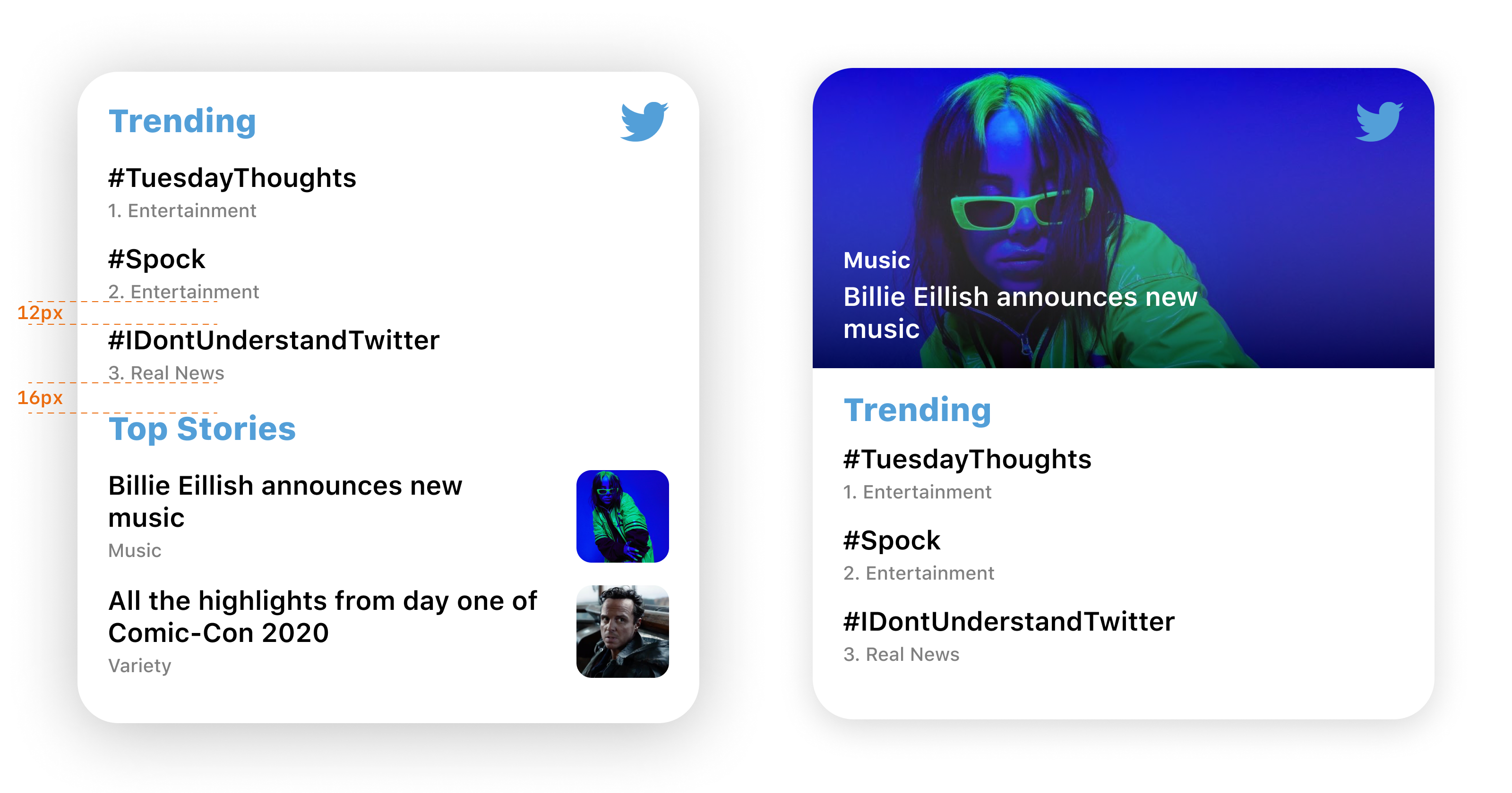
It adds a new Trending section. As I said earlier, this is not the only way you can design it. There are countless ways, and you should go with the design that suits your app the best.
Example 2 — Duolingo
Duolingo presents a gamified learning experience. Learners can maintain streaks and earn gems to buy unlockables. Streaks are the only thing that keep me going. Naturally, a small widget with my streak would be a welcome addition to my home screen. A medium widget shows the languages I am currently learning. I can tap any of them to go straight to the challenge screen.
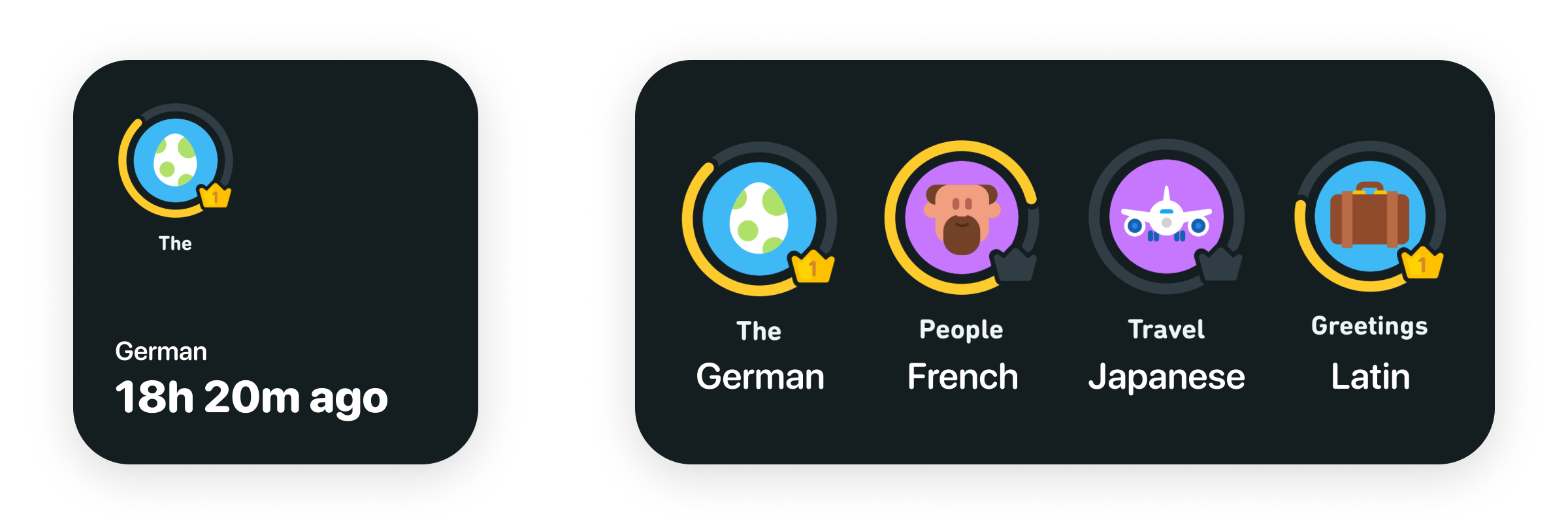
Notice “18h 20m ago” in the small widget. Apple recommends against using language along the lines of “Last updated X ago.”
Placeholders
When the widget is inactive or isn’t able to load data, Apple shows placeholders. Here’s an example:
SwiftUI generates placeholders without much code. You can find out more here.
Configurable Widgets
Widgets also let users have some preferences over what content the widget displays. For instance, you can edit the location in the Weather widget.
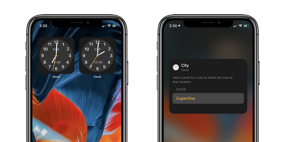
I can also end up having two instances of the same widget with different configurations. For example, I can have two clock widgets, each showing me time from a different timezone.
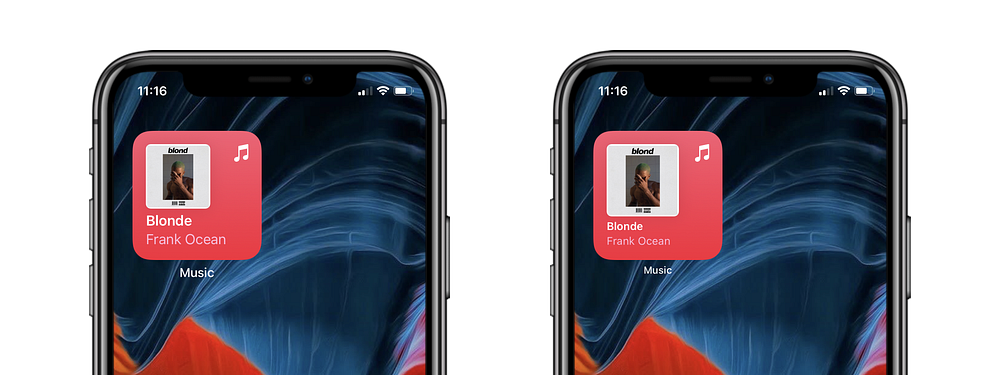
Dark Mode
As the devices switch between display mode, your widget must adjust with it. The Fill style uses a rich background, so in most cases, it won’t need changes to support Dark Mode. To learn how to design for dark mode, checkout Chethan’s ultimate guide.
Accessibility Support
Make sure that elements have enough breathing space on your widget. If a user is using a huge font size on their device, your widget should be able to scale its content up. Testing for different situations is straightforward on Xcode 12. You can find more here.
Tidbits
Apple only allows adding your app icon to the widget if your app acts as an aggregator of content. Apps like Twitter or News.
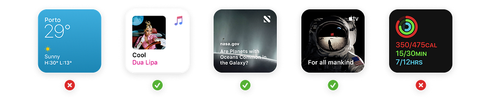
They also do not allow having your app’s name on the widget since it is redundant.
Common Layouts


Wrap Up
That is pretty much all you need to know to get started on your first widget. I would love to see what you come up with, feel free to get in touch with me.
Resources
For some SwiftUI tutorials:


