Different types of notifications: websites, apps and beyond
When designing notifications it is important to only show relevant information at the right time. A detailed review of the content and clear priorities are a good start of this type of a project. Messages that are more personal to the user and displayed at the right time, will avoid the risk of becoming an annoyance. Reducing the volume of notifications is also a good approach to a successful communication with your users. This article is an overview of different types of notifications and different formats which you could explore, to improve the communication between your company and your users.

Types of notifications
Depending on the type of application you are designing, notifications can be divided into two main groups by answering the following questions:
1. Does the notification require an action?
For example, when your team just released a new feature and you would like your users to try it. This type of message prompts users to complete a certain action, and should be displayed differently in comparison to more passive messages.
Notifications might just consist of information that you think will be interesting or helpful for your users, but don’t require any particular action. For example by congratulating your user on achieving a goal, when collecting points or a achieving a certain number of steps in fitness tracking apps.
2. Was the notification triggered by an event?
There are three types of events that can trigger a notification, depending on what events occured before:
- triggered by the user: for example mobile messaging, where the content is directed specifically to a particular user
- triggered by the system: specific to the system, for example a request to install an update
- event based notifications: triggered based on actions completed by the user within a software, for example recommending tax saving option when a user is adding a particular category of expenses
Answering the above questions should help you rethink the context and desired outcome of a notification. Messages/updates/notifications can be displayed in many different ways, depending on what you would like to communicate. Below are some examples of the most popular format of notifications within a designated area in-app, as well as other, less used, examples.
Standard notifications format

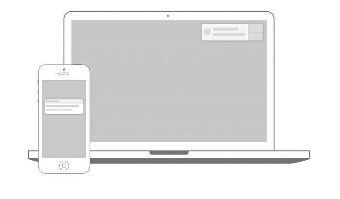
Most common notifications are displayed within a designated area, usually in the right top corner of the screen. It is the format we are used to from apps such as Facebook, Airbnb or Dropbox.
What is interesting about those examples, is the logical divide between the different types of messages. For example, direct messages from another users are usually separated from the other types of notifications, such as system updates.
Airbnb introduces this divide within one area called “messages”.
To suggest that there are new messages or notifications, Airbnb chose to use a subtle visual indicator — in form of a dot next to the messages. Dynamic in nature, the visual indicator disappears as soon as a user clicks to view the new messages.
Instead of providing one notifications area, Facebook separates notifications, based on the context that triggered each of them. Updates are categorized into logical groups, separating: messages, new friends requests and general activity updates. Facebook also uses a visual indicator showing the number of new updates, with a addition of a number of unread messages within a red circle. While exploring the area, unread messages can be easily distinguished from the other updates, as the color scheme used for them is bolder.
Dropbox follows similar format of a designated notifications area, placed in the top right corner of the screen. What’s interesting about Dropbox is the ongoing promotion of their premium features. Dropbox focuses on their key premium feature (more space) and shows upgrade prompts during different moments throughout the user journey. Each prompt is slightly different, even though it communicates a similar message, but often contains different copy and illustration. I assume this was added to ensure the user will keep on noticing it, instead of getting used to the same message and ignoring it over time.
Beyond the standard format
Even though the notifications area usually has a standard format described above, there are other ways of communicating with your users. Here is a small list which will hopefully inspire you in case you would like to explore other options.
In-browser push notifications
When navigating to a website, we are sometimes asked if we would like to enable in-browser notifications. This type of notifications is difficult to design, as the value of the messages promised has to be high in order for users to agree to allow push notifications to appear. They also have to be enabled on every new device or browser.
If you don’t have the option to build push notifications yourself, there are a lot of products which, for a fee, could make them easier to set up.
In-app cards
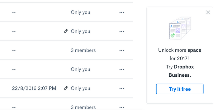
Using a card or a banner format can be a good way to communicate less frequent messages. Fo example, Dropbox uses them frequently to remind users about their upgrade options. Quickbooks uses this format as part of on-boarding or reminding users about upcoming tax deadlines.
Effectiveness of these messages will depend on the how frequently your users log in to the app, in order to view the message.
Modals/dialogs
A pop-up window can be used if an action requires immediate attention. However, this can be troublesome for the users and should be avoided if possible. Preferably this format would only be used if triggered by a specific action, when a user is more likely to expect it to appear. Ads suddenly appearing on a website, and stopping you from doing anything else unless you interact with the modal, are a great example of bad design.

Other dialog examples described by Material Design: https://material.io/design/components/dialogs.html#anatomy
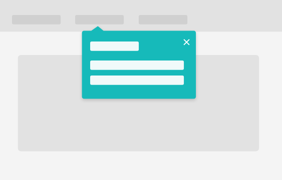
In-context pop-ups
This type of notifications points the user into a right direction, and it is particularly useful for onboarding or for showing new features.
Chatbot
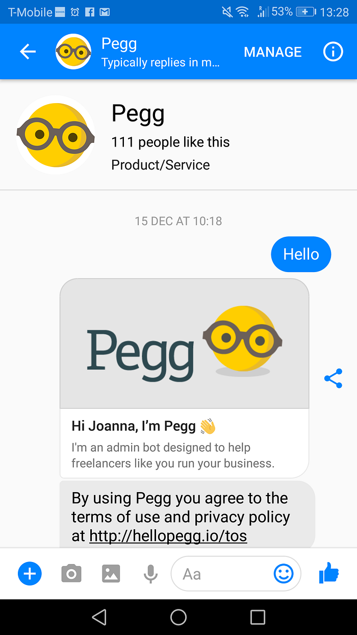
Automated chat services are an interesting way of communication with users. They could be costly and difficult to design, but they give you an option to contact your users even if they haven’t logged into your app in a while.
Examples:
- Pegg by Sage One (Facebook Messenger/Skype): https://hellopegg.io/ — quick actions
- Operator by Intercom — customer support
- Nikabot (Slack) — view what your team is working on
If designed well, chatbots can provide interactive customer support, helping users find answers to their questions faster. It is worth considering if the resources invested in a chatbot service would be more cost effective than a standard customer support.
In-app chat
An alternative to a chatbot could be a in-app messaging software, which is operated by the customer service team. There is a lot of services out there which could help implement this quickly, however it still requires a team to support it.
Text messages
Text messages should be the last resource, as they should only be used for the most important reminders. For example, in accounting software they could be used when a tax deadline is approaching. User should sign up to receive them and it should always be easy to opt out, in case they change their mind.

