Discover Figma: A practical guide
A hands-on guide for getting started with this powerful design tool.

If you’re a Designer stepping into the world of UI Design and looking for the right tool to help you create beautiful, functional UIs, you really can’t go wrong with Figma.
And. I’ve always said there’s no better way of learning a Design Tool than just diving in and building something.
So guess what?
That’s what we’ll be doing together in this article, where I’ll be showing you how to create a simple Mobile App Screen inside Figma.
Exciting times lie ahead…
Oh. Before you read the rest of the article…
🏠 Growing a SaaS startup? I combine strategic design with proven founder experience to help you build products users love.
Join the Haus waitlist for early-bird perks → https://gohaus.design/
Checking out the Figma interface.
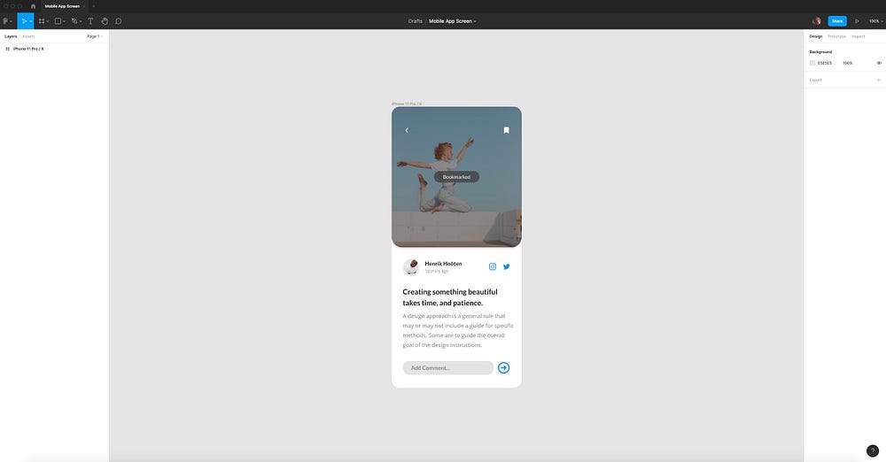
The great thing about Figma is its clean and intuitive interface.
I’ve used pretty much every design tool there is, and over time a lot of them have started to feel a little bloated, interface-wise.
Figma keeps it tight and lean, and it’s a joy to use daily.
Let me give you a super-quick overview of the Figma UI…
Toolbar

The Toolbar in Figma contains a variety of tools to help you on your projects, and what appears in the toolbar will depend on what you’ve selected on the Canvas.
Here’s a little list of Tools you’ll find yourself using the most…
- Move (V)
- Scale (K)
- Frame (A or F)
- Rectangle (R)
- Line (L)
- Arrow (Shift + L)
- Ellipse (O)
- Place Image (Shift + Ctrl + K or Shift + Cmd + K)
- Pen (P)
- Text (T)
- Hand (Press and hold SPACE)
Layers Panel
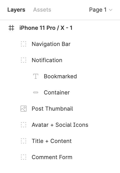
On the left of the screen is where you’ll find the Layers Panel.
This gives you easy access to the Layers, Assets and Pages used inside your current Figma file.
Any Frames, Groups or Objects that you add to the Canvas will be visible in the Layers Panel.
Assets Panel
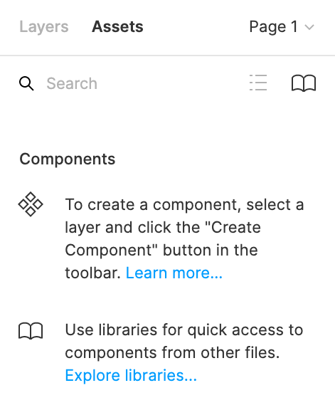
Inside the Assets Panel is where you’ll have easy access to all of your Components.
Components are reusable design elements such as Buttons or Icons, as well as more complex UI elements such as Menus or Modals.
To speed up your workflow you can quickly select a Component in the Assets Panel and drag it onto the Canvas to create an Instance.
Canvas
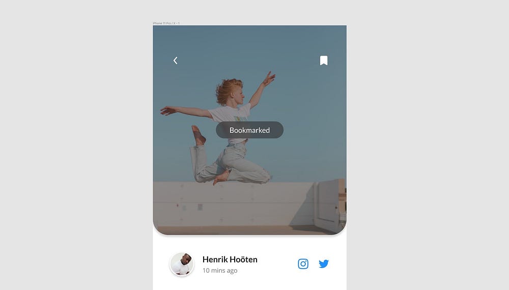
The Canvas.
This is where your designs are presented.
Erm. Yeah. Simple as that really.
Moving on…
Properties Panel
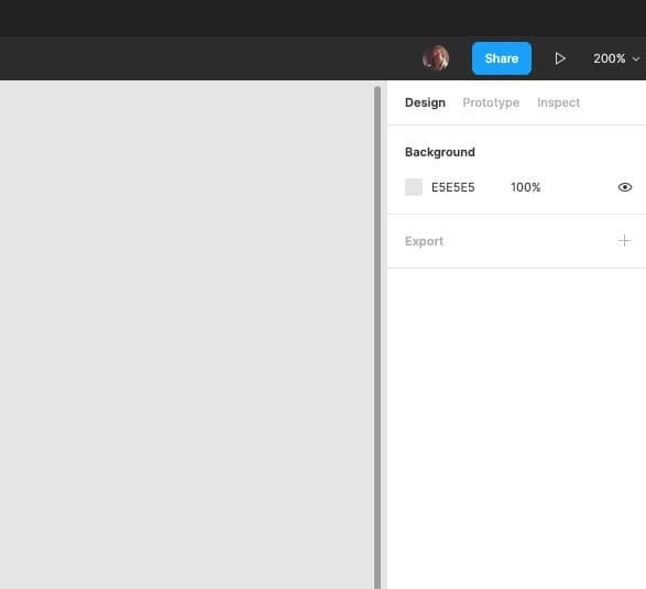
On the right of the screen is the Properties Panel which allows you to view and adjust the properties of any element you currently have selected, as well as access your current files Prototype settings and view the Code of any selected element.
Design Tab
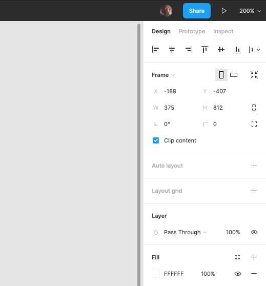
The Design Tab allows you to easily view, add, remove or change the properties of elements within your design.
The layer that you currently have selected will determine what settings are available to you in the Design Tab.
Prototype Tab
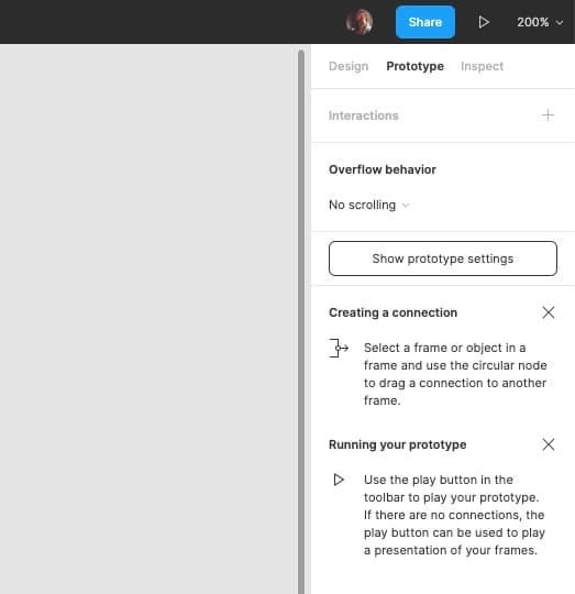
The Prototype Tab give you access to all the Prototyping functionality that Figma has to offer, and enables you to apply transitions between your Frames, bringing your static designs to life.
Inspect Tab
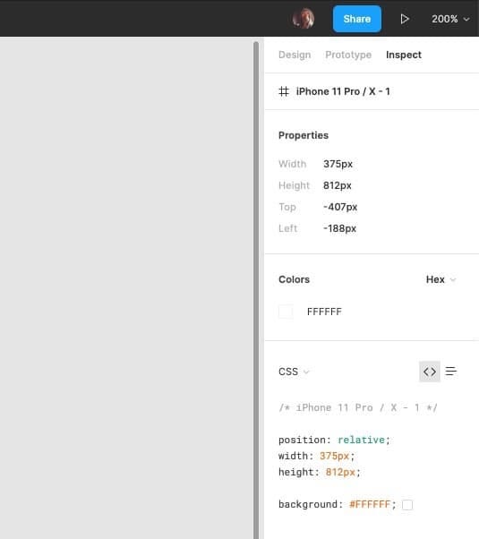
The Inspect Tab in the Properties Panel allows you to see how to present elements of your design in code, with the following formats available to you…
- CSS
- iOS
- Android
Now on to the good stuff…
Designing a Mobile App Screen.
Please Note: Before we dive into this part of the article, make sure you download the required design elements needed to follow along with the tutorial here. (There’s also the completed file in there for you to reference).
If you’ve not already, visit https://www.figma.com and Sign Up for a Free account.
You can also download the Windows or Mac App from here — https://www.figma.com/downloads
With Figma open, create a new document by clicking the Plus (+) icon at the top right of the screen.
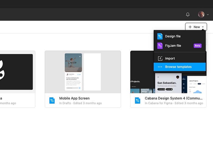
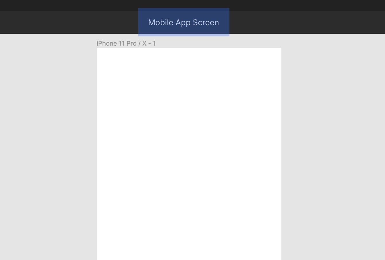
From the screen that appears, select the iPhone 11 Pro / X option, and click Create File.
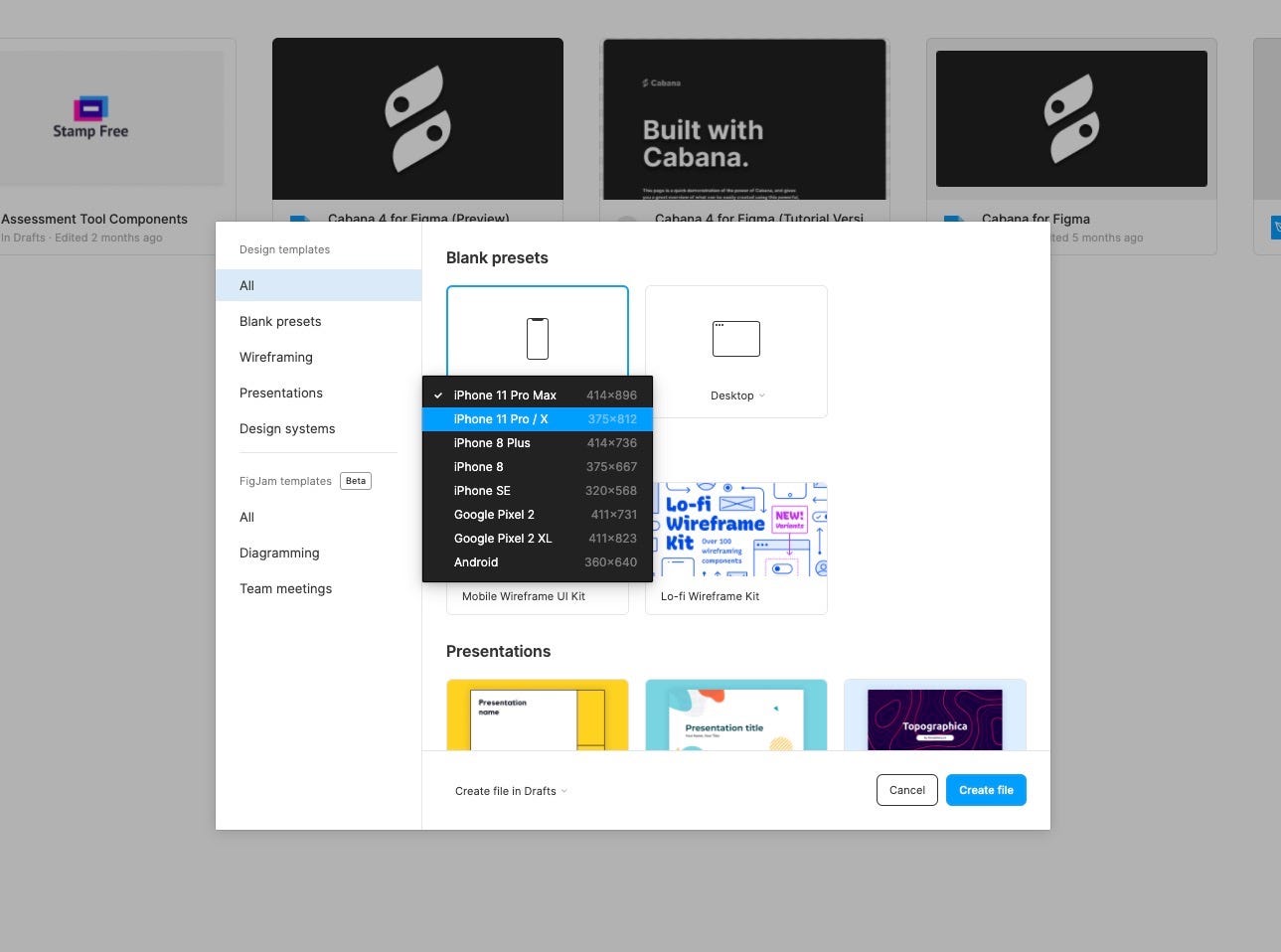
Then, with the Frame deselected, click on the file name in the Toolbar and rename it to ‘Mobile App Screen’.
Post Thumbnail.
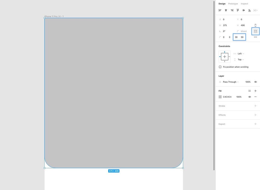
Select the Rectangle Tool (R) and draw out a shape around 375px wide by 406px tall and position it at the top of the Frame. You can also double-check it’s positioned correctly by checking that it’s set to 0 on the X and Y axis in the Properties Panel.

Still in the Properties Panel, click the Independent Corners icon and choose 30 for the bottom-left, and bottom-right corner radiuses of the rectangle.
Now let’s place an image inside our shape using the aptly titled, and super-helpful Place Image function.
So using the shortcut Shift + Ctrl + K or Shift + Cmd + K, choose preview.jpg from the Images folder and then click on the shape to insert the image directly into it.

Let’s add a colour overlay to our image to add a little contrast between itself and the elements that we’ll be placing over it shortly.
From the Fill panel, click the Plus (+) icon to add a new Fill. Make sure the Solid option is selected.
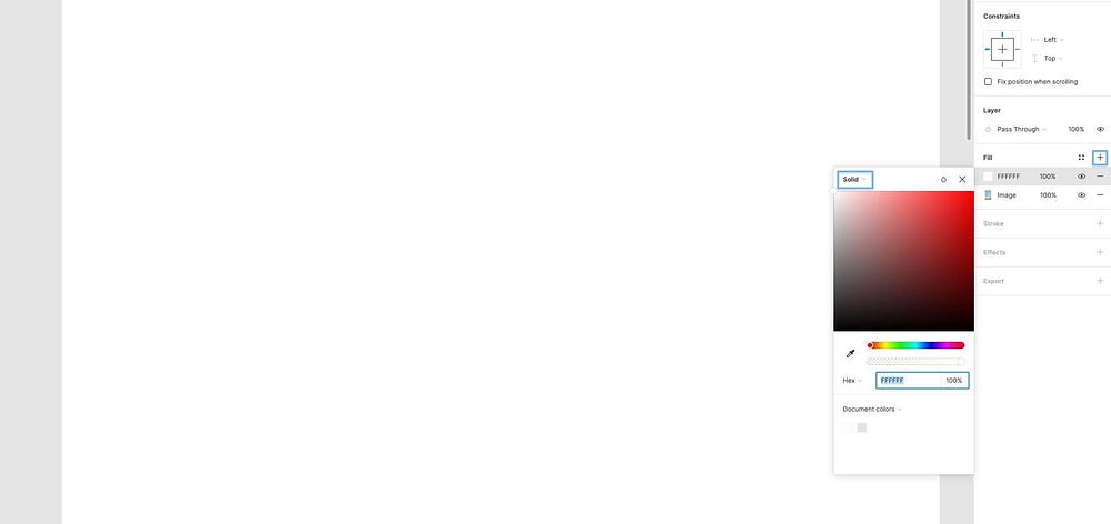
From the fly-out menu insert the following Hex (#) value: 303030, and set the opacity to 50%.

Finally, let’s add a subtle drop shadow to our thumbnail image and add a little depth to our design.
From the Effects panel click the Plus (+) icon, choose Drop Shadow from the select menu, and then adjust the following Effect Settings…
- X — 0
- Y — 4
- Blur — 4
- Color — #303030
- Opacity — 20%

Navigation Bar.
For the Navigation Bar we’re going to insert a couple of Icons. One for navigating back to the previous screen, and the other for bookmarking the article.
With your Icons folder open simply drag & drop the following icons, one at a time, onto your Frame…
- arrow back
- bookmark
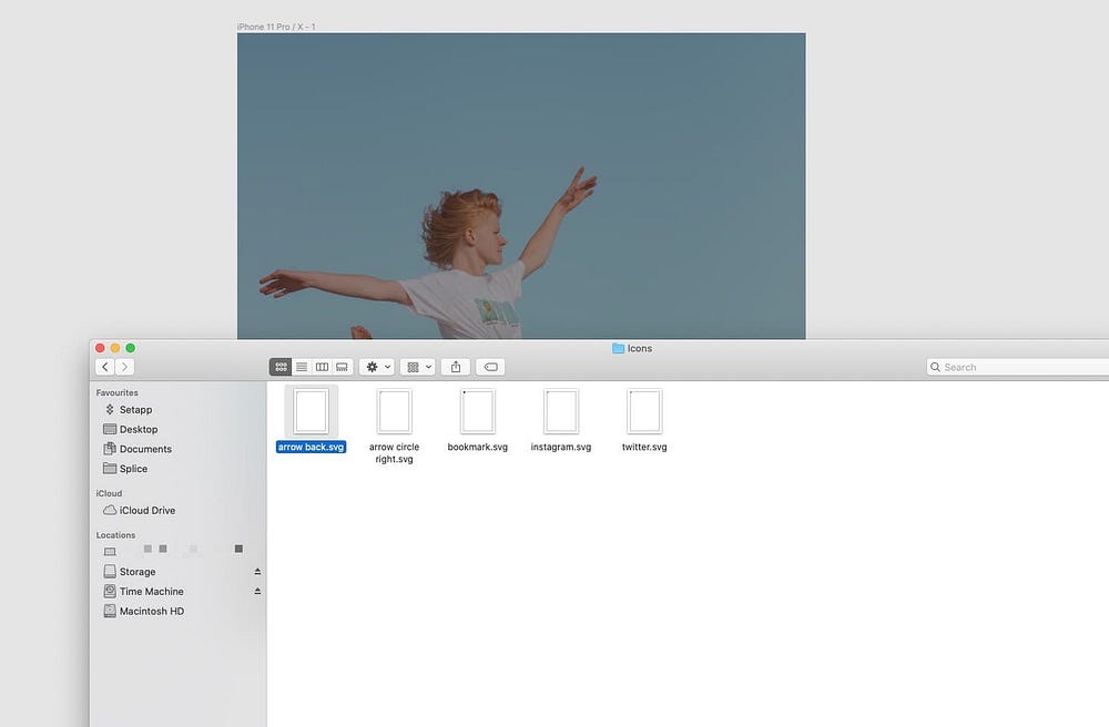
With both icons selected, go to the Selection Colors panel, and change the Hex value to White (FFFFFF).

Holding the Alt key to measure the distance between elements in your design, position each icon 32px from the left, and right edges of the Frame.
And then with both icons selected, go to the Properties panel and choose Align Vertical Centers (Alt + V).

With both icons still selected use Ctrl + G or Cmd + G to Group them, and Ctrl + R or Cmd + R to Rename. This just keeps things a little more tidy, and organised in the Layers Panel.

Always rename, and group as you go. It saves a lot of time and prevents you from coming to the end of a design and being faced with a Layers Panel of Rectangle 1, Rectangle 2 etc… Not cool!
Finally. Holding Alt, position this new Group 56px from the top of main Frame.

Notification.
As you can see we added a filled version of the Bookmark icon for the Navigation Bar as though the user had just bookmarked the post.
Let’s add a simple Notification that could be shown to the user when that Bookmark icon is tapped on. Just a subtle visual cue to show that the action (tapping of the icon) has been recognised, and completed.
Using the Rectangle Tool (R) draw out a shape around 131px x 33px, and then round the Corners to 24.

From the Fill panel, give it a Hex value of 303030 and reduce its opacity to 60%.

Onto the Effects panel. Let’s give this lil’ Notification a subtle Background Blur to add both visual interest, and a little more contrast between the image, and the text that we’ll soon place inside it.
In the Effects panel click the Plus (+) icon, and from the select menu choose Background Blur.

Click on the Effect Settings icon and change the Blur Strength to 6.

Time for some Text, and to tweak some more properties don’t you think?
Using the Text Tool (T), add a new text element and type the word ‘Bookmarked’.
Then from the Text Properties Panel, apply the following…
- Font — Lato
- Weight — Regular
- Size — 14
- Text Align — Center
- Align — Middle
- Fill — #FFFFFF
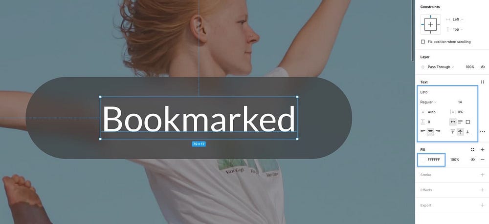
With both the Text, and Shape layer selected, use the Alignment options at the top of the Properties Panel to align the elements both Horizontally and Vertically to one another.
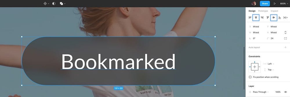
Use Ctrl + G or Cmd + G to group them and Ctrl + R or Cmd + R to rename.
Then finally use Ctrl + click or Cmd + click to select the Notification group, and Image, and use the Alignment options to align the Notification both horizontally and vertically inside the image.

Avatar + Social Icons.
Let’s get our Avatar, Author Name and Social Share Icons into place shall we?
Select the Ellipse Tool (O) and draw out a shape 48 x 48px. You can also hold Shift to constrain proportions as you do.
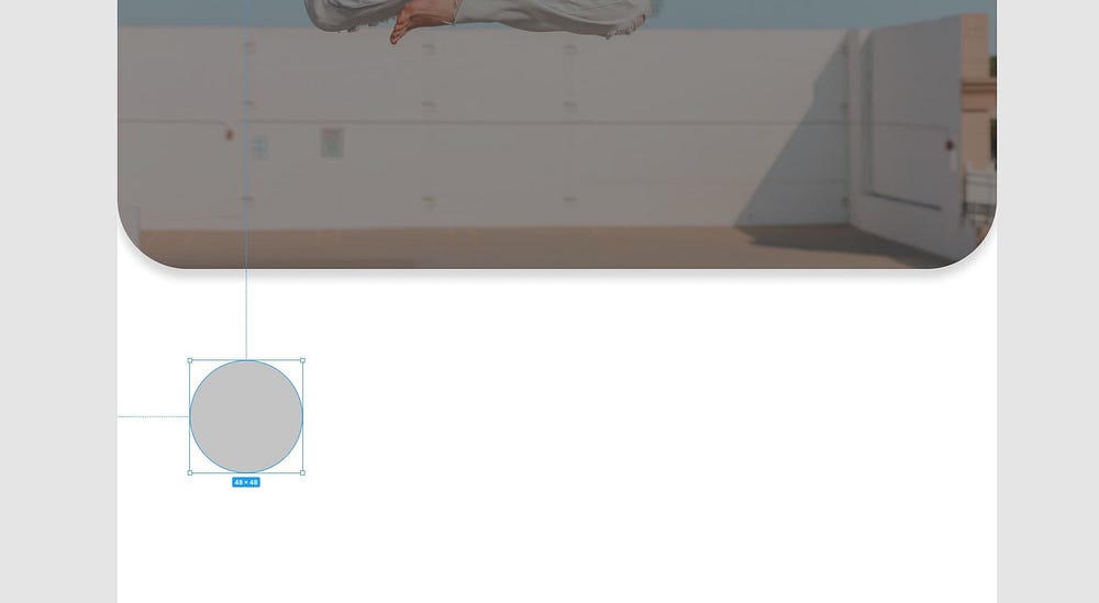
Using the shortcut Shift + Ctrl + K or Shift + Cmd + K to use the Place Image tool, select avatar.png from the Images folder and place it inside the shape.
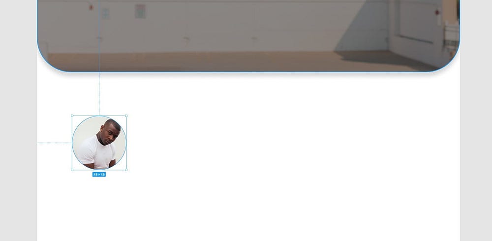
With the shape selected, hop over to the Properties Panel and add the following…
Stroke -
- Color — #FFFFFF
- Width — 2
- Position — Inside
Drop Shadow -
- X — 0
- Y — 2
- Blur — 4
- Color — #303030
- Opacity — 25%
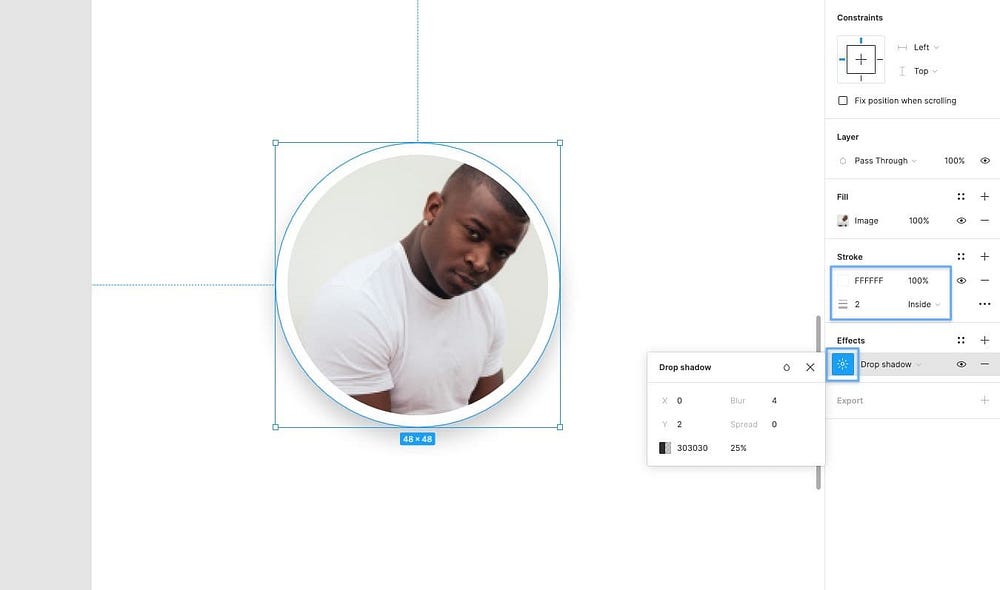
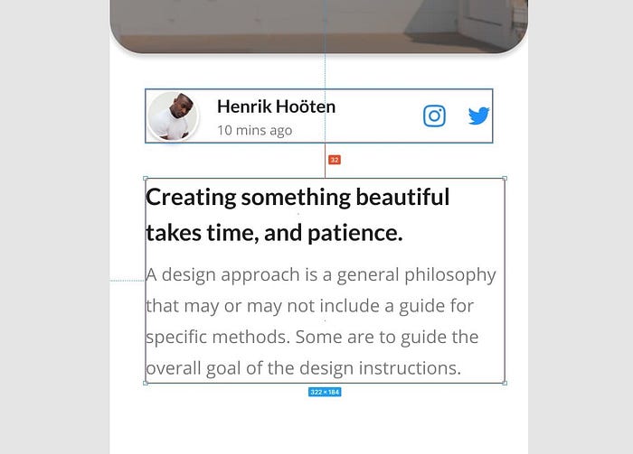
Let’s go ahead and drop in a few more Text layers for both the Author Name, and the date the article was posted…
Using the Text Tool (T) create 2 new Text layers, edit the text accordingly, and then for the Author Name apply the following properties…
- Font — Lato
- Weight — Bold
- Size — 16
- Text Align — Left
- Fill — #212121
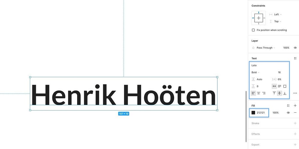
…and for the Date Posted use the following…
- Font — Open Sans
- Weight — Regular
- Size — 12
- Text Align — Left
- Fill — #7D7D7D
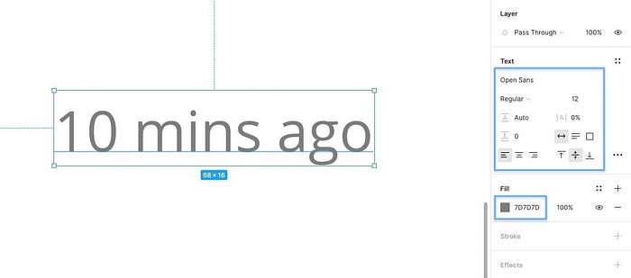
Using the trusty Alt shortcut, space the text layers to one another giving them a little breathing room.
Then use the Alignment tools, so they’re both Aligned Left to one another, and then finally Group (Ctrl + G or Cmd + G) them.
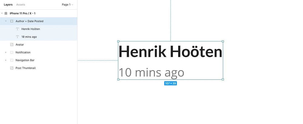
Align this new Group 16px from the right of the Avatar, and then with the new Group and Avatar selected, press Alt + V to align them vertically to one another.
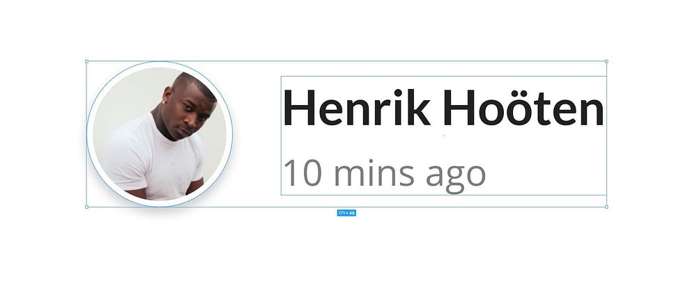
Let’s drop in a couple of social share icons…
Like before, simply drag & drop the Instagram and Twitter icons, one at a time, onto your design, and using a combination of the Alignment tools, and Alt shortcut, align them vertically to one another (Alt + V), and space them 16px apart.
Group (Ctrl + G or Cmd + G) the icons, and rename (Ctrl + R or Cmd + R).
With your Social Icons Group, Text Layers Group, and Avatar all selected, use Alt + V to align them vertically to one another.

Group (Ctrl + G or Cmd + G) those elements together, and then position this new Group 32px from the left, and right edge of the Frame, and 32px from the bottom of the Image.

Title + Content.
Let’s add a lil’ Title and snippet of Content to fill out our design some more…
Using the Text Tool (T), create a simple Title, and then from the Properties Panel apply the following…
- Font — Lato
- Weight — Bold
- Size — 21
- Line Height — 32
- Text Align — Left
- Align — Top
- Fill — #212121

Then, using the Text Tool (T) once more, create a paragraph of content to appear below the Title with the following properties…
- Font — Open Sans
- Weight — Regular
- Size — 16
- Line Height — 28
- Text Align — Left
- Align — Top
- Fill — #7D7D7D
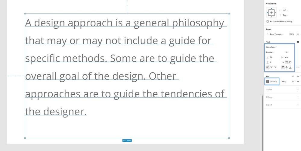
We’ve set the colour of this block of text to be a dark grey (#7D7D7D) so it contrasts nicely against the Title, adds a little visual interest, but it’s still accessible against the White background for users with reduced vision.
Hold the Alt key and hover between the 2 Layers to view the distance between them, and space them 8px apart.
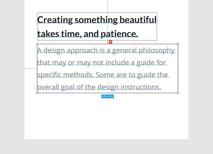
Don’t forget to Group (Ctrl + G or Cmd + G) and Rename (Ctrl + R or Cmd + R), and then space this new group 32px from the left edge of the Frame, and 32px from the bottom of the Avatar group.
Comment Form.
OK. Let’s wrap things up here, and add a little Comment Form/Field to our design.
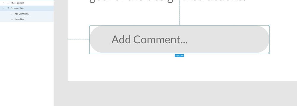
Calling upon the Rectangle Tool (R) once more, draw out a shape around 263 x 40px, give it a Corner Radius of 24, and a Fill of #E4E4E4.

Insert a Text layer (T), tweak the wording (ie; Add Comment…), and then add the following properties…
- Font — Lato
- Weight — Regular
- Size — 16
- Text Align — Left
- Align — Middle
- Fill — #707070

With both the shape, and text layer selected, align them vertically to one another (Alt + V), and then group (Ctrl + G or Cmd + G) them, and rename (Ctrl + R or Cmd + R).
Drag & drop the arrow circle right icon onto your design, and then using the Scale tool (K), resize it proportionally to 40 x 40px, so it shares the same height dimensions as the field we just created.

Position the icon 8px from the right of the Comment Field, and then with both the field group and icon selected, align them vertically to one another (Alt + V).

Finally. Group the 2 elements (Comment Field, and Icon). And position this new group 32px from the bottom of the text content, and from the left and right edges of the Frame.
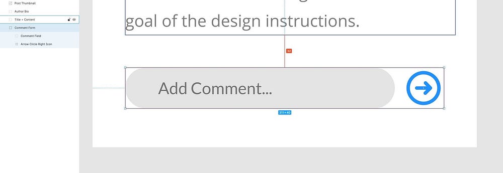
And that folks, is a wrap for our lil’ Mobile App Screen.
I’ve said many times before, jump in there, start designing, and then design some more. It’s the best way to learn a new tool and improve your design skills at the same time.
Oh. Before you go…
🏠 Growing a SaaS startup? I combine strategic design with proven founder experience to help you build products users love.
Join the Haus waitlist for early-bird perks → https://gohaus.design/


