Do you think your component library is your design system? Think again

Just a normal day at work:
- Me: “Hi, can I have access to our Design System?”
- Team member: “Sure, here’s our UI Component Library.”
Wait, what?
We have been hearing this since quite a while now. It’s been years and we still “just talk” about how companies like Uber and Airbnb invest in multidisciplinary teams dedicated to build and manage their Design Systems.
But even today, a lot of product companies, especially startups, get complacent after making a UI component library. There have been debates about the need of a Design System, how its different from a library, whether we should invest our bandwidth in it and shouldn’t a UI Kit alone suffice for product development?
Recently, my mentor gave me the responsibility to work on the Design System for our product. We were excited because we got a chance to build something that we wanted from so long. This article is about the What, Why and How of it. I’ll try to keep it short, unlike our weekly stand-ups.
What is a Design System?
Going by the most popular definition:
“A Design System is an ever evolving collection of reusable components, guided by rules that ensure consistency and speed, by being the single source of truth for any product development.”
It is more than just a UI Library. The whole purpose of a Design System is to define the design principles, style-guide, patterns, content tone, and the rules and specifications of the “reusable” components. These rules are very specific to the product and can differ from company to company.
Why is it needed?
Often designers find themselves asking questions like:
- “Do our interfaces share the same patterns, colours, typography and other styles?”
- “Why do we have to spend time cleaning someone else’s designs?”
- “Do we always have enough time to deliver a quality product to meet KPIs?”
We were in dire need of a solution for all this. Here are 3 more reasons why we needed a system:
1. High Velocity Development
The business requirements pressurise designers to build more, faster and better, but without standards in place, resulting in every new hire further slowing down the process. Without a Design System, every new project increases chaos in the process and slows down velocity.
2. Inconsistencies in Design
With huge teams, it is impossible to keep a sanity check. We still see a lot of elements being made from scratch and even smallest elements such as dividers have inconsistent usage. I addressed these issues in my previous article, 3 most common problems designers face in product startups. How do we make sure people are following the system? This brings me to the next big reason.
3. Lack of documentation and understanding
Even after getting a component library, designers often don’t know how to use it. Why should they? Did we train them? No.
- “Should this button come above or below the divider?”
- “Hey, what shadow are we using for hover?”
- “Should I use an icon button or a normal button in this card?”
These are all genuine doubts. Designers complain about not knowing the dos and don’ts and lack of an exhaustive guide. Its like I gave you a chainsaw, but didn’t tell you how and where to use it, and you ended up becoming the inspiration for The Texas Chainsaw Massacre. If only the killer had an instruction manual.
Now that we’ve understood the What and Why, let’s move on to the How.
1. Setting up the styleguide
Everyone loves designing components and they want to keep rolling and executing aggressively. Jumping into crafting components can be very tempting. But before that, we needed to set the foundation.

Design principles
These are certain values, which we base our designs on. Values which keep all the stakeholders aligned to the UX Vision.
You don’t need to start from scratch if you’re re-working on an existing Design System. But if its an entirely new project, referring to global user-centric design principles can be of great help.
There were many principles set. Here are my 3 personal favourite:
- Clarity: Through the use of familiar patterns, guided workflows, inline instructions and contextual information, our products are understood without the need for a manual, where possible, and provide easy access to concise and clear documentation where needed. Terminology is carefully considered and maps closely to the purpose or concept it describes. Cognitive load is offloaded onto the application wherever possible.
- Integrity: Information communicated to the user is accurate and thorough. Complete transparency instills confidence and trust in the resilience and safety of the product, which is crucial for managing mission critical infrastructure.
- Inclusiveness: Our products serve everyone from beginners to experts in the field. They empathise with the user, anticipate their goals and needs to deliver an experience that feels custom tailored. When a beginner feels stuck, the product provides guidance. When an expert desires a shortcut or advanced feature, the product supplies it exactly as the user would expect.
Content tone and patterns
Defining content patterns and principles is useful in a system as a reference for others and a way to ensure consistency across your components.
We used https://content-guide.18f.gov/ as our reference content guide for tone and patterns. We also defined some house rules like:
- Clarity is king: Reducing readability never means “dumbing down” your writing. It means communicating clearly and effectively, which if anything, is harder to do.
- Stay concise: If you need to be wordy, break it up with subheadings, numbers, bullet points, and smaller paragraphs. The more digestible your content is, the more likely it is to be read.
- Avoid Jargon: When we use jargon in our writing, we risk losing users’ trust. Government, legal, business jargon are often vague or unfamiliar to users, and can lead to misinterpretation.
- Address the user: Address the user as ‘you’ whenever possible. If you’re creating content for multiple users — in our case shippers and suppliers — address the primary user as you and refer to secondary users by their roles or titles.
- Use emotive tone: Empathise with the user. Understand their need of using the product. Descriptive texts and instructions should use a tone which appeals to the user. Avoid using direct and authoritative instructions.
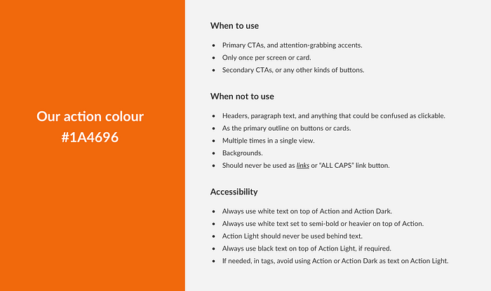
Colour Palette
Our colours are designed to clearly communicate actions, status, and direction within the interface. They serve to make things easier to understand and recall.
- Colours for communication: Each colour in our designs has a clear purpose and meaning. If a colour does not communicate, we don’t use it.
- Design for accessibility: Colour combinations should be created with colour blindness and contrast in mind. We choose contrast over trendiness.
- Colour should guide, not distract: Use colour to help clear calls to action stand out.
Type Scale
The type scale includes a range of contrasting styles that support the needs of your product and its content.
It is a combination of styles that are supported by the type system. It contains reusable categories of text, each with an intended application and meaning.
We used 13 basic styles which define the content structure. These styles are further modified into Text Styles which cover all the scenarios in the UI.
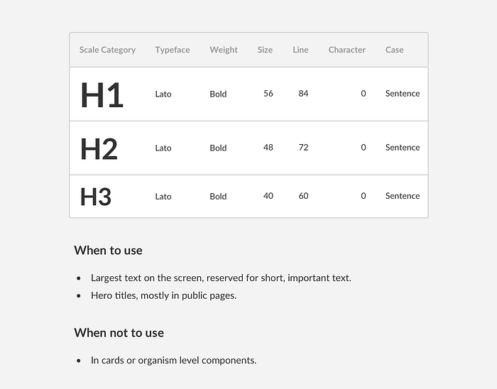
When the text styles were defined, we covered the Mobile Scalability, Line Lengths, Combinations with other styles, etc to define the usage and behaviours.
Shadows
Shadows provide cues about depth, direction of movement, and surface edges. A surface’s shadow is determined by its elevation and relationship to other surfaces.

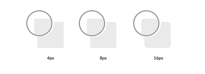
Border Radii
…and we went ahead covering Spacing, Layout, Grid and Fluidity. I won’t elaborate on these as you might have already read millions of articles and above all, there’s Material Design which was the core inspiration behind our system. So, moving on to the next step!
2. Building a component library
…or revisiting an existing one.
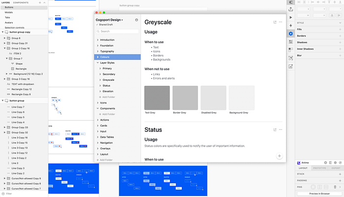
Remember at the top of this article, I got a component library in the name of a Design System? Yes, to our advantage, we already had a base library set up. We just needed to analyse it thoroughly, add or tweak components wherever needed, and most importantly, define these 4 parameters which were missing initially:
- Types
- States
- Usage(Dos and Don’ts) and Behaviour
- Specifications
In order to survive in the system, every component should be driven by the above parameters. Else, it’ll end up like these pillows:
I’ll explain how we tried to structure all our components in one place. Describing all of them here is suicide so I’ll just give you the example of our selection controls.
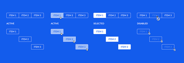
Selection controls
Everyone gives examples of the humble button. I thought I’ll let it stay that way, humble. So instead of a button, let’s see how we determined the structure of our selection controls.
Selection controls allow the user to select options. They can lead to a change in the current layout or add a new functionality in the same page but they never take the user to a new page.

Incase you feel that a component needs to be created by grouping of same or different components, always break it down while defining the states. I did this with tables, button groups, tabs, etc.
3. Lastly, documentation!
By this step, designers get tired and just want to get over with it. Like I am, trying to finish this article.
Bluntly put, we need to double our energies in this because this is the most important step of all. This defines the entire experience of your Design System, how people will use it, and what will happen to it once you are no longer part of the team.
We explored several tools for documentation like Zeroheight and Invision DSM.
I made a free account and started working on Invision DSM. The Craft plugin for Sketch, version control and collaboration features made documentation very smooth. But we couldn’t deploy it of course. Budget.
Role of Atomic Design Methodology
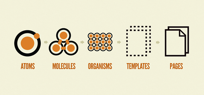
On an end note, I’d like to mention Brad Frost’s Atomic Design Methodology. Ever since I’ve read about it, I’ve been fascinated by the concept and it helped me understand the building blocks of a Design System and how to make the process easier. I’ll talk about Atomic Design in detail in another article, the basics and how it shouldn’t be limited to a component library.
Until then, keep creating Design Systems!
Oh I have something for you guys. Here are some reference libraries which might help you understand the process better.
Thanks for surviving!


