Doing user testing doesn’t mean you’re getting user feedback

In this post, I share some of what I’ve learned about the challenges of user testing sessions, some of my favourite approaches to testing product design, and how we can empower our users to positively influence UI direction, while we focus more on UX solutions.
👋 “Hey I’m Ben, I designed this product and I’m looking for some feedback.”
I’ve seen people introduce themselves this way when conducting testing sessions, and if I’ve learned anything about running them, it’s that this is not a great way to start things off. Here’s why: people are less likely to be honest with you if they think they’re criticizing your work.
If you want honest feedback, don’t tell someone you’re the designer.
While there’s something to be said for empowering users by letting them speak directly to those who can create change, people are far more likely to be honest with you about creative work if the person who created it isn’t in the room to hear the feedback. It’s not easy to give criticism, and often times as designers criticism is the only thing we’re looking for. So, to get the session started, an introduction can set the tone for what kind of feedback you’re actually going to get. Lines I’ve used include:
“This prototype was done by a consultant and were getting some feedback on the direction. We’re not sure if it’s the right way to go, so we’re talking to you to find out what you like, and what we could change.”
“The design team put this together as one of a few different directions were considering for this project. It’s pretty early days in the project, so any feedback, good or bad would be super helpful.”
“My dog ate the original, this is one the cat did.”
Ok… the last ones not true… but it proves my point that I lie when I want to engage a user group (that’s you in this case).
Think about it though: if your friend came up to you and said “hey, listen to this song, I’m the lead singer” and you didn’t like it would you tell them that? Working in a creative world means sometimes distancing yourself from your work if you want honest feedback.
Another thing…
Prototypes have their limitations.
No matter how hard they try, it seems like prototyping tools just aren’t there yet in a lot of ways. Don’t get me wrong, I’m impressed with teams like Craft and Figma putting some serious progress into their latest series of updates, but at the end of the day there’s nothing like actual coded product. Instead of trying to force a replicable experience out of a prototyping tool, and getting inconclusive feedback, I focus more on testing my interface, rather than my experience flow. I do this because when it comes to getting a user from point A to point B, we’re the experts — when it comes to building an intuitive, easy to understand UI, users are the actual experts. I rely mainly on two indirect forms of interface testing that can highlight the strengths and shortcomings of an intuitive and clean UI:
The memory test:
My favourite. I love this one. Here’s how it works if you’ve never tried it: explain to a user that you’ve designed a screen, and you’re looking for what pieces of that design stands out. Then, show the screen while continuing the conversation – I even try to be animated during the exercise by talking a lot, or I’ll wave my hands around a bit while I’m chatting (no joke) to keep the users eyes bouncing around in our environment while they look at the screen. I’ll show the screen for no more than 3–4 seconds, then, I close the screen and I ask them “So, what do you remember about what you just saw?”. If I’ve designed this right, the user will remember the hierarchy in the order of importance I’ve designed it for. They’ll remember the CTA’s we want them to engage with, and the elements or pieces of information they need to accomplish the tasks defined in the user stories we’ve created.
The puzzle exercise
Ever try to design a big data table? What a nightmare… what’s important? What’s not? Who knows… other than the user. It’s all just numbers and letters. So, as the designer, I know “we’re the experts” but we’re really not. When you think about it, product designers spend most of their time telling other people to tell them how to do their job, because we don’t know what they want unless we ask.
How do we solve this? Does the save button go at the bottom or the top? Is the date more important than the address? How do we know what an intuitive and easily digestible layout is for a mundane, balanced information screen is? Easy, we let our users draw for us.
Now, before my boss starts reading this and thinks I just delegate all my work to user testing, hang in there while I explain how to properly lead and get value out of this exercise.
Here’s how it works:
Let’s say we have a clean UI, but we want to better understand it’s value.
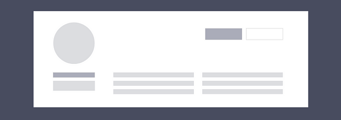
Here’s what we give our user:
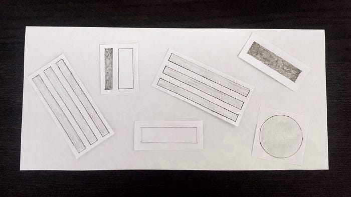
Then, watch the magic…
Let the user build out the UI the way they see it. Try to understand if people scan hierarchy left to right, or right to left, in a z formation, up and down, etc. Make sure you pay attention to the immediate reaction to this exercise — peoples choices based on gut are often revealing and a lot of the value of this comes in the first 10%, not the end.
The best part of these exercises? It’s versatility. This is effective for all types of visual design; it can be used for graphic, print, application and web and only take 4–5 minutes per user.
Note: you’ll need to create containers and sizes appropriately for this to work. Always test your paper prototype yourself before you give it to someone else to find any quirks in your arts and crafts skills.
If you want honest feedback on your designs, distance yourself from them, get feedback on UI more than UX, and do it often. You’ll be amazed at what you learn about how people understand your designs.