Optimizing the food ordering experience — a UX case study
How might we redesign the interface of DoorDash mobile App to optimize food ordering experience

Background
As a foodie who orders food delivery extensively from various of mobile Apps, including UberEats, Postmates, GrubHub, and more, I encountered frustrations when using DoorDash. So I challenged myself to redesign DoorDash’s interface to optimize the ordering experience within 2 weeks.
With that said, I understand that this is a redesign without access to actual user data, success metrics, the entire business context and rationale behind design decisions; and as an individual designer I have the luxury of working in a “perfect world” without constraints. The intention of this side project is just to challenge my product thinking and interaction design skills on a product I admire and use frequently.
I started this project with many assumptions about what matters to food delivery service users the most. To challenge these assumptions and discover new insights, I took a step back to look at the mindset and values of users of food-delivery services.
I interviewed 5 frequent users of food services, and 80% of them have used DoorDash previously. These interviews helped me uncover a key problem to solve for this redesign challenge.
Side note: This is a self-directed project. I am not affiliated with DoorDash.
The Problem
Among all food-delivery app users who have tried out DoorDash previously, 80% indicated that they couldn’t find restaurants and food items easily and quickly, and that “it seems like DoorDash does not have a greater selection of restaurants compared to other apps”. Why?
This problem is critical to solve because it directly causes users to switch to other food-delivery services — in an industry in which consumers have low switching cost and high bargaining power.
The Anatomy of the Problem
Food-delivery apps take the restaurant searching and ordering experience and digitalize it. To examine DoorDash user experience, I broke down the problem into two parts.
Part A. Inefficient restaurant browsing experience
Low glance-ability, lack of visual content and no personalization contributed to users’ complaints that “DoorDash doesn’t seem to have the type of restaurants I like”. Inefficient ways to present restaurant options cause the majority of information displayed on homepage irrelevant to user needs. On average, users spent 20 seconds skimming through the home page. Because they couldn’t find what they need quickly and easily, users started to make assumptions that DoorDash does not have ‘good’ restaurants.

Solution: re-imagine restaurant display system.
Current home page design uses a lot of real estate displaying information that users perceive as “irrelevant”: promotional card, featured national partners, and nearby restaurants (without images). While I understand these info fits into DoorDash’s business model, it hurts user experience, which in turn leads to low usage and user retention rate (as this is a personal project, I have no quantitative data to back up this hypothesis, and only qualitative data collected from user interviews)
How might I redesign the restaurant display page to emphasize glance-ability, ease of use, and help users make restaurant selection decisions quickly?
I focused on improving following aspects:
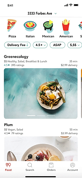
I. Personalize restaurant display without specifying category to minimize cognitive load.
1/5 users I interviewed with actually read the categorization text, which is an indication that these are less important information when it comes to restaurant selection. Additionally, while I didn’t use any eye tracking software, I noticed that users stopped at restaurants that have images most of the time. Among these restaurants, they clicked through those that met their preferences (types of cuisine).
The take away from this observation is that personalization of home page is key. Users are less adventurous on food-delivery apps and only order from the type of cuisine they already like. The redesign didn’t break down restaurants into categorization (e.g, nearby, trending, top national picks), as these categorization are far less important than cuisine types. Instead, it kept a minimal design by only displaying recommended restaurant based on users’ . past order history.
II. Prioritize user needs
Another insight from user research revealed that top factors user care about when selecting restaurants include: cuisine type, delivery fee, time of delivery, ratings. The redesign kept those filters on the top of home page for easy access.
III. Unify visual elements for more compelling restaurant cards
Current design for restaurant cards is inconsistent — while some have images, the majority doesn’t have. This created a friction in user experience.
Part B. Low scan-ability of restaurant menu
DoorDash digitalize the restaurant ordering experience, hence it needs to provide a menu browsing experience that is streamlined and clear. 5/5 users in my interviews brought up their frustrations with navigating the restaurant menu. There were “Too much click around before I see menu items”
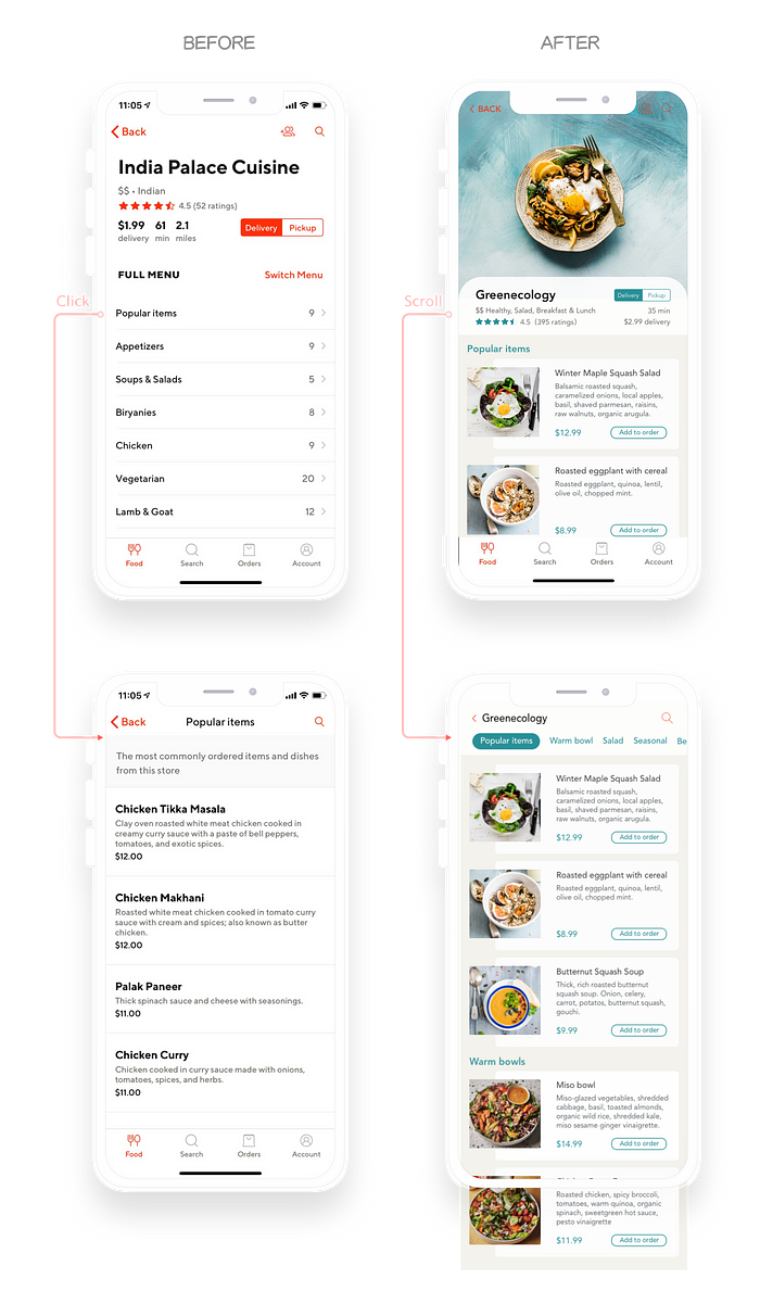
Solution: redesign information architecture and visual content of menu items.
I quickly realized that the information architecture (IA) of the restaurant menu page should be redesigned. A good IA aims at organizing content so that users could easily adjust to the functionality of the product and find everything they need without big effort. Instead of hiding menu items deep in the information architecture, all the menu items should be showcased in front of a user immediately.
How might I redesign the menu ordering experience to anticipate user needs? What information do users need upfront when choosing food items from the menu, and how might I design the interface to display the exact amount of information without overwhelming them with too much content?
To answer these questions, I started with looking at various menu designs of popular restaurants. Below are some of the key insights:
a. good menu design uses both visual and verbal content to guide users through food ordering experience.
b. menu ordering is visual.
c. a short description of the food item with key ingredients help users make decisions quickly and easily.
Reflections
As an aspiring UX designer, I constantly look at design best practices and evaluate various of digital designs. This project is a hands-on practice to translate my ideas into the redesign. Given the scope of the project, limited resources and time to do a proper user research, I framed this project to optimize user experience within DoorDash’s existing functionalities and microinteractions. I realize that those 5 user interviews is insufficient to understand different customer segments for new product features, but sufficient enough to reveal insights to improve microinteractions, which engage users with the product easier, more pleasurable, but are oftentimes overlooked.
If you are getting value from this post, please 👏 to help others find it. Feel free to reach out at LinkedIn or leave a comment below — I genuinely value your thoughts and ideas.

