Doripod 🐟— a UX case study

Doripod is an reward app which is suffering from bad user reviews and misleading user flows that confuses users who just downloaded the app. I took up this project from my hackathon mentor who is one of the co-founders of Doripod. My task as a UI/UX Designer will help Doripod from doing user research to building interactive prototypes. I have also come up with my own UX process that help guide me and my client into understanding the problem to designing the solution for Doripod.
My UX Process

Every idea or wireframe is frequently tested by myself and other stakeholder if any of us find any problem or solution I will need to bring it back to the Ideation phase to sketch out the flow and solution on a piece of A4 paper.
The Problem (Empathise)
According to the reviews of the app on Google Playstore which are bad the app is experiencing ridiculous flow issues and SMS verification issue. Each of the review scores are only 1 star which is very poor because it is the lowest rating you can get.
I tried it on myself by downloading the app and also got confused by the user interface and flow of the app. It certainly needs a complete revamp.
Finding the Sign Up button
The first thing I notice when I use the app is that it didn't ask me to sign up. When I try to access other areas of the application it ask me to log in instead. I have to explore around to search for the sign up action button. What I found out in the end was that I need to access the login page to able to locate the sign up action button.


Poor Sign Up Flow

The sign up flow and transition is very poor in Doripod.
- The interface of sign is broken
- The registration transition is bad and messy
- It uses confirm password method which slows down registration process
- The worst thing is that it goes to a white screen after sign up is completed. I need to restart the app to be able to use it.
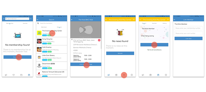
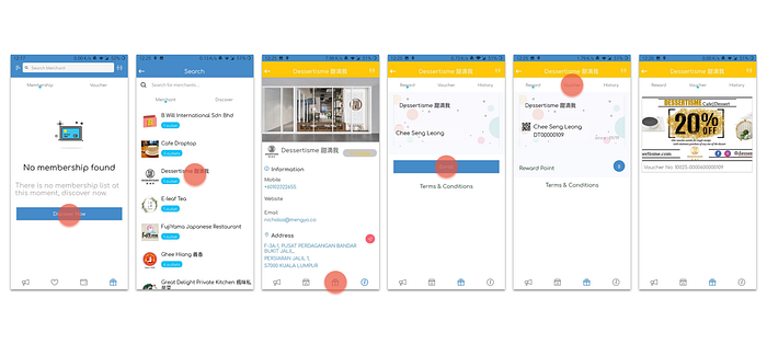
Merchant Membership Registration Flow
As Doripod is a reward app from shops, customers will need to register themselves to a specific shop/merchant to be eligible for point, voucher redemption and e-wallet usage.
The flow of a customer finding the register button is confusing enough for them to abandon the process and the customer acquisition part has already failed. Another issue is that there may be a chance that a customer cannot register to the merchant or store because there is no option to which is disappointing and frustrating for the customer after going through all the steps.
E-wallet Feature
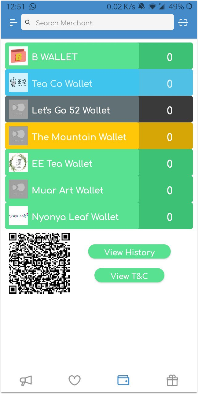
Limitations:
- Every merchant/shop has their own e-wallet, it will be chaotic when there are too many
- Customer will need top up the wallet by paying cash to the merchant (no bank transfer)
Research
Method
- Competitor Analysis
- Survey
Why
- Validate Assumptions
- Find the relationship between the co-existence of e-wallets and rewards app
- Discover reason why some people don't use e-wallets
Competitor Analysis
To be able to find inspiration and solution for Doripod, There are a lot of apps that rewards their users by having them to complete certain task or action but the ones I have selected focus on e-wallet and coupon redemption. I downloaded some new apps and also talked about the ones that I have been using.
- Shopback
- Focuses on coupon code redemption for online purchases
- A lot of variety of coupon codes
2. Boost
- One of the e-wallets in Malaysia
- Link bank account to transfer fund into e-wallet
- Provide cash backs to customers after purchase
- Discount code purchase for both online and offline purchases
3. Grab
- Emerging super-app
- Link bank account to transfer fund into GrabPay
- Has GrabPay, pay to earn points
- Points earned can be used to purchase rewards (discounted prices on rides, food, items)
4. Touch ‘n Go eWallet
- Able to link TnG card
- Has a variety of discounts for the usage of the e-wallet
Google Form Survey (Version 1)
I sent out a Google form to my friends, colleagues, and also posted it on Facebook to gain some traction. I got 31 responses. Before looking at the charts and graph some general insights collected is more than 95% of the respondents are working adults and 41.9% of them exist in the age group of 45-54 years old.
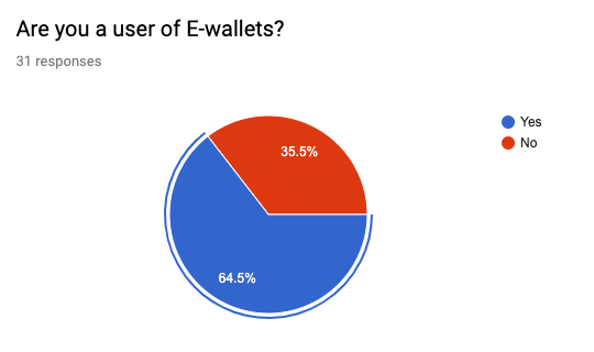
As expected the amount of e-wallet users is still more than non-e-wallet users.
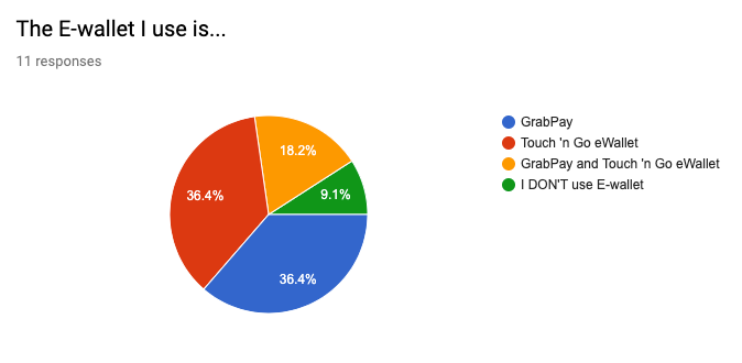
E-wallet Users
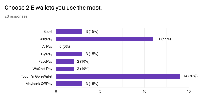
An interesting insight about the types of e-wallets being used in Malaysia. The results actually lead me to create another survey to further investigate the reason behind the high usage of GrabPay and Touch 'n Go eWallet.
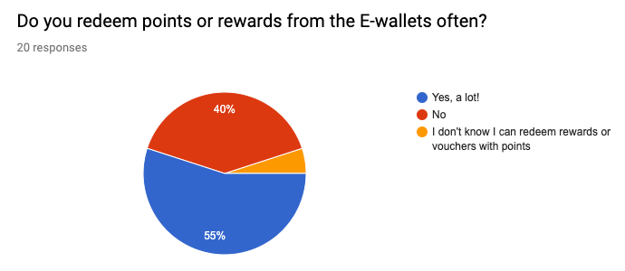
Since most of the e-wallets are associated with rewards and loyalty the assumption has been confirmed customers use e-wallets to gather points and redeem rewards.
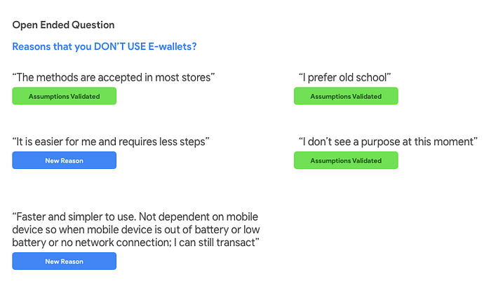
Non-E-wallet Users
I also gathered data on people who prefer the traditional payment method and their reasons behind it.
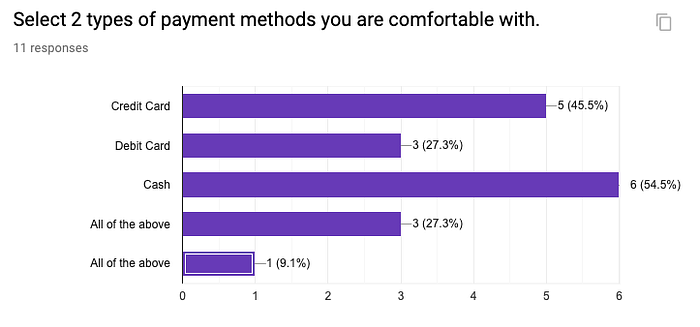
Cash is still considered to be easier to use compared to digital wallets in Malaysia.
Google Form Survey (Version 2)
After going through results and found out that GrabPay and Touch 'n Go eWallet has the highest user rate in the research I decided to conduct another in-depth survey on these 2 apps to find out the reason behind the high usage.
Why
- TnG is the most popular app among the 45-54 age group simply because it integrates with toll payment and also the TnG card which is essential for most Malaysians as the card act as payment card for parking, public transport, rebates on services.
- GrabPay has a good amount of partnership deals with a lot of merchants around Malaysia and always has promotion for users when using the E-wallet.
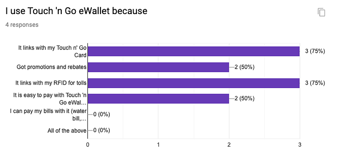
My assumptions are right for TnG eWallet.
- The first reason of it's high usage because it actually links to a card that people will need to use everyday.
- The second reason will be the linking of RFID tag to the app account.
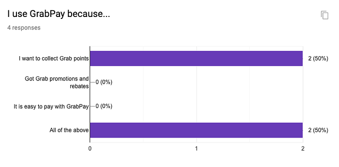
My assumptions are right as well for GrabPay.
- The users are mostly young adults
- They want to collect Grab points and there's a lot of promotions
- It has a lot merchant partners around Malaysia so it is easier to pay with it.
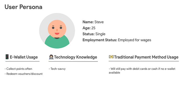
User Personas
I created 2 personas who are May and Steve from the first and second survey to further visualise who I am designing for.

User Stories
To understand more about the personas I created, I illustrate their daily life story to further explain how they perform in their daily life.
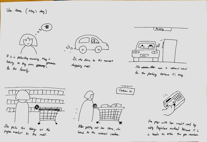
May's Story
Steve's Story (Ordering food through his phone)

Steve's Story (Eating at a restaurant)

Ideation
Team Discussion
I use Miro to write out ideas on digital sticky notes together with my client who is a developer and business stakeholder. He wrote down his ideas as well for Doripod. We discussed about the ideas generated via Skype to pin down necessary actions.
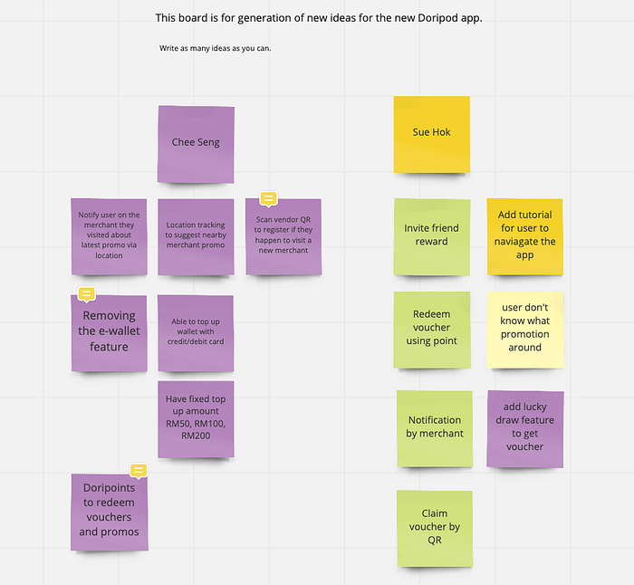
From the research datas, user personas, stories and discussion. Here's the few components we think that Doripod should have.
- Easy Point and voucher redemptions
- Displaying upcoming and nearby deals for users
- Removal of e-wallet feature (pending)
Sketches


Some early sketches done for Search, Point Collection, Viewing voucher, etc. There will be more sketches to visualise different iterations after multiple rounds of discussion and testing with stakeholders. Sketching is never done in only 1 phase it is continuously iterative.
Medium Fidelity Designs

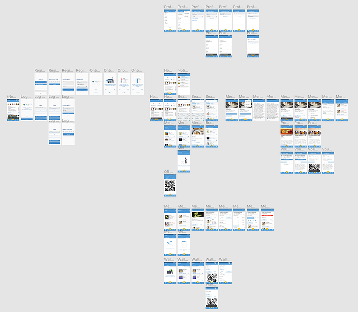
The image above shows you the entire medium fidelity of Doripod prototype. It is actually separated by sections like registration process, on-boarding process, applying merchant membership, etc. I have also created frames (or artboards) that shows the evolution of some parts of the application. You can view the wireframes here
Team Discussion 2 and 3
2 discussions were held through Skype to agree on parts that can be implement and also find missing parts that should be inside of the application.
Things to be added
- Navigation and viewing of merchant branches
- Implementation of Membership Tier
- Merchant membership registration flow
- Merchant contact and social media links
Home page
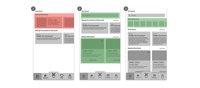
The image above shows 3 versions or iterations of the Home page design. It started out as just plain display and with too much whitespace at the bottom. In the 2nd version, I added a search function on top of it and also redesign the entire merchant card to display more information. After discussion and minor testing with stakeholders I added another section just below the search bar. The new merchants section.
Merchant page
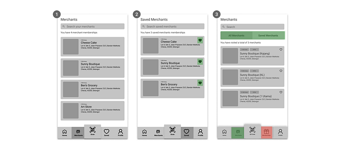
On number 2, I added a micro interaction on the merchant which enable users to save their favourite merchant immediately. After discussion I iterate again and made some huge changes to both saved merchants and its navigation. Number 3 shows that Saved navigation button has now been changed to Membership navigation button. I moved the Saved page and integrate it with Merchants page by having a tab function to switch between two different information.
Merchant Details page
Version no.1 has 3 tabs to display the history/activities conducted with the merchant. It also has a point display for point or stamp collection. Version no.1 was designed with the idea of enrolling to a merchant means enrolling for a membership without membership a user can't do anything with it. On number 2, I reposition how information is displayed and added a button that will direct users to the merchants membership page where they can redeem vouchers and collect points (it acts as a virtual member card). This version enables users to use vouchers that is not limited to only members of the merchant.
Membership page
Replacing Rewards page with Membership is the biggest change of this part. The membership page will act as a page that stores all your membership subscription or cards where you can easily access them. The 3rd version is a minor text change on availability of vouchers.
Membership Details page
This is a new page that shows details of a membership of a merchant. This page can be accessed from Merchant Details page or Membership page. No. 1 shows that vouchers have thumbnail images and I later removed it in No. 2 as I find it wasting too much space. In No. 2 I also added text button to afford actions on the vouchers. If a voucher has not been purchased then it will display "Purchase voucher" else it will display "Use now". After some discussion with my client we decided to put the thumbnail image section back and reposition the button to be more organised.
Merchant Details page functionalities

The discussion also helped me to include some important minor features to merchant details page. I added a icon that signifies more function where users can copy the merchant's address, share merchant's page to friends and also open merchant's location on Google Maps or Waze for navigation. We chose No. 2 because user can still save their favourite merchant immediately with extra functions just right beside it.
The comparisons above are selected to be shown here because they have gone through some significant and interesting changes throughout the iteration process. I cannot share the link to the mid fidelity as it a paid project but if you are interested you can email me to get to know more about it.
High Fidelity Designs (Prototype)
This is the high fidelity prototype of Doripod. I built the new interface with the foundation of Google's Material Design Guidelines and UI Kit because I wanted to learn about the design system.
Team Discussion 4 and 5
These are the 2 final discussions with the team that has developers and business stakeholders to test out and iterate or add mini functions around Doripod. I chose some of the most important parts in the prototypes to indicate the iterations.
Navigation bar
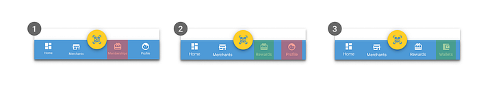
The navigation bar has 3 iterations throughout the design process because we decide to prioritise E-wallet page over Profile page.
- This version has all the basic pages that Doripod should have.
- After discussion 4 we wanted to display available vouchers easily so that we added that feature together with memberships and change the navigation name from Memberships to Rewards.
- The final version of the bar. Although I have stated that E-wallet shouldn't be a priority in the system but later on my client explained that it is a request from merchants as well. So we remove Profile and replaced it with Wallets instead.
Home
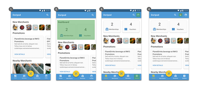
The most important page in Doripod as it the first page when any new or existing users will see.
- The original version is designed with cards as a container for information.
- With the introduction of Rewards page, we decided that we wanted to tell users the amount of memberships and available vouchers they have. 2 mini cards were added.
- Wallets feature came in and I need to swap out Profile tab and place it on the top right corner. I also removed the heading dashboard to review more information about merchants in the page.
- Notification icon is added in between of search and profile.
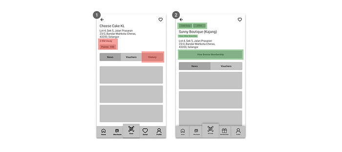
Merchants Details page

- This version consist of the basic functions of a merchant page where user can view merchant information, their news and also available vouchers.
- The 2nd version included 2 things which are a label that tells user that this is one of the stores and a button that can view other similar store but in different locations.
- The 3rd version consist of a button that will open a wallet page of that merchant because each merchant has their own dedicated e-wallet.
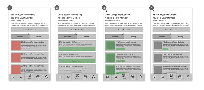
Membership Details page
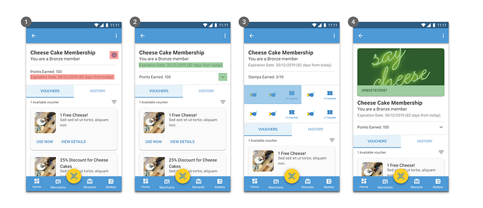
The membership details page can be accessed in both merchant details page and rewards page.
- This version has an information icon on the right side and membership expiration date just below the points label which will be removed in the 2nd version.
- I moved the membership expiration date above together with the title and membership tier to create the relationship between them. I also added a chevron down icon for the points as it will reveal the point expiry dates.
- This another version of the 2nd version. The only difference is that it is using stamp collection technique.
- This final version included a simple card that has a membership code if the QR code functionality does not work.
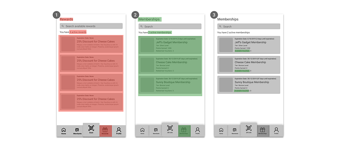
Rewards page
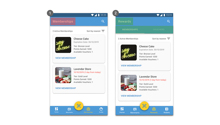
- This version is previously called Memberships page where it only display memberships the user have.
- The page is renamed to Rewards because it also shows available vouchers the user have.
The finished prototyped is then imported into Zeplin where my client can then exported it into code. Feel free to play around the prototype here
Conclusion
Challenges
The biggest challenge in this project is leveraging business needs and usability of the design because I need to learn how the business work and implement it into my designs even though sometimes it is a bit feature packed but it’s my job to balance it.
Things that I learned
Communication is key in this project. We had a total of 5 Skype calls in the span of 3 weeks. We need to listen to each other’s opinion and in the same time provide constructive feedback to the ideas suggested from software developers and business executives in the team.
What can be improve?
The first thing that come in mind will be the interactions. This is because I wanted to learn about micro-interactions and its effect on user testing.
The second thing will be actual user testing with external stakeholders. The testing and evaluation has so far been done by 1 external stakeholder who is my father and he managed to interact with the interface without much problems.
Acknowledgement
My client is very helpful and also gave me full authority and flexibility to design the UI. I am grateful to have them as clients. They also listen to my research data carefully and also thankful that the data I provided is actually useful for them in the future. I hope I can see my designs in action in the next few months after they develop it.