Easing and timing animations in Adobe XD
Welcome to part 2 of my tutorial series on the Auto-Animate feature in Adobe XD! In the first article in this series, we went through some of the most basic of features in XD, working our way into animating a small square. If you haven’t read that yet, and have little experience in XD or with the auto-animate feature, you can read that article here.
In that article, we learned a few key things about Auto-Animate:
- It looks for differences between two artboards, and animates between those changes.
- For a layer to animate, it’s name must be the same on both artboards. This includes but is not limited to groups and components.
- Each element within a group or component can be animated separately (This is because Auto-Animate sees the changes to each element within the group independently).
Knowing these 3 basic principles, we can start expanding our animations to do some more interesting things. But before we start creating more animations, I want to go over some more of the properties available within auto-animate, namely, easing and timing. These properties can create an entirely different feel from a relatively basic animation, so let’s get started!
Part 1: Easing
In the real world, motion is not instant. Things take time to accelerate and decelerate. For example a car doesn’t just go instantly from 0 to 60, it takes time. This is where easing animations comes in. We use this so that animations don’t feel jarring or unnatural to the user.
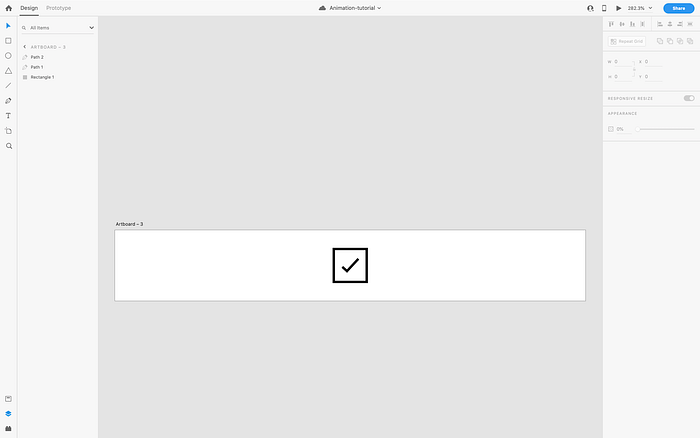
Let’s start with our file from the previous article, and we will apply some easing to our little box. Here’s where we left off last time:

If you take a look in the properties panel to the right, you will see a few options. We will talk about the trigger more in future tutorials, but for now let’s focus on Easing.
If you click on the Easing property, you will see quite a few options here. Let me explain the basic principle of each:
- Ease Out: This means that the object will instantly move at top speed, only slowing down as it reaches the end of its animation.
- Ease In: Exactly the opposite of Ease Out. It accelerates from 0 to top speed, and then stops abruptly back to 0 at the end of the animation.
- Ease In-Out: The most basic, realistic of animation easing. It accelerates from 0 to its top speed, and the slows back down to the end of the animation. This creates a nice, smooth animation.
- Snap: This one is interesting. Instant top speed, moves slightly beyond its final position, then goes backwards to the ending point of the animation.
- Wind Up: Same as snap, but in reverse. The object moves slightly backward, before moving at top speed to its final stopping point.
- Bounce: Exactly what it sounds like. The object moves at top speed to its stopping point, the “bouncing” back a little before actually stopping.
While some of these are not as smooth as others, they all provide a sense of “normal” movement to the user. Something that’s predictable and looks nice. Keep in mind though, certain easing properties look better in certain circumstances. For now, try each of those easing options on your box, and see just how the effect looks, and try to get a feel for exactly what each one does. Once you’ve done that, we will use what we have seen to create an animated check-box.
Part 2: Creating our check-box
The following part of this tutorial assumes a basic knowledge level of creating elements in XD using the shape tools (box, circle, line, etc.)
Let’s start by making our artboard little bigger. Go ahead and delete the second artboard we made, so you only have one, with the box centered. I also adjusted that artboard to be taller, 60px in height, and made the box 30px square, with a 2px black border. You should have a screen like this:

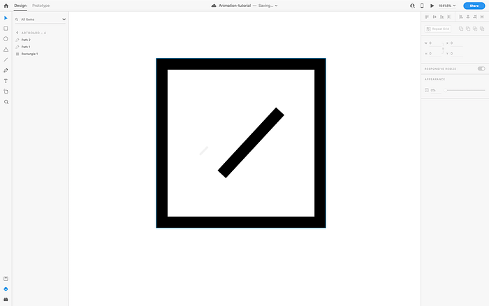
Our next step is to make the “check”. I used the pen tool, and created 2 separate segments, set the border to 2px, black, and carefully lined them up to get the desired result.
If you used the pen tool to make 2 lines, double click on the shorter part first. You will notice you now have just 2 dots, one on each end. You can move these around to adjust the alignment of your lines. Do this with both lines to match them up nicely as shown below:
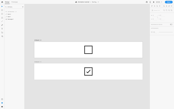
Now that I have my end state for the animation, I’m going to create my starting state, which will just be the empty box. To do this, I just click on the title of the artboard, hold ctrl/option, and drag upwards. This duplicates my artboard. Now with that copy in place, I’m going to make the check mark invisible, so we can animate it in later.
I’m going for a drawing effect, to make it look like someone is writing the check mark in the box. Usually, someone would draw the check mark from the far left, drawing down to the right, and the moving up and to the right to finish the long tail. How do we accomplish this XD? Simple!
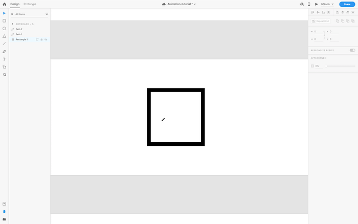
Double click the short line again, and with the handle on the lower right side, shorten the line as far as it will go, and then set the opacity to 0.
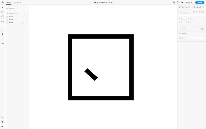
Repeat that process for the long line, shorting it to the lower left, where you would draw it from, and decrease opacity to 0.
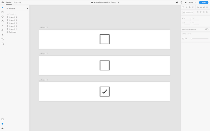
You should now have 2 artboards, like this:
We could in theory auto-animate this right now, but it would end up choppy. Why? Well, try it, then I’ll show you. Go into prototype mode, and connect the box in the first artboard to the lower artboard. Set the trigger to tap, and the action to auto-animate like so:
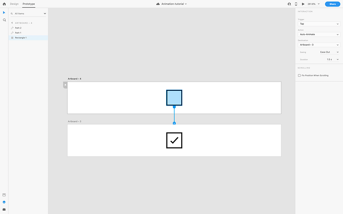
Now preview it!

It’s not bad, but we have some timing and drawing issues. First off, you may notice both lines draw simultaneously. That’s not how we draw for real, is it? Also, you can see how the opacity changes over the course of the entire animation. We don’t want that either! So, since we need to add more steps, we need to add more artboards…
First, get rid of your prototyping connector by clicking it and dragging it over empty space so it’s not connected to anything. Now, move your upper artboard even higher up, and let’s duplicate it below to give us a third artboard.
Now we need to make the opacity change instant, so that it doesn’t change over time. We don’t want both lines to become visible at the same time though. So let’s just find that shorter line, and set it’s opacity to 100%.
Now we can drag a prototyping line from the first box, to the second artboard, and set up our auto-animate transition. We want this one to be as quick as possible. Set the easing to none, and the duration to 0.1s. We don’t want the user to notice this transition, since we are just setting things up to make our animation draw correctly.
So, now that we have our line prepared, let’s draw it. Duplicate the second artboard down to create yet another, and in this one, lengthen your line to where it matches up with the longer one. To line it up correctly, I increased the opacity on the longer line, so I could see where the shorter one needed to end up, and I left it at the full opacity because the first line is covering it anyways. The animation will happen quickly enough the user won’t notice the change, and we will already have that longer line prepped for drawing in the next stage.
Now we can prototype it. Connect a prototyping line from the artboard (not the box), to this new artboard. We could animate it like this. With our current settings, we would click the previous artboard, and the line would draw to this new length. But we don’t want to have to click for every stage of the animation!
Instead, in the properties panel on the right, set the trigger to “time”. Time is only available when using an artboard as the trigger object, which is why we used that rather than the previous box. We don’t want the animation to pause here, so we set the delay to 0s. Use the settings seen in the image below:
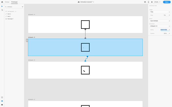
Now when you click the first artboard and hit play, your animation should look like this:

Check it out! You have a nice drawing effect for the first line in your check mark! Let’s break down what’s happening here.
The first artboard is your click, which triggers the opacity change on the first line, which then automatically (via a time trigger) moves to the third artboard, which animates the line from it’s length in the second artboard, to it’s new legth in the third artboard. Read that a few times until it makes sense!
Really all you are doing is defining a step-by-step sequence of events. Once you have this concept down, you can create virtually anything with auto-animate.
Knowing what we know about auto-animate, we already have the second line’s opacity back at 100%. So all you need to do is wire up another timed animation to the finished artboard we created a while back, and that longer line will animate to that finished length. Done! Here’s what it looks like:

Feel free to play around with the different types of easing, and durations for each stage. Toying with these values will help you create interesting effects. Remember though to keep it realistic and not go overboard! Overcomplicating the animation, making it too short or too long, could be irritating to the user.
So keep playing around with what you’ve learned so far, and in my next article we will look into composing multiple animations at the same time to create yet more interesting effects!