Endowed progress effect: Give your users a head start

TGI Fridays is a solid spot to pig out at, particularly with the kind of platters they serve. Those platters are good enough to keep me hooked, but they have another little tactic at play, which keeps me coming back, their rewards system. I earn 1 point for each dollar spent, and after I have collected a certain amount of points, I get rewarded with a free dish!
What’s better is that they offer a free appetiser just for joining ‘Fridays rewards’, to get things started.
This head start gave me the motivation to further pursue the reward system.
This is the Endowed Progress Effect.
What is the Endowed Progress Effect?
It’s the idea that if you provide humans with artificial progress towards a goal, they will be more likely to have the motivation to complete that task.
In 2006, Joseph C. Nunes and Xavier Dreze demonstrated this idea in research titled “The Endowed Progress Effect: How Artificial Advancement Increases Effort”, by handing out loyalty cards to the customers for a car wash. Every car wash would be accounted for by a stamp on the loyalty card. Customers could get a free car wash after 8 purchases.
Customers were divided into 2 halves:
- Group A: given cards with 10 slots, but with 2 slots already stamped out (20% progress)
- Group B: given cards with 8 slots, of which none were stamped out (0% progress).
Researchers found out that 34% of group A (experimental group) had redeemed their cards versus 19% of group B (control group). Both cases had to make 8 purchases, but a larger part of the experimental group, i.e. the group with a head start completed the task; One step is better than no step at all — I was feeling rather inspired.
Long story short, the participants that were given a head start towards completing a goal (by providing them with the 2 free stamps) had the illusion of less effort required, and thus had more motivation to reach the finish line.
What makes it work?
Let us now dive deep at what underlying concepts facilitate this effect.
Zeigarnik Effect:

Ever left a great thriller TV show in the middle? Or left a video game in the middle without completing the goal?
People remember uncompleted or interrupted tasks better than completed tasks.
This effect was observed a Lithuanian psychologist Bluma Zeigarnik in 1927. You can read about her experiment and findings in her research paper titled “On Finished and Unfinished Tasks”.
Whenever a task is incomplete/in progress, it bothers us, and it keeps popping in our head until it’s complete, creating task tension. But that tension is relieved as soon as we complete the task.
Hence, people are more driven and motivated to complete the already on-going task. We all want the satisfaction of seeing that “100% Complete” or that huge green tick mark at the end of completion.
This works really well for TV shows, where they leave the audience on the edge of their seats by putting a cliffhanger in the end.
It’s also super effective for designers to get users to complete a task they otherwise wouldn’t do.
Goal Gradient Effect:

The tendency to approach a goal increases with proximity to the goal.
People are motivated by how much is left, not how far they’ve reached.
In the above example, the coffee shop awards its customers with free coffee after 9 purchases. As the customer approaches the goal of 9 coffees, their purchases become more frequent to reach that finish line.
Also, observing the Joseph C. Nunes and Xavier Dreze’s car wash experiment, the customers with a 2 free stamps boost reached their goal of 10 stamps faster than customers with regular card (despite equal purchases in both). The head start gave the first group momentum, and it took them less time to complete those 8 purchases. The time between 2 purchases kept decreasing as they approached the goal.
This can be a great tool for user retention. If you’re designing digital products and looking for suitable places to apply the goal gradient effect, look for areas where users tend to drift off.
Goal Visualisation Effect:
As people approach a goal, external representations, which increase the ease of visualising the goal, enhance goal pursuit. — Cheema and Bagchi
Basically, when users can visualise the finish line, they are motivated and expend more effort towards completing it.
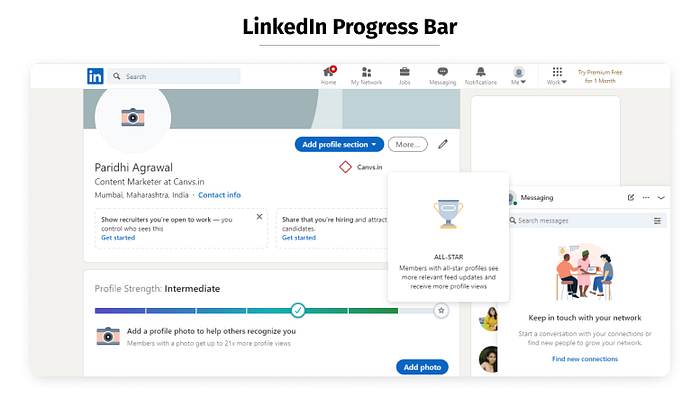
A progress indicator/bar is a perfect example of this. It can help set expectations for the user by indicating what steps are done, where the user is, what are the next steps.
LinkedIn uses this ideally in its user onboarding process, by indicating the users how much of their profile is complete and also recommends what next steps to be taken, like “Add Profile Picture”.
These tools prove to be useful in a product designer’s arsenal to enhance user engagement, user retention, and to motivate users to complete a task. When applied smartly, it could improve the onboarding process of products. It could simultaneously be fun for the users, thus making them spend more time on your platform, in turn, improving conversion and overall usage. After all, Who doesn’t like a head start and that sweet feeling of accomplishment?
Key Takeaways
- Endowed progress effect can motivate users into working harder towards a goal.
- Artificial advancement makes users believe they already made progress, and hence they are more likely to complete the task.
- Reframe tasks to make it look incomplete rather than unstarted (for instance, ‘Signing in’ as step 1).
- The closer users are to completing a task, the faster they work towards reaching it.
- People remember uncompleted or interrupted tasks better than completed tasks.
- Motivation can be enhanced by visual representations of progress and finish line.
The Canvs Editorial team comprises of: Editorial Writer and Researcher- Paridhi Agrawal, the Editor’s Desk- Aalhad Joshi and Debprotim Roy, and Content Operations- Abin Rajan
Follow Canvs on Instagram and LinkedIn. Don’t forget to follow us here on Medium as well for more design-related content.