Enhancing the photo editing experience for novice photographers — a UX case study
Role: UX Strategy, UX Research, Data Synthesis, Mobile Design (IA, UX/UI Design, Wireframing, Prototyping), Usability Testing
Timeline: 2.5 Weeks Sprint
Overview
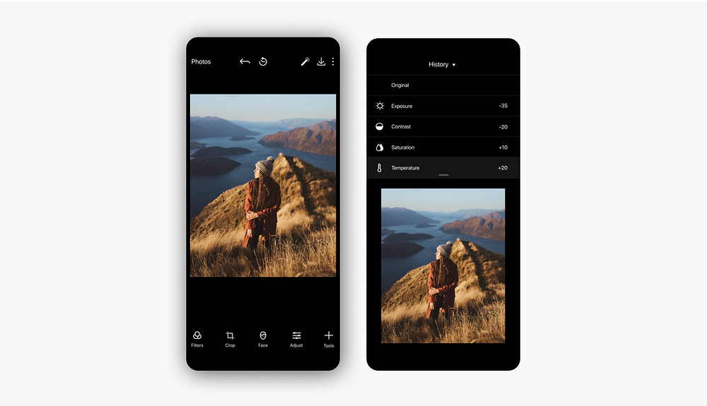
Polarr is a powerful photo editing app used by over 2 million people around the world to help them bring their photos to life. Their mission is to transform the way people capture and edit photos by giving photographers the professional tools and resources they need all in one place.
As part of a 2.5 week sprint, I led a team of 2 UX designers to redesign the iOS version of Polarr with the objective of enhancing usability for novice photographers.
The Problem
While Polarr, has become a leader in the photo editing space, they’re currently struggling to convert downloaders into returning users. This is because the complex interface and abundance of unfamiliar tools cause novice photographers, which make up over half of their user base, to feel intimidated and overwhelmed. Our challenge was to explore how we could enhance the photo editing experience for novice photographers, and ultimately get them to feel confident enough to turn into professional users.
The Solution
By prioritizing existing features and simplifying processes, we designed a more intuitive version of the Polarr Photo Editor to support novice users.
Research and User Experience
Identifying Existing Pain Points
We began our research by conducting usability testing with the current Polarr app. We asked 8 participants with various photography skills levels to complete the task of editing a photo to their liking using the app.
As we observed users navigate their way through the editing process, we identified many points of confusion and frustration. It also gave us a chance to discuss the various motivations of why people edit photos and observe how they generally approach the editing process.
Key Insights:
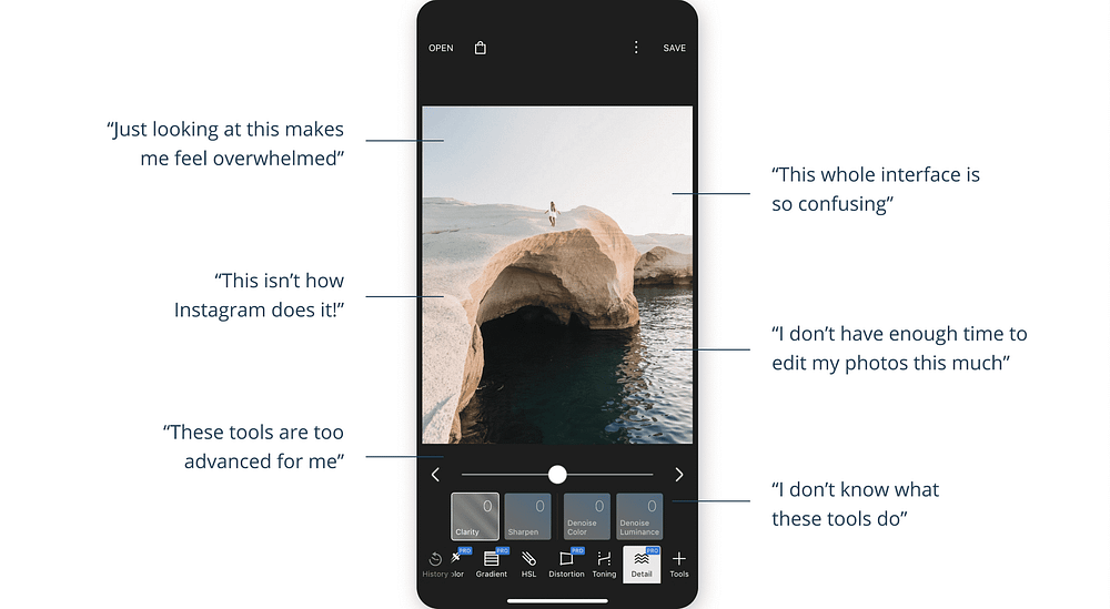
- People felt overwhelmed and confused by the interface
- People were unfamiliar with most of the editing tools causing them to feel intimidated
- People didn’t want to spend a lot of time editing their photos
- People were drawn to the face editing tools and filter customization
- The primary goal for editing photos is to share them on social media
“This app looks like it’s for professional photographers” — Alex Kierlanczyk
Defining our users
Based on the patterns identified in our research, we came up with a primary user archetype:
The Budding “iPhone” Photographer
Someone who is a beginner “iPhone only” photographer and wants to enhance their photos with the ultimate goal of sharing them with others and on social media.
Empathy Mapping
To help us further digest the data we collected from our user research and illustrate the user behavior and attitudes we observed in our usability testing, we created an empathy map based on our primary user archetype. Not only was this important for giving our team a better understanding of user needs, but it also established what user needs we should prioritize moving forward.

Mapping out the photo editing experience
In order to gain a better understanding of “The Budding iPhone Photographer,” we mapped out the end-to-end experience of taking a photo, editing it with Polarr, and then sharing it to social media. This allowed us to identify the greatest opportunities and key touch points for improvement.
As you can see below, there were several points at which the experience produced negative emotions in our user including:
- Deciding which photo editing tool to use
- Understanding what each tool does
- The complex saving process
These were the points that we identified as having the greatest opportunity to improve the current experience.

Restructuring the Information Architecture
We discovered that novice photographers only cared about a small subset of the functions that were included in the app in order to edit their photo. However, they struggled to locate the tools they needed because they were distracted by the plethora of other functions. They also had difficulties because the information architecture wasn’t similar enough to other editing applications they were familiar with like Instagram or Photos.
To solve for this, we needed to identify the top tasks and work with familiar frameworks to restructure our information architecture around. Through observations, additional activities, and discussions with our users we were able to identify the features we needed to prioritize in our solution, and ultimately rebuild the information architecture.
These features included:
- Basic editing tools
- Filters
- Face editing tools
- Auto enhancement
- Crop tools
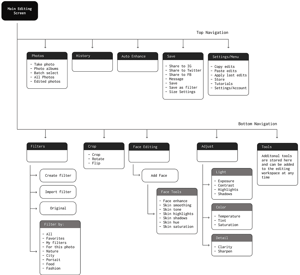
A sample of some of the activities we did that helped us restructure the app’s information architecture.
Design
Defining clear objectives for our design
In response to the pain points we identified during our research, we established 3 main objectives to guide our design decisions moving forward.
These included:
- Simplifying the photo editing process
- Speeding up the photo editing process
- Working with familiar frameworks of other photo editing applications
These objectives were essential in helping us enhance the entire photo editing experience for novice photographers.
Quick and easy access to key features
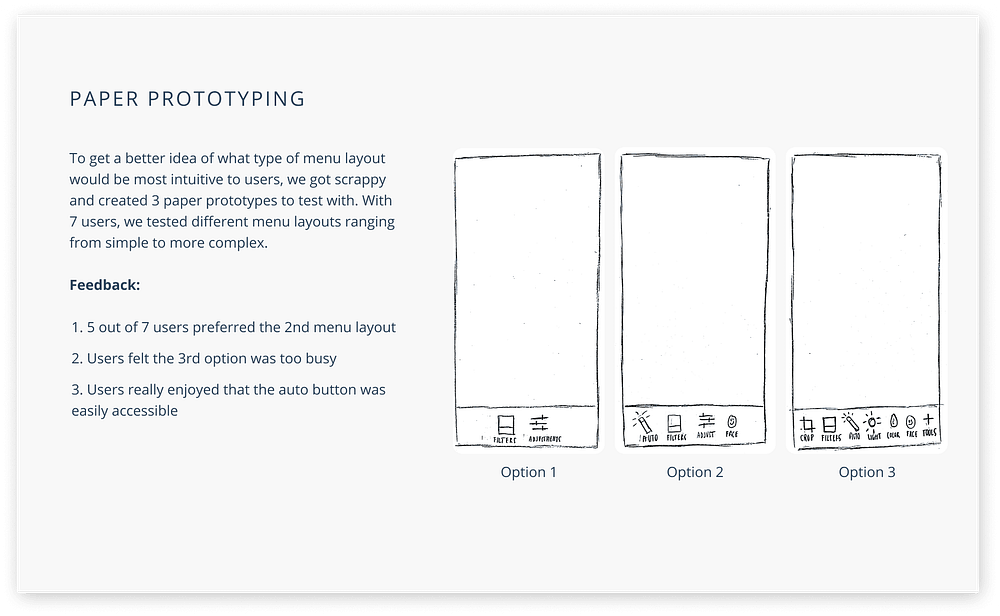
In order to simplify the interface, we made the most important and most frequently used functions quick and easy for users to access. For the functions that were used less frequently, we had them turned “off” on default and stored them in the tools panel. Instead of removing these tools, we wanted to keep them as well as the tools category of the current app. This was because we wanted to give users the opportunity to learn additional tools and advance their editing skills.


Simplified navigation structure
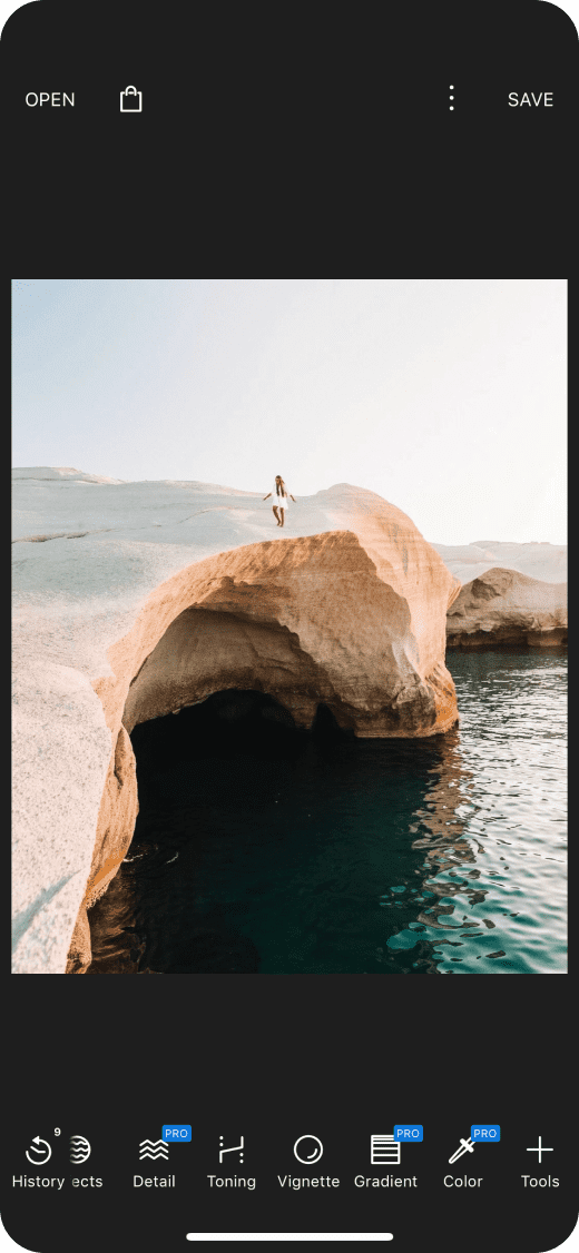
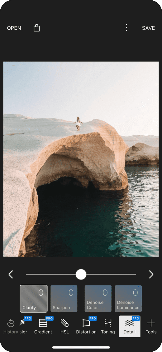
The current Polar app uses a stacking three-tiered navigation structure, which often times covers parts of the photo users are editing. To solve for this we created a more simplified navigation structure, which focuses on one task at a time.


Automating the editing process
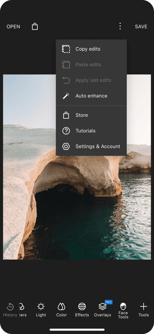
For users that don’t have enough time or photography skills to edit photos, we gave them the ability to speed up the process by providing them with easy access to the auto enhance feature. With our new solution, all users have to do is tap the magic wand icon and their photo is instantly edited and ready to be saved or shared.


Making sharing easier
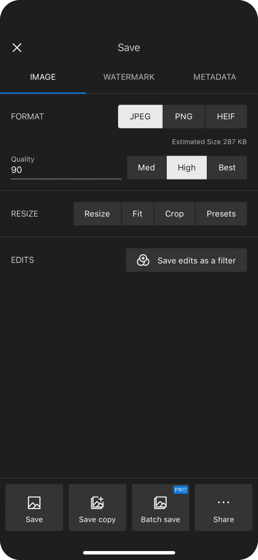
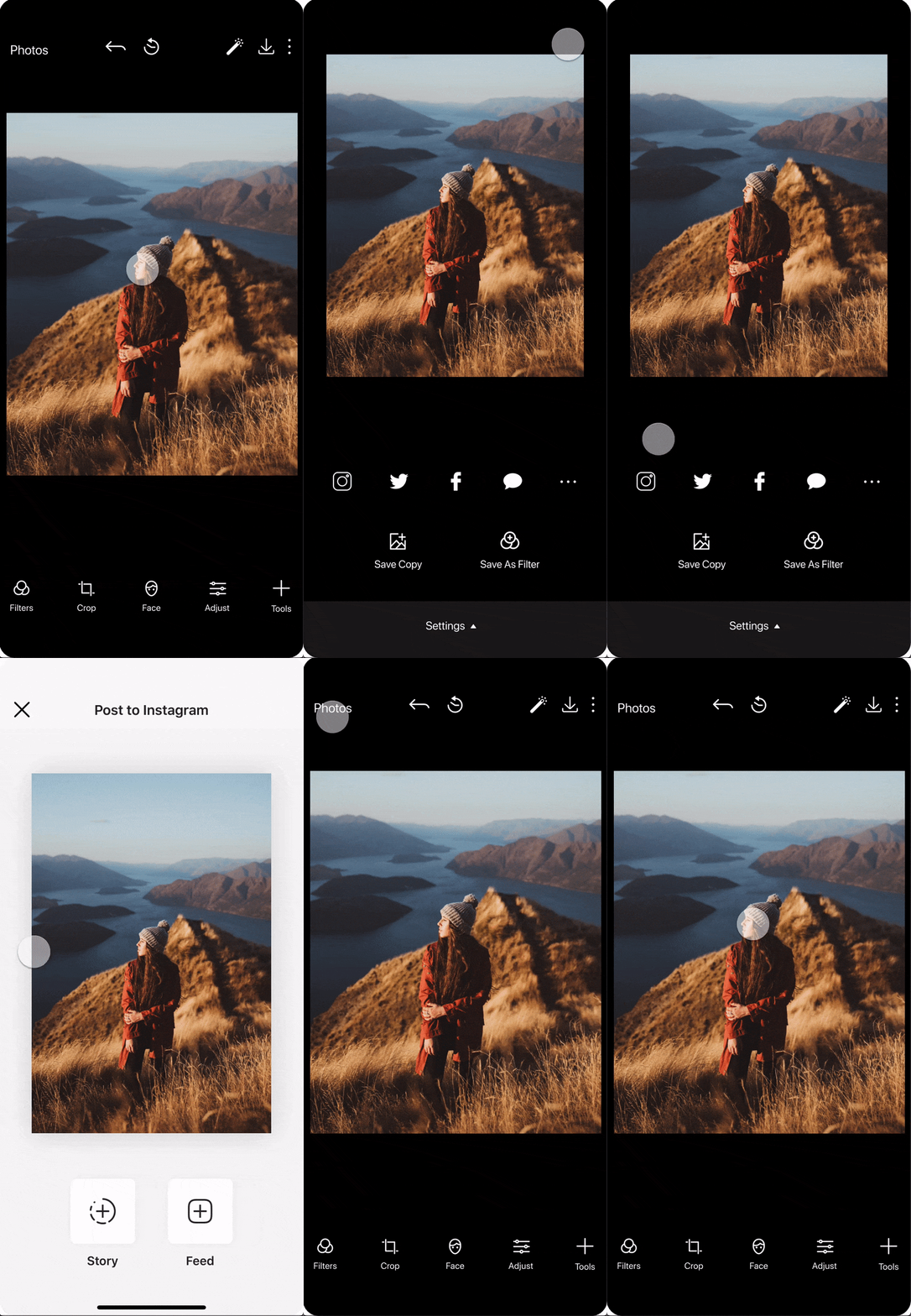
Through our testing and research, we uncovered that the primary motivation for people to edit photos is because they want to share them on social media. Thus, it was important that we made it as easy as possible for users to share their photos once they’re done editing. We achieved this by placing social icons front and center on the save screen to allow for easier access.

Working with familiar frameworks and design patterns
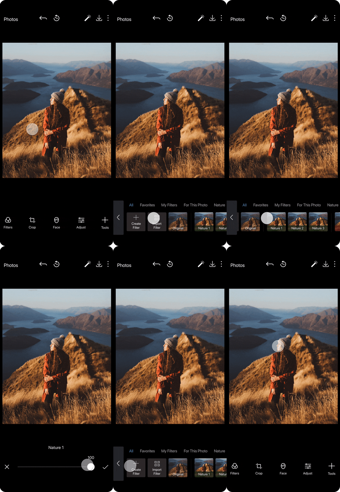
To simplify the learning process for novice users, we worked with familiar frameworks and design patterns. One of the ways we did this was by introducing an “Adjust” category to help users easily locate essential editing tools including light, color, and details. These features were previously spread throughout the app causing users to feel unsure where to go to find the tools they needed.


Next Steps
Testing, testing, and more testing
Moving forward with this project, we would like to discuss the possibility of onboarding and how it could add to the overall experience. However, the main focus for the next steps should be conducting more usability testing and then iterating further on our design based on feedback.
Conclusion
Respecting the boundaries of your constraints
While working on this project it was important that we took a step back to understand the constraints we were working under. Polarr Photo Editor features two types of workspaces: Express and Professional. Because our project scope was solely focused on the Express version of the app, we had to keep Polarr’s existing framework in perspective when making design decisions. This was in order to enable users to easily migrate from the Express workspace to the Professional version once they master more advanced tools.
Overall we had to work within our constraints and keep a majority of the UI elements and tools the same to make the transition more seamless. However, for the design changes we did recommend, it was important that they would not only benefit novice users, but also the entire Polarr ecosystem.
Have a project plan, but be flexible
This project also taught me how to organize a large project on a very tight time restraint. When it comes to leading and working on a team, having a project plan is essential to keeping things in line. However, as much as a project plan can guide you towards success, it’s important to also be flexible. I think this was important for us to keep in mind, especially when unexpected challenges and obstacles were uncovered as the project progressed.


