The power of microinteractions
Even before we understood the meaning of the word “Interaction”, we were already using it in its most basic form — PowerPoint transitions. The most exciting part of making a presentation as a high schooler was deciding how to make the text on the next slide appear. This is where we learned the aesthetic value that a few slide ins and fade outs could add to the entire presentation.

We next saw a more large-scale adoption of micro interactions in the form of loaders. Owing to low internet speed, the first item seen on the screen was the circular loader, which rotated indefinitely. This caused a high percentage of visitors to leave by the time the page could load.


To resolve this, the standard loader was initially replaced by progress bars which allowed the user to understand the status of the system. Eventually percentages and estimated time were added to improve user experience. This was a baby step towards enhancing the user’s experience throughout the wait time.

If the user is given an estimate of the time they need to wait as compared to an indefinite loader, there is a high probability that they will be patient and wait for the entire duration.
Each of these new loaders were built on the first and the most fundamental principle of Jacob Nielsen’s Heuristics for User Interface Design — Visibility of System Status.

This was improved further when more websites started introducing Delightful Loaders. While this was done to compensate for poor performance, it reduced the user’s frustration by a lot. No longer were users annoyed while their page loaded. The more creative the animation got, the more engaged the user became.
The downside to this was that the users stopped getting fascinated by the repetitive animation after a certain point and the frustration returned.

Micro interactions are most commonly used for the following purposes –
1. Delight
2. User Engagement/Attention capture
3. System status and Feedback
4. Minimalization
1. Delight
The most noticeable interactions during a user’s journey are added for delight. This is sometimes where micro interactions become animations. These animations are designed so that they add a little something extra on the screen, something that a client likes to call the “Wow Factor”.
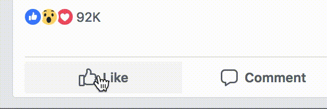
A very good example of micro interactions being used for delight is the new construct of Facebook likes. Even though the long tap to bring up the reactions is an interaction that takes some time getting used to, the jumping emojis are so enjoyable to look at that the new update has become an instant hit.
Delightful micro interactions make the experience for the user feel very personal.
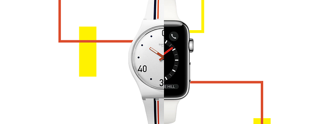
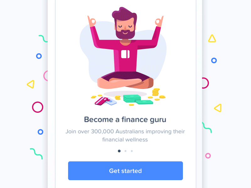
A simple on-boarding screen can create a very good first impression if the content is coupled with the appropriate animation as shown below.
2. User Engagement/Attention Capture
As users, our attention at most times is dedicated to the sole activity at hand . So, when something on the screen changes, we are most likely to miss it. This is known as change blindness. There are instances where although we’d like to capture the user’s attention, we don’t want to distract them from the task on hand. This is when micro interactions can come into play.
Subtle movements such as the notification icon moving are enough to make a user look, without distracting them. Micro interactions can be used to redirect the user’s attention to what needs his momentary focus.

A more traditional form of this are carousels on most e-commerce websites and applications. On landing on the home page, a user is shown an array of discounts or offers that the business is currently offering. Since a small space needs to accommodate multiple offers, the carousel moves automatically, thus attracting the attention of the user.
3. System status and Feedback
Micro interactions can be used to subtly indicate the system status and provide feedback to the user. To show the user the length of a video, Instagram uses a very subtle indicator. The time appears for one second at the beginning of the video and disappears immediately after. Even though this goes against Jakob Nielsen’s principle which states that the system status should be visible at all times, the micro interaction is enough for the user to gauge how long he needs to spend watching the video.
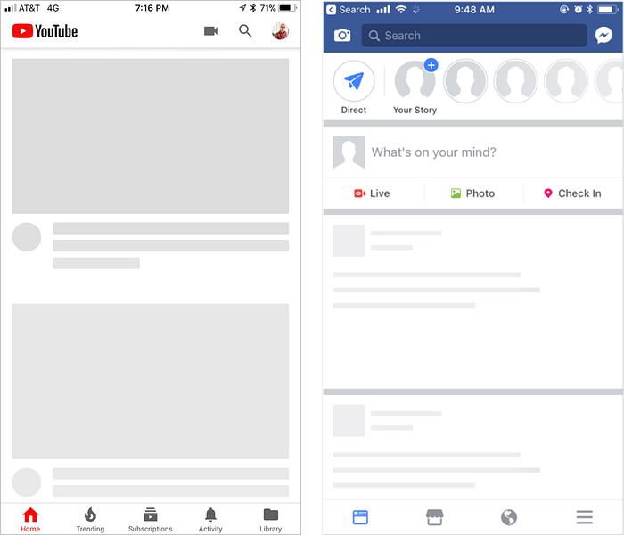
YouTube and Facebook moved away from traditional loaders to depict the status of a page load. They brought in the Skeleton Screens which revealed the layout of the page before the content would load. Looking at the skeleton screen while waiting for the text and images to show up made the waiting period seem shorter, thus reducing frustration.
4. Minimalization
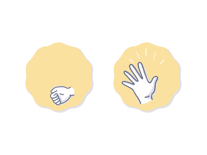
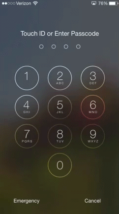
A common micro interaction most iPhone users come across is while entering the password on the lock screen. If an incorrect password is entered, the screen vibrates while clearing the password. Throughout this process, there is no text that comes up on the screen to instruct the user as to what went wrong.
Interactions that are similar to human gestures as so intuitive that they don’t need supporting text.
Most micro interactions used serve more than one purpose, delight being the most common.
A key takeaway from studying micro interactions is that as designers, we should not shy away from creating gestures that may not seem intuitive in the beginning; like the long tap in Facebook likes.
It might be a learning curve for the users, but if the animation is relevant and appropriate, user adoption will be rapid.