Eventbrite’s bold rebrand: how ‘The Path’ reinvents its visual identity
Reimagining the brand to capture the energy of live experiences
Eventbrite has been a central platform in the live event industry, enabling people to easily discover, create, and attend events. More than just a ticketing service, it connects communities through shared experiences.
With the evolution of digital interactions, brands must adapt to meet new user expectations. A company’s visual identity goes beyond a logo — it reflects how it positions itself in a shifting landscape. With its latest rebrand, Eventbrite signals a new direction.
But what does this new identity represent, and how does it align with the company’s broader mission?
Rebrands typically elicit mixed reactions, aiming to strike a balance between innovation and familiarity. Eventbrite’s new look, introduced about two weeks ago, embodies a fresh direction while staying rooted in recognizable design principles. It’s bold and thoughtfully crafted, reflecting the evolving landscape of live events and digital engagement.
A closer look at Eventbrite’s rebrand
As brands continuously refine their identities, each redesign presents an opportunity to reinforce core values and adapt to new expectations. Eventbrite’s refreshed visual identity reflects its evolution as a platform, balancing a modern aesthetic with the energy and dynamism of live experiences.
A week after unveiling ‘The Path,’ discussions about its impact and significance continue. In an era where brands must continually evolve to stay relevant, Eventbrite’s refreshed logo and identity emphasize the importance of adaptability.
But beyond staying modern, what does this rebrand really mean for the platform’s future?
A visual shift that tells a story
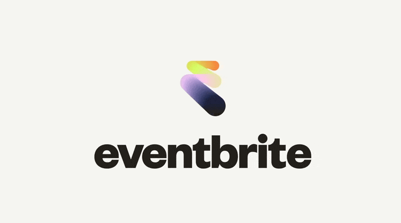
Eventbrite has decided to turn the page — or rather, to draw a path.
“The Path” is the name of its new logo, marking a significant transformation for the event discovery and management platform. More than a simple aesthetic shift, it’s a statement of intent: Eventbrite seeks to embody the energy of live events and the journey from curiosity to participation.

The meaning behind “The Path”
Eventbrite’s rebrand isn’t just about aesthetics. It reflects the evolving digital landscape, where users expect seamless and engaging experiences. The new identity aligns with the company’s broader mission — not just facilitating ticketing but fostering a deeper sense of community and participation.
Beyond a simple logo change, ‘The Path’ embodies Eventbrite’s progression and vision for the future. It symbolizes the journey individuals take when engaging with live events — from curiosity to attendance to lasting memories. The name suggests movement, exploration, and connection, mirroring real-world event experiences.

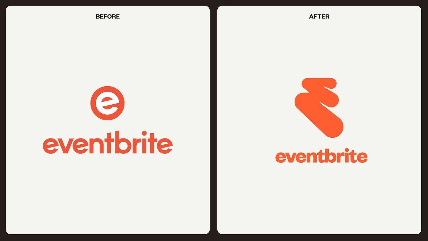
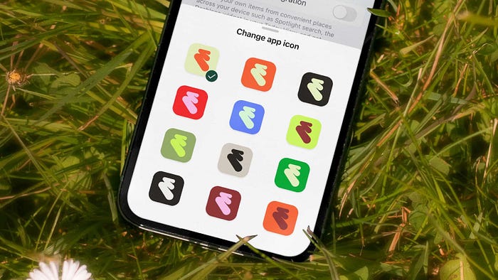
Created in collaboration with the design agency Buck, the new logo marks a departure from the familiar lowercase ‘e’ enclosed in a circle, introducing a more fluid, modern approach. This shift highlights the organic flow of event experiences, emphasizing the transition from discovery to participation and the shared stories that emerge. It’s a dynamic symbol of connection and movement — key elements of live entertainment.
The boldness of bold: a statement of identity
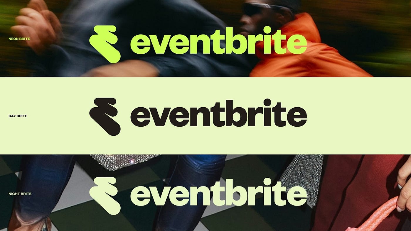
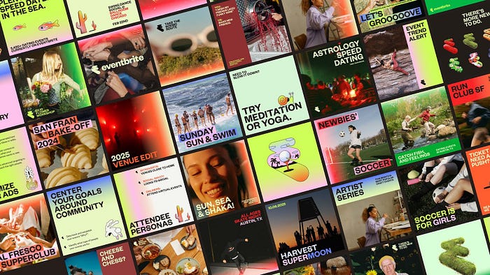
At first glance, the new design stands out for its bold, assertive typography. The choice of Founders Grotesk aligns with contemporary design trends that emphasize clarity and impact. The shift toward strong, confident branding has become increasingly common among digital and tech companies, as it conveys presence and recognizability. Eventbrite’s adoption of this approach reinforces its industry leadership and ensures high visibility across platforms, from social media to print materials.
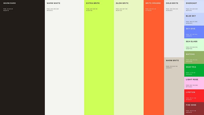
Color also plays a vital role. The refreshed palette features vibrant hues, chosen to capture the excitement of live events and the energy of human interaction. The new identity speaks the language of modern branding, appealing to both event organizers and attendees.
Behind the scenes of the new logo
Rebrands don’t happen in isolation; they reflect deeper shifts in a company’s trajectory. Buck’s design team developed “The Path” by analyzing how people engage with Eventbrite and determining what visual identity best represents this evolution. The decision to create a fluid, evolving mark stems from the concept of movement — not just physical movement at events but the excitement and anticipation leading up to them.
Designed to be flexible and scalable, “The Path” adapts seamlessly across digital and physical formats. The logo is not just a static symbol but an interactive element that comes to life in various digital settings, reinforcing Eventbrite’s role as an evolving platform for live experiences.
A redesigned app for a more immersive user experience
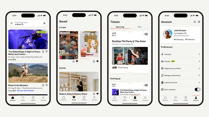
Beyond aesthetics, Eventbrite’s app update, developed in collaboration with Instrument. AI-driven recommendations and friend coordination tools signal a move toward a more personalized and socially connected platform. This evolution positions Eventbrite as more than just a ticketing service — it aims to be a companion in the event-going experience.
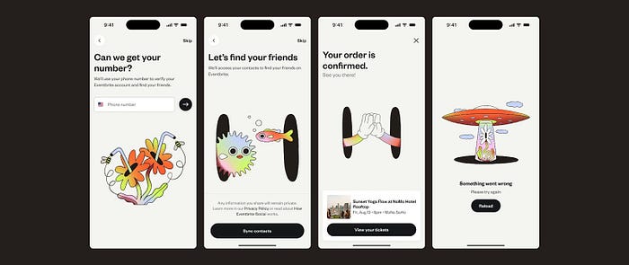
The updated app enhances event discovery with personalized recommendations and curated lists from local experts. One standout addition is the ability to coordinate with friends, allowing users to plan and attend events together, transforming digital interactions into collective experiences even before reaching the venue.
Conclusion: a rebrand looking forward
With “The Path,” Eventbrite isn’t just changing its look — it’s redefining its role in the events industry. The shift from a ticketing platform to a hub for live experiences reflects its ambition to foster deeper connections between people and events.
This bold visual evolution underscores Eventbrite’s commitment to staying relevant in an ever-changing landscape.
Author’s note
At first glance, Eventbrite’s new logo reminded me of Envato’s, due to their similar abstract forms. The similarity in visual language — particularly the abstract zig-zag mark — immediately stood out. While the logos serve distinct purposes, they share a contemporary, energetic aesthetic that aligns with modern branding trends. For a moment, I even wondered if this was the result of a partnership or acquisition.
But beyond this initial impression, there’s a larger conversation to be had about branding trends, originality, and strategic rebranding choices. Eventbrite’s shift with “The Path” isn’t just a new logo — it’s a repositioning of the brand within the live events space.
And I like it!

