Every color needs a number: Total Value
A good way to name colors in your palette.
It’s hard enough creating a good color palette, without having to worry about how to name your colors. And yet, no matter how many times I’ve done it, every single time I get a little bit confused.
In my search for an intuitive global solution that still makes sense over time, after new colors are introduced, I came up with the Total Value formula. It basically uses the color code to calculate the precent of black that is closest to each color.
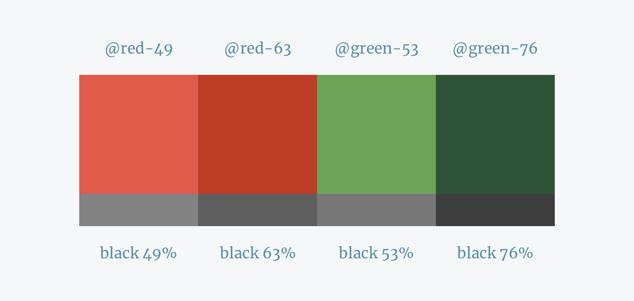
I use this number as the variable next to the color name: @red-[totalValue].
This allows me to distinguish the different reds in my palette, easily compare them to different colors and immediately know their tonal hierarchy.
How it came to be?
I first tried to tackle color naming conventions at Moovit. I had a particular problem with the app’s grays. There were just too many of them, with names such as “Almost_black”, “Lightest_gray_light” and “yet_another_bluish_gray”. I wanted to reduce the number of grays in the system but also to give them names that will last. Since they were all saturated, I used a photoshop layer black (#000) and eyeballed the opacity level of that layer that is closest to the selected gray. It worked great, but was both time consuming and inaccurate. Also when it came to more saturated colors like reds and blues it was much harder to eyeball it.
When we started discussing the naming conventions for our colors at Outbrain’s Symmetric UI design system, I wanted to find a way to implement what worked well for me in the past, but also allow anyone on the team to use it for any color they wish to add.
The Total Value Formula:

The formula basically calculates the sum of all the color values (Red,Green and Blue) turns it into a percentage, and reverses that number for easier use.
Here’s an online convertor from HEXcode to Total Value that my close and talented friend Shai Kerer created: danielsagi.com/totalvalue or if you prefer you can use this spreadsheet formula.
Personal note: I thought long and hard about whether it’s right to reverse the number in the formula. In RGB, the higher the number is the lighter it is, because the colors in our screens are made out of light. So in theory 100 should be white and 0 black. But I found the reverse way is much more intuitive for my daily use. It’s easier for me to conceive that 64 is darker than 52 than the other way around. Having my goal of creating an intuitive global unifier between colors in mind, I eventually decided to reverse it.

What is common today?
A lot of color naming conventions today use tints and shades, which basically mean how much white or black is added to the base color.
@red-darker-15 is red with 15% of black added.
This system relies on a base color to begin with, so the numbers are relative. @red-darker-15 and @blue-darker-15 are not necessarily similar.

Using Total Value instead gives you a global set of numbers that relate to every color on your palette, as well as considerably shorter names.
Furthermore, when creating a color palette I don’t simply add black or white to create the tints because it changes the color’s essence, reducing it’s saturation and changing it’s temperature. A darker red should have lower brightness, but also higher saturation and maybe even a small shift in hue.
Ok, but why not simply use the brightness from the HSB value?
I did consider this option at first, but it is not nearly as reliable. The changes in saturation considerably influence the color’s actual value, which the brightness number does not reflect. Here’s an example of 3 different tints of red with changes only in saturation. The Brightness remains 100% in all three, but it’s very clear that they have different values.

Total Value gives you an exact number of the red’s darkness, considering all the color’s parameters, including saturation.
What else can I do with this number?
Besides naming your colors, Total Value also helps you out in other aspects of your designs. A few advantages:
- Hierarchy — A single set of global numbers, allowing you to instantly know the colors’ tonal order.
- Contrast — Knowing the Total Value allows you to make informed design decisions regarding contrast. For example, you may want to refrain from putting black text over a background color with a high Total Value.
- Flexibility — Using Total Value gives you the option to change the hue and saturation of the tints in your palette.
- Scaling — You can always add new colors in between your existing ones with names that won’t mess up your initial order. Adding @gray-27 between @gray-20 and @gray-32 is much easier than between @gray-01 and @gray-02 or @gray-medium and @silver.
- Color matching — Total Value makes creating a set of compatible colors so much easier.
- Accessibility — Total Value gives you tools to help low-vision and color-blind people by adjusting your designs to comply with accessibility standards. You can even use this formula to automatically determine whether to use dark or light text on your website or app.
I hope at least some of this made sense to you and maybe helped you out making some decisions regarding your design system.
Feel free to ping me if you have questions and let me know if you found this article or my conversion tool helpful.
