Member-only story
Everything you need to know about color
And how to use it to be a better designer.
Color evokes emotion, sparks excitement, and grabs attention. Color can help draw your eye where you want it on anything from a poster or billboard to an email in your inbox.
Color can even influence your mood. Did you know the color psychology behind a red and yellow combination makes you hungry? It’s no wonder well-known fast-food chains like McDonald’s and KFC use red and yellow colors in their logos.
Color theory is a set of principles for creating harmonious color combinations. It’s a mixture of science and art. Understanding the fundamentals of color theory and where color comes from is important to know as a designer. Once you master it, you’ll know how to create the best color combinations for your graphic and web design projects.
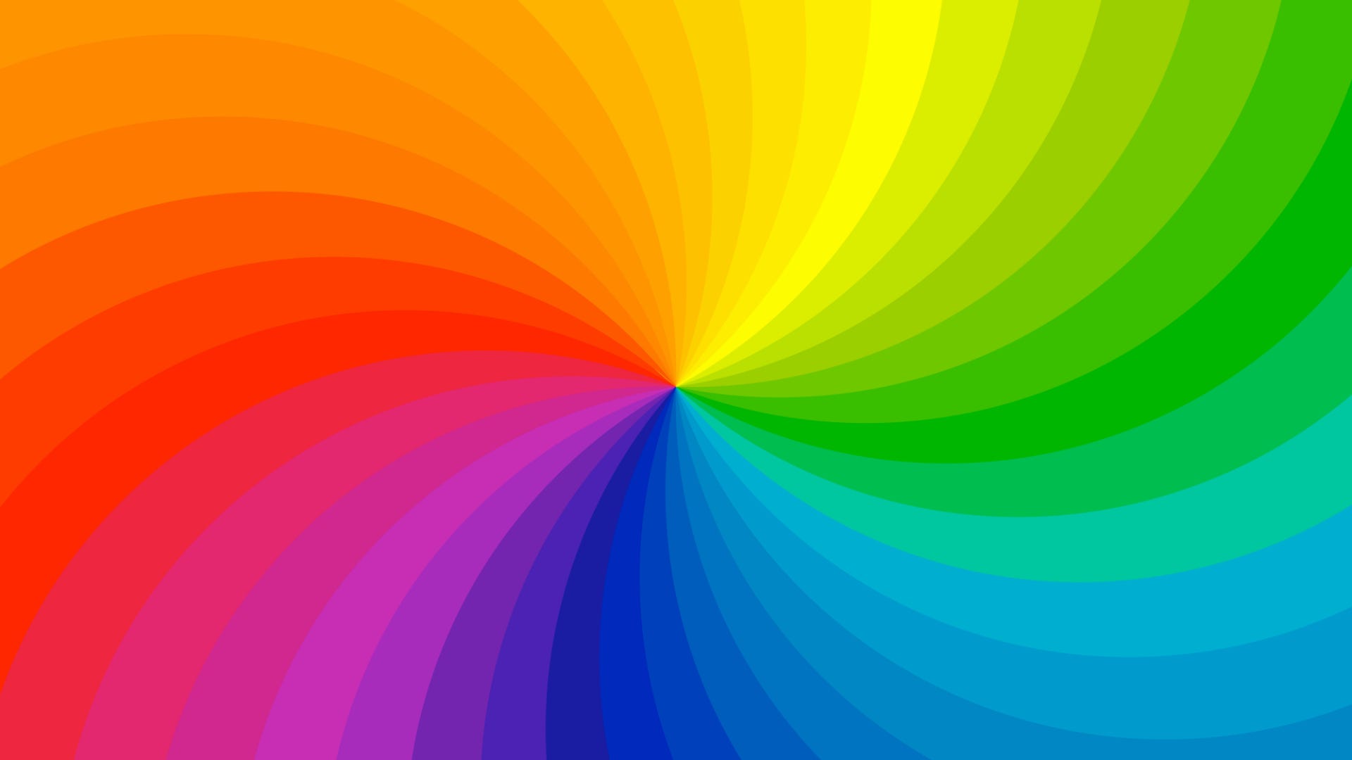
If you don’t believe color has an impact on your design then take a look at this example. It’s the exact same illustration, the only difference is the colors. Which one is pleasing to look at and which makes your eyes want to explode?


The color wheel
You’ve probably seen a color wheel in an early art class for school but what is it for and how can you use it to improve your designs? Once you understand the colors on the color wheel, the basic properties of color, and how to mix them, you’ll understand how to create rich color combinations that not only make your designs stand out but create a better user experience.
There are many versions of the color wheel but for this article, we’ll dive into a basic version. The color wheel is divided into 3 main categories: Primary, secondary, and tertiary color.
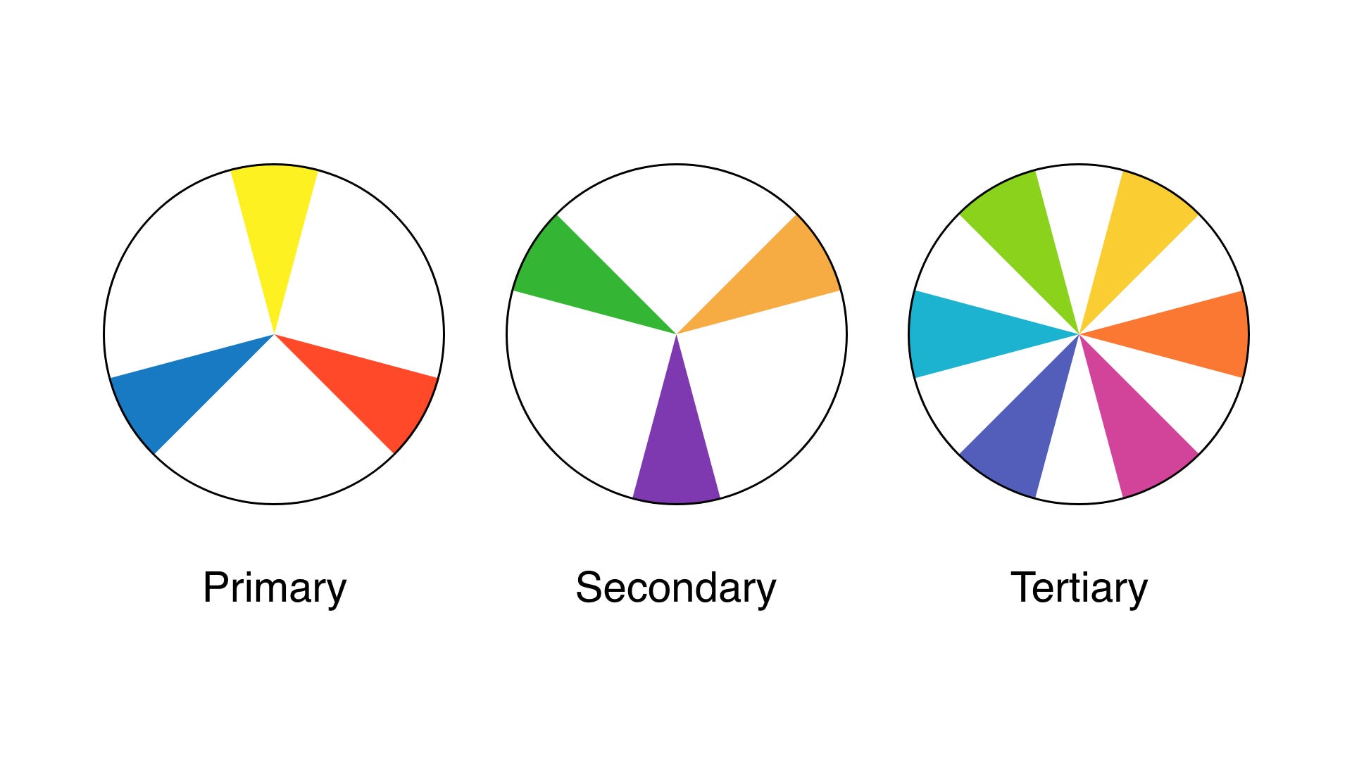
Primary colors are red, blue, and yellow. These are the three main colors you use to mix and create other colors. If you’ve even dabbled in painting, you know first hand how to mix just enough blue with yellow to make green.