What if, and why not? Apple’s Macbook Pro shakeup, one day later.
Expanding on Apple’s New Touchbar
During the introduction of the new MacBook Pro, I couldn’t help but wonder: what if you could use the technology behind the Touch Bar to separate content from controls in desktop software interfaces? Imagine how simple our affordances and UI language could be if your content and controls were completely separate.
First, screenshots. For fun. Then, an explanation of the underlying motivations, and then why this concept probably wouldn’t work.
Enjoy this article? Subscribe to my newsletter to get a new one each week.
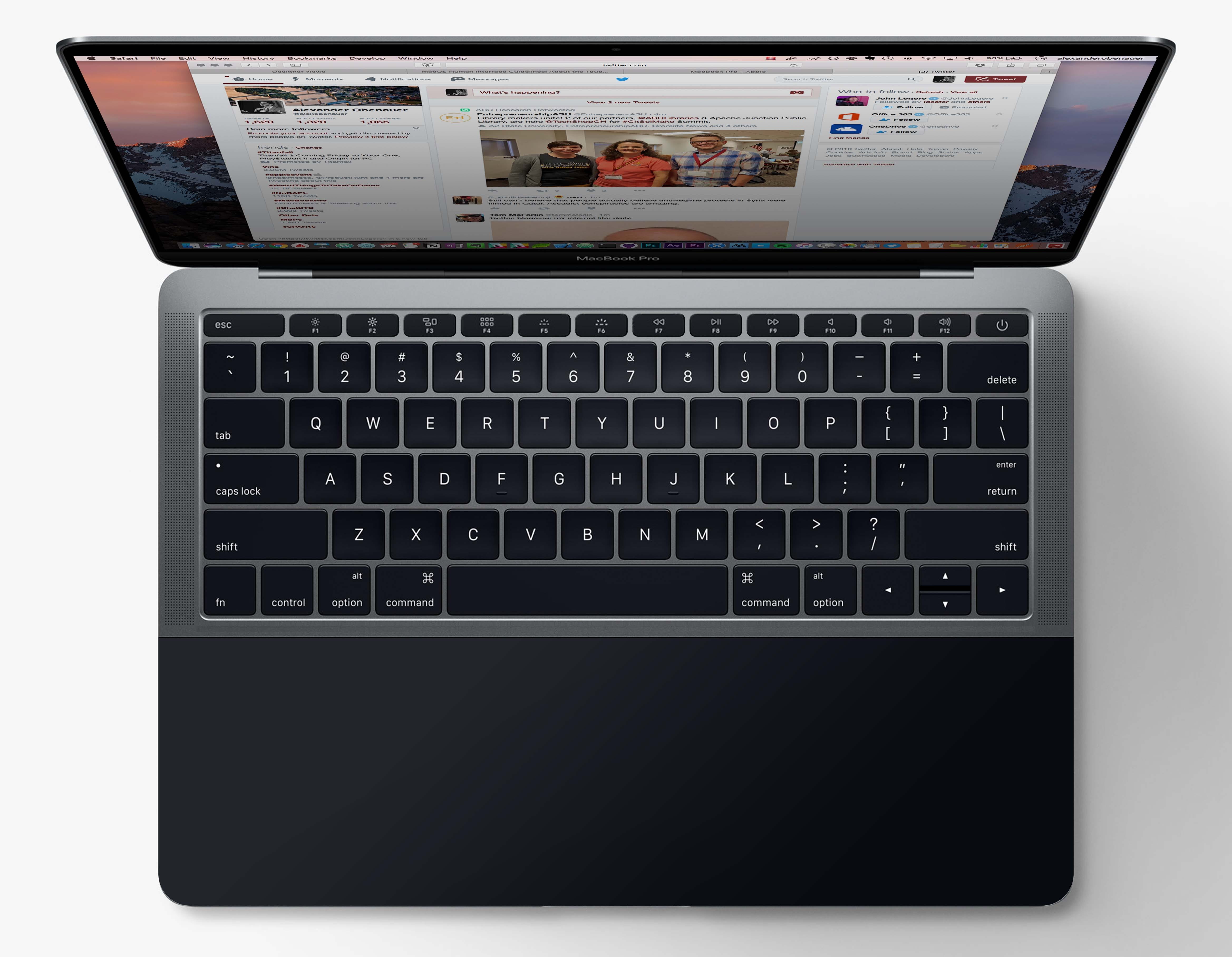


Let’s talk about this.
Here’s all of our interaction points on today’s laptops (stick with me here):
- Our screens show us our content.
- Our content is in windows that float on top of and around one another.
- We use our keyboards for typing text.
- We use our mouse or trackpad to move a cursor on our screen to manipulate the objects we see on it.
- We also use special key combinations on our keyboards to manipulate the controls on the screen faster than we could with the mouse/trackpad + cursor.
With iOS, Apple generally kept #1 and #3.
Instead of mouse/trackpad + cursor to manipulate on-screen controls (#4), we directly touch them on the touchscreen. This also meant that we don’t need keyboard shortcuts (#5) as much, since we don’t need to overcome the inefficiency of the mouse/trackpad + cursor (though some keyboard shortcuts have started to pop up on the iPad).
Apple dropped the windows (#2), allowing each app to take over the entire screen. This allowed us to drammatically simplify affordances in the UI: we no longer need to differentiate between so many different visual elements to show what is content versus controls in a UI, or which controls are active as part of the active window. This simplification has been so refreshing and focusing on iOS that Mac OS adopted full-screen as well, even though it doesn’t have the benefits of direct manipulation.
But people asked, “what if it did?” The simple answer has always been that it can’t: a touch screen on a laptop would lead to fatigue.
The Touchbar, introduced yesterday, muddies the lines a little bit. Your screen shows your content and controls. Your Touchbar shows the most prominent controls to control the focused application (plus, it looks like, some system state information at times like a current phone call). Your keyboard is for typing text, plus controlling the application. Your mouse/trackpad is for controlling the application by moving the cursor around the interface.
This immediately struck me as muddy. You now have 3 very different ways to control apps and their UIs. For what it does, Touchbar is clearly the best of them. It is the clearest, provides the most feedback, and has more degrees of interaction. Plus, it’s direct manipulation — a first on the Mac.
But that doesn’t change the fact that you can control your application by:
- Controls on the Touchbar that can be tapped, scrolled, slid
- Keyboard shortcuts
- Moving a cursor on screen (using a mouse/trackpad) to click or click and drag on-screen interface elements
Because the Touchbar is the best of them, and because it solves the problem the trackpad solves far better, I wondered if:
A) The trackpad and the Touchbar could be merged, and
B) The Touchbar could be expanded.
Why expand it?
What if your screen was strictly used to display content, and your expanded Touchbar was strictly used to control content?
Not even iOS has this kind of simplification and clarity.
Imagine how simple our affordances and UI language could be if your content and controls were completely separate; if you didn’t move a cursor around a big field containing both content and controls to manipulate that content, often not knowing what’s a control and what isn’t?
Now by “strictly,” I don’t mean all-or-nothing all the time — that wouldn’t be immediately possible. But with some graceful fallbacks, could we get the ultimate in interaction design for creators on a laptop?
Let’s check it out:
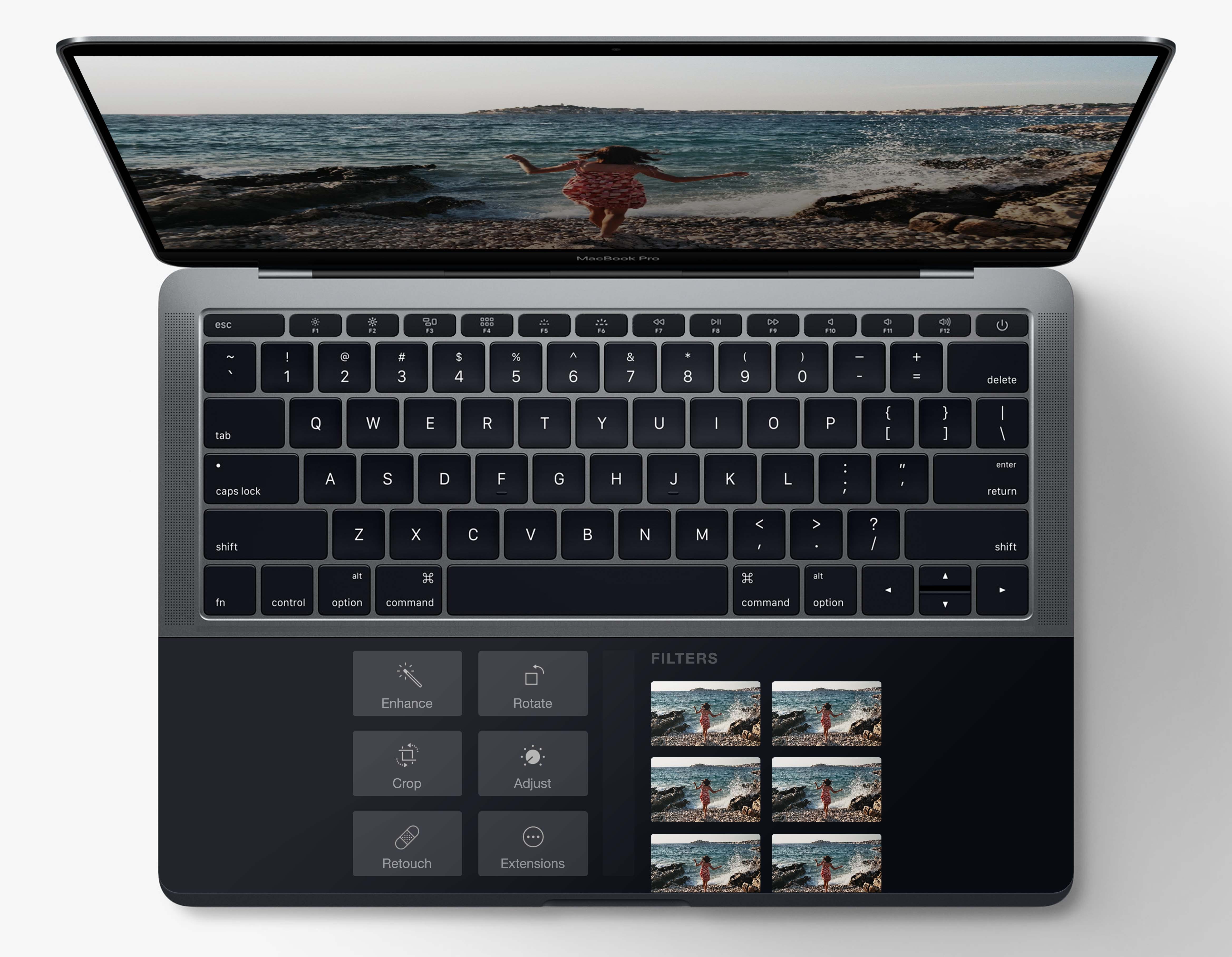
Imagine a ginormous trackpad that spans the width of the laptop. Let’s call it the Magic Touchpad.
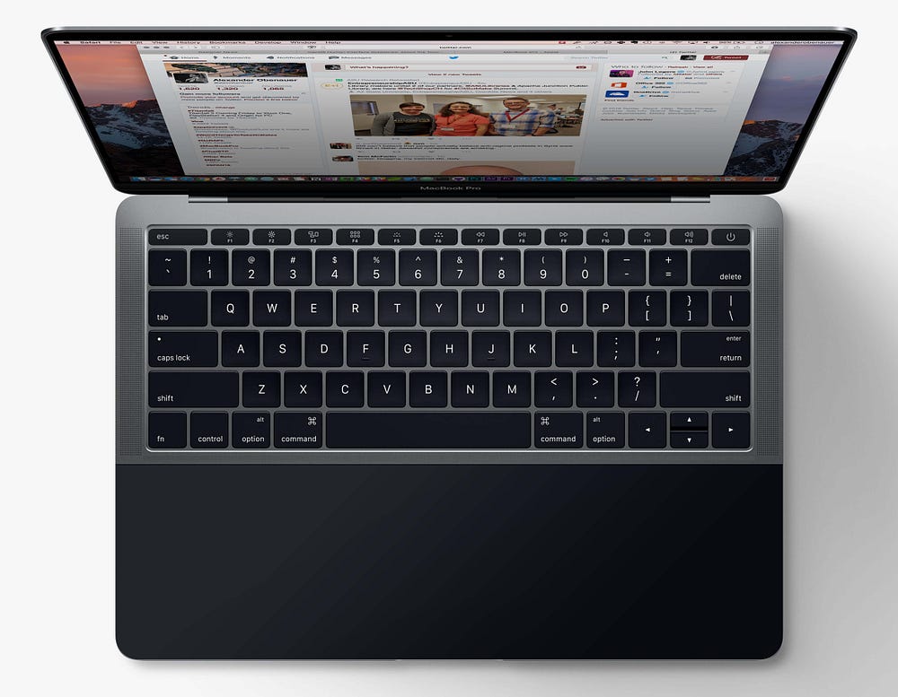
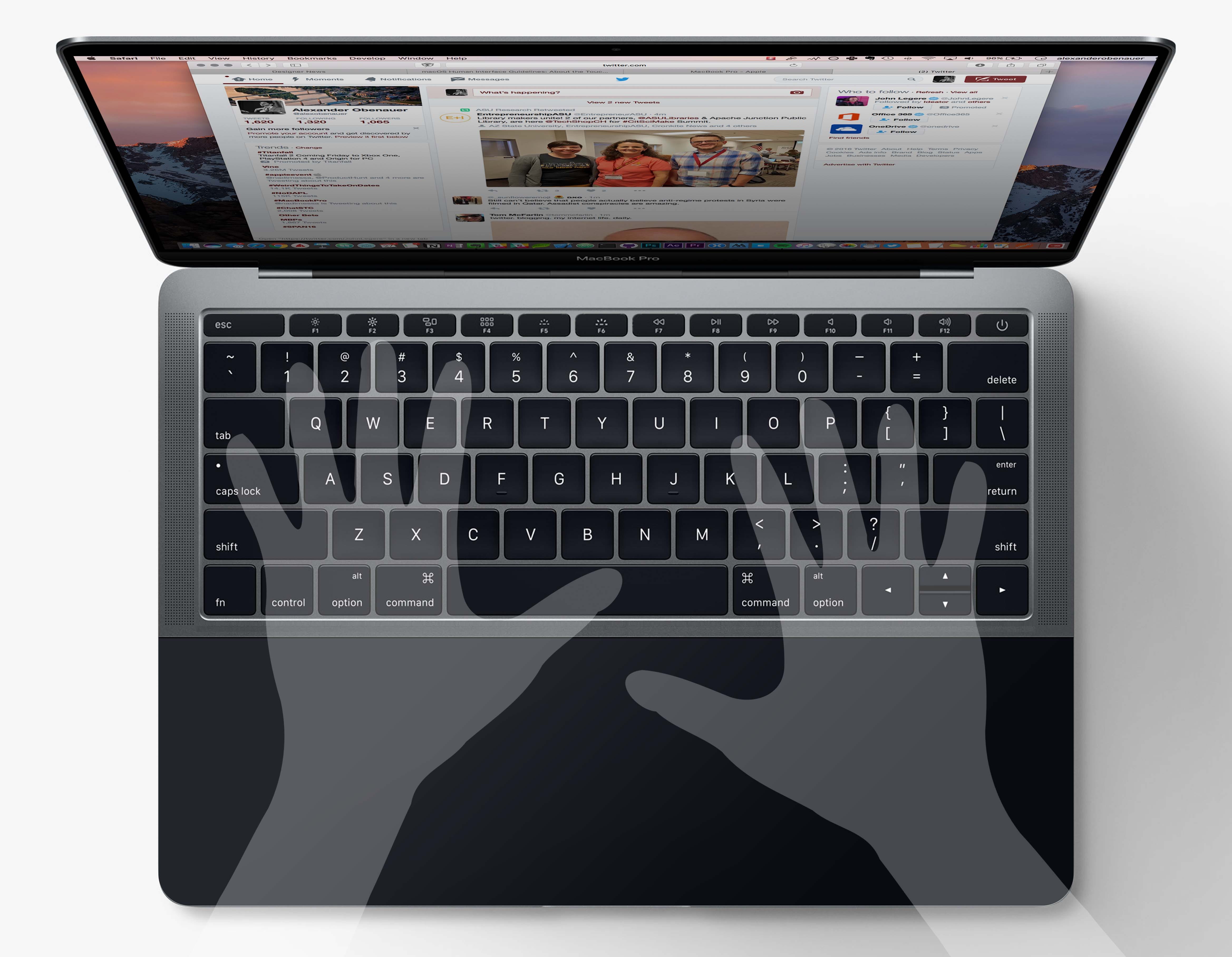
You’ll still use the sides as palm rests and the center as the trackpad field. It’d support force-touch, and it would be solid state, making clicks feel authentic with the haptic engine (much like the iPhone 7’s new home button).
But when you go full screen with an application — allowing that app to take over your screen (simplifying its UI as it doesn’t need to compete with other windows) — it also takes over your Touchpad.
On your screen, it only shows your content. On your Touchpad, it only shows your controls. The controls are in the center of the Touchpad — where you were controlling your cursor before.
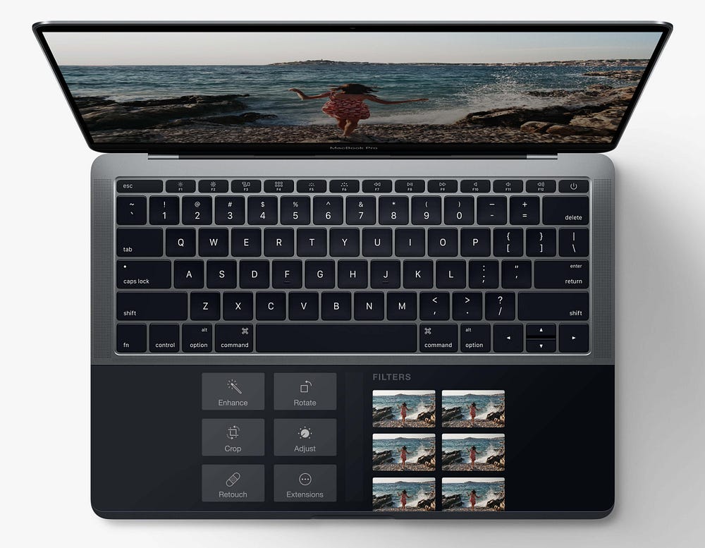
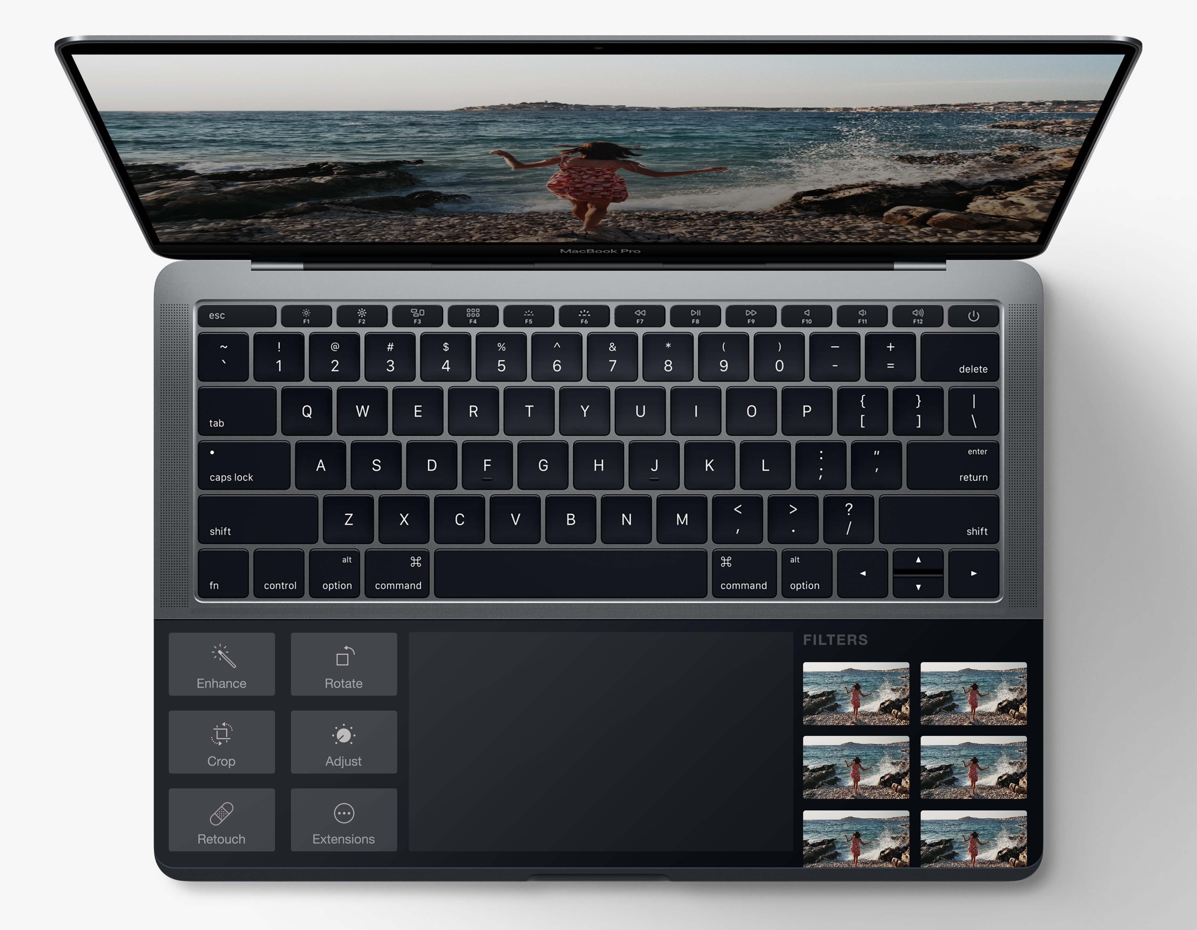
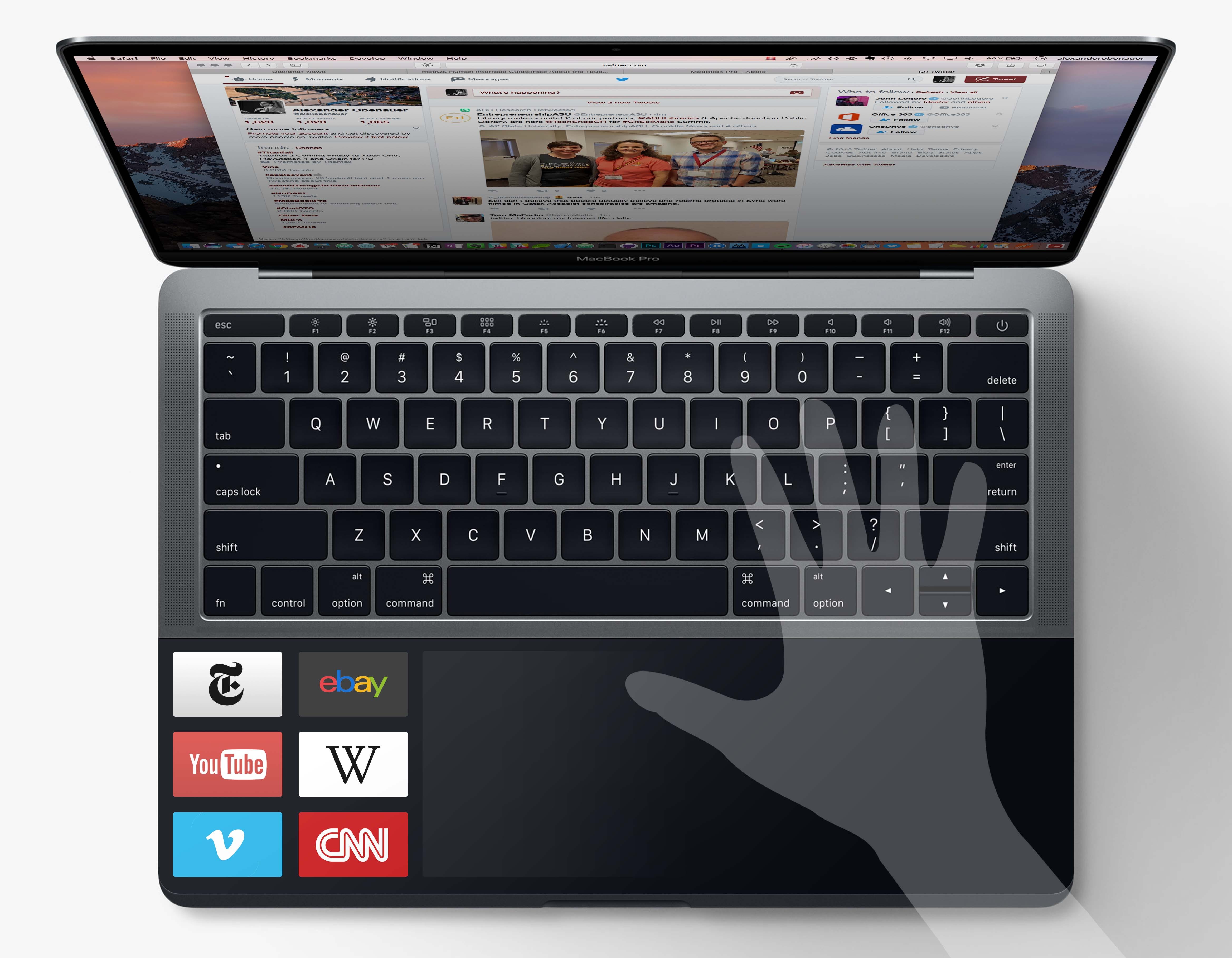
But here’s the graceful fallback, should there need to be one. If you start moving your finger, starting in the middle of the Touchpad, where there is a “graceful fallback gap,” the controls slide to the two sides, giving you a full-sized trackpad again. It could dismiss automatically after a delay, or on a button tap on the Touchpad.
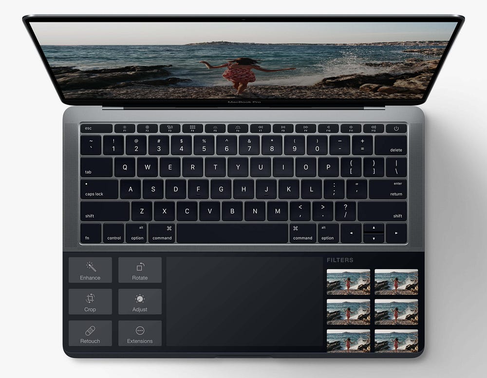
Now this is a simple example of how the Touchpad might work in Photos, but what about something more intensive? How would it look to put the controls for a more complex application on the Touchpad?
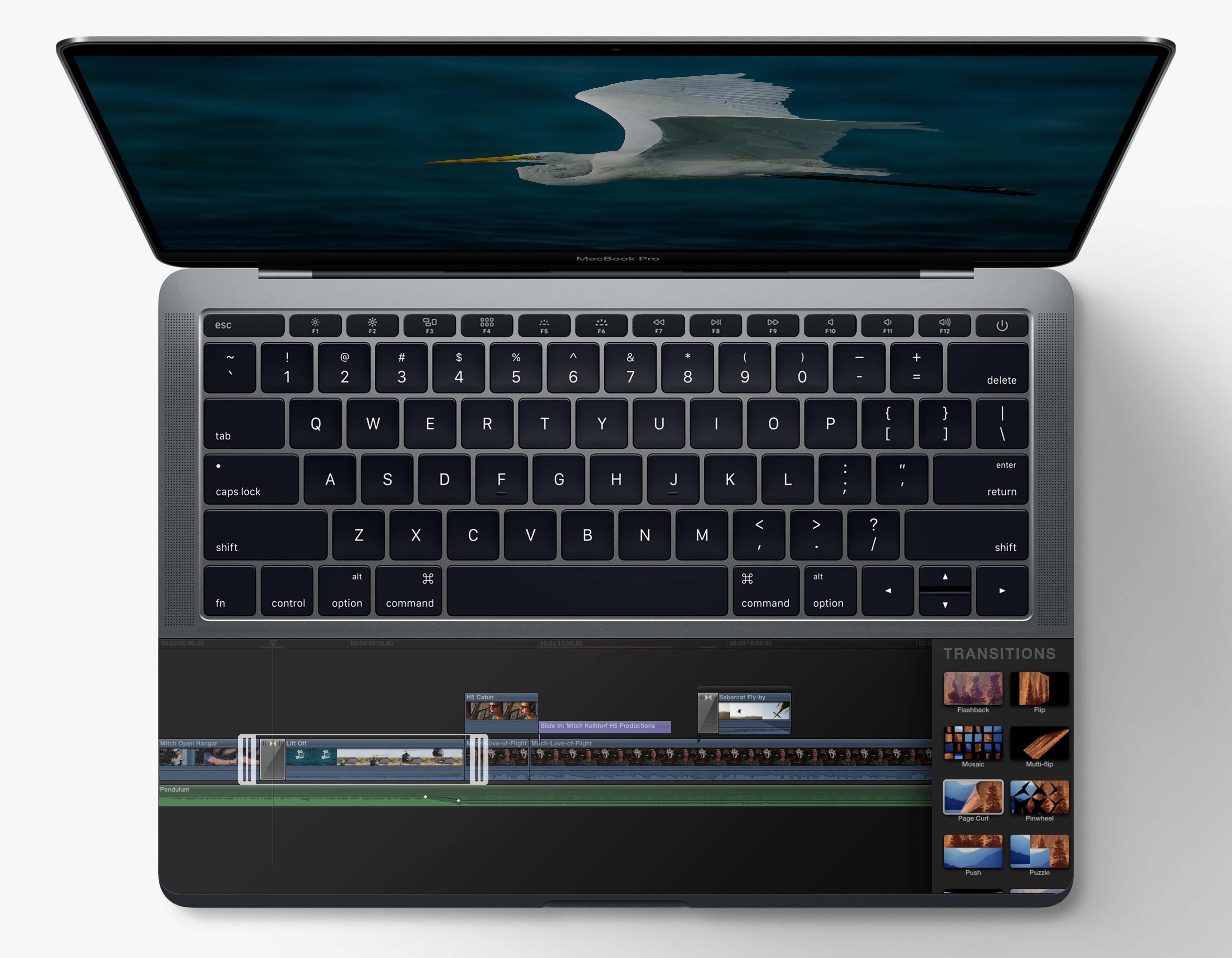
In Final Cut Pro, a professional creator’s application, the entire Touchpad could be used when the application goes full screen:

Check out the screen: there’s nothing but your content on it! It’s just the video you’re manipulating.
The Touchpad allows you to scrub around the timeline, directly touch elements, drag in transitions from a slide-in pane on the right, etc.
This really cleans up affordances in the app, and allows your content to shine on screen. This new interaction paradigm separates content from controls. The possibilities for interaction are limitless, and can be far more intuitive, with far better feedback, using only direct manipulation — on a desktop OS, with full-powered applications.
Back to graceful fallbacks:
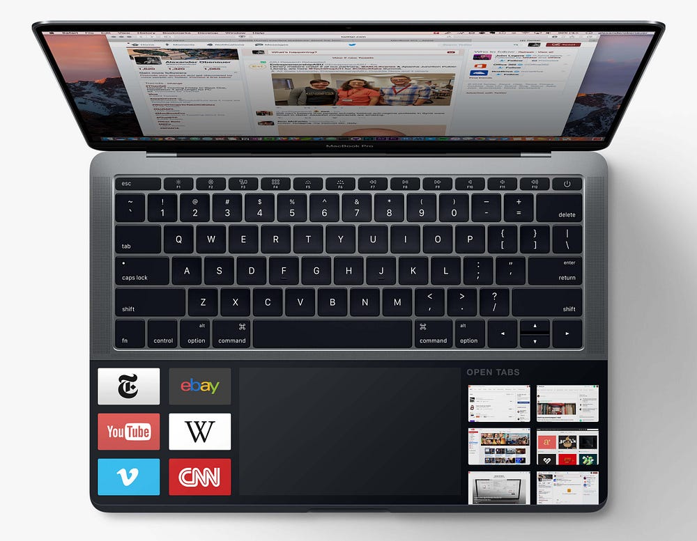
Imagine you’re browsing the web. You need a normal trackpad in the middle, and your wrists are on either side.
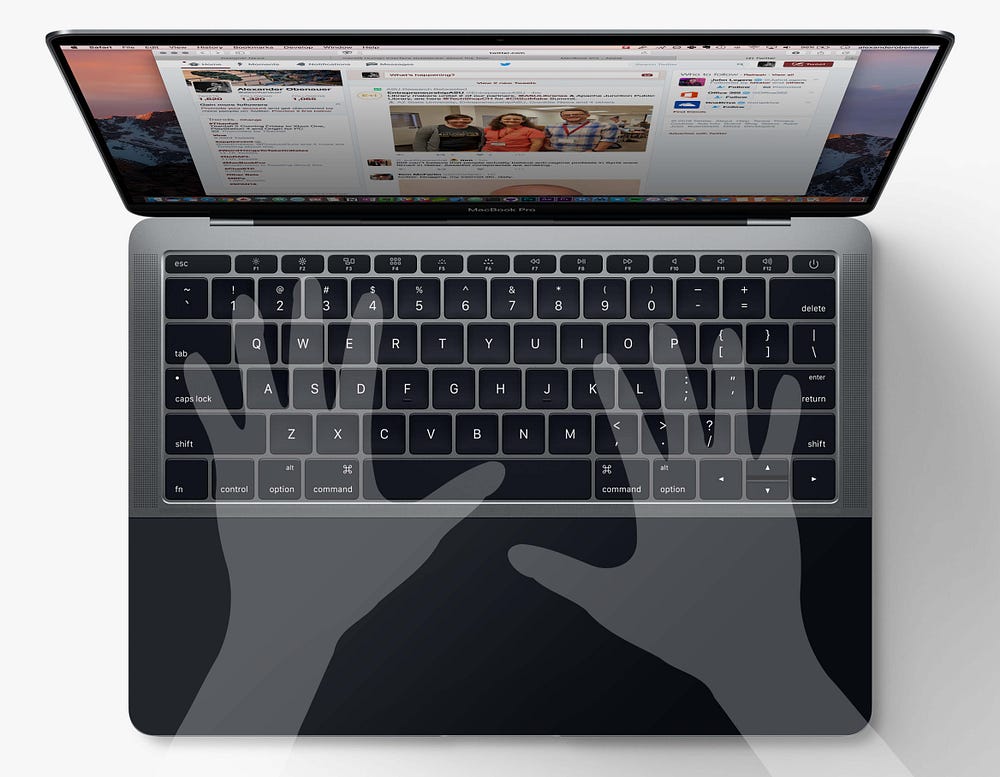
Imagine your “favorites” are on the left, under your wrist. If you lift your wrist, your favorites fade in. Tapping any one allows instant navigation.
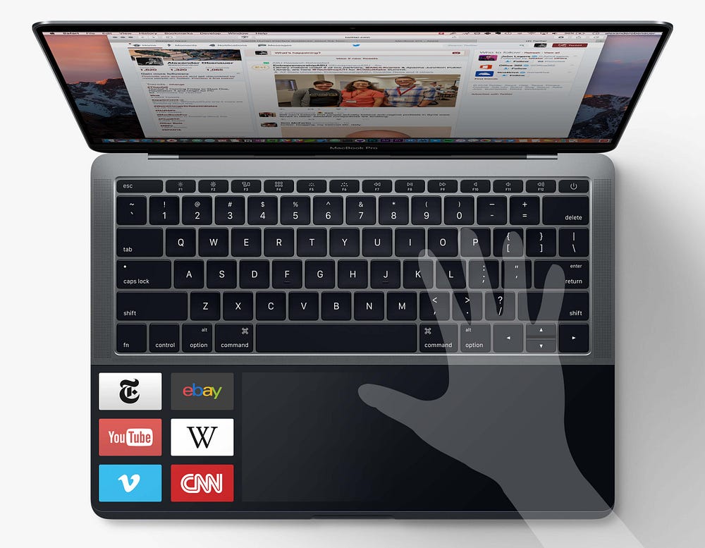
Lifting your right wrist could show your open tabs, with live previews, allowing you to pop over to another one.
Drawbacks
As cool as it is, there are some obvious downsides to this approach, which probably highlight why this isn’t the product that was launched yesterday.
I’ve written before on the ergonomics of software, something often ignored but terribly important:
It gets you looking way down at the bottom of your field of vision. You never have to look that low right now. Apple was probably comfortable with the Touchbar where it is because it’s only slightly lower than the screen, and while users may have letter locations memorized, many are probably already looking at the function keys when using some of them. Having to look down where your trackpad is currently is not ideal. Looking back and forth between the two screens could be jarring — I’d be curious to try it. Plus, the best view of the Touchpad is when you hunch over the laptop. While that’s probably my most common position already, it’s terrible for your neck and back.
Also, in your most likely resting position for your hands, while using the Touchpad — even if the controls are in the very center — you’ll likely cover up far more of them than you do with your iPhone or iPad. Try it: leave your wrists where they usually are, and then use your trackpad. Now imagine if there were app-specific controls lit up under there. You wouldn’t be able to see them that well.
Cool ideas I’d be curious to see expanded on. Want to play with it? Download this PSD, and you’ll be able to edit the screen and Touchpad.
Looking for a product designer to work with? Send me an email.
And if you enjoyed this post, be sure to hit the Recommend heart, below!


