Experience is in the details: analyzing the UX of streaming services
Looking at little experience decisions that make all the difference.

The Invisible Difference
When app markets mature the overlap in features and designs grows closer as they catch up and copy each other. The more similar the apps are to one another, the more important the experience is as a differentiator. As users, we are sensitive to any friction while using an app and gravitate to the apps that feel fluid and easy to use.
In this article, we will look at some of the top iOS entertainment apps and analyze their experiences.
The Kitchen Sink
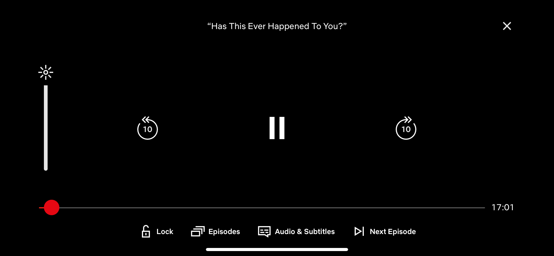
The amount of functionality one presents to a user is something to be considered. On the one hand, reducing functionality keeps the user-focused, but on the other hand, an increase in features could keep the user engaged longer. For example, once a user starts watching a video, Netflix’s interface is doing everything it can to keep them engaged and in the platform. Netflix throws the whole kitchen sink at the user: the ability to adjust the brightness of the screen, lock the screen’s orientation, and quickly skip to the next episode. It's the embodiment of the old marketing rule, "it’s more expensive to get new clients than to keep existing ones." While non-invasive, we can see that Netflix is actively designing to maintain the user’s attention and remove barriers from continuing to watch.
Takeaway: Remove the reasons a user will have to exit the app.

Back 10, Forward 30
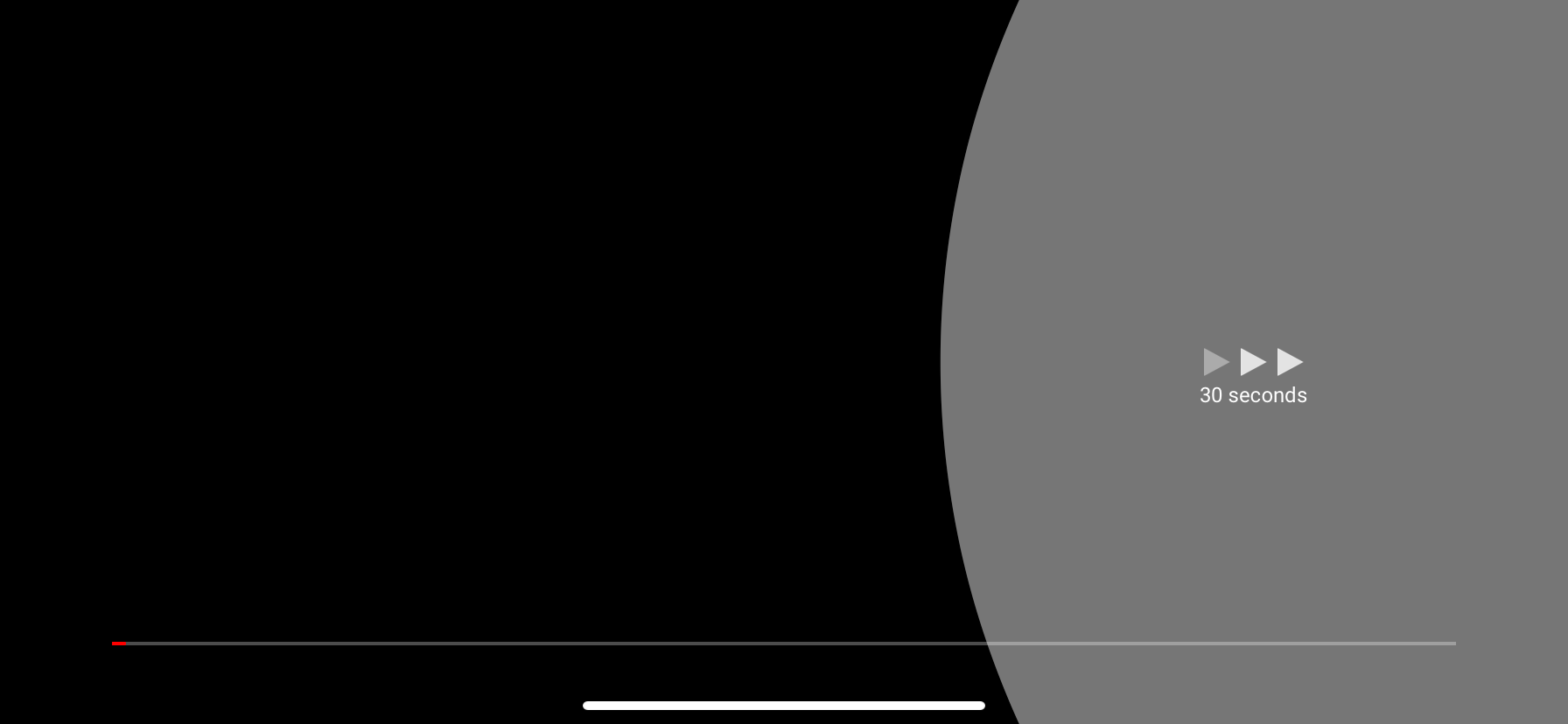
Understanding the user’s motivation informs a more effective design. The most prominent buttons in Hulu’s interface above are seek backward, pause, and seek forward; all are about moving through the video. The way these buttons function illustrates how Hulu takes cues from the user’s intention.
The user wants the functionality to accurately move through time, but that level of accuracy differs depending on which direction they’re moving. When the user is seeking backward to a specific scene they want a smaller unit of time so they can be more precise. Whereas when they are seeking forward they want to skip a scene and want to use a larger unit of time. Hulu’s “10 seconds back” and “30 seconds forward” is an amazing demonstration of understanding the users’ intentions and different motivations for fast-forwarding and rewinding.
I’m curious as to how Hulu concluded that 30 seconds forward and 10 seconds backward was the best duration for their experience. If you have an idea, let me know in the comments below.
Takeaway: Understand the nuance of a user’s motivation as it could lead to a new solution.
Thanks to Chris at niice.co for pointing out that functionality and thinking through this detail with me.
YouTube’s skip forward tap target area teaching users where they can tapDouble Tap Targets
Double-tap to seek is a pretty common feature among the apps surveyed — over half of the apps utilize it. What is especially empowering about YouTube’s execution is they are educating the user by giving feedback visually. When the user double-taps a side of the screen YouTube will animate a circle showing them it’s safe to tap anywhere in this area of the screen. This boosts the user’s confidence and puts them at ease, knowing that they don’t have to be so precise with their mechanics and can still get the desired results.
Takeaway: Educate the user with the interface.

Rotate For More
Hulu and YouTube both try to increase engagement and keep users watching by introducing more content. Both apps must have interpreted the rotating of the phone vertically to mean the user is finished watching. When the user isn’t watching videos the odds go up that they will exit the app. To counter this, both apps show related content or content that the user has shown interest in in the past. This ‘rotate for more’ experience is the apps last-ditch effort to keep a user engaged.
Takeaway: Turn exit points into opportunities.
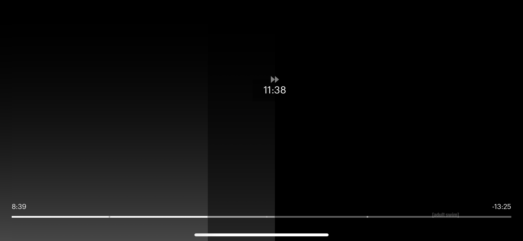
Full screen Drag To Seek
Hulu’s interface demonstrates its understanding of ergonomics with small devices. Hulu utilizes the full screen to show the user the scene they are currently seeking to, fully replacing the current frame so they can make out all the details. The second detail in the scrubbing interface is how they put the time stamp way up towards the top of the screen. This understanding of ergonomics allows the user to slide their finger across a large portion of the screen without worrying about a finger blocking the view of the time stamp. Once again putting us at ease and allowing us to not be quite as accurate but still get the result we want.
Takeaway: Fingers aren’t the most exact tools in the world. Be forgiving with the app experience, let your users get the results they want without having to be too precise.
Takeaways:
At first glance, the apps seemed so similar there didn’t appear to be much room for differentiation. But diving below the surface there were a plethora of differences with each experience. Here’s the full list of takeaways from this article:
• Remove the reasons a user will have to exit the app.
• Pay attention to the nuance of a user’s motivation as it could lead to a new solution.
• Educate the user with the interface.
• Change exit points to opportunities.
• Be forgiving with the experience, let your users get the results they want without having to be too precise.
Want to see the collection of screenshots captured while I was “researching” this article? Here’s the link to my Google sheet.
Nitpicks

Netflix’s bouncing x. When reviewing Netflix’s app I noticed the x in the top right jumping all over the place and even changing size a bit. A consistent x might feel a little cleaner, let’s get that x planted in the top right and keep it the same size.
Thanks: Sarah, Mark, and Liz for all the feedback and thoughtful suggestions!