Explaining WCAG principles: Operable
This is Part 3 of a series of blog posts about Accessibility. In this post we are checking the WCAG Principle Operable. Check out Part 2 to learn about how to make your web content Perceivable and Part 1 for the introduction of this series.

Making your web content Operable
The WCAG principle Operable is all about offering different ways in which people with disabilities can operate and move around your content. If, for example, one is unable to use the mouse, let them use the keyboard.
You will find that some of this Guidelines are also ones that you use, either because they make your work easier or because you move faster. Just more proof that Accessibility is in fact for everyone.
Guideline 2.1 Keyboard Accessible
Every section, element or option must be reachable using the keyboard.
You may have noticed before that you can move around certain websites using your keyboard. Pressing the “tab” button moves you from one place to another, as well as using the arrow keys in some cases. For people with motor impairments, this feature is extremely valuable.
When designing your website with keyboard Accessibility, be very careful of what is known as a “Keyboard Trap”[1]. This occurs when you are navigating using your keyboard and you reach an element that you are unable to leave from. A common example is a textfield that requires you to fill it in order to move on. Users must be able to exit any component they are on.
Earlier on we talked about how Accessibility helps all sorts of people, not just ones with disabilities. This guideline is no exception. Applying keyboard shortcuts not only helps people with disabilities, but everyone that uses it. It makes the navigation faster and, in consequence, you finish your job a lot quicker.

Be careful. Your keyboard shortcuts should be easy to learn and remember. Don’t forget about the documentation, it should also be easy to find.
Guideline 1.4.13: Content on Hover or Focus
The currently selected element is visually obvious.
I know, this guideline should be under the Perceivable category. But since it has to do with navigation using the keyboard, I personally think it makes more sense to explain it here.
Imagine navigating a website without the arrow of your keyboard. It would be a nightmare trying to guess where you are pointing at. This issue is present with people that can’t use a mouse and instead use a keyboard to move around.
As designers we must highlight in which element the user is currently at. Either designing a focus or hover state that indicates the user where he is at.

Guideline 2.2: Enough Time
Give enough time to your user to read, comprehend and use the information he is given.
There are some websites that have a time limit for completing a certain task. The must common example is having a time limit for completing a form. Some companies do require this as part of their business model. Nevertheless, they should offer a time extension for users that might need a bit more time to complete the task.
Guideline 2.3 Seizures and Physical Reactions
Animations should never flash more than three times in one second period.
I believe this is one of the most important guidelines. It is very important to follow through because the outcome could be terrible.
This guideline has a AAA requirement that is equally important to follow. It is about Animations and Interactions. Users should be able to disable distracting content like, for example, gifs or animations.
This AAA guideline is for people that are easily distracted, so they can pause any distracting content that interferes with the task they want to focus on. Also, if a gif or animation is used by another user that flashes more than three times in a second, this guideline is also very helpful for people with seizures or physical reactions.
Guideline 2.4 Navigable
Users should be able to navigate, find content and determine where they are.
One way of meeting this criteria is by using descriptive and easily identifiable headings to organize the content. Just like most of us scan the headings and content of a website to find relevant information to us (maybe you did it on this blog), screen readers function in a similar way by jumping from heading to heading. Users with sight impediments use this technique to quickly determine where to start reading.
This guideline also explains that the purpose of a link inside a text label should be clear from the label alone. The user needs to know where it will lead to before clicking it. Avoid using the words “Click Here”; instead, try “Soccer Highlights” so the user knows what to expect.
Guideline 2.5 Input Modalities
Provide alternatives beyond the keyboard to navigate the contents of your site.
It is true that the keyboard is the most common tool to navigate among people with disabilities, which is why we have a lot of guidelines for it. But for some it is not a viable option.
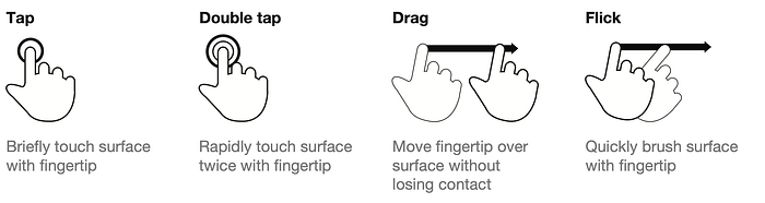
Some screens offer a touch screen option to navigate with a finger or pointer without the use of a keyboard. Craig Villamor, Dan Willis and Luke Wroblewski developed a simple guide with the basic gestures for most touch commands, named the “Touch Gesture Reference Guide”[3].
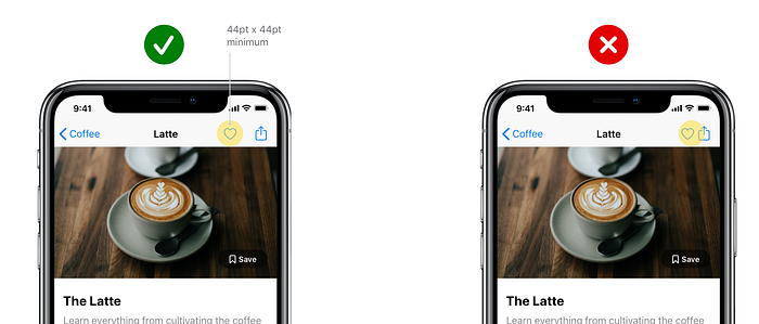
Another level AAA requirement that is not mandatory but is an important one is about buttons. Buttons that are too small or close to each other could be hard to trigger with a finger or pointer.
Buttons should have a minimum 44pt x 44pt so they can be accurately tapped with a finger or pointer. Avoiding this guideline could result in much struggle by the user because it could become hard to reach.
Conclusion
We discussed different ways in which we can make our web content Operable by different users. Altho there are many guidelines for keyboard navigation, there are other methods we must take care of.
Like in the previous blog where we talked about the WCAG Principle: Perceivable, in this one I only talked about level AA requirements (with an exception of a couple of important AAA ones). If you wish to know more about the other guidelines for the Operable principle, be sure to check the WCAG website[5].
In Part 4 we will finish discussing the POUR principles with the last two letters: making our web content Understandable and Robust. They are a couple of short ones, so don’t worry, we won’t take long.

