Explaining WCAG principles: Perceivable
This is part 2 of a series of blog posts about accessibility. Check out part 1 for more information about accessibility and get better context about what we will be discussing here.

Making your web content Perceivable
The WCAG principle “Perceivable” is all about introducing the information and components of our site in a way that all users can understand.
We need to have different alternatives to communicate our web content. Like Senior Software Developer and UI/UX Designer Anwar Montasir puts it:
“If a blind user cannot see our content, he can hear it”.
Accessibility is a team effort, everyone in your team should be aware of the importance of it. Some guidelines are a team-effort between designers and developers, so don’t be surprise to encounter a few of them. This principle can be broken down into four guidelines:
Guideline 1.1 Text Alternatives
All non-text content should have a text alternative in the code that describes the content.
Users with screen readers use alternative texts to know what they are looking at. Try to be descriptive about the element. Notice how it is not the same having “pancakes” as an alternative text than “stack of pancakes with honey and butter”.

Avoid starting your alternative text with “An image of…” because screen readers will already start with “This is an image”.
Be short. Avoid having several lines of text to describe the content. The less words, the better.
Guideline 1.2 Time-Based Media
Provide captions and transcripts for prerecorded and live audio and video content. This is to make it accessible for people that have hearing loss or problems understanding speech.
A best practice for captions is using a black background with white or yellow text, as well as having no more than two lines of text at once.

Another good practice that I find very helpful is to try making the captions draggable across the video screen. This way we can make way for information that might be lost behind the captions.
Guideline 1.3 Adaptable
Content should be presented in different ways without losing information. For example, portrait and landscape orientation on mobile devices.
As designers, it is our job to make sure that our designs are well understood in different orientations and screen sizes[1].
Guideline 1.4 Distinguishable
Make sure that it is easy for users to identify the content (either seeing or hearing) separating foreground content against its background. It is all about playing with the contrast.
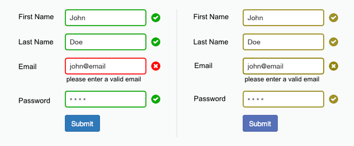
This guideline indicates that we also need to combine multiple visual cues for giving feedback and not to stick only on color.
Users with color blindness won’t be able to differentiate certain colors from each other, for example with red or green. In addition to using this colors for statuses, you could add certain icons to better differentiate the meaning.
The Distinguishable Guideline also indicates that we should avoid using audio and video that starts automatically; they can affect the performance of screen readers. It is also important to note that any sound that is three seconds or longer should have the option for pausing the sound or controlling the volume.
In terms of resizing the text, the Distinguishable Guideline says that users don’t have to struggle navigating the site or scroll horizontally when zooming in. The information should be legible up with 200% zoom[2].
Conclusion
We now know in more depth what the Perceivable principle stands for and some guidelines that we must follow to meet the criteria.
In this blog I included the guidelines for up to AA level requirements of the WCAG. If you want to know more about them, including the AAA principles, be sure to check their website for more[3].
Coming up on part 3 of this series of Accessibility posts, I will be explaining the letter O in POUR: Operable.


