Exploring a smart component concept in Figma
Isolated context-aware responsive child components

A couple of months ago I wrote an article about a set of features that I was missing in Figma. I enjoyed playing around with those ideas and I thought it would be interesting to explore this other idea I had a bit further. I would like to do a deep dive into making components in Figma more aware of its context. The overarching goal here is to close the gap between design and development. Keep in mind that I’m probably not taking everything into account whether this is realistic and its purpose is rather to explore the concept.
The overarching goal here is to close the gap between design and development as much as possible.
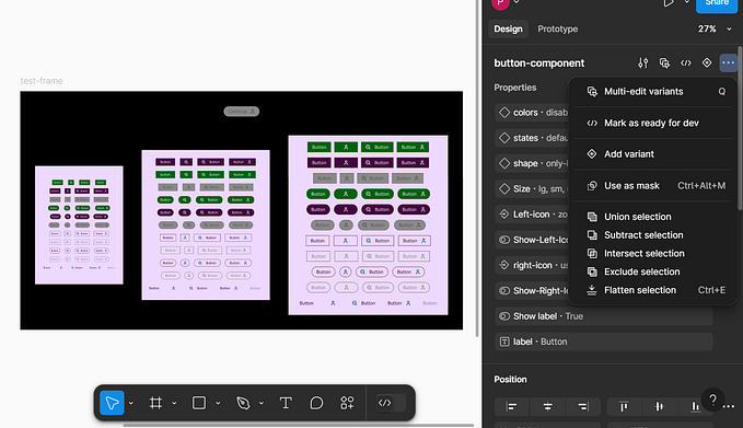
Problem
When you are designing Figma components that need to work for multiple breakpoints, you probably stumbled upon the issue that you eventually ended up with multiple variants. In some cases, you can use the Constraints and Layout functionality to make the components more scalable but you will still end up with more than 1 component. Below you can see an example of how some of our components at the project I work are setup. The sizing is based on the breakpoint we have.
❖ data table / s
❖ data table / m
❖ data table / l
❖ data table / xl
If you look at how components are built by developers, you usually have one component which adapts based on its context. In Storybook, for example, you always have one component which you can view in different breakpoints. Trying to create a similar setup is the starting point for this exploration.
Solution
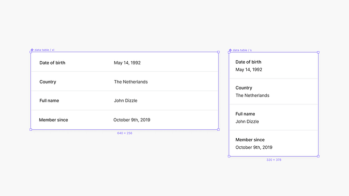
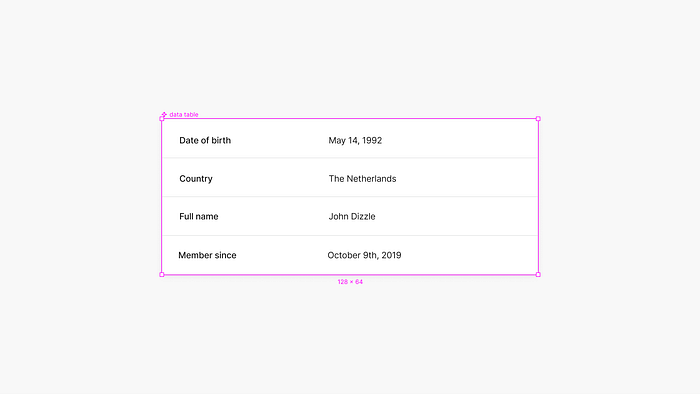
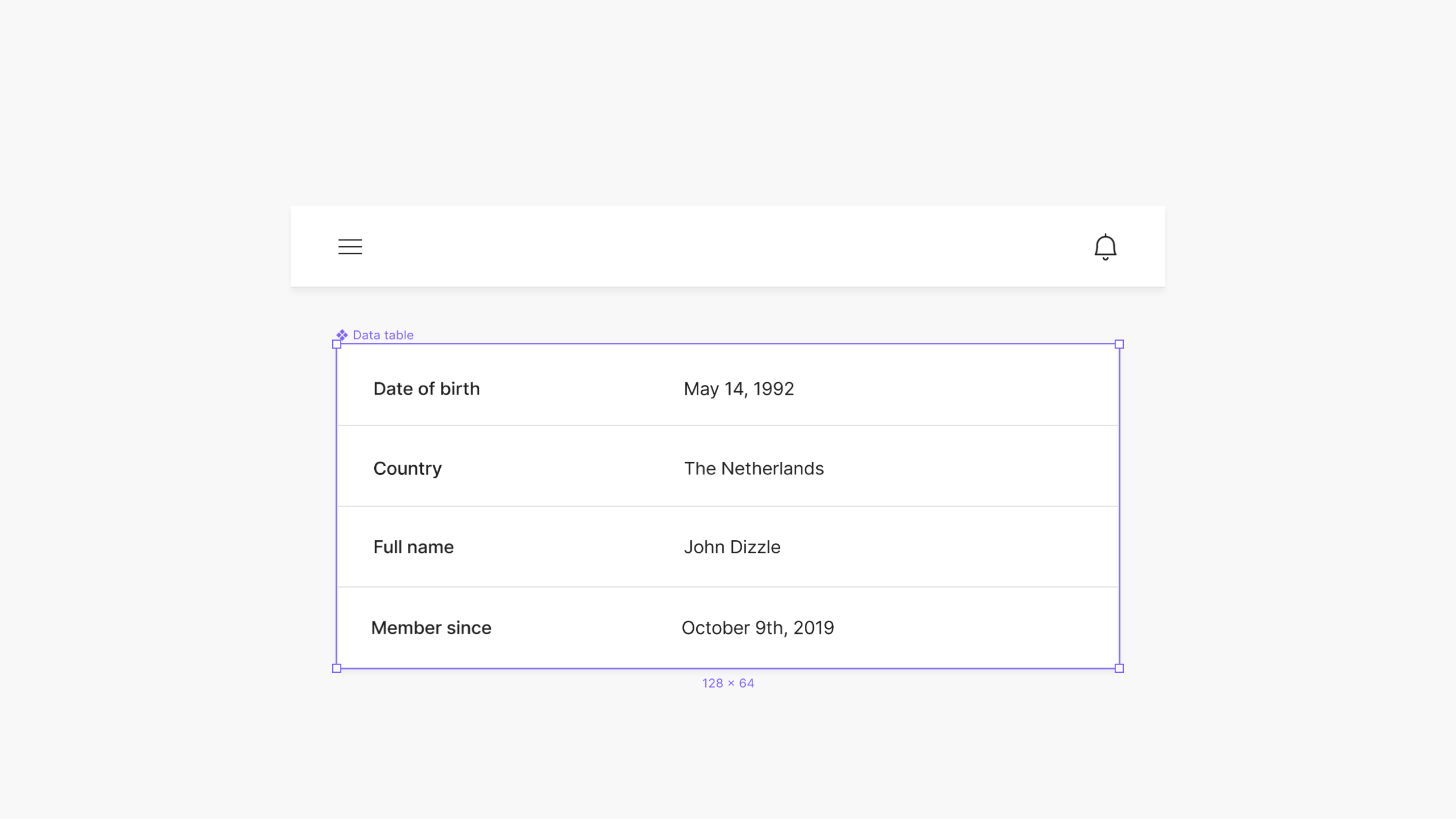
Let’s take for this example a simple data table component like the image below. Tables with variable data are usually hard to view on mobile devices because of the lack of space horizontally. For this example, I took two different sizes from the same component.
Isolating the component
The idea is that you have ✥ Smart components that can be edited in an isolated view. It would be similar to the way Sketch handles Symbols — Sketch’s version of components. I picked a different color for this type of component to have a clear distinction between regular and smart components.
Within this isolated view, you can create multiple child variants with a new panel that allows you to pick or define a breakpoint. This way you can define a breakpoint on a specific child variation of that component. With the Constraints and Layout Grid, you would still be able to define the behavior of the individual elements within the child component.
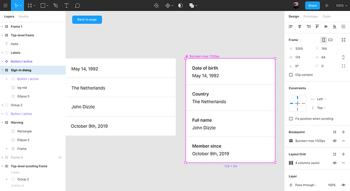
After setting up all the breakpoints inside the component, it is now fully responsive based on the frame size where it’s being used. Scaling the frame would then result in the component to scale based on the breakpoint of the frame.
Connecting components
For the Smart Component to know how it should behave with other components when scaled, there needs to be some way to connect them. For this example, I am using a simple navigation bar component together with the data table from before. The idea is that you would be able to drag a component onto each other and they would connect after some time like the sketch I drew below.
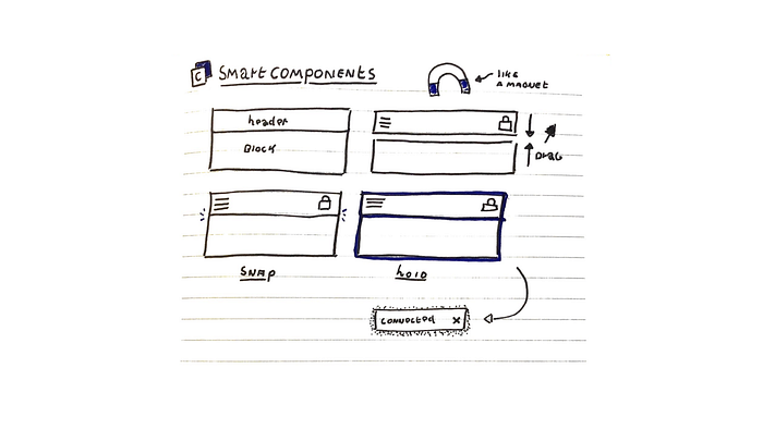
To make the concept a bit more visual I made a small prototype in Principle of how the interaction could work. On drag, a light purple border appears which indicates that the components are ready to be connected and a small loading indicator gets shown until the connection has been made. This interaction is to prevent you from connecting components randomly by mistake.
Step-by-step
- Visual indicator around the child components (light purple border)
- Time indicator on hold (loading indicator)
- Indicate the action with copy ‘Connecting components’ (visual bell)
After connecting the components, it needs to know what the margins are between each other. This could be fixed by using a horizontal grid that is set on the frame where both components are inside and to use the constraints to stay aligned.
Finishing up
Eventually, after setting up all the above, you would be able to create responsive page templates without having to switch around separate instances of a single component. Having one component would also reduce the amount of used space on a component overview page.
The isolated view for components could also be interesting for prototyping purposes. Imagine being able to prototype on a single component level. This would enable creators to design how components should work on their own and combine these within page-oriented prototypes.
Thanks for reading my article and I hope you enjoyed it as much as I did to make it. I am looking forward to the future of UI design software and how it will shape our work as creators.


