The many shades of Empathy in digital product design
How to spot and create more empathetic websites.

Before we dive into semantics, I’d like you to take a moment to reflect on your life. Flip through the opportunities that you’ve had, the challenges that you’ve faced, and the millions of nuanced experiences that have affected your day to day life.
All of these unique moments have helped shape how you interact with the world around you. Now think about your favorite barista in the local coffee shop. Try to imagine the opportunities they’ve had, the challenges they’ve faced, and what their daily experience might be like. Now try with the cashier at your grocery store, or the telemarketer calling at 7:00 pm on a Tuesday.
If you imagined other’s points of view, congrats! You just exercised a form of empathy, which is sometimes defined as perspective taking or putting yourself in someone else’s shoes. Although this is a great place to start, true empathy is a lot more nuanced. Alice Devecchi and Luca Guerrini define empathy in Empathy and Design: A New Perspective as
an understanding of another’s mental and emotional state with the intent and capacity to act appropriately
The intent and capacity to act appropriately are sometimes overlooked in favor of the more simplistic ‘put yourself in someone else’s shoes’ language. But it’s these pieces that separate empathy from its more common companion, sympathy. Empathy produces meaningful (and useful) human-centered outcomes where sympathy can only produce superficial outcomes.
If you haven’t seen Dr. Brené Brown’s beautifully illustrated talk about the difference between empathy and sympathy, I highly recommend it.

So, why should we care?
We are constantly bombarded with a massive amount of information and sometimes our brains take shortcuts to cope. For example, it’s easier to disregard information that doesn’t fit easily into your worldview than consume it and adjust accordingly. This shortcut is called confirmation bias — and it’s only one of the many biases we’re prone to (the graphic below shows them all).

Unfortunately, these shortcuts are often subconscious and can have severe consequences for our relationships, products, and society. In product development, one of the most common biases is the egocentric empathy gap, or the tendency to assume that what we value is what others value. According to a British Journal of Social Psychology study,
This gap is what can lead product designers (who tend to be tech-savvy themselves) to overestimate people’s willingness to adopt new technology. It can also lead to “power users” designing products or features that frustrate wider audiences. On the bright side — there is evidence that acknowledging this tendency and empathizing with others helps minimize its effect, resulting in better outcomes for more people.
Emotional Empathy
Emotional empathy is literally feeling how someone else feels. This is fitting since the word empathy is derived from the German word “Einfühlung” which was widely used in the field of Aesthetics to mean “feeling into”. Adam Smith credits emotional empathy with shaping our sense of morality, affecting our social relationships, and inclusivity as well as giving us the motivation to act. Here’s an example: a friend comes to you and says they’ve just received news their house was destroyed in a fire. It is highly likely that you feel distressed, worried, and sad on their behalf. You may spend time asking them questions, helping them go through their things, or raising money on their behalf because you feel their pain and want to help.

Emotional Empathy on the Web
As a designer, creator, or developer, understanding how someone else might feel when they use your product is important because it allows you to strike the right tone in your product as you address their emotional needs in addition to functionality. Think about hospital websites. People who visit them most likely need specific information about the type of healthcare provided, types of insurance taken, directions to the facility, or visiting hours. If they’re looking for this information, chances are they’re under stress and have a heightened sense of emotion. Channeling this feeling allows you to think about what aesthetics might provide them with a sense of calm while demonstrating compassion and competency. And because you have a sense of their urgency, you’ll want to give them the information they need quickly and easily. Let’s look at this in practice.
The first thing you see on the homepage above is an image that shows medical staff with a patient. This visually signals that patients are a priority. Additionally, the doctor’s friendly smile and caring demeanor indicate that compassion is a core value to the hospital. The simple color palette adds a sense of calm and professionalism without distracting from the image or important information.
The website’s architecture demonstrates insight into the visitor experience. Priority information (current flu alerts, address and contact information, and common navigation) is visible at a glance while navigation items are obvious and written in language that is easily understood.
Now let’s compare Duke’s hospital page to WakeMed’s (above). Both have a simple color palette and a hero image. However, WakeMed’s hero image focuses on an app about wait times that isn’t necessarily pertinent information for someone visiting the website. Red as a primary color in this context feels like a warning instead of offering a sense of calm. There is no image, language, or other indication that patients are the main focus of this hospital. That’s not a great message to send to someone seeking healthcare.
The navigation pattern looks obvious at first, but the options in the main navigation bar (top red bar) are not specific to this hospital’s campus which is what you might expect on the campus’s main webpage. Instead, the site-specific navigation is further down, slightly hidden, and uses jargon that isn’t clear. For someone who needs information about this hospital’s services, visiting information, or billing, this is likely to be a frustrating experience. Healthcare is already complicated, we shouldn’t design websites that make it any more confusing.
Emotional empathy is especially important when designing for people who are emotionally taxed and need to make financially significant decisions. Funeral home websites are another context where this is critically important.
The Mullins Family funeral home website above uses a soothing color palette and imagery but it does not pass the accessibility test for color blindness or the tired weary eyes of a grieving person. The main navigation is hidden behind a context menu (upper left) forcing people to search around the website for any information other than a phone number. And last but not least, the website’s copy is in desperate need of an empathy makeover. In particular, “Call Today!” reads like a retail store advertising a buy-one-get-one-free deal — at a minimum, that exclamation point needs to go.

The Lowe Funeral Home homepage above also uses nature imagery (it’s actually a slow-moving gif of swans swimming) to provide a sense of tranquility but, largely thanks to the copy, the tone is warmer and more caring. The exposed navigation at the top consists of clear, relevant options with an emphasis on a contact phone number that is legible and kind. A brief scroll down the page shows obituaries and extra resources offered by the funeral home. The website’s copy is supportive and the muted color palette is peaceful and legible.
Cognitive Empathy
Emotional empathy is not the only important aspect of empathy — cognitive empathy is the ability to intellectually understand someone else’s perspective without necessarily focusing on emotions. This type of perspective-taking requires us to withhold judgment and imagine someone’s holistic experience (recall the exercise at the beginning when you reflected on others’ experiences). According to Human-Computer Interaction (HCI) researchers, Peter Wright and John McCarthy, imagining someone else’s feelings about a given situation isn’t enough, we need to think through their perspective using our logic and research.
Cognitive Empathy on the Web
Let’s use a less emotionally charged situation to evaluate cognitive empathy — public transit — because who gets stressed thinking about that?

People generally come to transit websites from a variety of devices with specific needs. Generally, they need to be able to check train schedules, plan a trip to a new destination, and check travel time. And they need to do it quickly. Transit sites need to accommodate people’s varying degrees of familiarity with both the city’s geography and the city’s transit system. This means cognitive empathy is essential to the site’s ability to successfully serve all of its riders.
New York uses a “throw everything on the page” approach. Technically speaking, all the information you need is on the page — somewhere. The three-column layout lacks a clear visual hierarchy which means that people need to spend more time finding what they need. If you’re in a hurry or need to adjust transportation plans on the fly, this approach is not ideal. The columns are filled with text, hyperlinks, and small images that are challenging to navigate on a mobile device. Even worse, the text and hyperlinks are often difficult to tell apart. Thinking about the rider’s context of use and prioritizing information with a clear structure would go along way to improve this site.
Seattle’s department of transportation website is equally difficult to use, but for the opposite reason — it lacks enough information to be helpful. Its homepage has a list of hyperlinks to transit options without indicating which transit lines operate where or when. If you’re a newcomer to the region, you’ll probably need to click on a lot of the links, or do some extra leg work to figure out which mode of transport and then which line of transport is most appropriate for your trip.
Providing people with a regional route map, insight into cost and availability, and/or offering a trip planner would show people who are unfamiliar with the transit options that the city values their business.
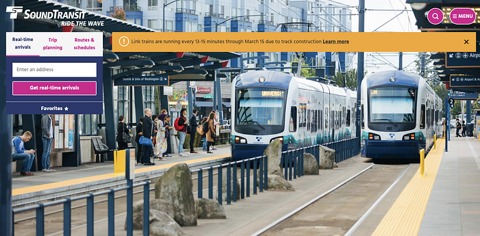
Compare the city of Seattle’s transit homepage with Sound Transit’s homepage above, which conducted user research and gathered rider input. The Sound website is highly focused and highlights transit alerts, trip planning, and schedules. Its pared-down design is easy to use and translates well to mobile devices — perfect for using on the go.
One last example of a transit site that’s designed with different perspectives in mind: the Boston Metro site. It’s easy to use for people who are hopping on transit for their first or their millionth time. The navigation bar focuses on schedules, alerts, trip planning, and lets you quickly search for what you need. Scrolling just a bit shows fare information for each mode of transportation — highly relevant for people planning a trip for the first time. And like the Sound Transit site, it’s easy to use on a mobile device.
It’s obvious that the designers spent a lot of time thinking about different rider perspectives and are constantly updating the site based on rider feedback — basically the definition of cognitive empathy. Additionally, they use a friendly tone and familiar language which makes riders feel comfortable using their services. It’s a great demonstration of emotional and cognitive empathy working together to meet people where they are.
Conclusion
Empathy is a multifaceted concept that is much more than a quick thought about someone else’s shoes. When appropriately applied, it helps uncover valuable insights into the lives of other people and then moves us to act (and in this case design) on their behalf. In this sense, empathy is the ultimate defense against some of our most common biases and one of our best hopes of producing outcomes that are useful and compassionate.
We focused mostly on understanding what empathy is in this article. If you’d like some exercises to help you practice empathy, check out our 5 techniques to becoming an empathy master.
Article Citations:
- Types of Empathy from The Skills You Need, accessed December 2019
- Rikke Friis Dam and Yu Siang Teo, Design Thinking: Getting Started with Empathy from Interaction Design Foundation, accessed December 2019
- Alice Devecchi & Luca Guerrini, Empathy and Design: A New Perspective, 2017 from The Design Journal
- Brené Brown, Empathy vs Sympathy, 2013 from The RSA
- Jeff Desjardins, Every Single Cognitive Bias in One Infographic, 2017 from Visual Capitalist.
- Shana Lebowitz and Allana Akhtar, 60 cognitive biases that screw up everything we do, 2019, from Business Insider.
- Jeanne Liedtka, Perspective: Linking Design Thinking with Innovation Outcomes through Cognitive Bias Reduction, 2014 from Journal of Product Innovation Management.
- Karl-Andrew Woltin, Vincent Y. Yzerbyt, and Olivier Corneille, On reducing an empathy gap: The impact of self-construal and order of judgment, 2011 from The British Psychological Society.
- Brian Carroll, Why Marketers Fail at Customer Empathy and How to Fix It, from B2B Lead Blog, accessed January 2019.
- Karsten Stueber, Empathy from Stanford Encyclopedia of Philosophy, Fall 2019 Edition
- Adam Smith, Cognitive Empathy and Emotional Empathy in Human Behavior and Evolution, 2006 from The Psychological Record.
- The Psychology of Emotional and Cognitive Empathy, from Lesley University, accessed December 2019.
- Susana Martinez-Conde, Stephen L. Macknik, How the Color Red Influences Our Behavior, November 2014 from Scientific American
- Daniel Goleman, Three Kinds of Empathy, 2007 from Daniel Goleman
- Peter Wright and John McCarthy, Empathy and experience in HCI, 2007 from Conference: Proceedings of the 2008 Conference on Human Factors in Computing Systems, Florence, Italy, April 5–10, 2008.
- Kathleen Meditz, Developing user personas for the new MBTA website, 2016 from Medium.
- Liana Leahy, How mtba.com listens and learns from you, 2019 from Medium.

