Exploring the experience of podcast listening — a UX case study
For the past several months, I have been on and off working on a project aimed to explore habits of podcast listening, and to create a new experience from my findings. I wanted this project to be transparent regarding my process, so this write-up is an attempt to document it, as well as showcase the final product.

Table of Contents
- The Beginning Part
- Back to Square One
- Pivoting
- Second Draft
- Third Draft
- Explaining My Designs
- Key Learnings
- Room for Improvement
- Wrap up
The Beginning Part
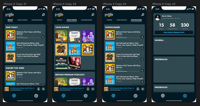
In April last year, I became a cool and trendy young person – I purchased a monthly podcast subscription, a la Stitcher Premium. For those who are unfamiliar, Stitcher is a streaming service and hosts several exclusive podcasts, specifically those related to improv comedy — my second favorite kind of audio media. But I digress; as I began scrolling through the catalog on the mobile app, I quickly came to the realization that while the content was pure, the interface left little to be desired. And thus, sparked inspiration for my latest case study.
I started this project by auditing Stitcher’s application. I focused on things I normally do when I listen to podcasts, mainly: finding an episode of a show to listen to, and interacting with it. From a usability standpoint, Stitcher has room to improve.
In Stitcher’s defense, their app isn’t terrible. It just isn’t great. The app appears to encourage discovery of other podcasts over my own listening habits. This, coupled with a couple a few other superfluous steps and features and treatment of certain things ultimately lead to a semi annoying experience. [Disclosure: by the time I began writing this, Stitcher had updated its application. What I’ve written below reflects the newer version, but some of the issues I’ve pointed out have remained the same.]
The initial home page of the app is a list of episodes; however, it is a mix of 1) the newest episodes from podcasts I follow, and 2) recommended episodes from podcasts I don’t follow. I can, however, filter to refine the list. Additionally, the treatment of items in this list feels very awkward – I don’t understand the spacing of items, and each item takes up so much space that on my iPhone 7 I can only see 2 items at a time. The home page ends up being a waste of my time, so I typically navigate manually to shows and episodes I want to see. It’s just easier.

When it comes to navigating to a specific show (which I often do), it gets a little annoying. First, the bottom navigation could use some clarification — at first glance, I’m not quite sure what the icon second from the right is (browse), and I assume that the icon third from the left is my profile (“My Podcasts”). Second, if I am looking for a specific episode of a podcast, it takes 4–5 taps to reach from the home page. So even though it may take more effort to reach, I feel more in control of what I’m looking at, making it easier for me to understand. Also, it’s way easier to quickly scroll through a list of episodes where I can see 6 episodes of shows I am actively interested in as opposed to 1–2 episodes (home page) that may or may not apply to me.
There’s a lot of little finicky, niche features in Stitcher. When playing an episode, the user has the option to: set a sleep timer, open a “car mode” interface (larger buttons), change the speed of the episode, cast to a Chromecast device, and view the podcast queue. Also, when playing an episode, you can go back 15 seconds, but 30 seconds forward. Strange.
This pattern of feature-fever continues in other parts of the app. When viewing “My Podcasts”, Stitcher differentiates between “favorites” aka shows I follow, “saved episodes”, and “downloaded episodes”. In reference to the latter two, I’m not sure why they have both – when would I want to save an episode but not download it? They also provide the option to create a new playlist, and show you your listening habits (neat!). Personally, I don’t see the need to make podcast playlists, but I could see it being a feature people would want. While some of these features are actually pretty interesting, some leave me scratching my head. I wonder if some of these features were requested from user research, or if they were put in on a whim.
Overall, I appreciate Stitcher’s efforts to introduce new features that may amplify my experience, but my own podcast listening doesn’t seem to be prioritized. Make it easier for me to listen to my shows!
Once I annotated Stitcher’s app, I began wireframing. Early attempts to create a new design were proving to be tougher to figure out than I thought, and my low fidelity mocks left me uninspired. Coincidentally, I also started working full time around this time, leaving me with little time to focus on this study. So, I ended up putting it on the back burner.
By the time I returned to the project months later, my only references were my audit and the half-baked mock-wires. Unsure of where I left off, I pushed forward and attempted to make some polished mockups, disposing of my initial wireframes in the process. The end result was a design that, while explored some interesting ideas, didn’t have much regarding vision. It just felt … broken.
That being said, it was a great exercise on trying and failing to build a design system. After each iteration in this phase, I asked myself “okay, but how do I get to my profile?” or “how do I perform this action?”. I never stopped to question my goals or objectives of the project. What was supposed to be a logical step forward turned into a purely cosmetic overhaul. I soon found myself wondering what I was even trying to accomplish, or if my solution even made any sense. So I started over.
Back to Square One
Once I made the decision to scrap the previous design work, I spent some time framing the project in a Google doc. I wrote a design statement, identified problems I found from my audit, listed some questions I was trying to answer, used my own listening preferences to come up with a few solutions, and kept a timeline of things I wanted to accomplish.
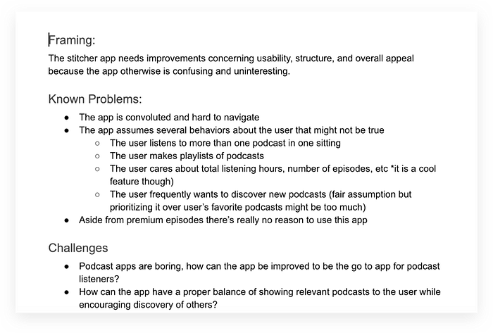
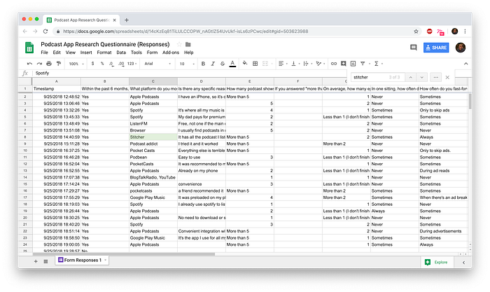
I also wanted to confirm some of my assumptions about podcast listening, so I created an anonymous 12 question survey (via Google Forms). I asked participants about their podcast listening behavior, such as “How many episodes do you listen to in one sitting?” or “How often do you fast forward in one sitting?”. I pushed my survey online, on Reddit (r/samplesize, a subreddit for survey taking) and received 106 responses [Disclosure: I added a few questions after receiving feedback on my survey and then reposted my survey on Reddit, so some questions only received 42 responses]. From the data I collected, I found out the following information about general podcast listening habits:
- 25% of people listen to their podcasts on Apple Podcasts, while 15% of people use Spotify, 10% use Youtube, and 50% use a third party service like Stitcher or Pocketcast (among others). The most common responses for why they use the service of their choice were “it’s convenient”, “it’s already on my phone”, “it’s easy to use” and “it has all the shows I like”.
- 63% of people actively follow less than 5 different podcast shows.
- In one sitting, 42% of people listen to 1 episode of a podcast, while another 28% of people don’t finish the episode.
- 28% of people only fast forward during an episode to skip ads.
- 55% of people reported that they rarely listen to an episode of a podcast more than once.
- 32% of people find out about new podcasts by hearing about it on a podcast they already follow.
- Of 42 participants, 43% of people download podcast episodes before listening to them, and 49% reported they were very satisfied with their podcast listening experience. Interesting.
Pivoting
Somewhere between gathering data from my research and starting my second draft, I made the decision to step away from focusing solely on redesigning Stitcher, and to instead make a podcast experience on my own terms. There were a couple reasons I made this decision.
First, I found that some of the problems brought up in my survey were broadly an issue for more than just Stitcher. Second, I wanted to focus solely on interactions regarding navigating and listening to my own shows, as opposed to designing a full set of experiences such as browsing new shows or managing my profile/subscriptions. This relatively streamlined approach allowed me to stay focused and keep my objectives specific, and also avoid being scatterbrained like my initial take. I could create a new interface without the constraints of an existing system. So, I again changed my objective from redesigning Stitcher as a whole to creating a cohesive set of experiences (minus Stitcher branding) that aim to simplify personal listening habits.
After re-framing my project, I did another competitive analysis of Spotify and Apple Podcasts. I found some interesting UX patterns, and from there created a list of sections to include in my interface (which I wrote down in my framing document). I found that there are about 3 key sections to concentrate on:
- Podcast Show Page – a specific show section that contains relevant information to the show, as well as a list of all episodes.
- Now Playing – displayed when an episode is playing. It allows the user to manipulate the content being played. Also, a condensed form is displayed while performing another action within the app.
- Podcasts List (Home)– the initial page that a user sees, often when first opening the app. It contains recent episodes from shows you follow, and/or a list of the shows themselves. I’ve noticed this section is sometimes split into two pages in other apps – one for all recent episodes (initial home page), another separate page for all shows (think songs vs albums, videos vs subscriptions).
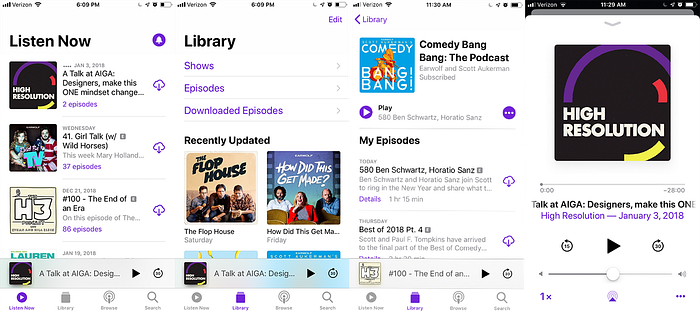
When examining Apple Podcasts, I found it to be strangely segmented. The differentiation between “Listen Now” and “Library” makes sense on paper, but in practice it just feels odd. Of course putting the content in its purest form — an episode of a show — at the front of the experience could make my interactions fairly straightforward. However, they assume that what I’m looking for is contained in the list of recent episodes. Like I mentioned previously, my listening habits usually involve me looking for something specific, compared to my viewing habits on Youtube, for example, where I know I want to watch a video, but I’m unsure of what I want. It’s a small change in behavior, but I enter the app knowing which show or shows I plan on listening to, and since I only follow a handful of shows it is just easier to navigate to each show individually.
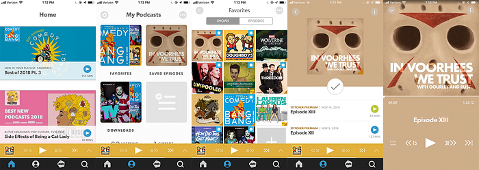
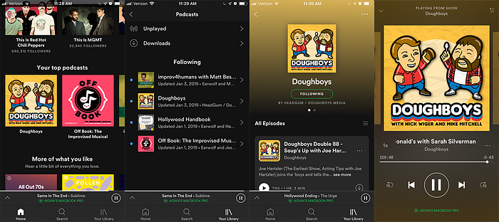
Spotify has an interesting problem, in that its podcast streaming service seems to be kind of an afterthought. It makes sense, given that the majority of people that use the platform probably use it for music as opposed to podcasts. But nevertheless it felt like I was checking nooks and crannies in the app for any semblance of a dedicated space for podcasts. Likewise, certain interfaces, especially the “Now Playing” section, feel like a mishmash of UX priorities. For example, where one might use the swipe-to-skip feature continuously when listening to music, it doesn’t make much sense to perform the same action with a podcast episode. It’s consistent with the rest of the platform, but its use case is a bit iffy.
That being said, I did appreciate Spotify’s podcast show page: while showing the cover of the podcast for each episode is a bit redundant, I appreciated all the relevant information condensed into chunks on the page. It’s easy to digest and I know how to interact with it.
Second Draft
In terms of creating a new interface the second time around, I wanted to pay more attention to the smaller details. I started by making a couple quick medium fidelity wireframes to get a feel for the UI. Then, I created a style guide of fonts, colors, icons, and early design components that could be applied universally. After this, I worked on my mock-ups.
Also, I wanted my final deliverable to be the dimensions of an iPhone X, but it was difficult to grasp the size and spacing of things with that display, since I was using an iPhone 7. So, I made my mocks to fit the display of my phone, mirrored the designs to my device to make sure elements fit properly, and then remade the interfaces again for the larger iPhone’s display. In hindsight it might’ve been a tedious step, but it helped me understand my designs a bit better.
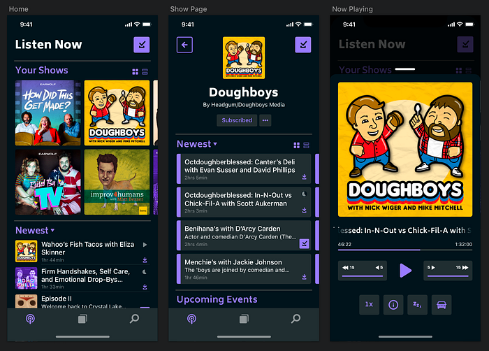
The second draft was definitely a more solid attempt at creating a new interface. The wind-up to creating the mockups was good — framing the project helped leaps and bounds, and the user research was really good validation, but UI-wise I felt like I didn’t follow through. There were several issues with the UI that ended up being settled on instead of solved, and I felt like I borrowed too much from other applications. For example, in “Now Playing”, the elongated text fades off the side if it’s longer than one line. Podcast episodes usually have pretty long titles, and if I were using this app I certainly wouldn’t wait to read the whole thing. Compromises like these, while they exist in other leading podcast applications, ultimately left me dissatisfied.
There were some pretty cool features I added this time that made it into the third draft (which I will explain later), but overall the second draft designs were just okay. The point of the project was to make valuable usability changes, not rehash what everyone else is doing. So I again went back to the drawing board.
Third Draft
I feel that by my third take on this project, it had grown into something I could truly own. When I started my third draft, I kept most of my initial styleguide and app architecture (as well as my findings from the audit and user survey), and focused more on the UI and interactions between sections. This time, instead of looking for inspiration primarily in other podcast applications, I spent my time on Dribbble. After some time on the platform, I found a new approach – use bottom sheet-like components displayed at half the length to display multiple pieces of information simultaneously. This sort of UI is similarly used in apps like Google Maps (except in that context, bottom sheet content is secondary).

With this interface, the user would be able to interact with both pieces of content without having to navigate to another section. If the user wants to see more or less of either content, they would simply expand or compress the bottom sheet. So, the most concise information – in this case the episodes of shows – can be displayed directly, while still displaying other bits of relevant information. The UI is flexible enough to function across the 3 main sections I defined without getting finicky or breaking. Keeping this in mind, I designed my mocks. And a logo too! Pardon the pun.

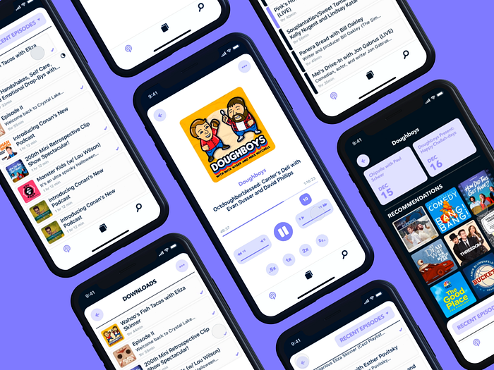
Explaining My Designs
With my third draft, I found myself able to make meaningful and original design changes based on my research and findings. While it may not be perfect, it’s certainly the most polished iteration, and it’s something I can stand back and be proud of. So let’s jump into it.
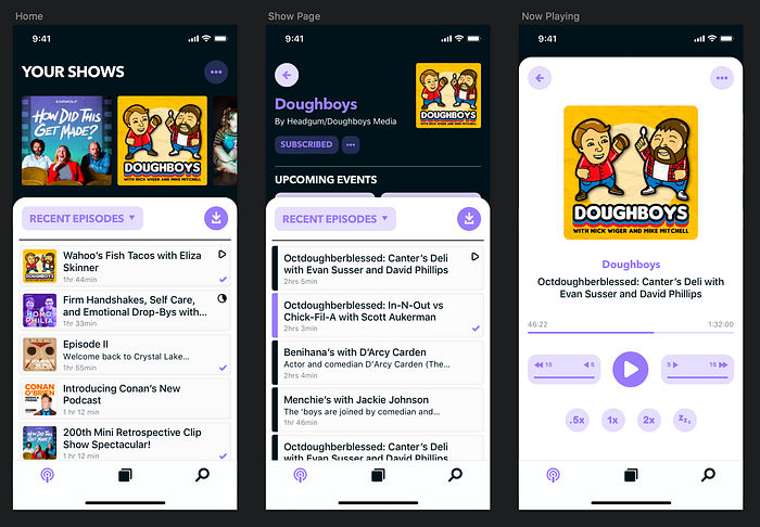
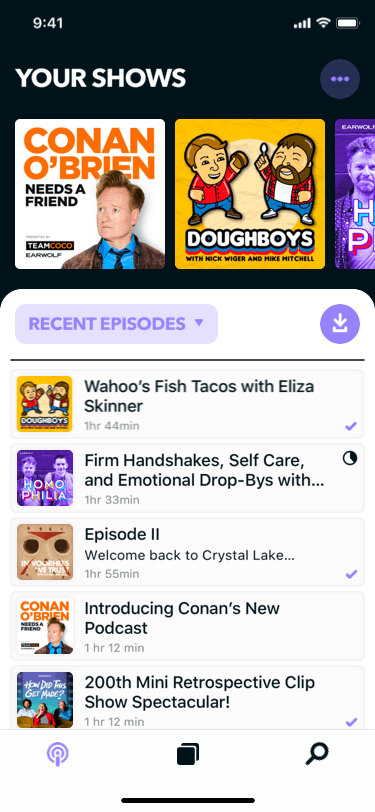
First, the home page (aka podcasts list). Using the half-bottom sheet approach, upon entering the app the user initially sees a list of all recent episodes from shows they follow, as well as an h-scroll of all shows they follow above it. As I previously mentioned, the most important pieces of content in a podcast app are the episodes themselves. The list of episodes can be filtered to show most popular episodes as well as older episodes as well.
Furthermore, the downloads section is now surfaced to the top right of every bottom sheet that contains a list of episodes. To download an episode, the user left-swipes on the episode, and left-swipes again to delete it from their device. Upon scrolling through the list, the bottom sheet expands full screen. Additionally, since most people from the survey only follow around 5 shows, the list of shows is displayed via an h-scroll, making use of space and simplifying the experience (see Apple’s “Listen Now” vs “Library”).
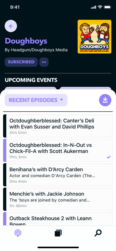
The “Podcast Show Page” follows a similar approach to the home page: the primary information displays the episodes of the show in question, followed by other relevant information to the show. Because a good amount of people discover new podcasts via podcasts they already follow, there is a section behind the bottom sheet dedicated to showcasing recommended podcasts. Also included is a “Live Shows” section, where users can see upcoming live performances and prepare accordingly.

Lastly, when playing an episode, the user is taken to the “Now Playing” section, which contains my personal favorite feature, what I call the “super-scrubber”. Often times, podcast applications include the ability to skip or revert to other podcast episodes. However, 42% of people listen to 1 episode of a podcast in 1 sitting, and another 28% of people don’t finish the episode. Therefore, the ability to skip shows seems to be a feature that not many people use. And since about a quarter of people surveyed use the fast forward/rewind features solely to skip ads, it only makes sense to make it easier to refine that ability.
Enter the super-scrubber: a component that allow the user to fast forward or rewind in increments of 5 seconds, from 5 to 15 seconds. And of course, the title of the episode is displayed on multiple lines instead fading off the page.
Key Learnings
Overall, this project greatly exceeded my initial expectations. What started out as a mere visual design project ended up being a mix of research and design iteration. I tripped and stumbled a few times, and at certain points lost my vision of the project, but in the end I came out with a high fidelity prototype, a functioning design system, and data to back up my design. I feel satisfied and accomplished with my work output, and I learned a lot through each iteration. Here’s some key takeaways:
- It’s an Iterative Process: It’s a huge cliche, but there’s a ton of learning in failure. There will be times where you commit to something, spend hours on it, and it just doesn’t work. It doesn’t feel great, but now you know what needs to be improved. Get back up and take another swing.
- Framing and Research Matter: When I first started as a designer, my attention span was incredibly short. I had an idea, I worked in sketch for a few hours, and pushed the mocks to Dribbble the same night. The assumption that good design happens overnight is false. Spending time to frame a project is crucial in the design process. Identifying known problems, solutions, challenges and goals will help in determining what to focus in on, and will keep you sane when you hit a snag. Likewise, consider performing user and UX research before jumping into Sketch. Having your assumptions validated from real users will make a huge difference. And definitely try posting to Reddit if you choose to do an online survey.
- Be Aware of Design Trends: Trends can be a huge help when creating new designs. Competitive analysis has the potential to show you what is currently working in the industry, or what isn’t. It’s important to know the difference. Just because two or three leading companies use the same layout doesn’t mean it’s inherently good. Likewise, if a feature or component in another similar application is working, great! Use it to spark inspiration. Be original and stay sharp.
Room for Improvement
There’s no such thing as a perfect design, or a perfect designer, and this holds true for myself and this project. Here are a couple things I could improve on.
To begin, because I chose to focus solely on the personal-listening aspect of podcast applications, I failed to consider the browsing, search, and other features within a podcast application (aside from the placeholder bottom nav). Therefore, it’s unclear whether or not my half-bottom sheet approach would work in other areas, or whether or not it would even make sense to include it.
When performing my user research, I depended solely on online interactions with subjects. It is plausible that because of this dependency, specifically from using Reddit as a means to collect information, that my data from my survey might have been skewed to represent a specific demographic: podcast-listeners who browse Reddit. While this isn’t a huge issue in the grand scheme of this project, it could have been equally beneficial to distribute the survey in person, or examine how other people interact with their respective podcast app of choice.
There are several microinteractions in my prototype that are a bit left field to say the least. A lot of navigational buttons move around the page when interacted with, and it might be hard for users to make sense of where they are in relation to the rest of the application. The same can be said for the new features added. If I were to take this project a step further, I would put my prototype in front of users (preferably the same people interviewed), have them perform a few tasks, and ask to walk me through their process. I’d use this information to apply changes to my design.
Wrap up
The goal of this write-up was to document the process of this project from start to finish. I believe it’s important to not only show off the final deliverable, but to be transparent in the journey you took to get there. I hope this article has provided some insight into the design process.
I’ve compiled most of my files into a Google Drive folder, including: my framing document, results of my survey, a sketch file of the 3rd draft, and the prototype. You can check it out via my Google Drive.
Thanks for reading! If you would like to reach out, email or connect with me on Linkedin. Feedback is appreciated!
Tools used for this project: Sketch, Google Docs, Google Forms, Principle for Mac, Adobe Illustrator, Adobe Photoshop, Reddit