Fail early: the hidden design principle behind great UX
Why good designs fail as early as possible in the user journey.

There’s a principle in design that doesn’t have a name — at least, as far as I know — but can make or break products and services due to the intense frustration and rage elicited from users when the principle is violated. I’ve taken to calling it “failing early” because I keep seeing it pop up everywhere.
Just to clarify, I’m not referring to the fail fast principle in startup culture in which it’s preferable to spend minimal resources to test an idea, but it’s a tangentially related concept.
At first glance, failing early doesn’t sound like a good thing. “Why would I want my service to fail at all?” you might be thinking.
But hear me out.
Why is it important to fail early?
Whether your product is software, or a retail operation, or any other service, you can’t fulfill all customer requests all of the time. You might have geographic constraints that limit your service coverage to certain areas, disruptions to your supply chain that make certain products unavailable, or you might simply get requests that are outside of your core competency.
In those situations, it’s better to let the customer know at the earliest possible time that they can’t get what they want. That’s failing early in a nutshell.
In a way, failing early is an extension of the UX heuristic visibility of system status, which advises us to “present feedback to the user as quickly as possible” in order to create trust through predictable interactions.
Failing early vs. failing late
Consider the scenario when an experience fails late. Let’s say you go to a restaurant. You leaf through the menu, take a few minutes to decide, and finally call the server. The server takes your order. After 15 minutes of waiting, he informs you that the salted fish fried rice is unavailable and asks if you want to have it replaced. You reluctantly agree. After all, you’ve already spent 15 minutes waiting — a sunk cost fallacy, but let’s leave that discussion for another time. After another 20 minutes of waiting, the iced tea and beef brisket arrives but the server informs you that the dumplings you wanted are unavailable. By then your frustration is reaching volcanic levels but it’s too late to back out now. You eat the food you didn’t want in the first place, make a payment, and leave — vowing to leave a bad review.
Compare that to the alternative of failing early. You arrive at the restaurant and take your seat. As soon as you sit down, the server immediately informs you that dumplings and salted fish fried rice are unavailable. You decide to go elsewhere.

Failing late creates so much frustration and annoyance because it wastes your time and locks you into suboptimal options. Conversely, failing early helps you avoid wasting time and resources and maximizes your autonomy.
Applying the “fail early” principle to a food delivery app
So how do we apply the “Fail Early” principle?
First, you need to identify your failure scenarios. For a food delivery app, this might include the following:
- The restaurant is closed
- The delivery address is outside of the service area
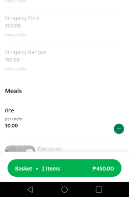
- A specific food item is unavailable
- Expected delivery delays due to a lack of riders
Then, you need to design your customer journeys and flows so that the failure scenarios can surface at the earliest possible time. This is why it’s common for delivery apps to ask for your location at the beginning of the journey so that it can immediately filter out all restaurants that don’t include your address in their service area.

Closed restaurants can be handled by either hiding them from the search results or showing them from the search results but placing a label and applying visual styling to indicate that they’re closed.
Unavailable food items can be handled similarly by applying visual styling and clear labels to indicate they’re out of stock.
Failing early in digital banking and mobile wallets
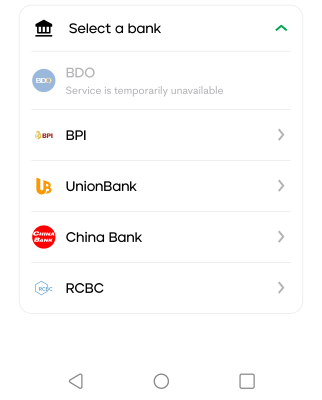
Using the method we discussed earlier, let’s first identify a key failure scenario for digital banks: third-party downtime. Mobile wallets and digital banking apps typically integrate with a swathe of other third parties to provide services such as paying bills, adding money to your account, sending money across banks, and so on. Inevitably, these other parties will experience downtime.
Now, as we’ve talked about, we need to push the failure as early as possible in the user journey to avoid frustration.
For example, if there’s a bank transfer facility and the third-party is down, then we shouldn’t let the customer proceed with the transaction at all so that they don’t waste time typing the recipient’s account number and amount, especially if they haven’t saved those details previously.
How do you actually fail early?
We now know how to apply the principle on a high level. There’s still one remaining question, though: how do we actually inform the customer in a digital app or service? Should we show an error? Hide the problematic service or product? Disable the item?
As usual, it depends on the context. The most important thing is clearly communicating why they can’t proceed with something.
For out of stock products, you could place an “Out of stock” or “Unavailable” badge along with subtly greying out some of the colors, though keep in mind your contrast ratios for accessibility.

For unavailable services like our bills facility on downtime earlier, we can apply a similar badge along with slightly greying out the icon. Then, show an error message when they tap on the icon.
What you SHOULDN’T do is just disable buttons or actions without any explanation via copy or error message. Disabling buttons is generally bad practice because the user often doesn’t know why it’s disabled.
What if you hid the unavailable item instead? Well, hiding has a similar issue: the user doesn’t know what happened and why they suddenly can’t find a feature or product they wanted. Usually, it’s only a good idea to hide something in the UI if it’s irrelevant to the current mode or situation. There are some exceptions.
In our example of a food delivery app earlier, you could initially hide the restaurants that are closed, i.e. outside business hours, but provide a filter to show closed restaurants so that customers can order for the next day. Or, you could sort the search results so that the closed restaurants show up at the bottom. That way, the results are more relevant but the customer can still find the closed restaurants.
Key takeaways
- Failing early means informing customers as soon as possible when you cannot meet their needs, which helps avoid frustration and wasted time
- Identify potential failure scenarios and find ways to surface them to the user as early as possible
- Clearly communicate why the product, service, or function is unavailable


