Understanding Figma’s interactive components feature

Figma has been busy working on a lot of new features recently and one that has captured my attention is Interactive Components. This feature allows us to quickly assemble reusable interactive components and bring our designs to life as clickable prototypes.
Before this feature was developed, we could create interactive prototypes, but it involved workarounds and a lot of effort duplicating and tweaking multiple frames to demonstrate interactivity. It was not an efficient process when it came to making updates.
The difference with the new feature is that we can define interactions between variants at the component level. These interactions are then baked into the component and will be available in all instances of it.
Previously, we would link entire frames to create our prototypes. Then Figma launched its Variants feature, allowing us to have multiple states of any single component. This still meant using workarounds to simulate interactions though.
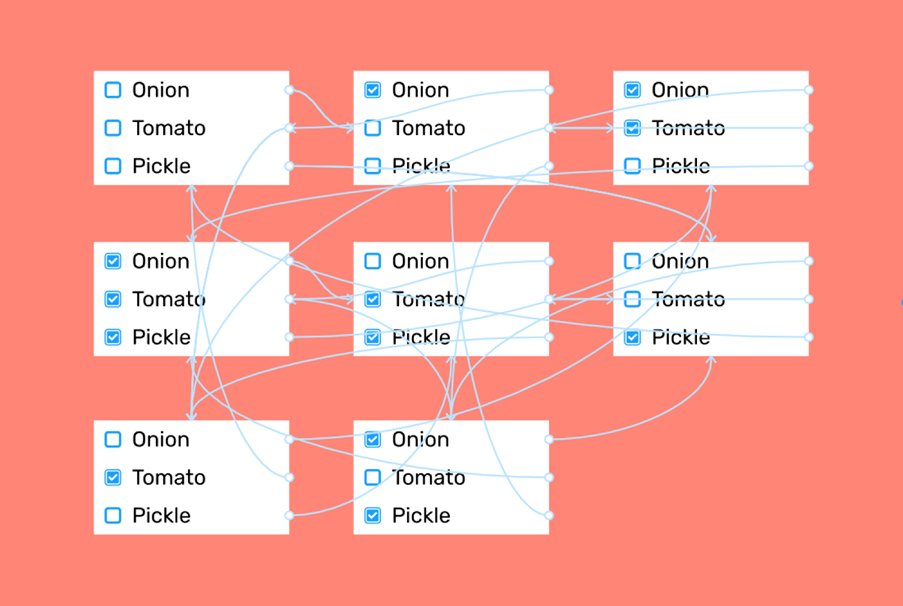
As you can see above, to demonstrate interaction with three checkboxes, we previously needed 8 screens, which would all be the same, except for the checkbox selection. We would also need 24 interactions defined between those eight screens.
The Interactive Components feature builds on the Variants feature, allowing us to create interactions between the variants within a component.
These interactions can be set to work, based on a variety of triggers, most commonly “On click”, but also “On drag”, “While hovering”, “While pressing” and other triggers. “After delay” is a useful one that I’ll discuss later. This allows us to produce animations after a predefined delay, i.e. without any user interaction.

Using the checkbox example again, with the Interactive Components feature, the 8 screens and 24 interactions are replaced by defining the interaction at the component level. This results in just 1 screen and 2 interactions.
How it works
I’ll use a hover state on a button as an example.
To start, create a button component with variants for “default” and “hover”. If you’re new to variants, check out this guide from Figma first.

Adding interactivity
- Switch to Prototype mode.
- Select the “default” variant inside the component. You’ll see the same blue prototyping nodes on the component variants that you see when making prototypes using frames. Drag this node to the “hover” variant in the component.
- Select “While hovering” to create a hover state.
- Figma will recognise that you are working within a variant and will provide a new “Change to” option. This allows you to change from one variant to another. It’s an option that will only be available when prototyping with variants.

This component is now set up with a hover state interaction. Every instance of the component will now inherit these new properties.
To see this interaction working, add your component to a frame, select the frame and click the Present button.

You can also nest interactive components, in the same way that you can nest regular components. In the example below, the Button and Menu Item components shown on the left have hover interactions.

These components are nested inside the Dropdown Menu component on the right. Additional click interactions are added to the dropdown component.

You can see how this approach is much more efficient when you need to change something. For example, changing the colour of the hover state once in the Menu Item component will change it in all three of its instances in the Dropdown Menu component.
Prototyping animation
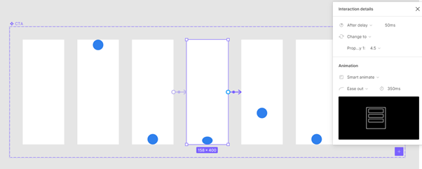
Interactive Components is a great feature for showing interaction in standard UI components, such as buttons, switches and dropdowns. It can also be used along with Figma’s animation features to set up multiple animations within a single frame in your prototype. For example, I set up a component of an animated button, with variants for the different stages of its animation, using the “Smart animate” feature and the “After delay” trigger. I also set up the headline text in a separate component, to animate after a delay.

This was done by setting up a component for the button with seven variants for each step of the button animation. Then I added an interaction between each variant.
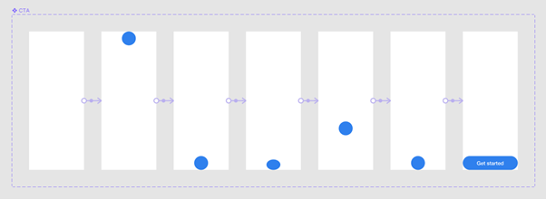
The “After delay” trigger and Smart Animate feature can be used to simulate a ball bouncing and becoming a button.
The headline text was set up in another component to animate in after a separate delay.
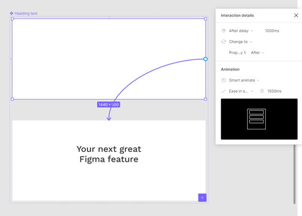
These two components were then added to a frame. The interaction properties defined in each component work independently of each other.
The ability to add multiple components (each with their own embedded animation rules) to a single frame allows us to create rich micro-animations in prototypes.
Conclusion
The Interactive Components feature is a welcome addition for those of us who create prototypes. It makes the process of prototyping much less daunting, more modular and efficient. It allows designers to experiment with concepts, iterate designs quickly and ultimately produce more advanced and realistic prototypes. Having better prototypes also improves usability testing as it gives users a more realistic prototype to test, which should result in richer insights.

