Finding My Way Through The Amazon
A UX case study for Amazon’s iOS App

Overview
I use Amazon obsessively to research and buy all my products — I even considered myself a power user, up until I discovered a feature in the mobile app that I had never noticed before. This made me curious about how other customers were using certain features and inspired me to conduct a UX case study on Amazon’s iOS app.
Quick usability testing revealed several issues with key features in the app, so I designed solutions to solve those problems and validated them with additional usability tests.
Objectives
- Discover how people use the Amazon mobile app, specifically around searching and purchasing an item in a store
- Find pain points in the user experience
- Create solutions to solve those pain points

Why Amazon
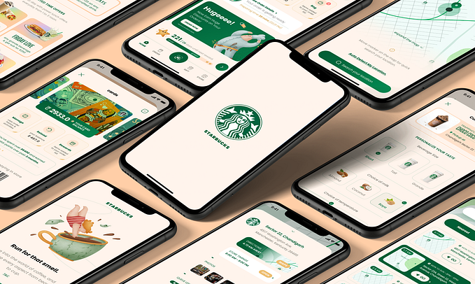
Amazon is my go-to place for discovering, researching, and buying the majority of all my products. One thing I love is being able to use my favorite service on the go with the Amazon mobile app. Recently, while shopping for some products at a store, I discovered a feature on the mobile app that I didn’t even know existed — the scan feature. It is more powerful than your basic barcode scanner, as it can recognize shapes and objects and surface the exact item in the mobile app, or find something very similar to the item you were looking for.

I was really excited to find this feature because it made product research and comparison an absolute breeze when shopping for products in stores.
I did wonder, however, why it had taken me so long to discover the feature in the first place. When had other users figured out the scan feature? Was it just hard to find? Was it possible that there were other features in the app that I wasn’t aware of?
How are other people using the Amazon mobile app, and what issues are they running into?
To get answers to these questions, I decided to take action and do some guerrilla usability testing on the user experience of Amazon’s app.
Process
To identify and solve real UX problems, I followed this design process:

Guerilla Usability Testing
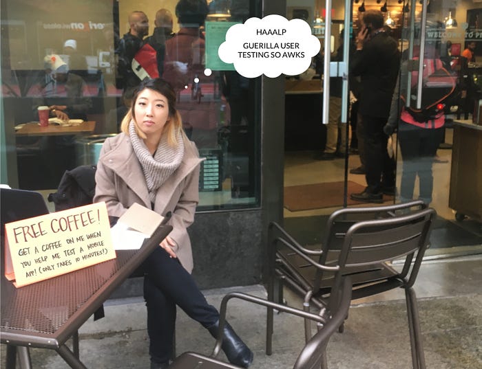
To test the user experience, I asked 7 people to go through a series of pre-defined tasks on the mobile app as I recorded their actions and took notes on anything they said or did during the usability test.
All of the users had previous experience with shopping on Amazon on desktop, but had little to no experience with the mobile app.
Before I assigned the tasks, I set up the scenario below:
“You’re in a bookstore, and you see this book that you want to buy. However, the price looks a little steep and you’re wondering if you could find a better deal online.”
I brought a physical book with me to make the experience more realistic, and also to provide users with several ways to search for the book (search bar, scan, voice, etc.).
Below are a few of the tasks I had the users go through:
- Search for this book
- Now search for this book using a different method
- Read the good reviews
- Read the bad reviews
- Check the shipping address
Synthesis
I reviewed the user interviews and usability tests to identify any pain points that users were running into. After writing down the insights from the usability tests, I grouped them based on similarity to determine which issues were the most common:

I was surprised to see some of the issues that users were running into and the reactions they had when they struggled to complete a task.
Quotes from users during usability testing:
“It’s kinda hard.”
“Oh…I don’t know how! It’s really difficult.”
“I hadn’t noticed this is a thing.”
“I might not be able to do this…”
“Okay…oh my god.”
Since this was a personal project, I took it upon myself to determine which would be the top design problems to tackle based on potential impact to business goals and user needs.
As Amazon is an e-commerce company, I assumed that revenue is their top KPI, so I kept that in mind as I narrowed down the problem areas and prioritized them based on potential impact on revenue:
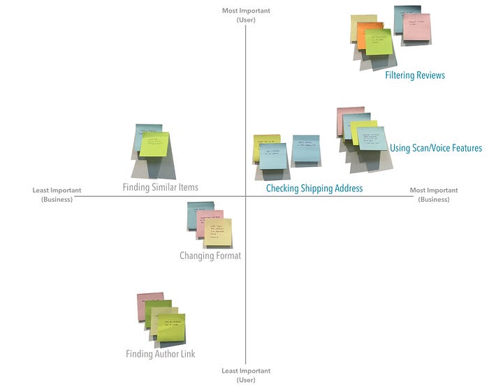
After prioritizing the pain points, it was pretty clear which issues were the most common and would also have the highest impact on revenue:
1. Sorting and filtering reviews
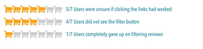

Reading reviews are a key part of the online shopping process — a quick Google search shows that 61% of customers read online reviews before making a purchase.
Yet in the Amazon app, users were confused about how to sort or filter reviews due to the lack of visual cues in the current UI, and were often unable to find these features.
2. Checking the delivery address


The app has a button to check the shipping address right on the product page. However, some users didn’t even noticed the button and instead used their account settings or went halfway through the checkout process to check their shipping address.
3. Using the scan and voice search features

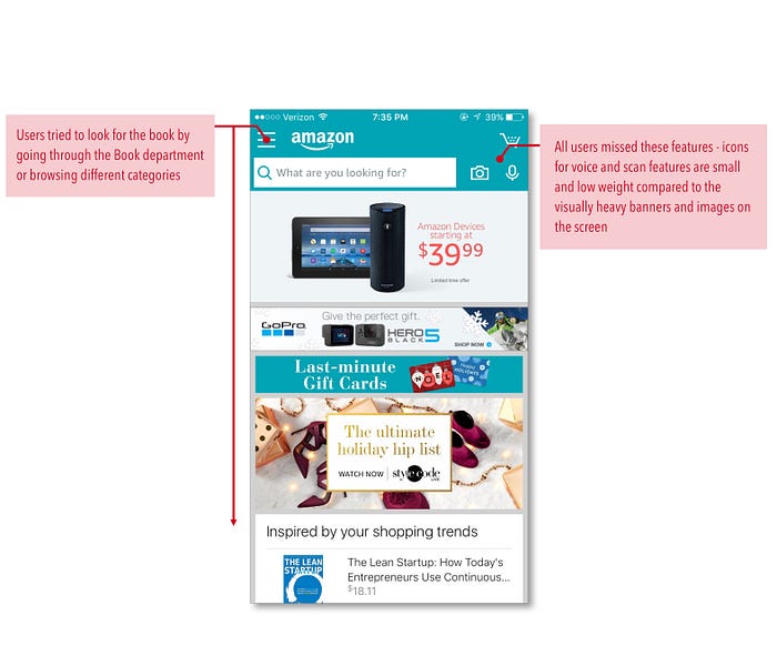
When asked to find the book using a method other than the search bar, none of the users noticed the scan or voice buttons in the top navigation. Instead, they all proceeded to look in different departments and categories.
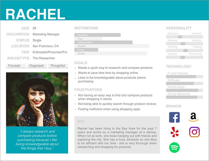
Persona
After identifying and prioritizing pain points, I created a provisional persona to help me create solutions for a specific type of user. This persona was roughly based on users that I talked to during the usability testing, and if I had more time, I would strengthen this persona with additional user interviews and research.
UI Sketches
I sketched out some rough ideas on paper to ideate some possible solutions for the top pain points before diving into high-fidelity mockups — using low-fidelity wireframes allowed me to explore several different ideas instead of spending too much time on a single idea.

Task Flows
I created task flows of the top 3 pain points I identified to understand the relationship between the task and the various actions that users took to complete it. Then I created task flows of my proposed solutions to see how it would help improve the user experience — see the comparisons below:
Filtering/Sorting Reviews


Checking Shipping Address
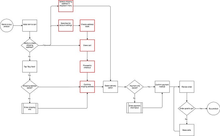
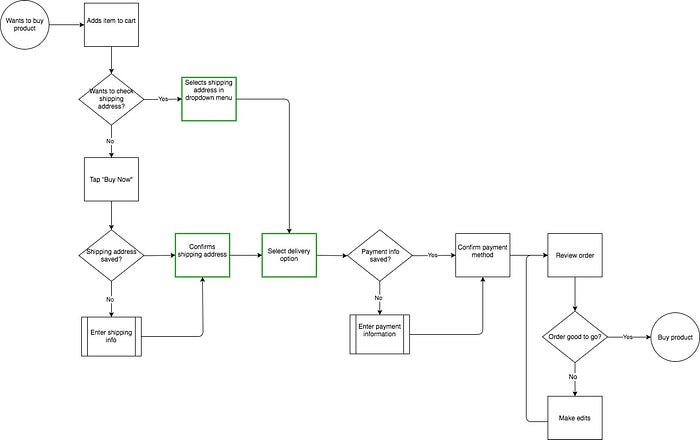
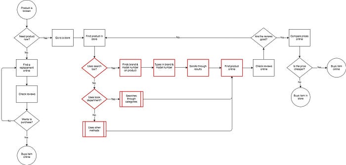
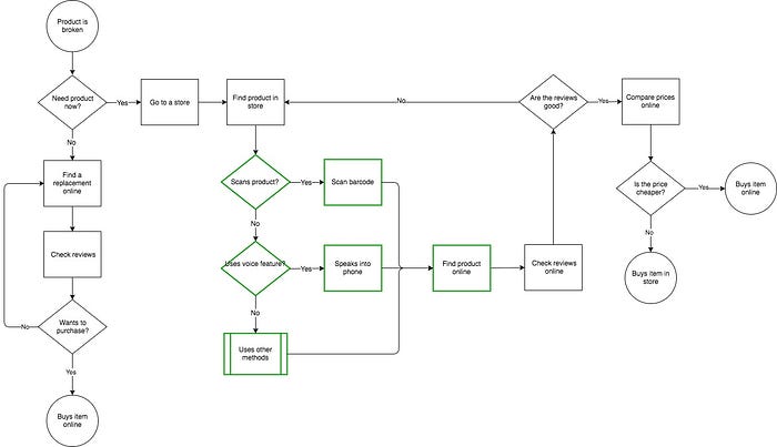
Searching for Product
Prototyping
Based on the lo-fi wireframes, I created high-fidelity mockups in Sketch. The changes I made are annotated below:
Filtering/Sorting Reviews


Solution: Reducing the friction for sorting and filtering reviews would help users make quicker decisions about the item and increase the purchase conversion rate.
Checking Shipping Address


Solution: Providing users with an easy way to check and select their shipping address on the product page would allow them to skip a step in the checkout flow and speed up the checkout process.
Searching for Product

Solution: Increasing discoverability for the voice or scan features could potentially increase online sales from users who want to research and compare products when shopping in stores.
Using the high-fidelity mockups, I used Marvel to create an interactive prototype for validation testing.

Click here to play around with the prototype!
Validation Testing
After creating the prototype, I tested my solutions using the same usability test questions from my initial tests. I also targeted people with a similar background to my initial users — all of them have used Amazon on their computers, but had little to no experience on the mobile app.
Results from validation testing:


TL;DR
Through some quick guerrilla testing, I found several issues with filtering and sorting reviews, checking shipping address, and discovering the scan and voice features in the app. Based on the results of the tests, I redesigned these features and validated my design decisions with follow-up usability tests on a high-fidelity, clickable prototype. Though the results from validation testing are qualitative, they show that even small changes to the app can increase discoverability and usability of important features.
I am not affiliated with Amazon in any way, I’m just a fan of the company and mobile app. The app in its current state was designed based on needs and constraints that I am not aware of, so this is just an exploration of design problems and ideas for solutions ☺.
Conclusion
If you’ve made it this far, thanks so much for reading!
This case study was an opportunity for me to explore ways of improving one of my favorites apps and flex my design skills by creating a solution from beginning to end. It was an awesome learning experience and I can’t wait to do more case studies!
Feel free to reach out on LinkedIn or agneskim5(at)gmail.com to chat about UX or anything else☺.
Special thanks to Jon Ganey, William Ng, Tiffany Chang, Katie Chen, Geronimo C. Ramos and others for helping me conduct usability tests and edit my post!