Fitz shopping bot — a UX case study
How I practice product design with design challenges

Project Summary
Designers these days are expected to go beyond aesthetics and help build great products to deliver business value. I practiced creating a brand new product with a design challenge that I created myself and learned a lot in the process.
I hope this case study can help you practice product design and level up your design skills.
The Design Challenge
“Shopping for jeans and other form-fitting apparel online can be time-consuming and frustrating. It’s hard to compare between different styles, and it’s hard to know for sure how they will fit in real life.
The challenge: can you help customers select the style of jeans that fit while shopping online?”
This problem came from my experience working as a UX designer at Levi’s. I often saw customers struggle to compare different styles of jeans while shopping online. They hesitate to place orders or abandon cart because they’re scared that the jeans wouldn’t fit.
This case study is an example of how you can practice product design with this all-in-one design challenge kit that I created that include guides, research, templates and so much more. You can download the free demo kit and give it a try. I hope it will help you level up your design skills!
Using Jobs To Be Done framework to solve a design challenge
I used a step-by-step process based on the Jobs To Be Done framework to develop my design concept. This process helped me break down the challenge into smaller problems that I could solve one at a time.
1. Specify End User
“Customers” were given as end users in the challenge. This is quite a broad group of people so I narrowed it down to customers who are in need of business casual jeans for work.

2. Create a Job Story
Keeping the end user in mind, I created a Job Story based on the Jobs To Be Done framework.
“When I shop for jeans online, I want to make sure they fit and look good on me so I can wear them for work.”

3. Collect user surveys
I used Amazon Mechanical Turk to run a quick survey about fit issues when people are shopping online.
Mechanical Turk is a great way to run quantitative surveys if you want to get results fast. You do have to be careful though because your target users need to be Mechanical Turk workers for the survey to be valid.
Since it is very likely that a good portion of Mechanical Turk workers also shop online for clothes, this was my chosen survey channel. It allowed me to quickly find out more about the users and their behaviors.
I sent out the survey with a link to a Google Form and got 61 responses in an hour.
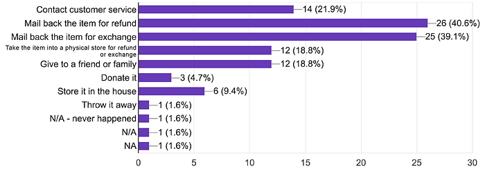
Most customers order the same size as they did on their last purchase and check the website’s size chart to select a size.

When an item does not fit as expected, many customers opt to return an item or request a refund, maybe contacting customer service.
This costs retail companies money and time in order to handle these extra requests and processes.
4. Conduct user interviews
I conducted 3 phone interviews with customers who have done online shopping for apparel in the past 3 months.
One customer relies on other customers’ reviews heavily when shopping for the right size.
“Because of the vast number of reviews (on Amazon), I found it to be very accurate if the item is smaller than expected or larger than expected.”
One customer finds that a personal shopping consultant is reassuring for the shopping experience.
“There’s just so much stuff on the website. That’s why I like the concept of being able to consult with somebody in a personal way so that somebody can help guide me a little bit to narrow my choices. That’s very reassuring to me.”
One customer relies on her years of experience shopping online to determine what to order.
“Oh it is totally challenging (finding the right fit)! It’s through trial and error I have had in the past where I would order different clothes and learn what fits.”
5. Create quick proto-persona
I created a proto-persona that included demographic, goals and behaviors. She is kind of a melded version of the customers who I have talked with. This helped me envision the kind of problems that such a user would have.

6. Identify pain points: card sorting
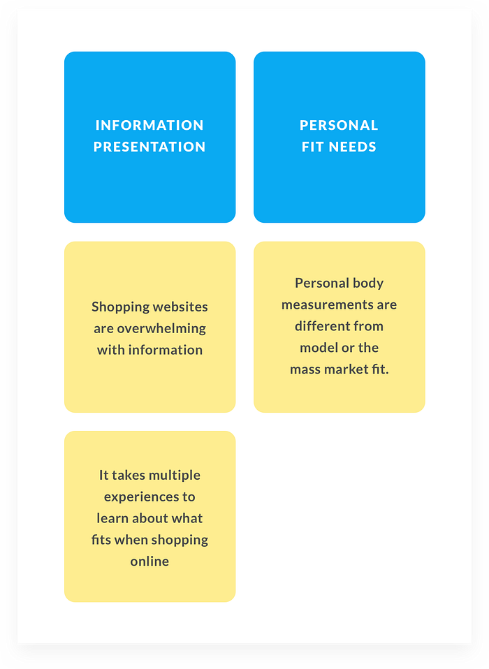
I highlighted all the problems that the customers mentioned from the interviews as well as the survey, and did a card sorting exercise to determine categories of the pain points and which category presents the most problems.

I concluded that most problems come from how the information is presented on the shopping website, and how well it helps customers find the right fit for their unique body shape.
7. Conduct quick competitive analysis
At the end of the survey, I asked the customers to include a few sites they most often shop for clothes on. Amazon, Asos and American Eagle were mentioned quite often, so I decided to pick these companies and do a quick competitive analysis on how they handle the major pain points.
Information presentation
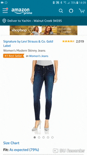
Amazon: Amazon’s product page is very long and overwhelming, full of lots of useful data but also sponsored items and unrelated ads.
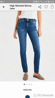
American Eagle: American Eagle’s product page is long, but mostly taken up by customer reviews, which is very helpful for the customers.
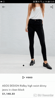
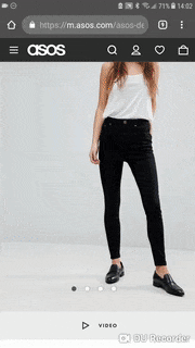
Asos: Asos’s product page is the most concise of the three. It only includes basic product info and two recommendation modules.
Personal Fit Needs
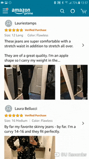
Amazon utilizes its vast number of customer reviews to help customers decide what would fit them best.
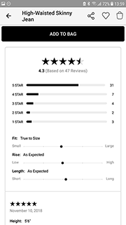
American Eagle calculates a “fit expectation scale” from the customer reviews.
Asos helps customers with a “Fit Assistant” module developed by Asos’ own in-house team powered by Fit Analytics, an artificial intelligence recommendation engine that uses the customer’s measurements and their past purchases to recommend a size that fits.
8. List and rate desired outcomes
I listed and rated the users’ desired outcomes by how important they were and how well-satisfied they were with current solutions. This enabled me to prioritize and pinpoint exactly how my solution would solve the users’ problems better than current solutions.
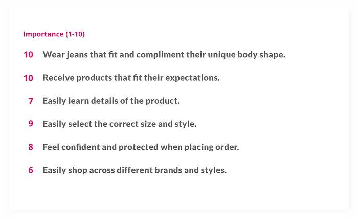
First, I listed the desired outcomes that our proto-persona would like to have.

Then, I rated the importance of each outcome.
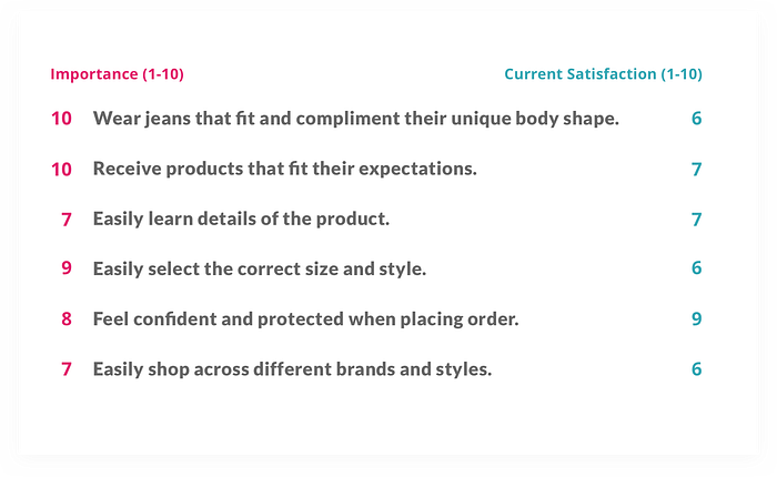
I rated how these outcomes would be satisfied by major shopping sites such as Amazon, AE or Asos.
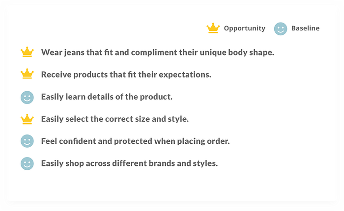
Then I used this formula to calculate the opportunity score of each desired outcome
Importance — current satisfaction = opportunity
I simplified the formulas from Lean Product Playbook’s Importance vs. Satisfaction matrix, the Gap Analysis and Jobs To Be Done opportunity score calculation into this formula.
This simplified formula is easier to remember and use when doing quick brainstorming.

Some desired outcomes had a low opportunity score while having a high importance score. These outcomes are already satisfied. I categorize these as baseline outcomes, meaning that users expect all solutions to achieve these basic results.
At this point I was able to see opportunities to solve the problem better than the major shopping sites as well as basic results I needed to provide for the users.
9. Brainstorm design solutions
The cool thing about the rated desired outcomes is that no matter what form the solution comes in, we know the kind of results the solution should achieve. We can brainstorm all sorts of products that can achieve these results.
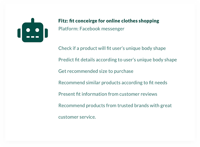
I chose to design an AI fit concierge that provides personalized size and fit recommendations.
- Use conversational interface to solve the problem of overwhelming information on product pages
- Gather customer information and use artificial intelligence to provide personalized recommendation
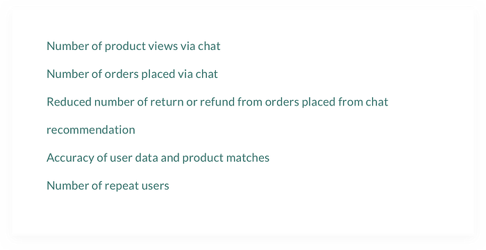
10. Specify success metrics
The list of desired outcomes I came up with came in handy again. Besides conventional digital product metrics like user engagement or reviews, I also wanted to measure the success of the app by how well it delivers the outcomes that the users are expecting.
11. Storyboard
My storyboard tells the story of how the persona, Mel, uses the chatbot to order a new pair of jeans for work during her lunch break.

12. User flow
There are three key flows that the users go through while using the chatbot.
- Onboarding & Fit quiz
- Check size & fit for a particular item
- Get similar items recommendation


13. Draft conversations
For a conversational interface, I went ahead and sketched out the rough conversations with nothing but a text editor. This helps determine the flow of the conversation without being distracted by needing to come up with visual elements.

14. Wireframes
Since Facebook Messenger provides a wide range of graphical components such as quick replies, button templates and webview, it was very helpful to create wireframes that consider how these components can be used.

15. Visual designs
Since the chatbot lives on Facebook Messenger platform, one of the most important visual design element is the bot’s profile image.
Also, for a conversational interface, the bot’s personality, voice and look becomes the soul of the product that heavily influences the user experience.
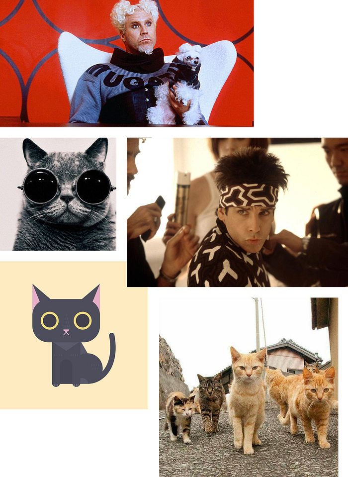
Elements I wanted to infuse the chatbot with include fashion guru, cool, non-human (cat, of course!) and a little bit humorous.
The mood board
Whenever I think of fashion guru I think of Mugatu, the villain in one of my all time favorite movies Zoolander. I imagined the bot to be a little over the top like Mugatu but kind hearted like Zoolander. And it would be a cat, of course!
Say hello to Fitz!
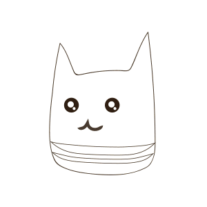
I wanted the bot’s name to have the word “fit” in it, without sounding too mechanical or long. “Fitz” is a real name that foots the bill.
I chose a bright yellow and blue for the profile image because it needs to have high saturation and contrast so that when it is as small as a profile image on the messenger platform you can still feel its presence.
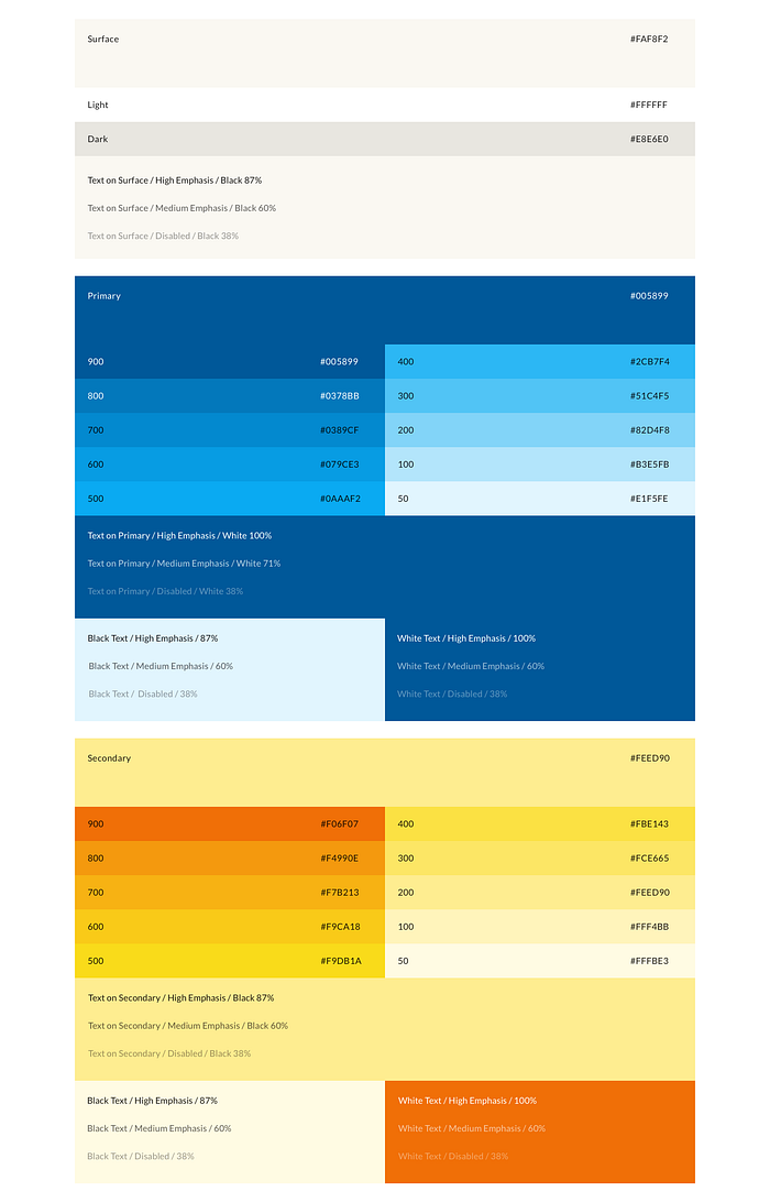
Foundations for visual design
Since this is a new product, I used Material Theme Editor to quickly come up with the color the typography system. This saved a ton of time since Material Design plugin in Sketch helps you figure out a whole range of shades and font sizes to use in different situations.

16. Prototype
I used Botsociety as the prototyping tool for Fitz. It was very easy to start prototyping with Botsociety’s Facebook Messenger modules because I had already done the user flows and draft conversations.
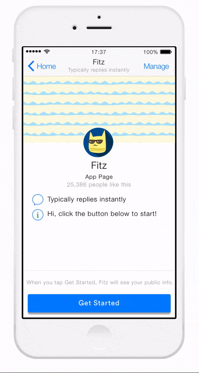
New user greeting: declaring purpose
The first thing Fitz says to the new user is declaring its purpose — helping customers order the right size of items while online shopping.

Fit Quiz
After the greeting, Fitz asks the customer to take a fit quiz so that the customer’s measurements and preferences can be recorded and used for personalized recommendations.

Existing user greeting
Once the customer has done the fit quiz, Fitz can immediately present the options for customers to check size and fit for a particular item, or find similar items that fit the customer.
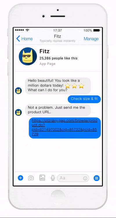
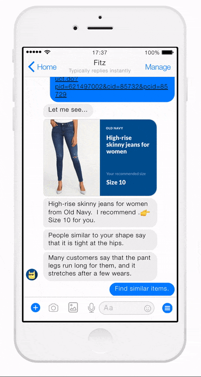
Size and fit recommendation
The customer pastes the URL of an item that he/she is considering, and Fitz comes back with a visual size recommendation, along with summaries from customer reviews on fit, comfort and potentially other aspects of the item.
Similar items recommendation
If the customer would like to explore other similar products, Fitz can recommend products that have similar fit and style across multiple brands. The customer can also check size and fit on any items that stand out.
Marketing Efforts
Although there are roughly 1.3 billion users on Facebook Messenger, there’s not a prominent channel for chatbot discovery. Since Fitz does not belong to any existing business with existing audience, it will need some marketing efforts so customers will discover and adopt its usage.
Landing page: Fitz can use paid advertisement that drives traffic to its landing page.

Postcard: Fitz can also be advertised in offline shopping channels such as malls and department stores to promote its services.

Key Lessons
I learned a lot from testing myself with this design challenge:
Plan ahead for user interviews
The user interviews were by far the most time consuming and at times frustrating part of the case study. Some participants who sign up might not show up for the call or meeting, so always schedule more participants than the interviews you need. Send reminders a day before to increase the chance of them showing up and completing the interviews.
Same pain points, lots of product solutions
Try brainstorming product solutions outside of the app space and explore other interfaces and different types of technological constraints. What would a wearable device product look like? What if the product could be a physical book or poster? What if a human being is required to solve the problem? The possibilities are endless.
Designing for chat interface
Define the user flows before drafting conversations to make sure the conversations help users get the job done.
Branding and personality is the soul of the chatbot. Make the chatbot suitable for the environment (work or casual) where it is used, the audience that it will talk to and how it helps them get their job done.
Utilize visual components of the chat platform. Most chat platforms such as Facebook Messenger or Slack have many visual components like quick reply buttons, unfurling links in messages and stickers. Utilize these visual components to make it easier for users to take actions and provide a more personalized and friendly user experience.
Practice Makes Better
This case study is an example of how you can practice product design with this all-in-one design challenge kit that I created that include guides, research, templates and so much more. You can download the free demo kit and give it a try. I hope it will help you level up your design skills!
Thank you for taking the time to read my case study!
If you found this article helpful, let me know 👏👏👏.
If you want to read more click the “follow” button below and follow me on twitter.


