Five simple design patterns to improve your website
Design patterns can help solve common website design problems — why don’t we lean on them more?

User interface design patterns are considered a common language for designers. It’s a vocabulary that solves many design problems and as a result appear over and over again. So if you’re struggling with user flows and tasks, consider leaning into some common design patterns to optimize your solutions.
In this article I’ll walk you through one of my common flows as a reader of The New York Times, and take a closer look at 5 design patterns that help me seamlessly navigate this common routine.
The Routine
On the weekends I like to ease into my news consumption. This means I prefer to start with lighter fare, play a game or two to start engaging my brain, and then move into world and regionally specific news. So I’ll pour myself a cup of coffee and head over to nytimes.com.

01. Flat Navigation: Give your users the top level view.
Starting on the home page, the nav bar is separated into sections of the newspaper in a flat structure, making every section apparent at once. The navigation is repeated on the hamburger menu on the top left.
While this approach might seem obvious, think about how many websites try to cram things into this nav space that don’t belong. Short section names that indicate the highest level of organization are appropriate here, nothing content specific like article titles.
02. Module Tabs: When you’re facing space constraints
Once I’ve clicked through to the Style section, I scroll through the page and I don’t see anything that piques my interest, until about halfway through when I see a module tab that presents a view of recent stories alongside the ability to search.

Module tabs like this are a design pattern that can help you when you’ve got limited space, and content or functions need to be separated into sections.
My interest in LVMH lead me to search, and I found a story about Rihanna and her hiatus from LVMH that I clicked through to.
03. Article Lists: Give your users options to stay engaged
After finishing the story, I scrolled down and saw additional stories I might consider reading. What’s interesting here is that I’m not looking at a list of headlines but at three different article lists.
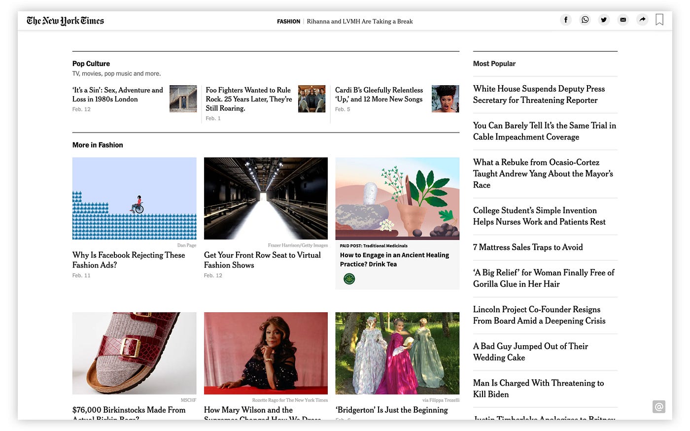
Three different formats present a straightforward headline list for ‘Most Popular’, thumbnails alongside titles for ‘Pop Culture’, and larger preview images above headlines in ‘More in Fashion.’ The biggest visual emphasis is placed on stories I’m likely to continue reading, since I’m already inside a fashion story. And it makes sense that ‘Pop Culture’ is next in hierarchy, since it’s a larger category that contains fashion. The list of ‘Most Popular’ is ubiquitous and generally associated with this format.
This purposeful approach helps guide users to content that will most appeal. It’s a good thing to keep in mind when presenting additional stories to your users.
04. Fat Footer: Keep your users on your site for longer stretches
After scanning the article lists, I find myself at the bottom of the page, where I’m faced with a ‘fat footer.’ While you might dismiss this as a bloated repository of links, it’s actually an easy and natural way for your visitors to continue their journeys on your site.

Not quite ready for real news, I decide to play one of the Times’ games, and a link to that section is readily available here.
05. Cards: Organize different pieces into one coherent piece
In the games section, my options are organized using the ‘cards’ design pattern. This approach allows the Times to present many different gaming experiences as a collection, and to organize different groupings of games succinctly, and in a visually engaging manner through its bright colors and intuitive iconography.

Unfortunately, I can’t seem to finish the Spelling Bee, and I’m almost out of coffee, so I decide it’s time to face the music of real news. What’s interesting at this point of my journey, however, is that the games world of the Times completely strips out all navigation related to their primary content.
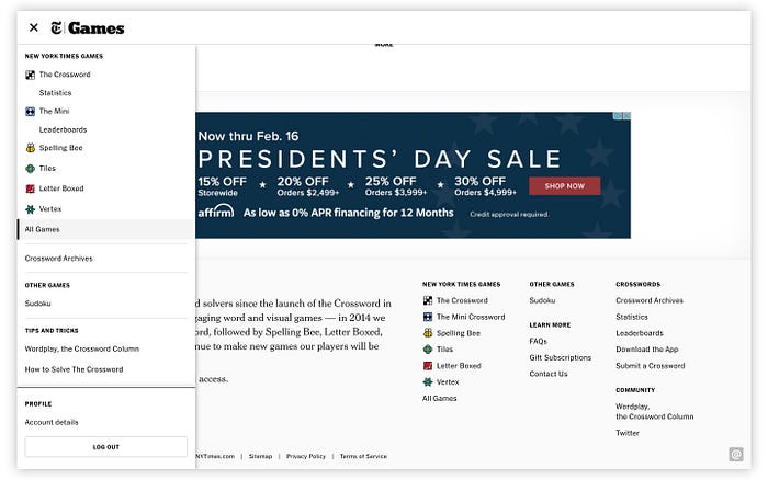
The only link to the home page is a small link in the footer, which is specific to the Games content; likewise for the hamburger menu.
While this might seem peculiar and counterintuitive, it’s very likely a deliberate choice. Perhaps user research revealed that when subscribers played these games, they wanted full immersion and no distractions that pulled them away. The fact that full access to their games requires a fee could have also played a hand in this approach.
In any case, I’ve found my way back to the home page, and back to reality: politics, pandemics, and so much more.
So when you’re considering user journeys as they relate to UI design decisions for your next website project, a great place to start is with design patterns like these — they’ll make your design process easier and will lead to more effective results in the long run. Find many more to consider at uipatterns.com.


