Redesigning the Apple Podcast app

I love listening to podcast, it’s a habit that I formed since 2 years ago or so.
Podcasts are like books. They are packed with knowledge, life stories, and experiences, except, they are free (mostly)!
I listened to at least 2 podcasts during my daily commute from May to July for the General Assembly User Experience Design bootcamp in downtown Austin. Since I usually listened to podcast on my laptop, it was my first time using the Apple Podcast App (without exploring other options because I was lazy and for the sake of convenience), and it was….not very intuitive.
Why?
First, I didn’t know why the episodes that I saved disappeared after I listened to them (now I understand that you have to “Download” it). Second, there’s no way that I can search for a specific episode in a podcast. Instead, I have to scroll through episodes after episodes to find it.
And Much more…


Yikes.
So I decided to give myself a month to put what I’ve learned into use and redesigned the Apple Podcast app! (iOS 11.4.1)
Note: This was a side project that I wanted to challenge myself, and I’m not suggesting Apple to adopt or change the app design. Just some ideas 😉
Introduction
A Podcast is a series of audio episodes surrounded with a particular topic.
Based on The 2018 Infinite Dial Study by Edison Research and Triton Digital, about 44% of Americans (124 million people) have ever listened to a podcast. In terms of device used to listen to a podcast, 69% of podcasts are consumed on smartphone/tablet/portable device compare to only 55% in 2015. Another report by Nielsen shows that 23.9 millions of users who are 18 or older listen to podcast on smartphones in 2017.
I apologize if I made you dizzy with all the numbers and stats. Just know that the number of people who listen to podcasts on their phones is HUGE, and the number is increasing with a steady linear growth.
Design Process Overview
Here’s how I approached the redesign challenge:
- Comparative/Competitive Analysis
- Interviewed 6 people who have listened or listen to podcast on their phones
- Researched online articles, blogs, Reddit, and Youtube to see what people were saying about the Apple Podcast app
- Sketched out ideas based on research
- Designed low-fi/high-fi wireframes
- Asked 4 people to do usability testing on the high-fidelity prototype
- Iterate/Reflection
Competitive/Comparative Analysis
The first step I took was to look at some other popular podcasts app out there, and see what features those apps have.
Three free apps that I compared were: Overcast, Castro, Podcast App (for iPhone iPad).
I picked those 3 based on the popularity/recommendation I saw on Reddit and Quora, and the ratings on the App Store.
Here were some of the comparisons that I did:
- The Playing Screen

2. The Podcast Overview Screen

3. The Podcast Category Screen

The above were some features and pages that I compared. Every app had its own strengths and weaknesses, and I took those into consideration when sketching out the redesigned version of the Apple Podcast app.
Now, let’s talk to some users and see what they say.
User Research
I personally had experienced several frustrations using the Apple Podcast app, but as the saying goes, “I’M NOT MY USER,” I decided to do some offline and online user research.
“You are not your user!”
Talking to users was definitely one of the most if not the most important thing through out the entire design process because you’d always find interesting stuffs that you weren’t aware of.
After talking to 6 users between age 26 and 35 who listen or have listened to podcast on their phones, here were some of the results that I found:(Applications the users use include Apple Podcast app, Overcast, and Pocket Casts)
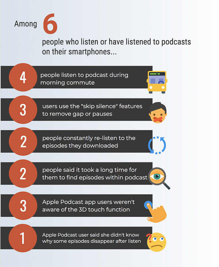
What surprised me were that I didn’t know a lot of people use the skip silence feature, and I didn’t even notice that the 3D touch on the Apple Podcast app could actually pull up an additional menu (I learned that with a user by accidentally hard clicking the “+” icon).
Thank you user interview!
Apple Podcast app analysis
I also took a deep dive into the Apple Podcast app and looked at several online discussions on Reddit, Quora, YouTube, and articles. (Just to clarify that I’m very new to podcast apps in general, so I don’t know what the previous version of the Apple Podcast app looks like)
Here were some of things that people were talking about:
- Integrated with Siri. Easy, simple, and free to use for a non-podcast maniac
- Sync with iTunes. The UI is very similar to Apple Music
- Unable to change the order of “Listen Now”
- Unable to make playlists of episodes (Able to make playlists of podcasts)
- Unable to search episodes within a podcasts (This pain point has been brought up several times. Wink wink 😉)
Looks like there are a lot of people dislike the iOS Podcast app, but there are also a good amount of who people like the simpleness and convenience of it.
While the native app has room for improvement, I tried to align my redesign with what it looks like now as much as possible to maintain the consistency with the current Apple brand.
Sketching
Sketching was probably one of the most exciting parts to me. It was the time you started putting down ideas onto paper; drew it out. A pencil, an eraser, and some paper (and occasionally a cup of creativity juice but not necessary) that’s all you need.
Since the framework of the app was already created, I sketched out some changes I’d like to implement to see how the refinement was going to look like based on all the research I did.

You may find the the sketches still look very similar to the current Apple Podcast app.
You’re right.
Based on the user research, I found that the frustrations people had were not really about the color or the display, but the lack of functions. Since the current native podcast app layout looked very similar to the Apple Music app, a brand new design might deviate from its consistency.
Redesign Solution
I focused my redesign on 4 different parts: Playlist, Podcast overview, Listening page, and the Search page.
Before I show you the major redesign, I’d like to show you a small tweak that I made on the bottom navigation.
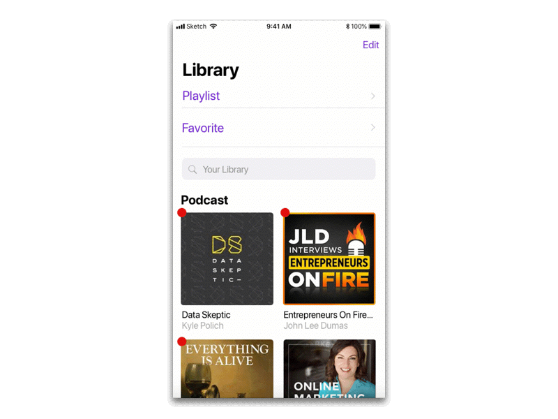
Currently the Apple Podcast app has 4 different pages shown in the footer: Listen Now (shows the podcast episodes that you haven’t finished or just added), Library (shows the podcasts that you’re subscribing), Browse (shows podcast categories, rankings, featured podcasts…etc), and Search (search podcasts or episodes).

Since I found that a lot of people were confused about the differences between “Listen Now” and “Library”, I combined “Listen Now” and “Library” to just one “Library” because they served very similar functions.

Okay, enough throat clearing. Now let’s dive in!
1. Playlist
Currently the Apple Podcast app is unable to make playlists. You can add the podcasts that you like into a “Station”, but you cannot select specific episodes within a podcast(s) and group them to a list.
I don’t subscribe to podcasts. Instead, I listen to episodes (on different podcasts) separately based on the content. If I want to go back and listen to those episodes that I liked, I’ll have to either go to the “Downloaded Episodes” list (assume I downloaded the ones I like), or… I don’t know. Let me know if you’re an avid Apple Podcast app user and you have a solution for me.
A playlist would be a great solution to solve this problem. The idea is that I can add the episodes (from same podcast or not) that I want to listen into a playlist, so I don’t have to search them one after another in my vast Library.
**You can add episodes from your Library or the podcast overview page or the listening page.

2. Podcast Overview
Podcast overview is a page where you can check out the podcast’s content, rating, and reviews.
Below is an example of what the current podcast overview flow looks like:

- When you click a podcast, the first thing you’ll see are the title, the rating, a snippet of description, and usually 4 recent episodes.
- When you scroll down, you’ll see “Available Episodes” (which will bring you to the 3rd screen) and the Ratings & Review of the podcast. The second screen also has a “Best of the Podcast” section, which seems like the algorithm always puts the most recent ones as the “Best of the Podcast” (WHAT !?).
- The “Available Episodes” page is just a list of all the episodes. No category, no played unplayed. hmmm.
Here’s what I proposed:

Also introducing: the#Hashtag search!
Hyperlinked hashtag was introduced by Twitter around 2009. Since then, plenty of social media platforms have adopted the practice to let users engage with specific conversations.
Instagram posts with at least one hashtag average 12.6% more engagement than those without. - WordStream
So what if we let podcasters add hashtags (4 max.) to episodes so listeners can find related episodes quickly?

Boom!
To put the “Podcast Overview” redesign in a nutshell:

3. Listening Page
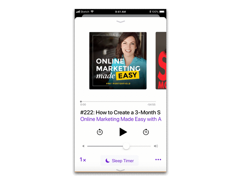
One pain point I had with the listening interface is that if I want to listen to another episode or skip the current one, I’d have to exit the current page and choose something else from the Library (or Listen Now). Of course I could also scroll down to the “Up Next” section and choose. The problem with that was I didn’t even know the listening page was scroll-able. Ha. And I found 4 people I interviewed didn’t notice that either.

The changes I made include:
- Replaced the AirPlay icon with the “Sleep Timer” button which currently you have to scroll down a bit to see it.
- Added “Trim Silence” and “Add to Favorites” to the “ …” menu.
- Carousal/slider design that allows you to switch episodes quickly. It’s dangerous to do all the switch-episode-business while driving when using the current app because you have to make sure your finger is clicking the right episode. With the carousal design, you can just swipe left or right to change episode easily.
- Added a little Arrow down the bottom so users know that they can scroll down.
- Not shown in the redesigned screen, but the play speed should be 0.5 , 1, 1.25, 1.5, 2 (currently it’s lacking 1.25 speed)
** Based on user research, I tried to put the features that users use the most (sleep timer, trim silence…) on the initial screen (the listening screen that you see without scrolling down).
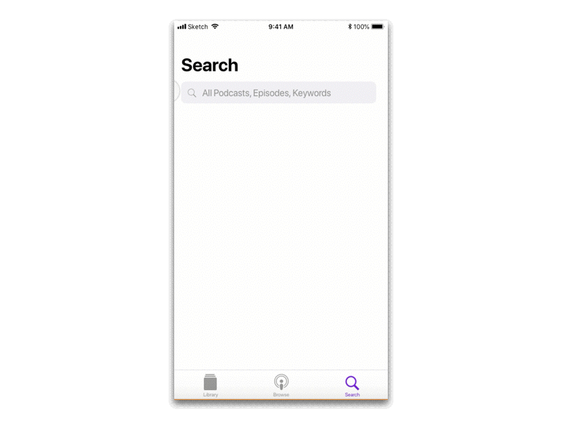
4. Search Page
There weren’t many changes I made on the Search page.
Except,
this one thing that really didn’t make sense.
For instance, if I wanted to look for episodes where Tim Ferriss has been on (other than his own shows),

the search result would pull up Tim Ferriss’ own shows as well as other “Podcasts” he has been on. And when I clicked those other podcasts, let’s say the “Listen to Money Matters” podcast, it’d take me to the Listen to Money Matters podcast overview page instead of the episode(s) that I was interested in. And I had no clue where to find the episode(s) that Tim Ferriss was on.
So,
the final proposal I want to make is:
Whenever a user searches a name on the Search page,
- Only shows the podcaster’s own podcast (if the person has any) at the top.
- When you scroll down, show the episodes that the person has been on (Not the episodes of the person’s own show, but episodes of other podcasts that the person has been on).
And that’s all the proposals I made for the Apple Podcast app redesign!
What I Learned
First thing first, I want to thank you so So SO MUCH for your time reading this. I know there are a lot of things going on here, but I hope it’ll add some insights to your design life.
I spent approximately 4 weeks to go through the entire design process. As I made a transition from a customer support role to UX design, I realized my background has not only helped me listen to what users are saying, but create solutions that fit their needs. (My interest in SEO and content marketing also helps a bit, and I’d love to see how UX and marketing can work together)
Here are 3 things that I have learned through this project:
1. Talk to users no matter what
I always learn something new through user research. In this case, I learned that a lot of users use the “trim silence” and “sleep timer” functions that I don’t use.
Talking to users provide validation to your pain point, too. For example, I didn’t know that you could scroll the Listening (Playing) page until few weeks ago, and I thought everybody knew that it was a scroll-able interface. But hey, after user interview I discovered that a lot of people actually experienced the same problem as I did.
“Empathy is at the heart of design. Without the understanding of what others see, feel, and experience, design is a pointless task.”
–Tim Brown, IDEO
2. Sketch some ideas first before talking to users
I don’t know if this is a good practice or not, but I found that when I started sketching after user interviews, some questions that I hadn’t thought of came up.
I followed up and did some quick testing so I could figure out what worked and what not quickly.
If I could re-do this project again, I would sketch first and pay attention to the current app’s layout and features, and then form my interview questions along the way. This way, I could catch more detailed and focused answers from users.
** Just a simple sketch will do. The point here is to come up with more specific questions to ask users. I’m not sure if this technique will work if you’re building something new instead of redesigning an interface.
3. The 2 to 4 stars reviews
If you’re also looking into online reviews on either the app store or Amazon or somewhere else, I strongly suggest you to look for the 2 to 4 stars reviews because they usually provide both pros and cons with detailed explanation.
Although there’s no app review on the current Apple Podcasts app, I found that looking at what others are saying was a great way to gain insights. Not saying you should totally rely on the reviews, but it’s definitely a great place to check out product feedback by users.
I always love the idea of creating stuff and put it out there, that is why I decided to make a career switch to UX design. Of course I still have a ton to learn in the field, but I’m ready to take on challenges and see what impact I can make to the world :)
Thanks again for reading! I would love to hear your comment, feedback, or if you just want to say Hi 😊
You can reach me on LinkedIn, Portfolio, or the comment below.

