Member-only story
Fluid typography in design systems: from design to code
A complete guide for designers & developers.

In an era where users interact with digital products on a plethora of devices, from smartphones to widescreen monitors, typography becomes more than just a visual element — it’s a cornerstone of usability and brand consistency.
In this guide, we’ll explore how to build a fluid typography system that ensures a flawless reading experience, whether on web or mobile.
The Building Blocks of a Typography System
1. Primitives
Primitives are the fundamental building blocks of your typography system. They consist of raw, unmodified values that define essential typographic elements such as font family, size, weight, line height, letter spacing, and color. These are not tied to any specific context or use case, making them versatile and reusable across your entire design system. Below is a simplified example.
:root {
    /* Font Families */
    --font-family-sans: 'Arial', sans-serif;
    --font-family-serif: 'Georgia', serif;

    /* Font Sizes (Referencing your Sizing Scale) */
    --font-size-100: 16px;
    --font-size-200: 20px;
    --font-size-300: 24px;
    --font-size-400: 32px;

    /* Font Weights */
    --font-weight-regular: 400;
    --font-weight-bold: 700;

    /* Line Heights */
    --line-height-100: 1.25;
    --line-height-200: 1.5;
    --line-height-300: 1.75;

    /* Letter Spacings */
    --letter-spacing-tight: -0.02em;
    --letter-spacing-normal: 0em;
    --letter-spacing-wide: 0.02em;

    /* Colors */
    --color-text-dark: #000000;
    --color-text-light: #FFFFFF;
}
These primitive tokens define basic typographic properties that can be applied universally. However, on their own, they don’t convey specific meaning or context, which is where semantic tokens come in.
2. Semantic Tokens
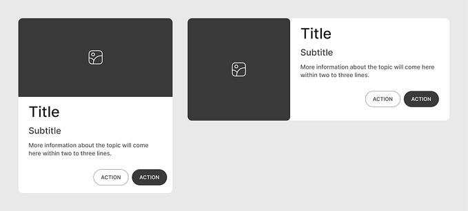
Semantic tokens build on top of your primitives by assigning meaningful, context-aware roles within your design system. These tokens are designed to reflect the purpose of the typography rather than its raw attributes, ensuring that typography is consistently applied across various UI elements.


