Follow platform UI guidelines? Or invent our own?
An Android developer’s perspective…
- Our app shouldn’t look like other apps
- We should have our own UI language
- It is cheaper and faster to have a unified design for both Android and iOS
- Standard views and stock widgets look cheap
These and many others are the points that UI/UX designers try to make to tell us we shouldn’t follow Material Design for Android and Human Interface Guidelines for iOS, and to convince us to have our own custom icons, our own custom buttons and views and widgets and gestures and navigation and...
But should we? Let’s investigate each point one by one and answer the one million dollar question once and for all.. Not really.
Our app shouldn’t look like other apps
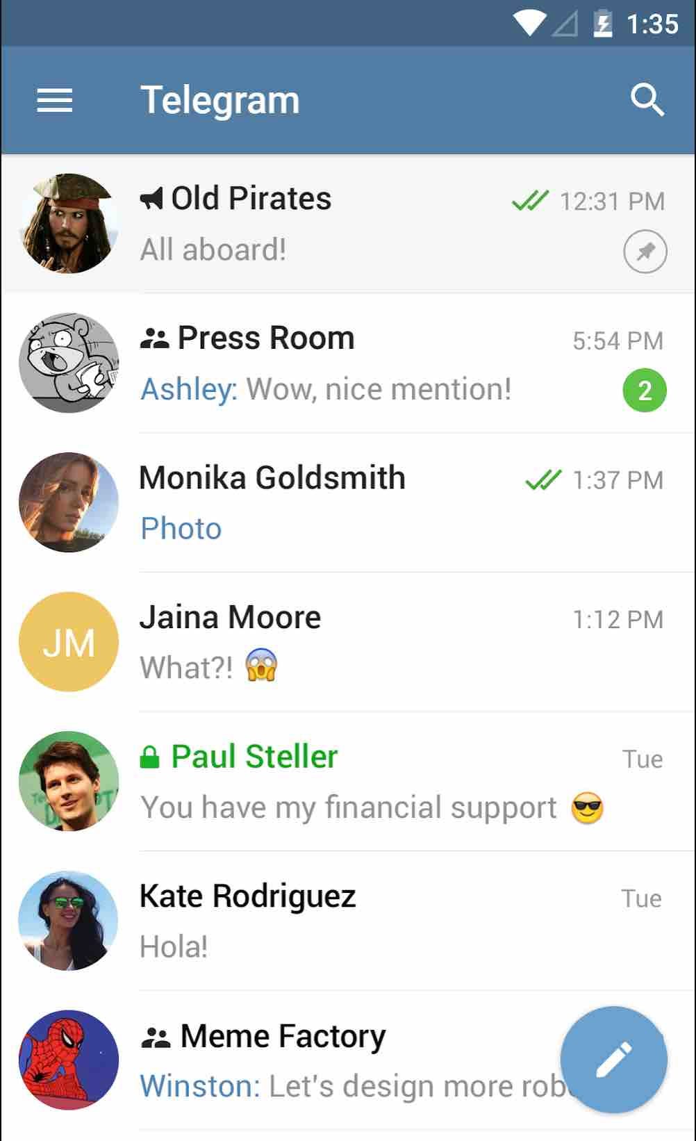
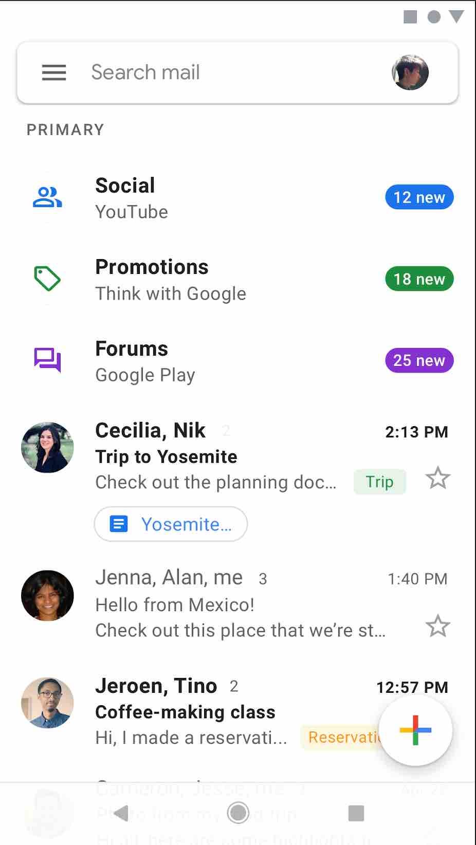
Why? Isn’t it all what UX is about? A consistence flow? To better explain what I mean I should give you an example. So one day we got my mother her first smartphone. She was quite used to her old conventional phone, so at first she couldn’t really work with it. But all we did was to teach her how to work with a messaging app named Telegram so she could chat with us. It was a little bit hard for her to learn the keyboard and navigation and all that, but after some time she started learning and exploring and doing the stuff faster. Because of working with Telegram she learned to work with Play Store and Messages and a lot of other apps. She learned the meaning of Navigation Drawer so she already knew how to open navigation drawers in any other app that followed Material Design. She understood the meaning of Floating Action Buttons. All because these apps followed the same UI guidelines. They were consistent! They had a consistent flow. If you learn one you know how to work with the others! Instead of waisting time to understand new views and their jobs, the user can actually try to understand the application’s main functionality!
So let me ask you again: Isn’t it all what UX is about?
We should have our own UI language
Are you telling me that we should reinvent the wheel? Okay let’s reinvent it! How many hours, how many user researches and experiments, how much are we going to invest and spend to understand what is the correct look for a button?! Does it look clickable enough? Does it look unclickable enough when it’s disabled?! Are our radio buttons look right? If you ask your designer they would probably say: “Yeah! I think they are obvious enough! They look good!”. Well ask them this question now : “On what basis? On what basis a button should look this and not like that? Did you invest as much as Google or Apple invested? Did you researched as much them? Or is it just your personal taste?”
When a designer says that we should invent our own UI language, it’s like when a developer says we should first invent our own programming language.
No! We should use the wheel! Use the platform UI guidelines and spend your time on the UX! Just like when a developer uses the platform programming language and spends time on finding the best software architecture.
Let’s face it: no user is excited enough to explore or/and try to learn our new apps! You can not count on that. You cannot say that we are going to teach them our design! When was the last time you enthusiastically tried to understand and explore an app that you just installed? Other than Tinder?



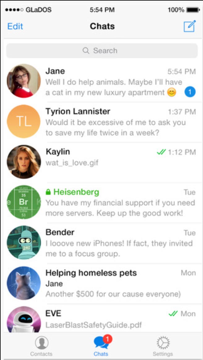
It is cheaper and faster to have one unified design for both Android and iOS
Now it’s getting actually interesting! The amount of time that a developer should spend on creating UI and views that are not native to the platform, the amount of hacks and implantations that they should go through is much, much more than for a designer to actually use native views in their design. Most of the time a designer would show the developer an image and say: “When you swipe down this happens, when you click on this that happens!”. And it’s the job of the developer to make the designer wishes come true! Now it’s the job of the developer to implement, support and maintain these custom views for each Android or iOS versions! And you can always find new bugs now and then, all because you didn’t use the native views. Even if you take none of these points into account, you are going to stuck in each platform limitations or characteristics. Let’s say you want to have a Navigation Drawer in the iOS version of your app, then the iOS developer should add the swiping gesture to open the drawer which is totally against the platform gesture behaviour, because it is reserved for going back in the screen stack! It’s a navigation gesture.
So which one is faster or/and cheaper again?
Standard views and stock widgets look cheap
This is actually my favorite point. So are you actually suggesting that Google Photos or Play Store or even App Store or Apple Pages look cheap?
Not to my eyes but it’s really a matter of personal taste! Again you should always be able to back your point with some basis!


TL;DR:
We should follow each platform UI guidelines. They are well known to the user and using them gives us more time to actually focus on the UX itself. They are also easy for the developer to implement and maintain on each version of the platform.
But I know, as designers you guys like to go crazy with the creativity and fun ideas. Great! That’s why we have web!
Web isn’t any companies platform! It’s a neutral environment. So here you shouldn’t follow Material Design or some other companies UI guidelines. You should make it special! Something unique for your company. As matter of fact every other company is doing the same thing.
Follow platform UI guidelines. If you are not on any platform do whatever you see fit!
