Form best practices — the Do’s and Don’ts in form design
All over the world in every application people use forms. They use it for different reasons like business processes, proposals, surveys and many more.

In this article below, let’s take a look at the 10 best practices that will help you to design distinct usability forms.
Hope it will be useful for both designers and developers. Have fun ☺
Well, let’s start!

What does ‘form’ mean and where it is used?
In general, a form is a box with labels and fields with a call to action buttons.
Below are some examples of Forms used in many parts of websites and applications:
· Login/registration
· Purchase order
· Ticket reservation
· Room booking
· Payment checkout
· Newsletter/subscription
· Consultation/audit request
· Donation
· Survey
· Custom form.
So, How to design a user-friendly form?
In general, form design hides a lot of hard and painful points for user side. Hence, it is necessary to design a form that is user-friendly.

Let’s start by discussing the two main rules for form design:
· First of all, the best practice for designing forms is to do User Testing and never neglect a user’s opinion, even if you disagree.
· Doing User Testing helps to figure out life-hacks like measure time of interaction with form, detect pain points, observe how user work with interface, and where he got stuck or can’t find the necessary element, etc.
Performing these activities helps beginners to avoid the biggest and ignorant mistakes in the FORM world.
Tip 1: Single-column layout
Avoid zigzag field placements. It is figured out through eye-tracking tests that the user spends more time jumping from one column to another and finds trouble to identify a specific field in the form.
Instead of this, the one-column design is just a read from top to bottom which creates a simple interaction with a form.
Forms with multi-column designs often lead users to omit fields, simply because they do not notice them or because they misinterpret the meaning of the multiple columns, or fill out unrelated or incorrect fields because they misinterpret them to be part of the needed input. (c) Edward Scott

Tip 2: Path to completion and align
University of Basel researchers have found that left-align is better than center-align as the best way to reduce the path to completion time; as in left align eyes don’t need to jump across the page.
The right alignment of the labels reduced the overall number of fixations by nearly half, showing that this layout greatly reduced the cognitive load required for users to complete the task.(c) Matteo Penzo
Tip 3: Use wizard for long forms and progress bar
When you have requirements to design big data form, make sure that all fields in the form are really necessary, unique and not duplicated. Even if you don’t have the opportunity to optimize your big data form, just use the wizard with steps.
And it’s easy just:
· Group form fields on sections.
· Remember SAVE BUTTON: It protects user’s processed and filled data
· Display Step by Step progress of filling: This helps the user to understand how many steps are done and how many are remaining.

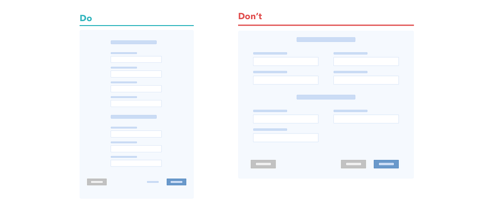
Tip 4: Don’t forget to group related information
Grouped form looks organized, neat and clear. So, group related information in long forms under sections with titles or separators.
Why should we group related information?
Let’s say, a user wants to change something in any particular field while filling a form and suddenly feels a need to change any field. In such situations grouping will help the user to quickly remember in which section the necessary field was present.
Tip 5: Optional instead of required
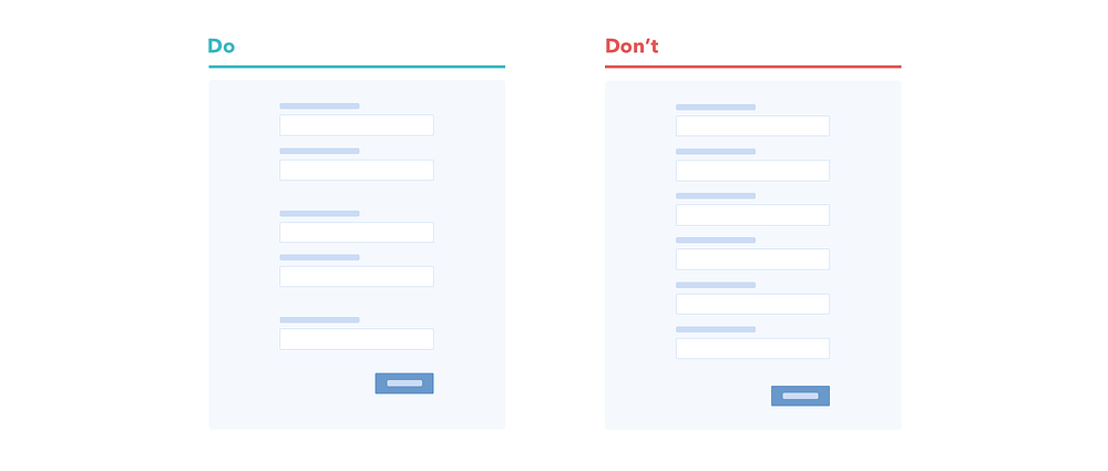
Most of the times, there are all fields are Mandatory except of couple of fields that are Optional.
It is a wide practice to mark required fields with asterisk, but in reality this form starts to ruffle with red asterisk. Btw, red color cause a negative association from user side, because a red color is for errors only.
In my experience, once during testing a prototype, a user asked me what does this asterisk means? Is it a label like in books or some description?
Strange, isn’t it? We see that asterisks are clear for not all types of users.
A simple solution to avoid such misunderstandings, it’s good to use “only the optional fields”.

Tip 6: Use autocomplete
Users are lazy and it is true.
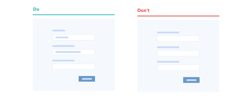
So, when you have an opportunity to make their lives more simple, they will appreciate it. Autocomplete/Autofill makes form completion 30% faster. Hence, analyze the elements of a form that can be autocompleted/auto-filled.
To give you an idea, elements like the city, country, phone, email, etc can be autocompleted.
Tip 7: Custom input format
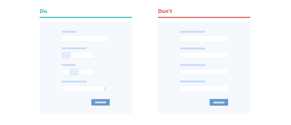
Pay attention to input field format. It is a bad practice to use only simple inputs or dropdowns everywhere.
It doesn’t matter if you have more field types. Users love different representations of data fields.
The simplest way to represent attractive information is
· Use radio buttons for gender types, don’t be afraid using icons
· Use labels with text of currency for finance fields, auto separate thousands and millions
· Design obvious field for mobile numbers, days of week, dates, etc
· Use advanced search with auto-suggestion in case of location/address instead of many field that user have to complete manually
Also, never forget the rules about input format
· The length of the field affords the length of the answer
· Validation for email fields
· Pre-fill/auto-detect as much as you can
· Min/max length
· Numeric, alphabetic, alphanumeric, all symbols
· Dependencies
· Placeholder.
Tip 8: CTA(Call to Action) style rules
User should not spend a lot of time figuring out what button should be used to perform an action. For example: Is this button for submitting a form or discarding it?
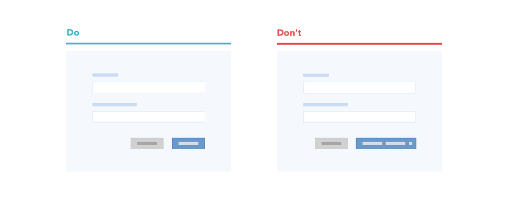
So, make sure that you define and differentiate the primary and secondary buttons properly in a form.
You can simply do this by using different colors. Avoid same colors for primary and secondary buttons as they can mislead the user. Else use contrast colors to differentiate them.

Tip 9: CTA microcopy
Use brief and clear names for CTA buttons. The main goal of this buttons is to catch users’ attention and call them necessary action. When it short and clear it takes less time for reading and decrease path to completion time.
Tip 10: Use inline form field validation
Never neglect designs for form validation! Don’t put it on developers shoulders. It is the most important part among all the various form functionalities.
As a designer, you have to prepare texts and views for different types of error states, help text, other methods of communication with user. Spend time for validation microcopy. If you don’t have resources for preparing text for every type of errors, just think about global error microcopy.

Always remember that when you prepare a list of texts for error messages you should never blame your user for his mistakes. Instead, make sure that your messages are clear and to the point.
Major point, user data needs to be validated in real-time. Don’t make your user fill all fields and click submit button to understand that something has gone incorrect.

Summing up
To make your form design outstanding, let’s AVOID the following

· Complicated messages
· Global validation after submitting
· Long titles for fields
· Long names for CTA buttons
· Not grouped information
· Discard auto-suggest/autocomplete
· Endless fields on one page
· Using one input format for everything
· Neglect accessible (color-blinded)
· Using multi - column design
· Using labels instead of placeholders in fields
· Confusing paths to completion
· Avoid user testing
· Don’t apply recommendations and guidelines
So, keep thinking about your new form design, and Good luck in creating yours!

Useful sources that were used in this article
Observing the User Experience, Second Edition: A Practitioner’s Guide to User Research
UXMatters — Evaluating the Usability of Search Forms Using Eyetracking: A Practical Approach
UXMatters — Label Placement in Forms
Baymard Institute — Form Field Usability: Avoid Multi-Column Layouts (13% Get It Wrong)

