Why does everything look the same?
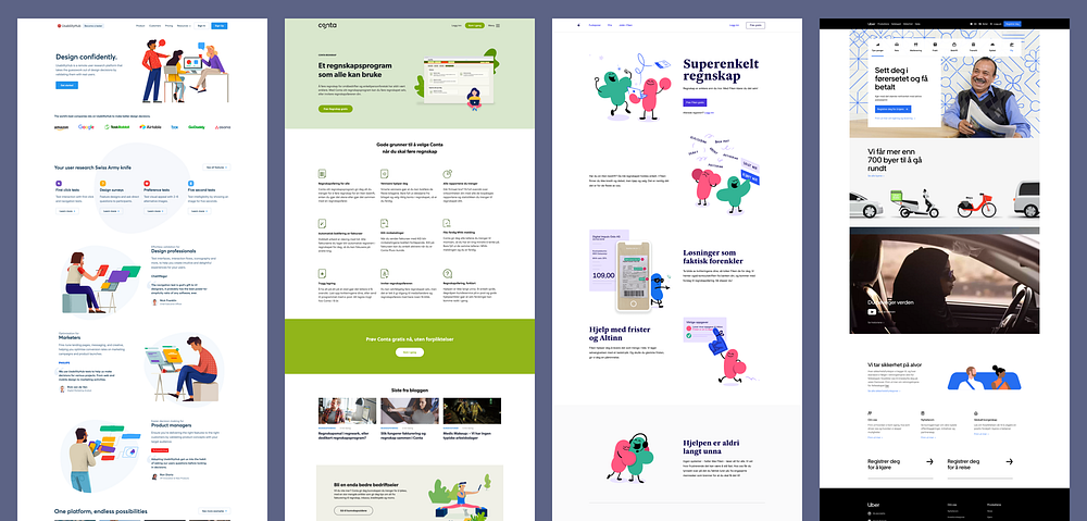
Have you noticed that nearly all websites of a given category look the same these days?

The digital design industry is dominated by people calling themselves UX-designers.¹ While titles rarely capture the skills of a designer with precision, in general UX designers are people that rely on short-term measurements of a design for their decisions: Performing user tests, analysis of user traffic and conversion rates. As a result, todays digital design is a product of what has been measured using statistics and numbers in the short-term. It’s part science and part past experience that drive design decisions.
Because of this, sadly, the internet has become a boring, stale place. Everything looks the same, and everything follows the same formula. If numbers are all there is, optimal solutions to common problems can be known beforehand. All you have to do is test something, and if the numbers are good, just reuse it for all your future projects. Thus new thinking is no longer necessary for many design tasks. Out-of-the-box solutions to a problem that have been proven in A/B tests by the likes of Nielsen-Norman Group and Google are readily available. Designers are barely needed for some of the most common design tasks, as the “correct way” of making things can be done following an online recipe. And how many apps and websites simply use Google’s Material Design? Digital designs can be pieced together from experiments previously run.
Digital designs can be pieced together from experiments previously run.
Cold and calculating design
Something is lost when digital products are made this way. The clients ability to communicate visually, and to build a brand through uniqueness is diminished. The pursuit for ever-increasing conversion rates, ever-shorter time for the user to find information and ever-optimization of everything that is measurable in the short-term, creates a bland, dull and uninteresting experience. Not necessarily because it is, but because we have seen it before. What could have been a unique experience, influenced by who the client is, what they do and why, must give way to a 10% increase in newsletter-signups and a .2 minute increase in user retention.

Designers and their clients in the digital world have forgotten the importance of visual communication that isn’t necessarily measurable with an A/B test. Aesthetics are still valued in the design world, but the graphic/visual designer is usually relegated to picking out a nice typeface and making some illustrations, and placing them in a spec given by a UX-designer or a service designer. The structure, concept and user journey through a digital product is almost set before the design project even begins, because “it’s been tested”.
This is bad for the client and the organization the client represents: Marketing professionals have long known that people buy and vote with their emotions rather than their reasoning. ² ³ Brands and the emotions they provoke are much more powerful tools than functionally optimized experiences. Graphic designers have used this to their advantage for decades. While designers have spent a long time convincing the world that design isn’t merely “making things pretty”, the right aesthetics can be crucial for customer trust and opinion, even to the point of making a user believe a product is more usable than it actually is.⁴
Form is function
Aesthetics aside — form usually does follow function, but form should do more than that. Form is not simply shape, it’s the how something is. A chair, for example, is one of the most basic household objects, yet thousands of variations are available in different colors, shapes and sizes. Why does one pick a Rococo chair over the Emeco 1006? It isn’t a matter purely of personal taste over what’s “prettier”. They both serve the same function: Something to sit on with proper posture. The emotion or feeling they capture, however, is the real differentiator. Their colors, material, ornamentation or lack thereof tell you something beyond the fact that it is something to sit on. It tells you where the chair belongs, what kind of person buys that type of chair, or what the chair signals to people who see it in someones home. Thus: Form is function in itself.
This applies to digital design as well. Consider the website of fashion-company Arche68: While it might take longer for the user to find the product they are looking for and actually buying it, the user is left with an emotional impact that numbers-based UX-design cannot replicate. The form of Arche68’s website will appeal to some and drive away others. It hits a target group. The way it is is also part of its usability.
We need to balance our priorities
If you think this article seems crass against a numbers-based approach to design as a principle, that isn’t the intention. User testing, A/B testing and analytics are a crucial component of digital design. The ability to build and measure a product that is as usable and useful as it can be, must be taken into account in every single design project. The numbers-based, scientific approach to design is crucial. All i’m suggesting is that we balance our priorities more. Perhaps we sometimes can discard what our numbers tell us in favor of something a little more interesting, because the value of something interesting and communicative might be greater.


