From a colourblind designer to the world: please stop using red and green together

Colourblindness is a visual impairment that affects around 1 in 12 boys and men, and around 1 in 200 girls and women.
It has many forms, and can impact the perception of a wide range of different colours and colour combinations.
However, the most common kind — and the one I have myself — is red-green colourblindness. The opticians’ term for the specific type I have is “deuteranopia”.
For me, this means that:
- where red and green appear together, they usually look the same as one another — especially if the hues have high saturation and low value (or in lay terms, if they are bright)
- where red and green appear in isolation, I often can’t tell what colour they are — again, this is more likely with bright hues
- I’ll often mistake green midtones for brown (I used to love all my brown clothes until people told me that most things I buy are actually green…)
- less often, I struggle to see the difference between purple and blue, and between yellow and green
(If you were wondering about traffic lights, in the U.K. at least, red and amber look very similar, but green looks completely different — a kind of off-white — because the saturation is very different from the other two.)
How to avoid creating problems for colourblind people
Given how common red-green colourblindness is, it’s surprising how often I still encounter red and green used for functional elements in user interface (UI) design and information design.
Here are just three problems I regularly encounter when using apps and websites, and how to avoid them.
1. Red and green used to indicate form validation errors
Problem: Using colour to indicate validation status means that I often can’t tell which form field is in error:

Solution: Add other visual indicators of validation status — ideally both an icon and a text label — and avoid using red and green together:

2. Red and green used for primary and secondary buttons in forms
Problem: Using red and green to indicate “OK” and “Cancel” (or similar) can lead to confusion and user errors, especially when working at speed:

Solution: Make it clear which is the primary and secondary action using distinct button styles:

Even better, place the buttons one below the other, so that it’s clear which is the primary action (this isn’t appropriate for dialogue boxes, which follow their own conventional design pattern):

Better still, use colourblind-friendly hues:

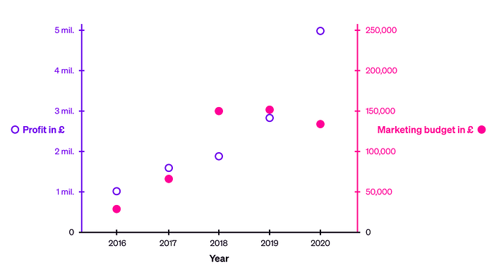
3. Red and green used to convey meaning in charts
Problem: Using red and green to plot different series of data can literally make the visualisation unusable, because I can’t see which points belong to which series:

Solution: Use different colours, and support interpretation by using different point styles for each data series, and adding a legend:
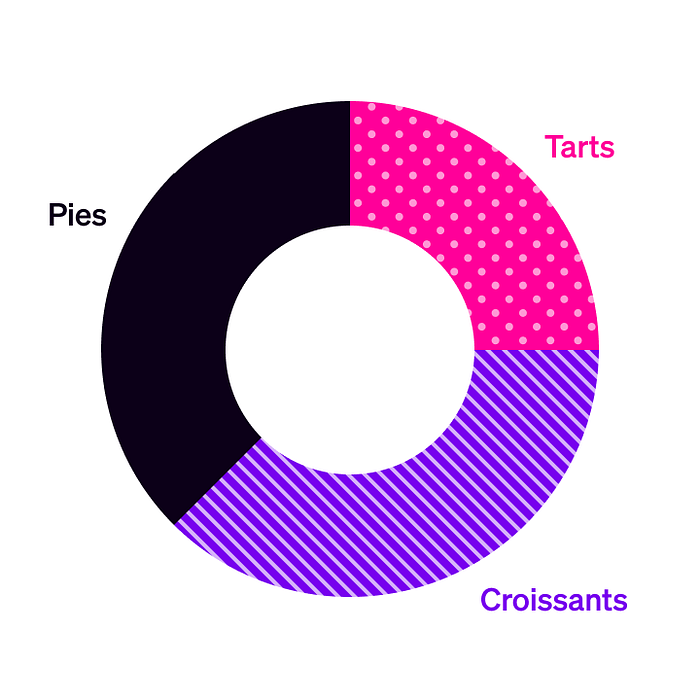
The same problem arises with charts that use areas rather than points — for example, donut charts:
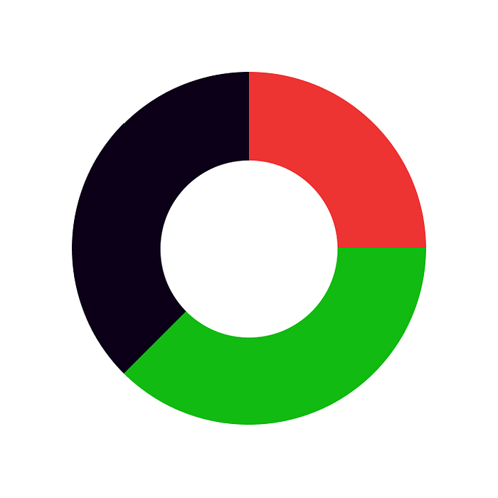
In this case, as well as using more colourblind-friendly hues and including text labels, you can add patterns to help indicate which area relates to which category:
What if you *have* to use red and green?
Suppose, for whatever reason, that you have to use red and green together in a design.
You can make this scenario slightly better for colourblind users by ensuring that the “apparent luminosity” of the hues you choose is clearly different.
To show you what I mean, here are two buttons with similar apparent luminosity — meaning they appear similar in “brightness”:

And here are two buttons where the red has low apparent luminosity (is dark and saturated), and the green has high apparent luminosity (is light and desaturated):

In conclusion…
To include colourblind users in your design, follow these rules:
- Avoid combining red and green in user interface design and information design
- Add text labels and icons so that colour isn’t doing all the work
- Support colour choices by combining them with different styles and textures
- Choose less problematic colours wherever possible
- If you have to use red and green, differentiate them by adjusting saturation and value
(If you want to learn more about the colour terms used in this article, take a look at our free course materials about colour.)
Baseline is a free design bootcamp with 100% in-house course materials. (No signup, no email address, no payment, nothing.) You can start at the beginning or check out the design principles assignments to get a feel for things!
Originally published at https://baselinehq.com.


