Game of Types
When you play it, you either have good or bad type. There is no middle form for your content.

Typography is the foundation how you communicate to people. Often, I feel so overwhelmed looking at different typefaces and the combinations of them to form a good style. So one should have a good sense of playing (using) typefaces with content, for it to be legible, readable, and clear. As said by Chris Do, If you don’t control Type, Type will control you.
Good typography is measured by how well it reinforces the meaning of the text, not by some abstract scale of merit. Well produced typography is one that understands the goal of subject. It helps in presenting the good content to look great. Remember, Typography is not a math problem with one correct answer.
Working to get a good typography into your design is possible by captivating few important things.
Important things to consider:
Knowing the purpose
Your ability to produce good typography depends on how well you understand the goals of your content. Typeface that you select should speak the seriousness and set the mood to observe your content. Sign boards would help you understand this point.

Typographic choices that work for one text won’t fit for another.
Learn about your users
Empathy towards your users is the key for good design. Knowing what category(age factor) of users you are designing your content helps in choosing the right typeface. Every typeface is designed to serve certain purpose. Align the same with the users purpose as they grab your content.
Imagine you are designing content page for kids below 10 years in age. You might want to present it in more casual way for the kids to find it engaging to read.

Typeface style on the left looks formal and straight. Where as the options on the right look more casual and kids might love it. I mean to say that the right one would give a warm gesture to kids than the one on the left.
Choosing Typefaces
Google took a stab at categorizing type into 5 variations.
Serif is a small shape or projection that appears at the beginning or end of a stroke on a letter.
Sans Serif is a typeface without serifs.
Monospace typefaces display all characters with the same width.
Display is miscellaneous category that are only suitable for use at large point sizes.
Handwriting typefaces are unconventional with a natural, handwritten feel.

While legibility is determined by characters in a typeface, Readability refers to how easy it is to read words or blocks of text. This is affected by style of the typography that is formed by choosing 1 or more typefaces.
Determine scale
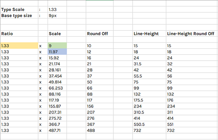
Type scale helps in maintaining good contrast within the content. There is a ratio at which your typeface scales from minimum to maximum sizes. Tools are available online to determine the scale for a particular ratio. One of it is Modular Scale by Tim Brown.
I came up with my own version of it. This will help set your Type scale ratio and the Base type size you want to have for your content. You can customize the same with your favorite Type scale ratio.
Put to action
Here you can pick different font sizes and put together to form a good contrast with in blocks of text.
In the below picture, which one is more legible? Left or Right?

I guess you might be more inclined to the tile on the right.
That is because it follows a good type scale to represent blocks of text as shown below.

Here is a sample type scale that i generated using this scale.

These are few important things to consider while you start with typography in your design. There is more to getting perfect with types.
Typography is an ocean. I still stand at the shore. :P

Useful links
https://vanseodesign.com/web-design/legible-readable-typography/
https://practicaltypography.com
https://modularscale.com
http://thinkingwithtype.com/letter/
https://guide.freecodecamp.org/typography/type-classifications/
http://www.designishistory.com/1450/type-classification/
Community
Clap, share and comment if you like this post. Looking forward to know more about the topics that you want to discuss here.