Game UI and UX: in-game character conversational experiences
A short analysis on the rendering and function of text-based conversational and instructional interfaces across simulation, platformer, and open-world games I have played.
Platform: Nintendo Switch
Games: Overcooked! 2, Unravel 2, The Legend of Zelda: Breath of the Wild
I was one of the few lucky people to land a Nintendo Switch at the height of demand…h/t to my loving and shopper savvy partner for finding it!
Like many who are locked-up and practicing social distancing, I wanted a way to explore and connect with people and found video games to be a novel way to do so. I found that a pervasive component of video gameplay is the use of conversational interfaces to navigate environments and accomplish goals.
I realized that there were good, bad, and game-specific ways of designing conversational experiences. Below are a few observations and recommendations in a prioritized list of games I played with least to most thoughtful conversational experience designs.
#3 Overcooked! 2: Text animation that leaves a bad first impression

The Overcooked! series offers friends and family fun, stress inducing, simulated cooking mini-games that balance difficulty and attainability just right. The storytelling and character illustration are equally engaging and delightful.
However, I cannot say the same about Overcooked’s dialog animation design.
Design Delta: At the start of the game, the player on-boarding module implements a dialog box that renders important cooking instructions. My partner and I, playing on our 48" TV screen, attempted to read the dialog message in sync with the game sequence, but found it difficult to follow and comprehend the text as it populated outward from the center of the dialog box.
I had a negative visceral reaction my first time trying to make sense of the instructions. I had to read the instructions twice and get over the unsettling feeling after being forced to read text in multiple directions. Playing with the hand-held console, the text animation wasn’t as off-putting as when I had played on the big screen, but I still would prefer for the text to display more predictably.
Luckily, for game players, these dialog boxes don’t appear too often in the game. There are clear and pictographic instructions before each mini-game. If game designers had implemented these dialog boxes to display in actual mini-game play, I know I would have been distracted.

As one of the first impressions of the game interacting with instructional information that helps me successfully complete game tasks, I was really displeased with this user experience.
Design Change Opportunity: Populate text left to right (LTR), or right to left (RTL), based on cultural audience and have character strings populate, all at once, the entire length of dialog box line, instead of having text animated letter-by-letter.

Design Change Outcome: Reading text LTR or RTL is natural and intuitive for players. Populating an entire line of words at once allows users to read and listen to in-game narration at ease without trying to increase or decrease their rate of sensory information comprehension.
#2 Unravel 2: Player instructional needs and game lighting influence player text interfaces

The Unravel series offers players a great collaborative experience navigating visually impressive worlds with few in-game auditory or text-based instructional queues. The fun part is verbally coordinating with your teammate on how to navigate each game level.
I believe Unravel game designers were quite thoughtful with how they implemented their instructional dialog feature. For instance, during game play, it’s not emphasized that in-game instructional queues are even available. Once players discover this feature, they have the option to turn it off, leaving players to rely only on each other to figure out game navigation. I respect and appreciate their design decision and game-play philosophy.
However, for those of us who every once in a while need guidance, I have a few observations that might make you appreciate Unravel’s instructional text design.
I noticed that the instructional dialog box always displays in the bottom-center of the screen, where our yarn avatars are. This makes sense as it is easy to simultaneously interact with instructional text as we move to the upper-right portions of the screen to overcome obstacles.

Comprehending and applying instructional queues during real time game play is a difficult task, but Unravel game designers have made this doable with their thoughtful use of content placement and contrast. Only in Unravel, a world that is shrouded in darkness, especially in the lower bounds of the game environments, do their instructional content design decisions deliver consistently; a luxury other game designers cannot easily reap.
Design Delta: One issue I found reading the instructional content was that the all the words carried the same weight making it difficult to easily identify keywords that would help me perform in-game actions quicker. The white, upper and lower dialog box borders also made it hard to read the text during game play.
Design Change Opportunity: Use color and letter bolding to emphasize keywords that address actions and game objects that integral in game scene navigation. Design borders on the fringes of the dialog box to improve readability without compromising focus.

Design Change Outcome: Players recognize keywords and react more quickly with game actions and objects instead of spending time reading and recalling instructional content that disrupts game play.
#1: The Legend of Zelda: Breath of the Wild: Subtle typography details that bring Link et al. to life
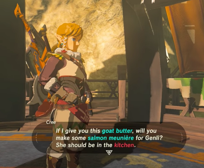
The Legend of Zelda: Breath of the Wild (BOTW) is a highly immersive open world game with stunning scene scapes and great attention to visual detail. BOTW dialog boxes are no exception.
BOTW has implemented the primary dialog box to display over 1/3 of the game screen with a black, transparent fill. Playing on the big screen or hand-held, the use of color-coded text that differentiate between objects and destinations as well as the bold, medium-sized font makes it is easy to read the text and identify critical game objects. The animated triangle is also a telling indicator that shows that there is more dialogue to read. With a dialog box so big, I am glad BOTW did not design it to display during critical combat or cinematic events in the game, as it would distract players.

I am also impressed with how BOTW queues players to engage in conversation with reaction dialog boxes that display during real-time gameplay. The content copy is usually brief and accompanied by a small icon that suggests the tone of the conversation the character will bring to interactions.
In digital interactions, where facial expressions and body language are hard to interpret, having affordances available that help players make somewhat informed decision to engage in conversation, is considerate of a player’s time and their desire to navigate the BOTW world with same agency and capability that they have in the real world.

Design Delta: In conversational scenarios where characters engage in internal dialogue, i.e. think to themselves, BOTW chose an odd way of designing that experience. It took me 3 weeks of game play to identify that these dialog boxes, with text slightly shaded grey, represented a character’s internal dialogue. I noticed this difference when I had a difficult time reading the text in the dialogue box and decided to investigate.
In situations where game characters reveal important clues about potential game outcomes and Link has to select response decisions to conversations based on internal dialogue information, it is important for players to be able to easily differentiate between types of dialogue. Otherwise, the player may make an uninformed or hasty decision that places them in an unfavorable game event.
Design Change Opportunity: Change the color of the characters name to a bold blue or purple — which symbolize notions of self awareness — and make the dialog box background less transparent.
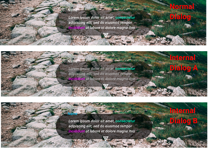
Design Change Outcome: Players will instantly recognize that two visual components of the dialog box have changed — the character name and black transparency- and interpret the “different” dialog box as one pertaining to a character’s internal thoughts.
Upon my return to videogame play, after a 15-year hiatus, I didn’t expect to be so caught up with game dialogue experience design. My interest might have to do with me getting older and crankier or perhaps an outcome of my career change to product design. Although none of the above design deltas would stop me from playing any of these great games, they do help me notice and appreciate the small design details in content-packed scenes. I hope that readers play and appreciate these games as much as I have.


