You're unable to read via this Friend Link since it's expired. Learn more
Member-only story
Get better at using color palettes with choropleth maps
The intensive and creative way to practice with color palettes.

We often don’t get the chance to practice working with custom color palettes as UX Designers. There’s often company branding or a style guide that guides many of our color choices, which means we don’t have much chance to work with color palettes and gradients.
However, a popular data visualization can help you practice working with these color concepts more effectively: Choropleth maps. You’ve probably seen some (or even made some) without knowing the actual name of it.
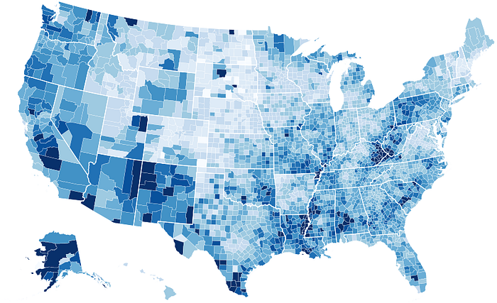
But creating a good choropleth map requires a strong understanding of how color can affect a reader’s perception of data. But to get started, we first need to talk about starting with choropleth maps.
What are choropleth maps used for
It may be tempting to say that any data involving geography should involve creating a choropleth map, but that’s not quite right.
We can only use choropleth maps when we want to understand patterns with geographic data. The main…

